Download as PDF, PPTX
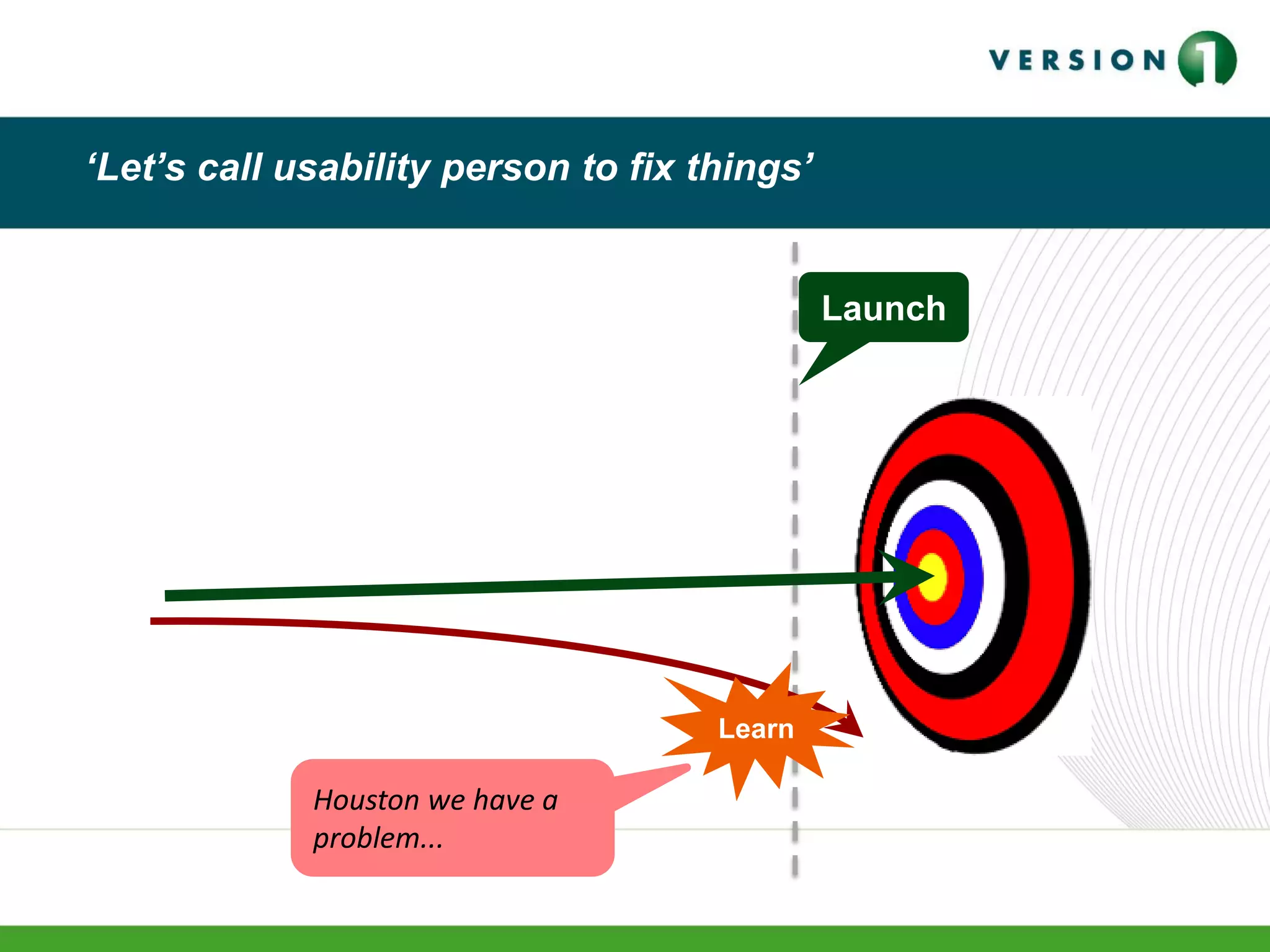

![A better way
Learn sooner
Save time
Reduce risk
Launch
Learn Learn Learn
[1]](https://image.slidesharecdn.com/v1-practicalusability-v-170128213921/75/Practical-Usability-12-2048.jpg)


![A better way
Learn sooner
Save time
Reduce risk
Launch
Learn Learn Learn
[1]](https://crownmelresort.com/image.slidesharecdn.com/v1-practicalusability-v-170128213921/75/Practical-Usability-12-2048.jpg)


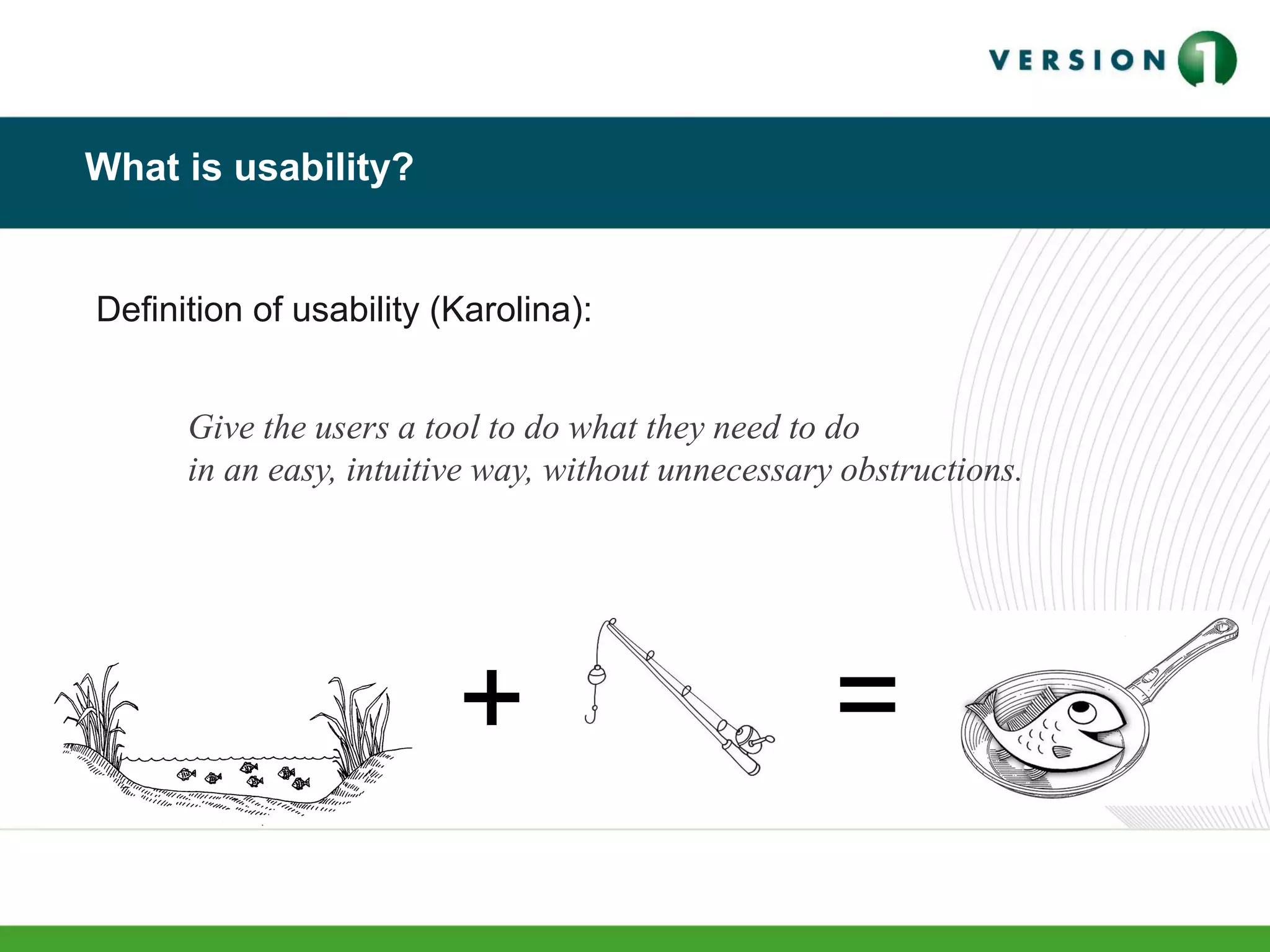
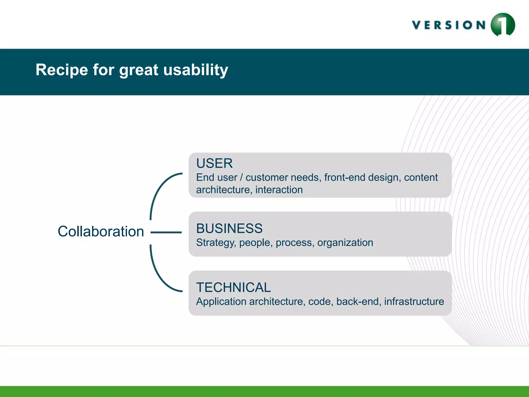
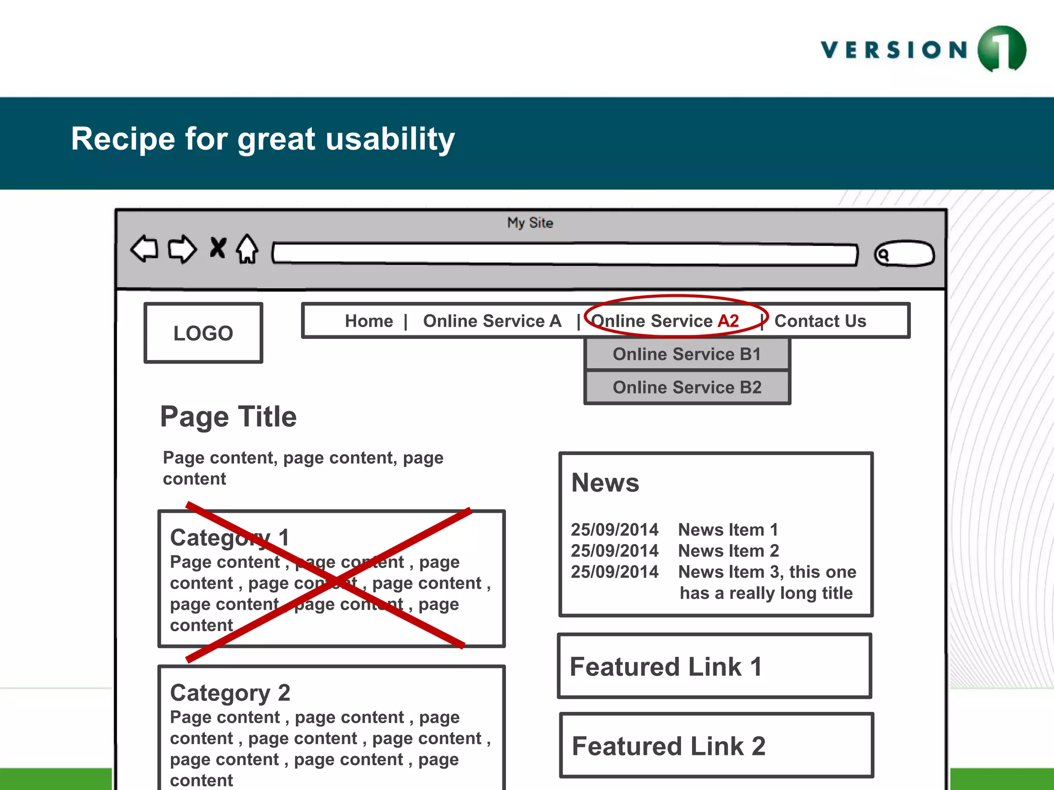
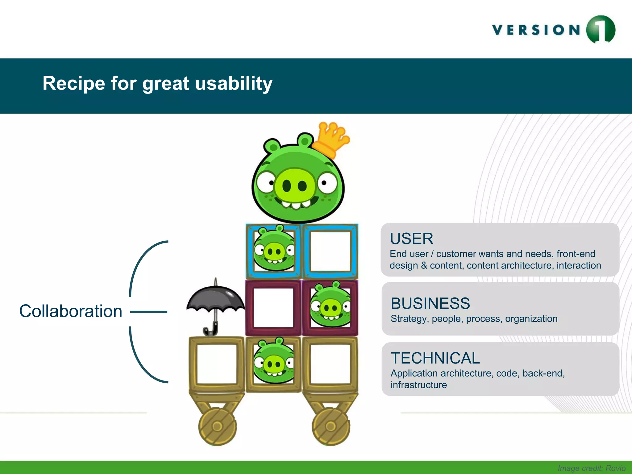
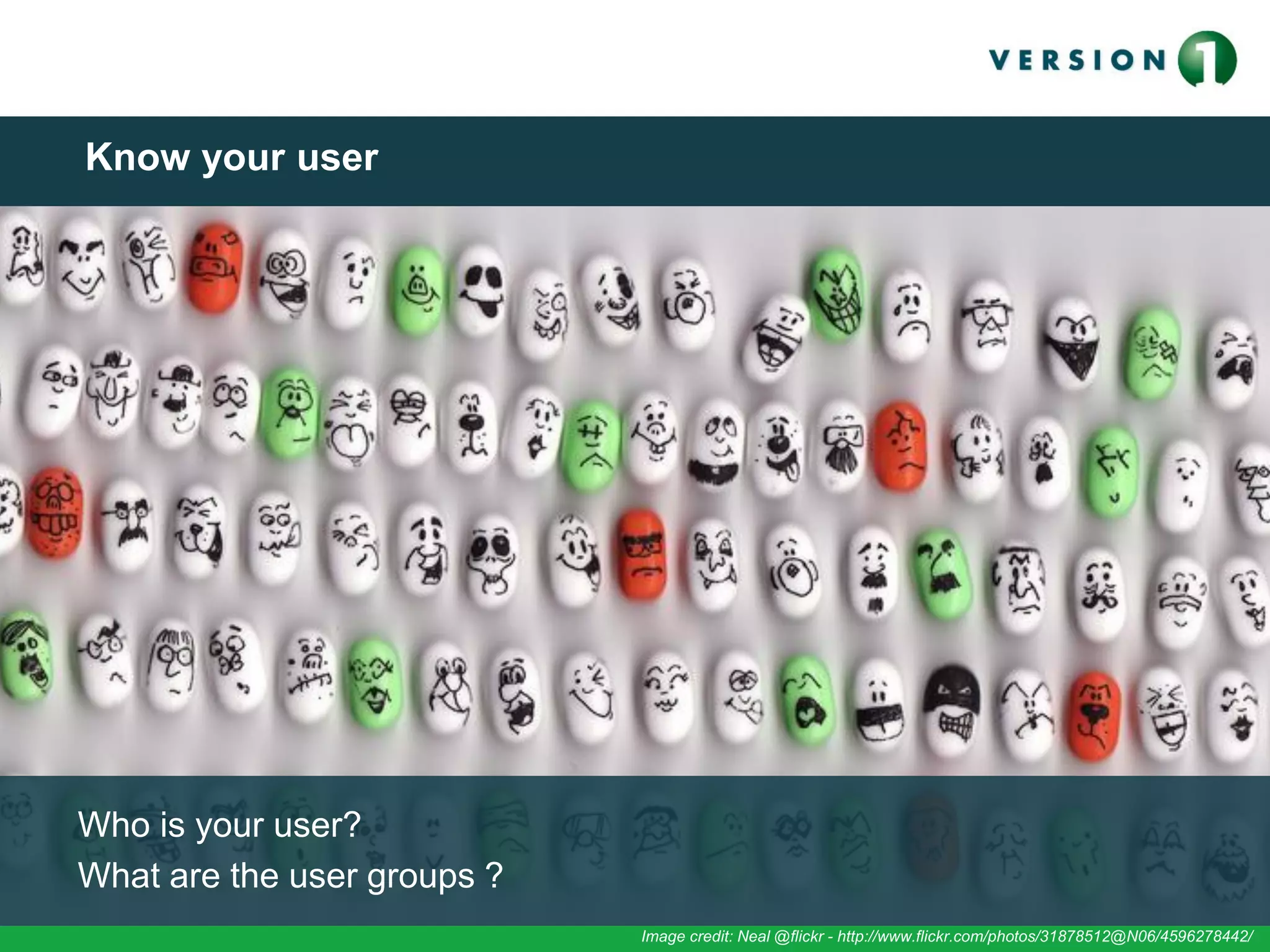
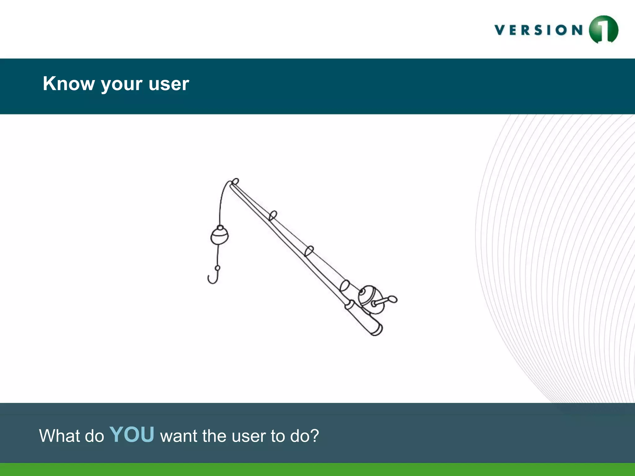
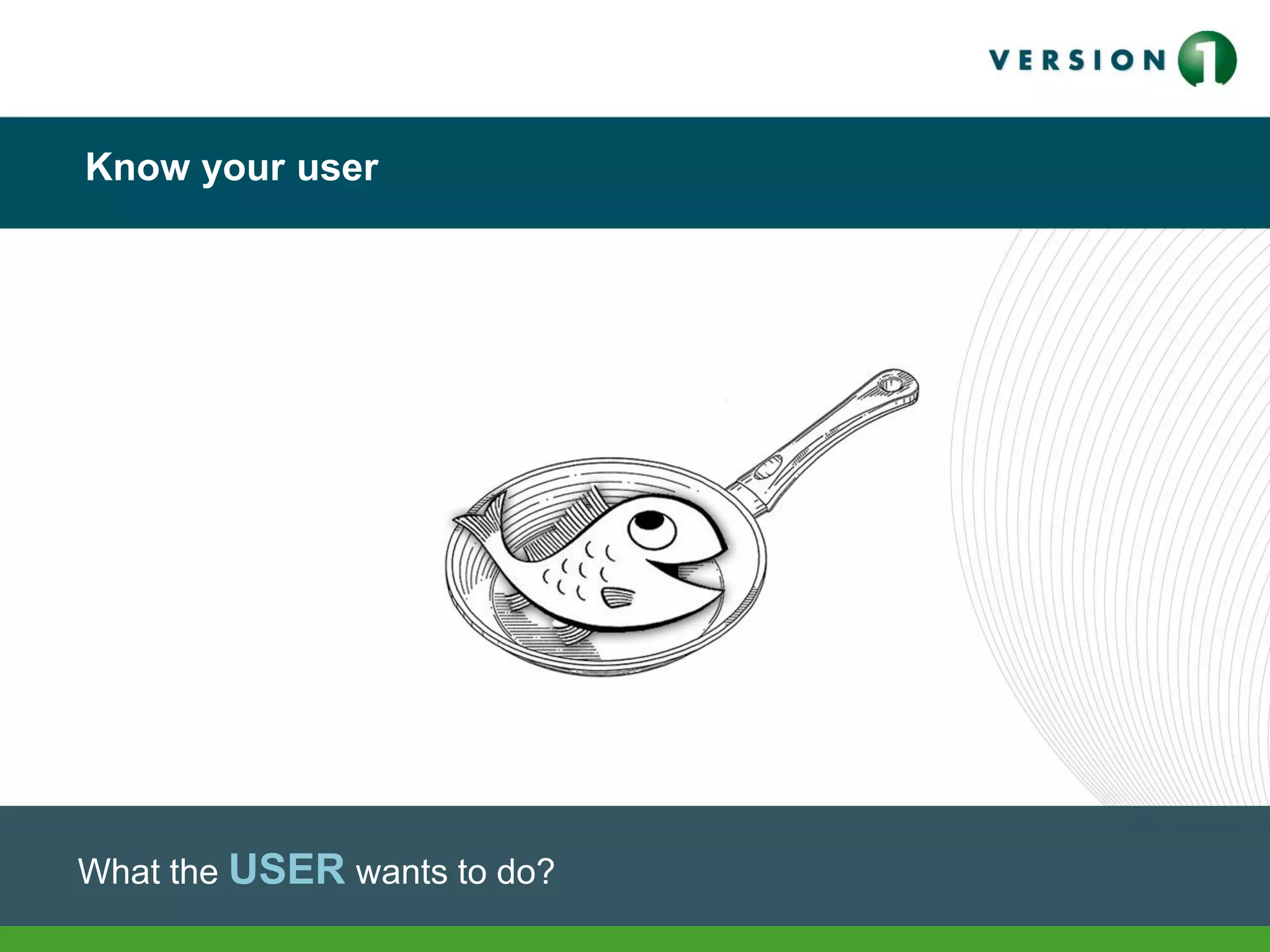
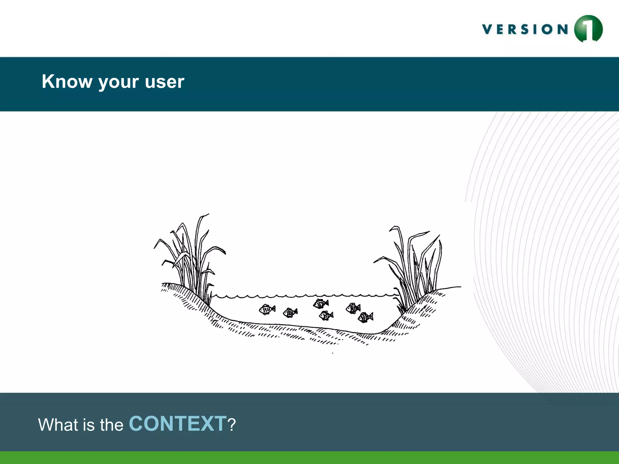
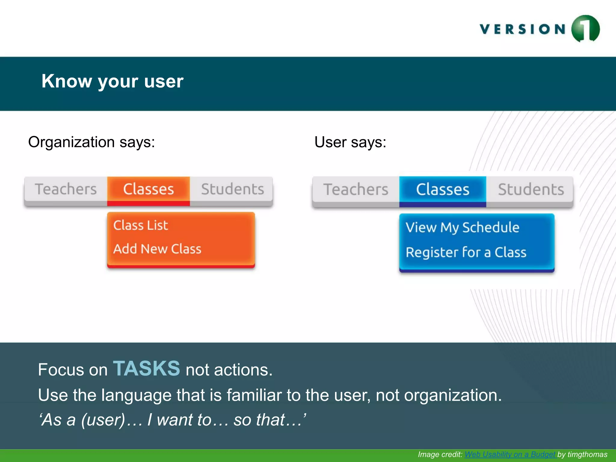
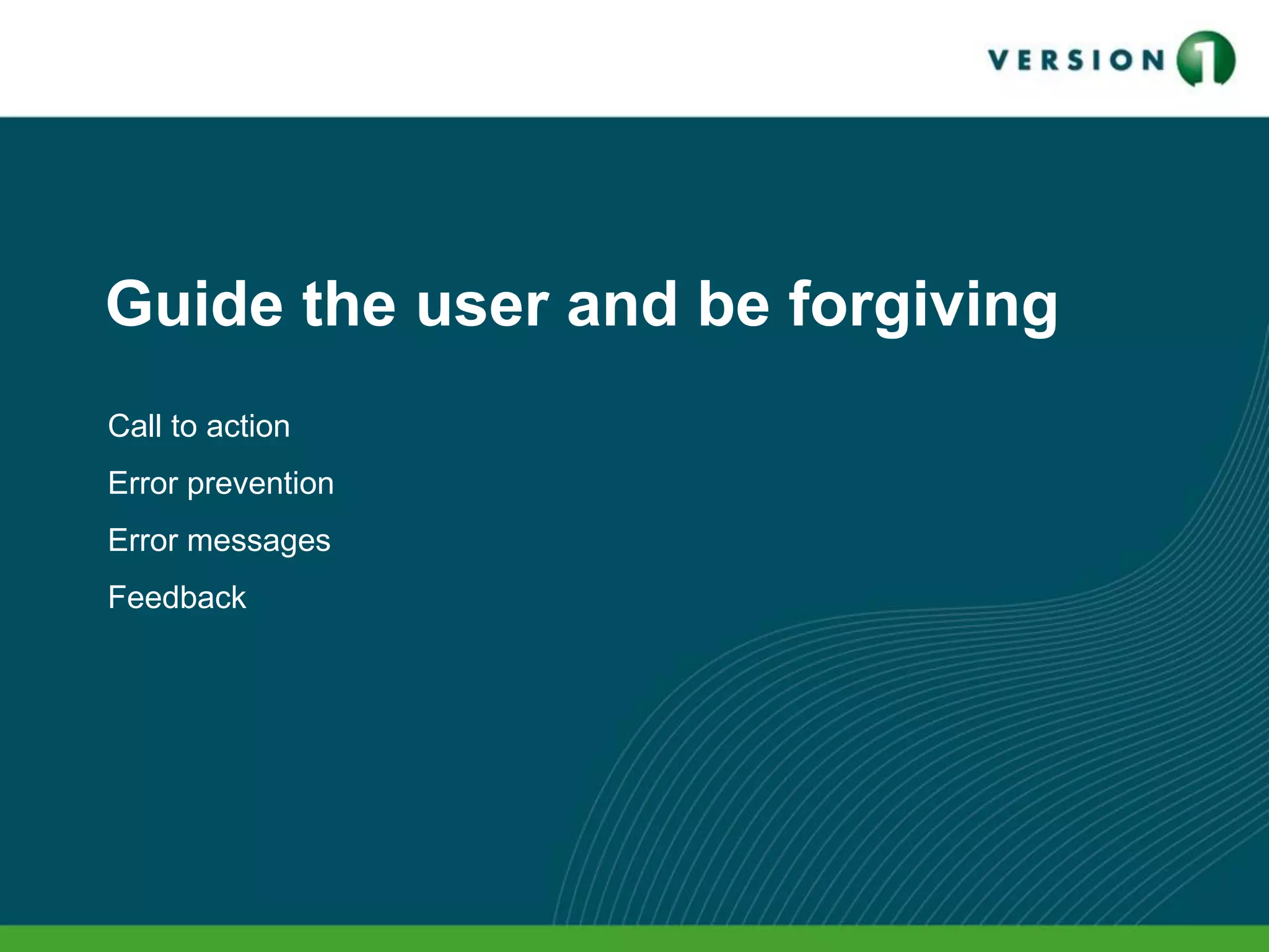
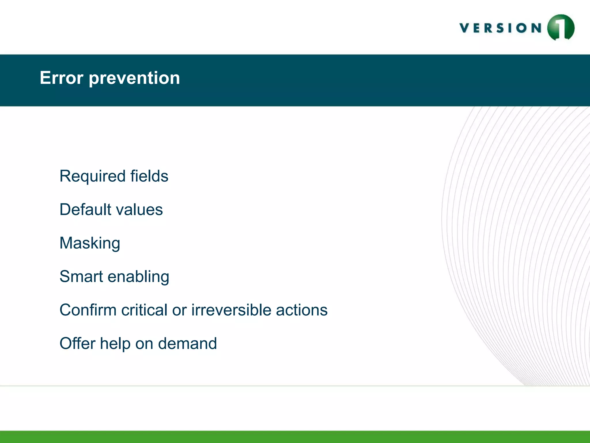
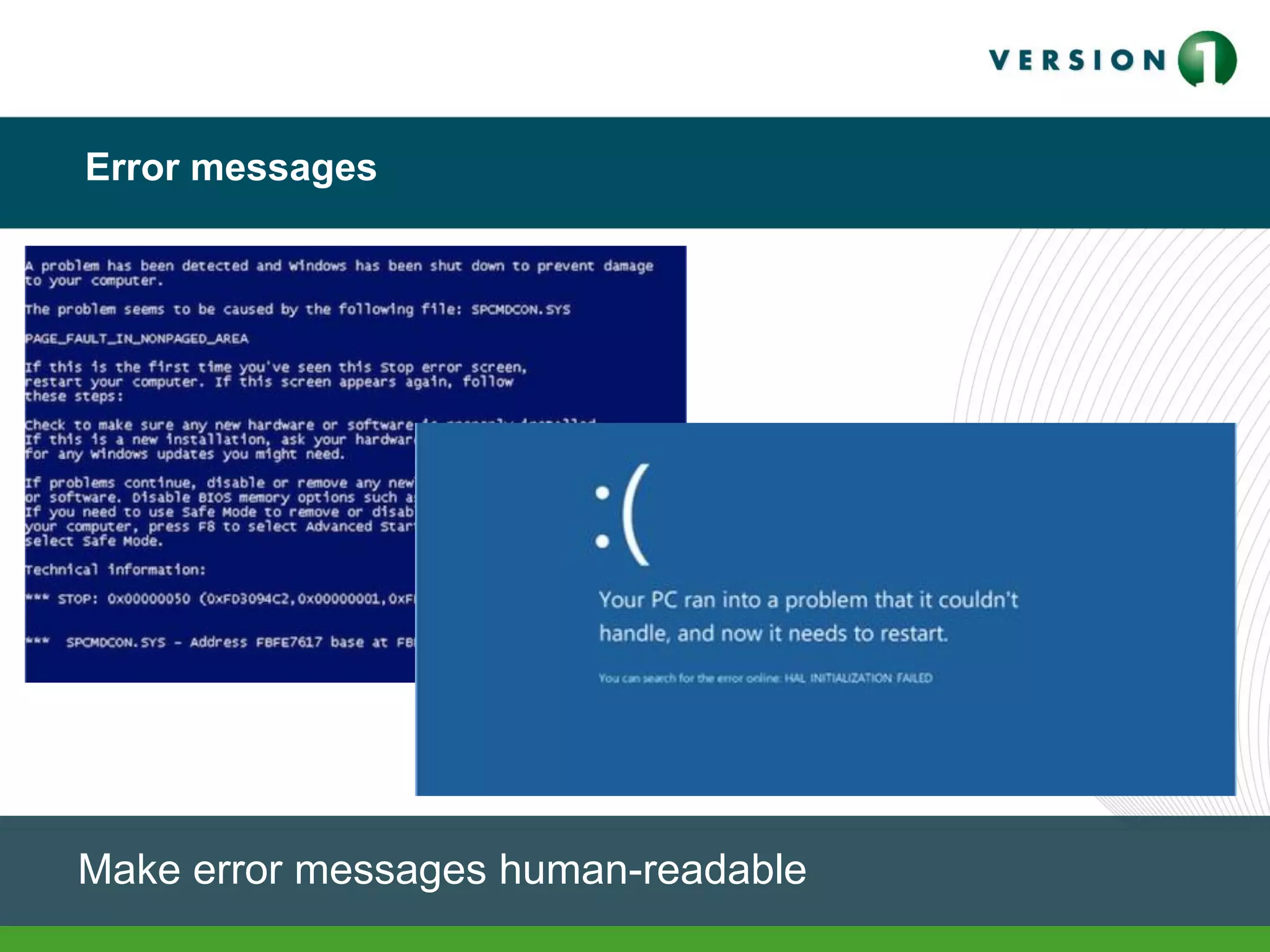
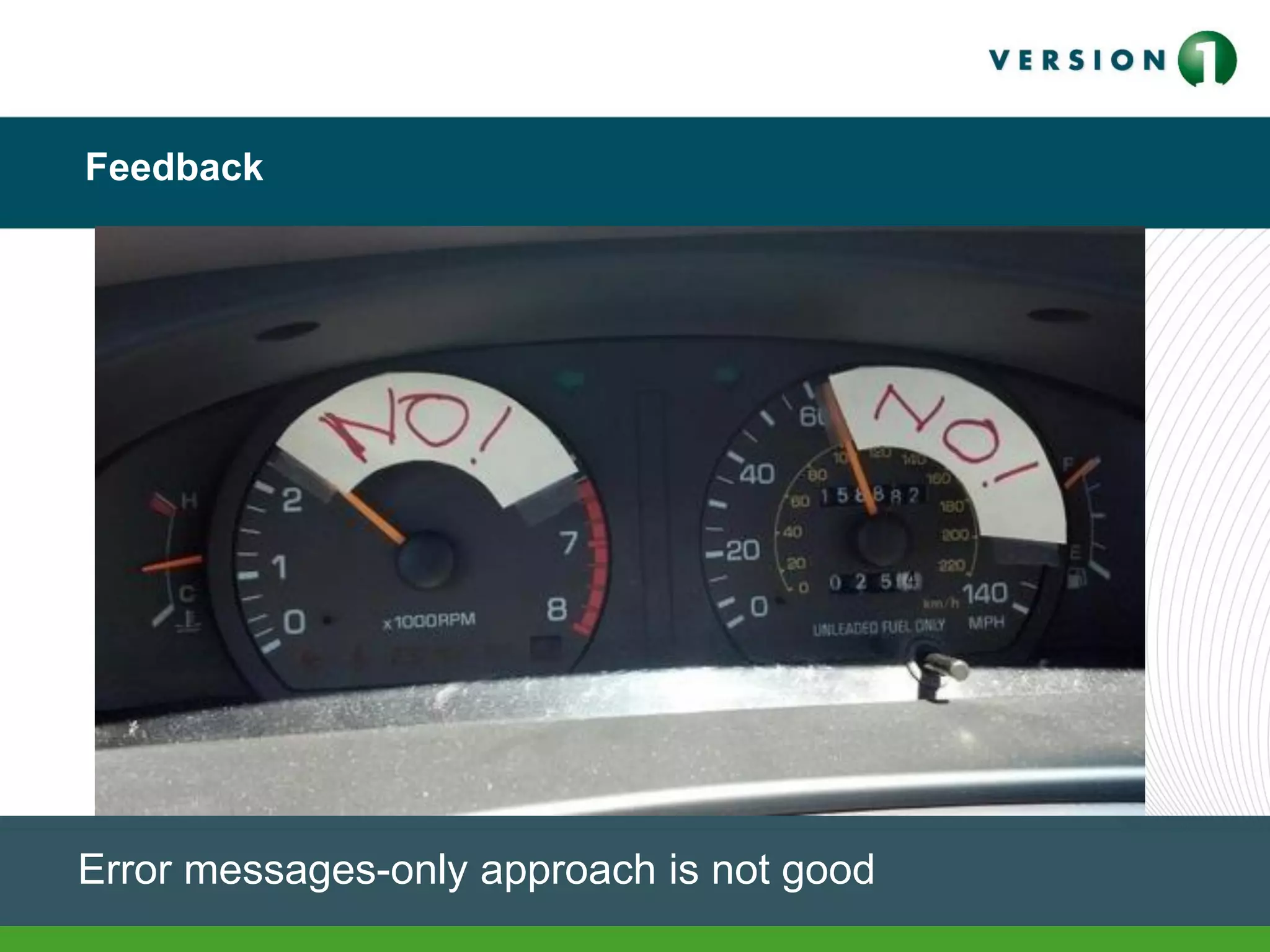
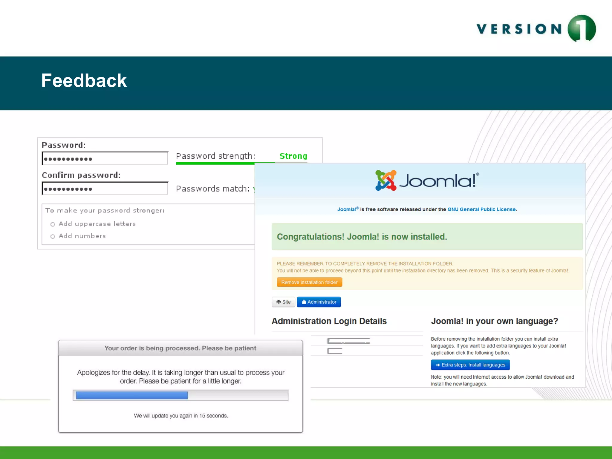
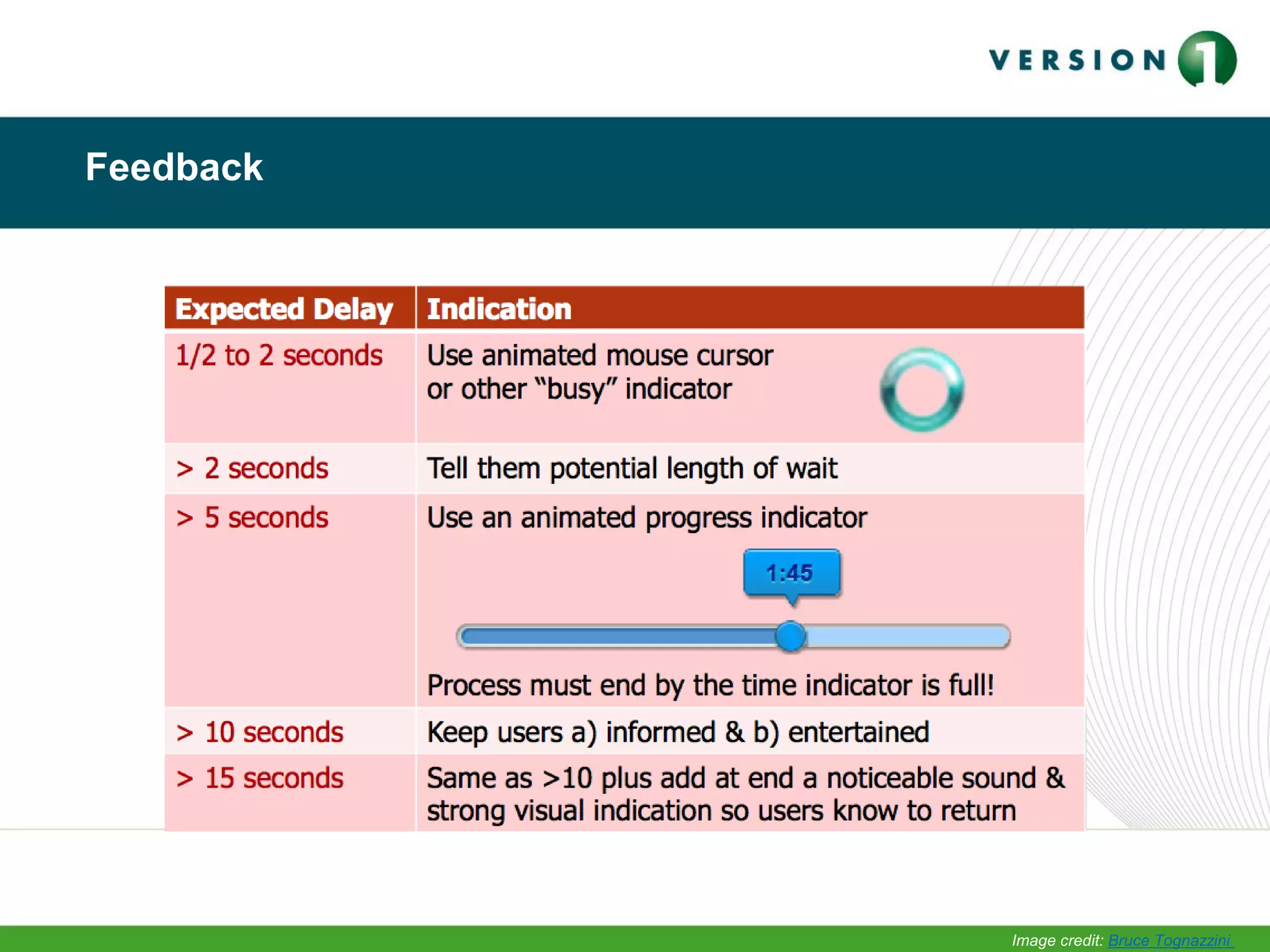
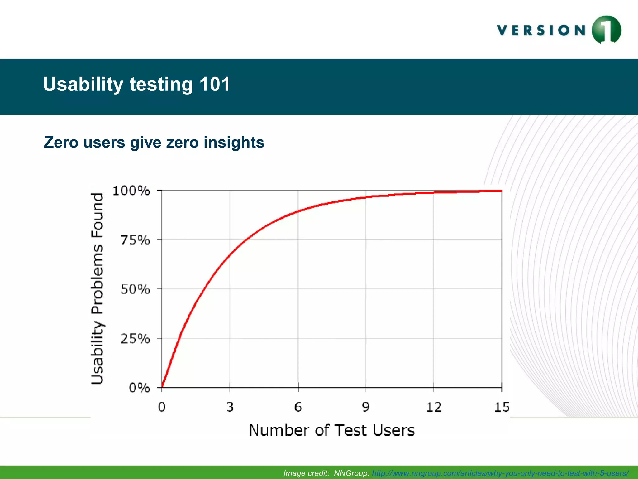
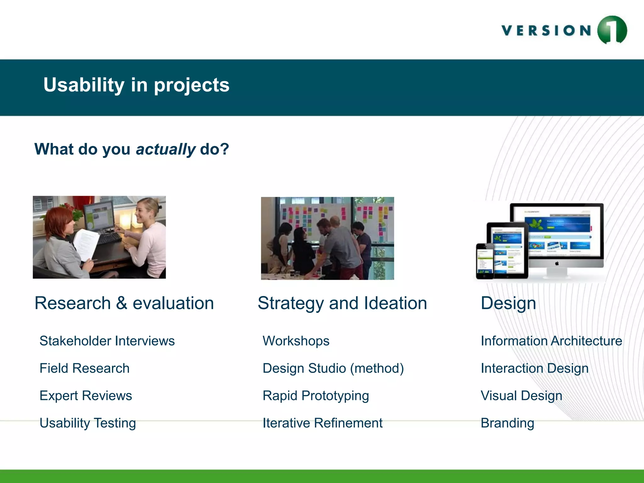
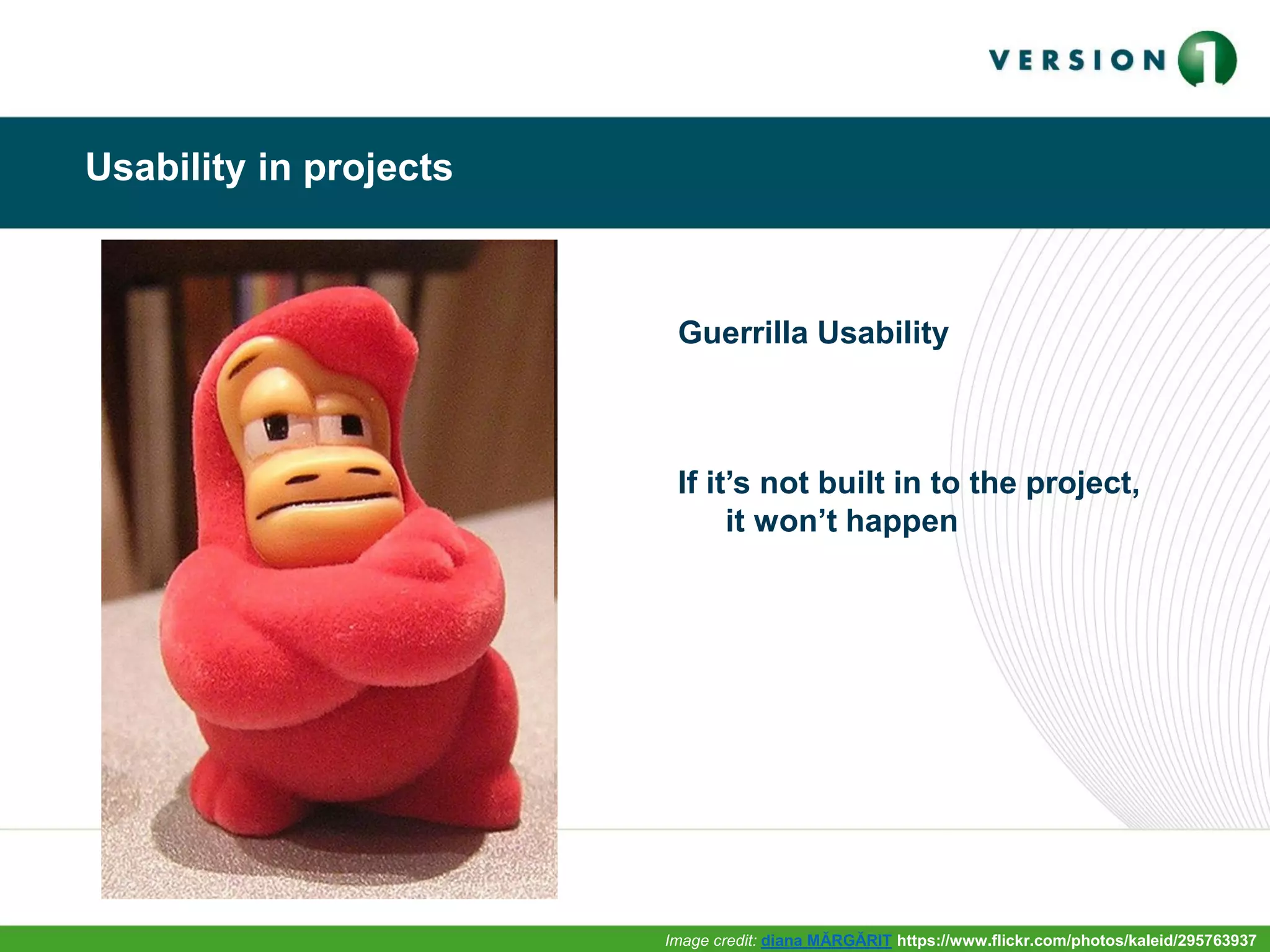
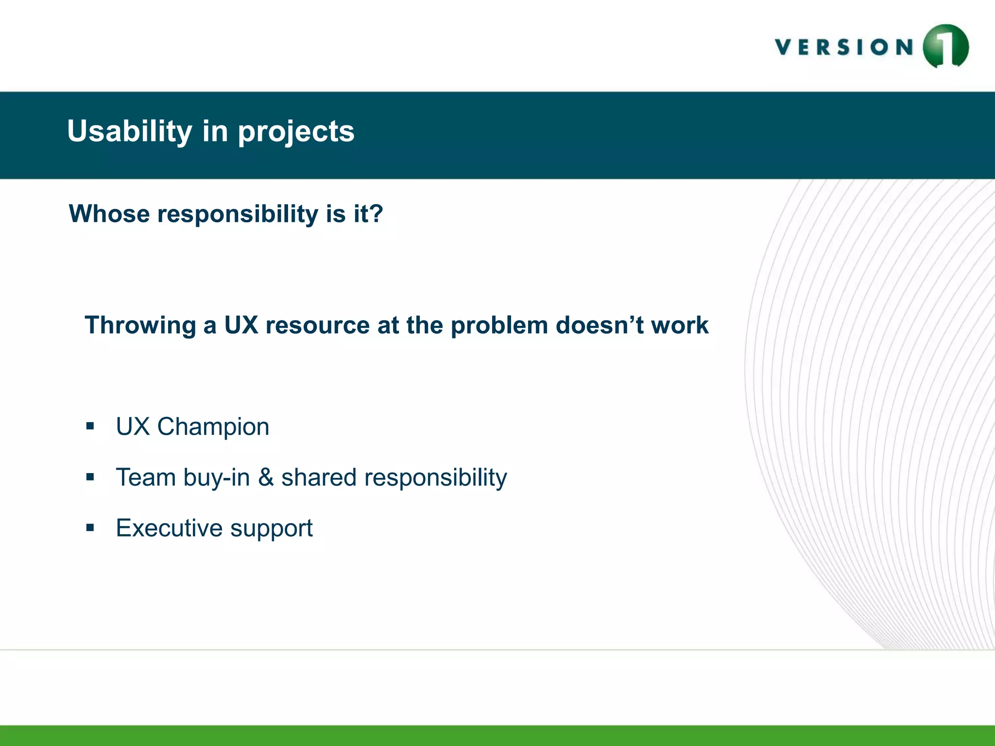
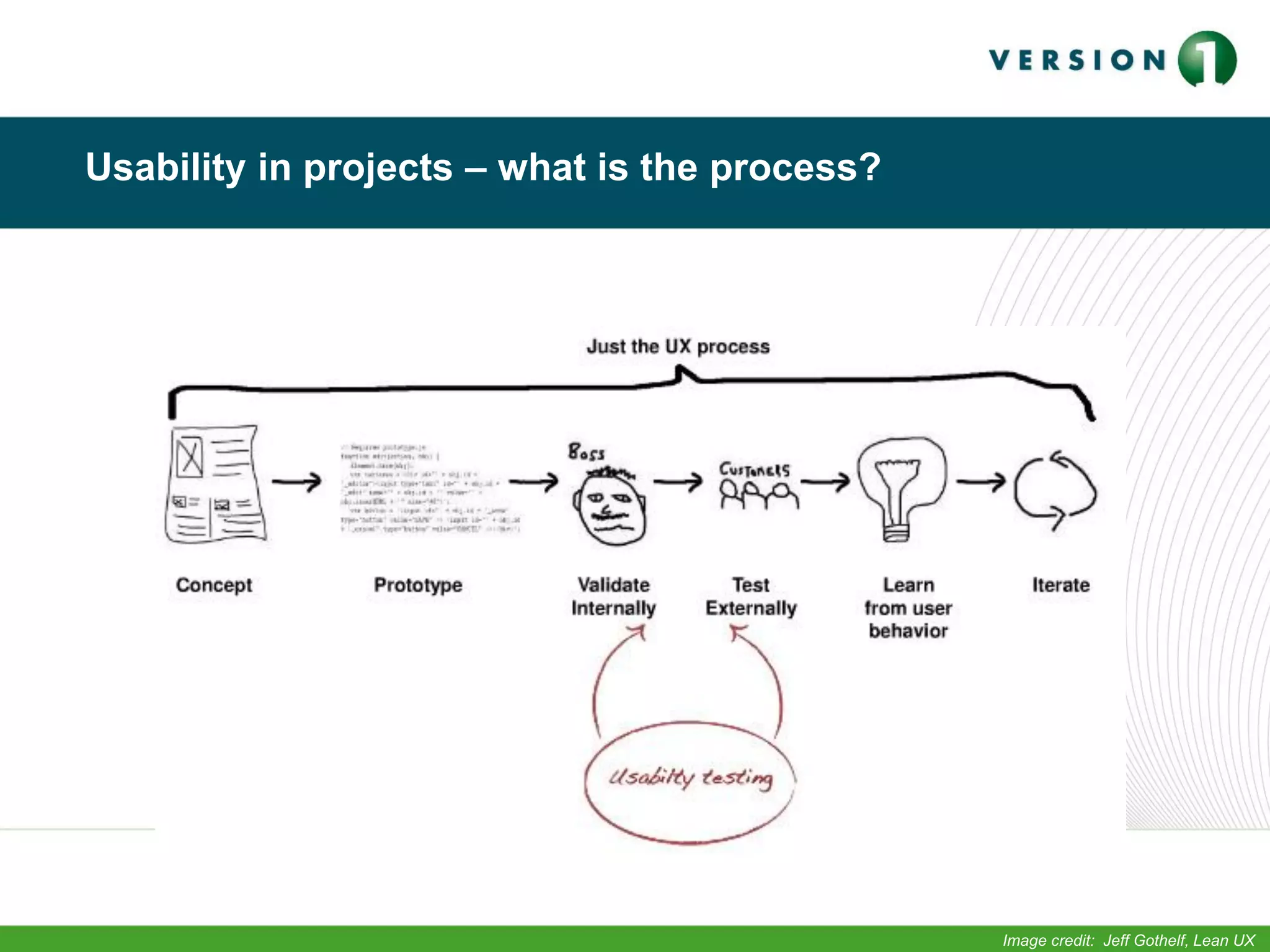
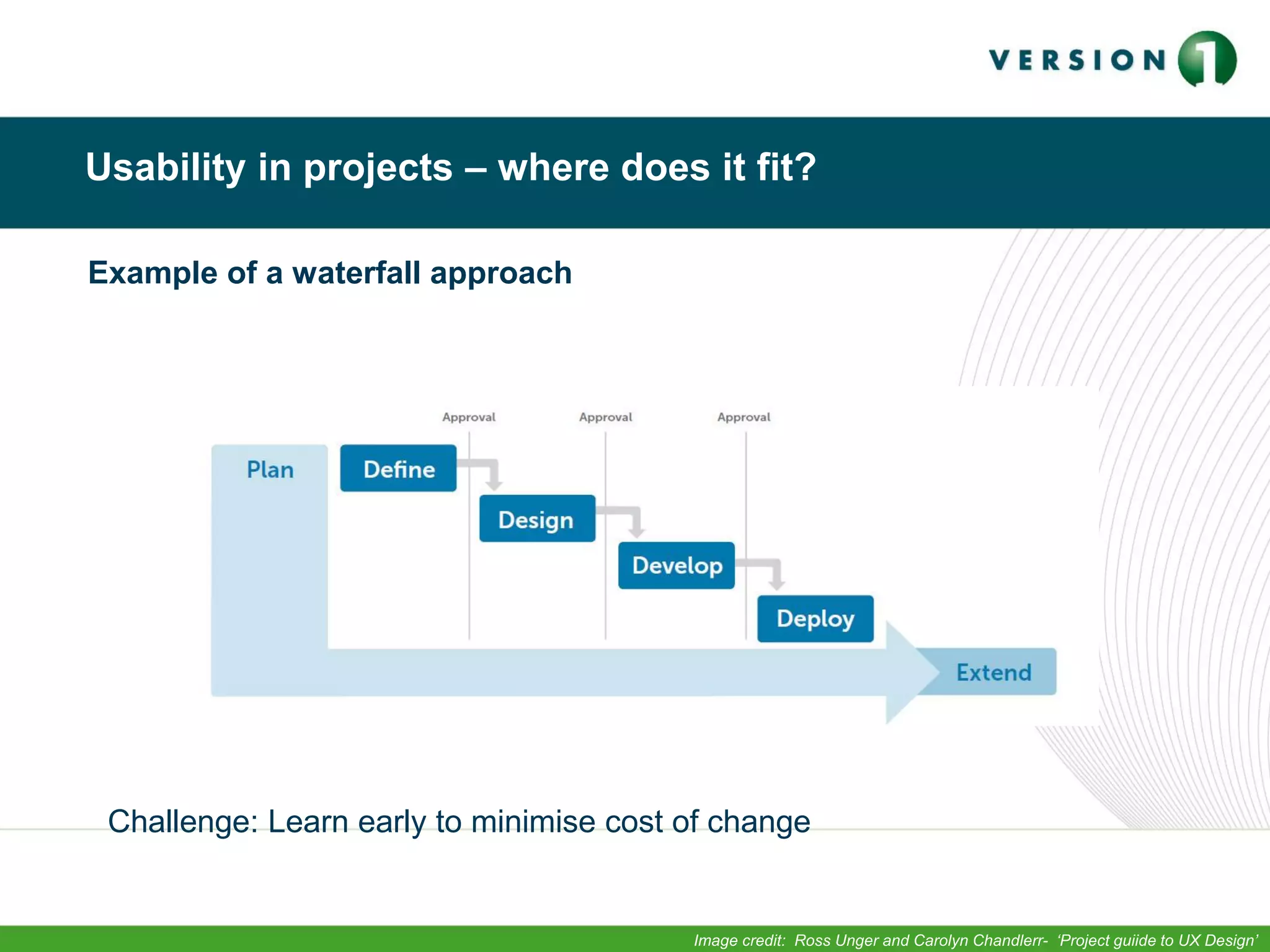
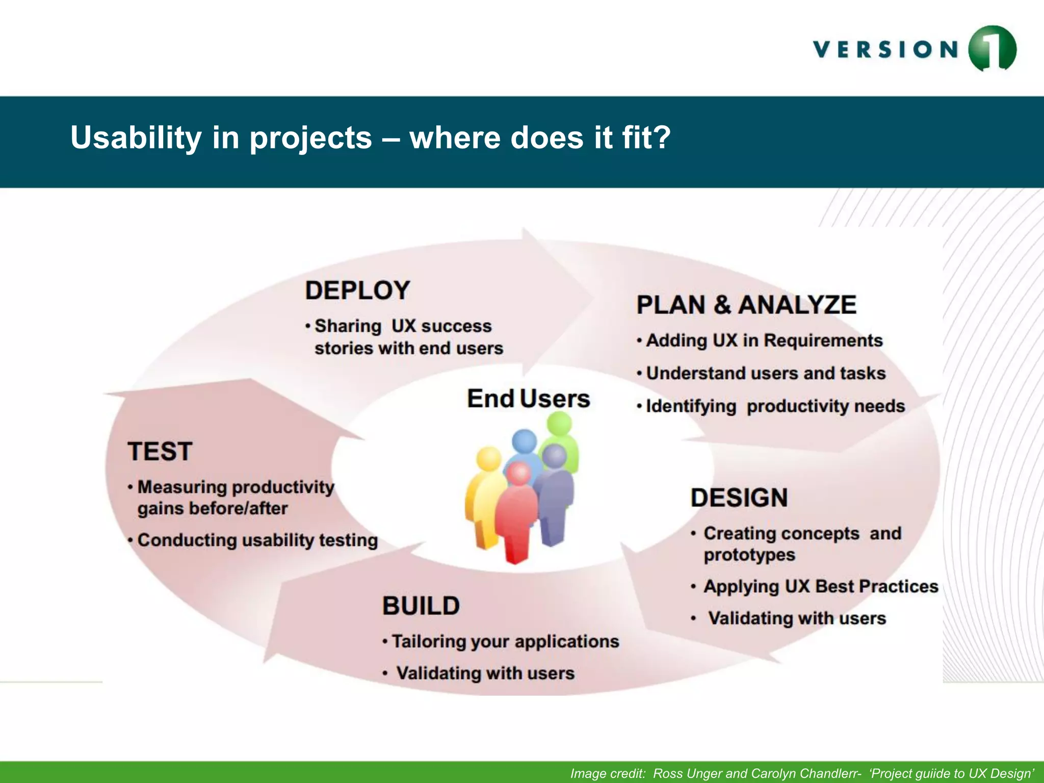
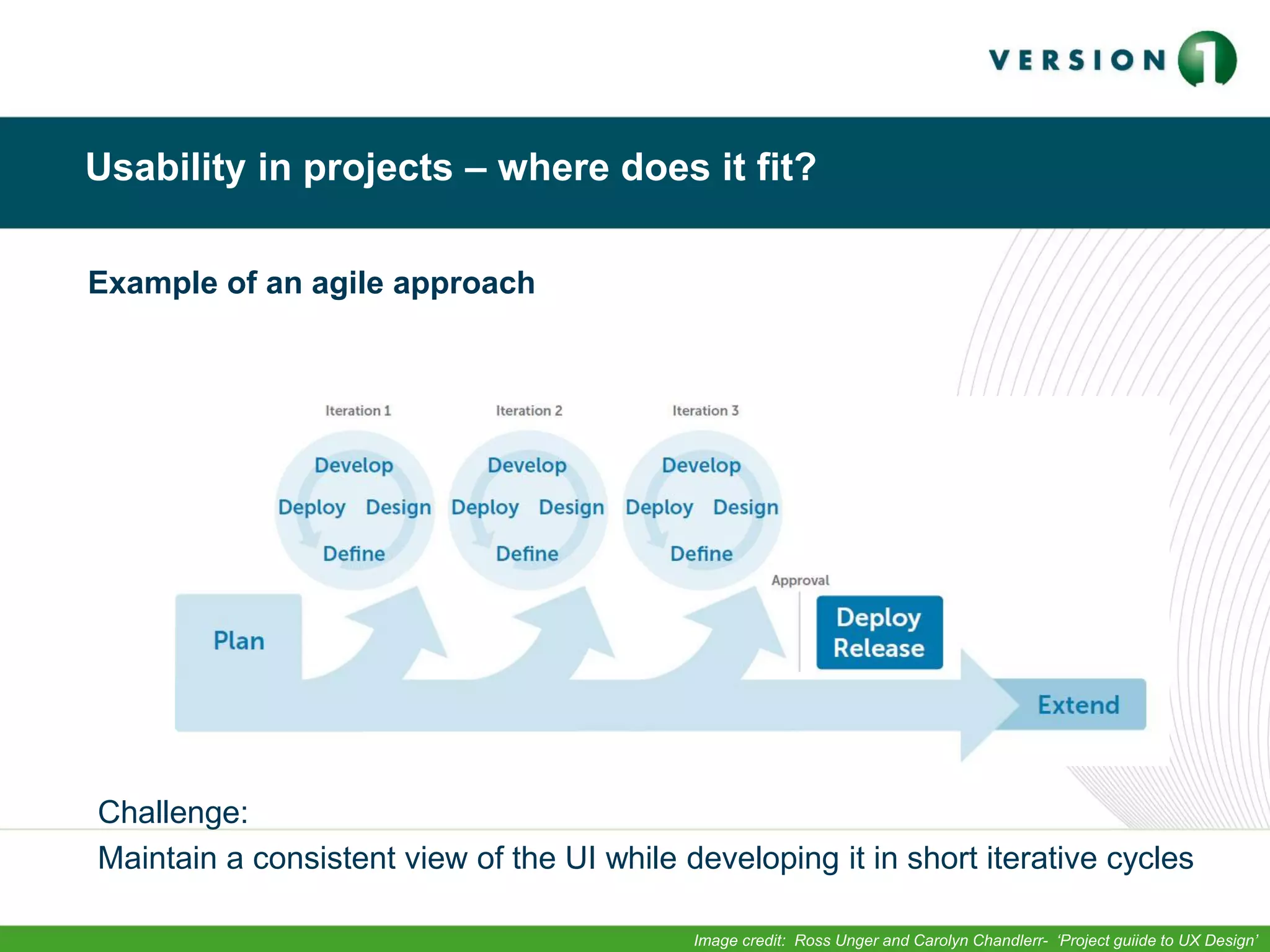
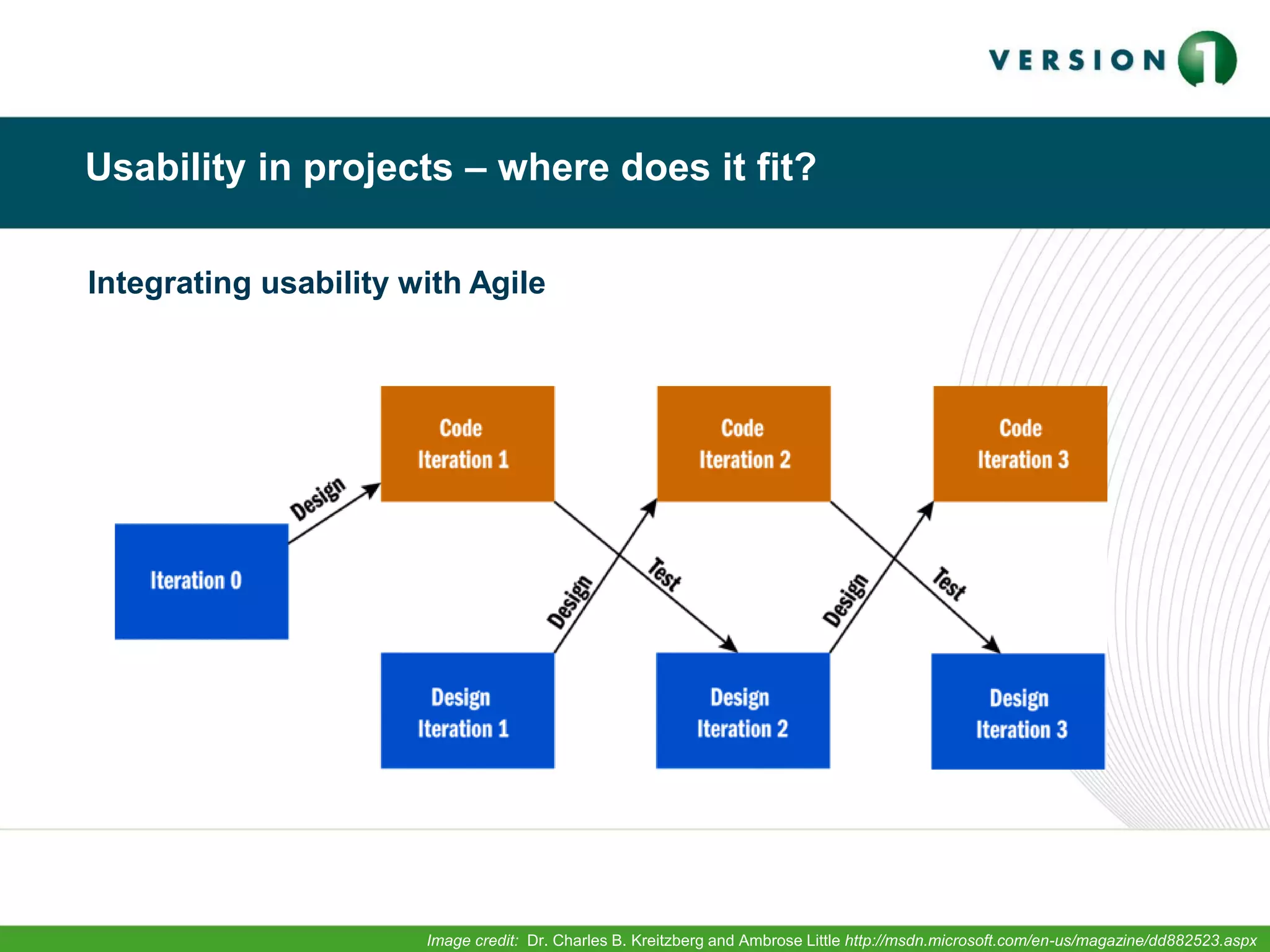
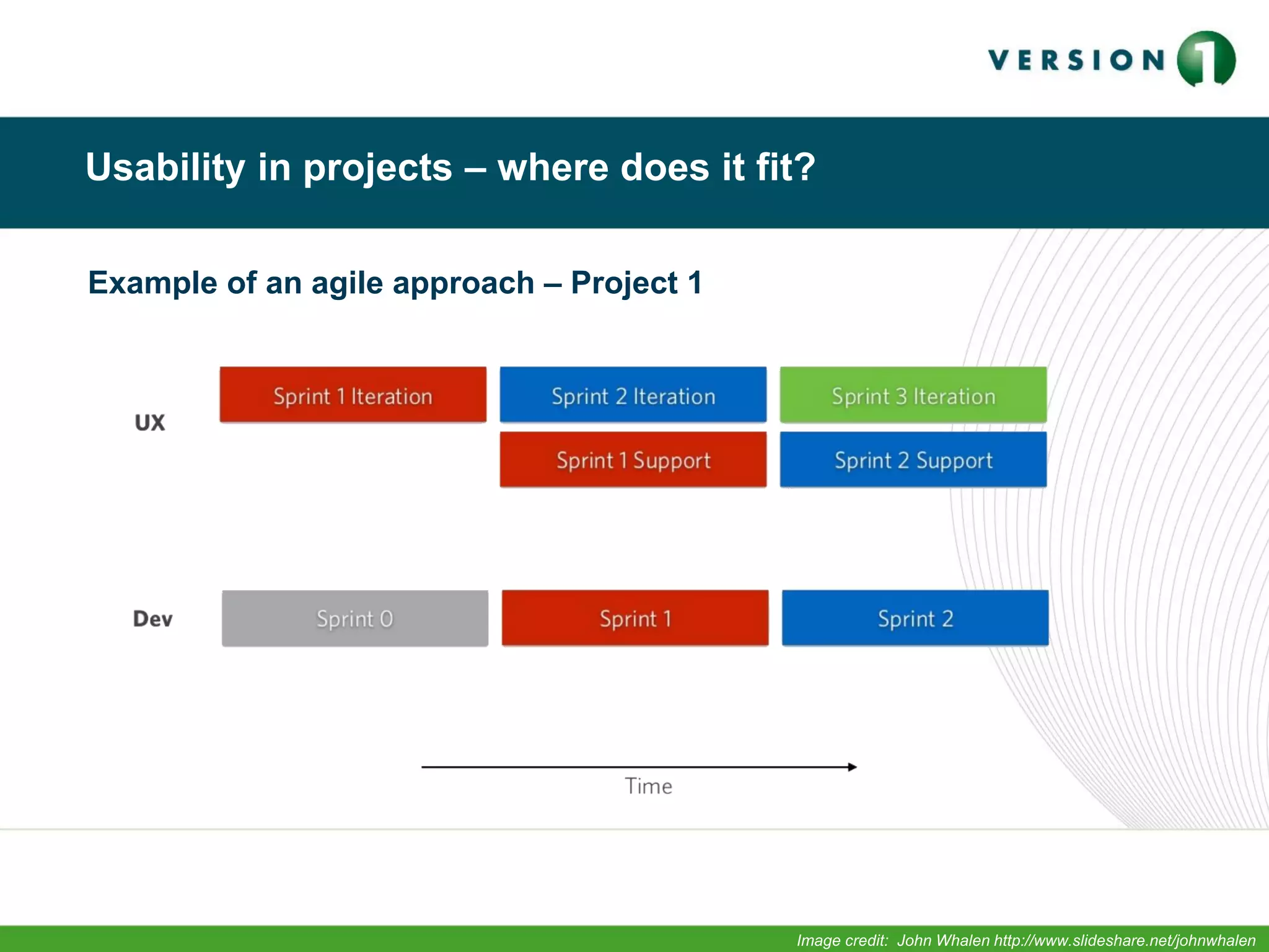
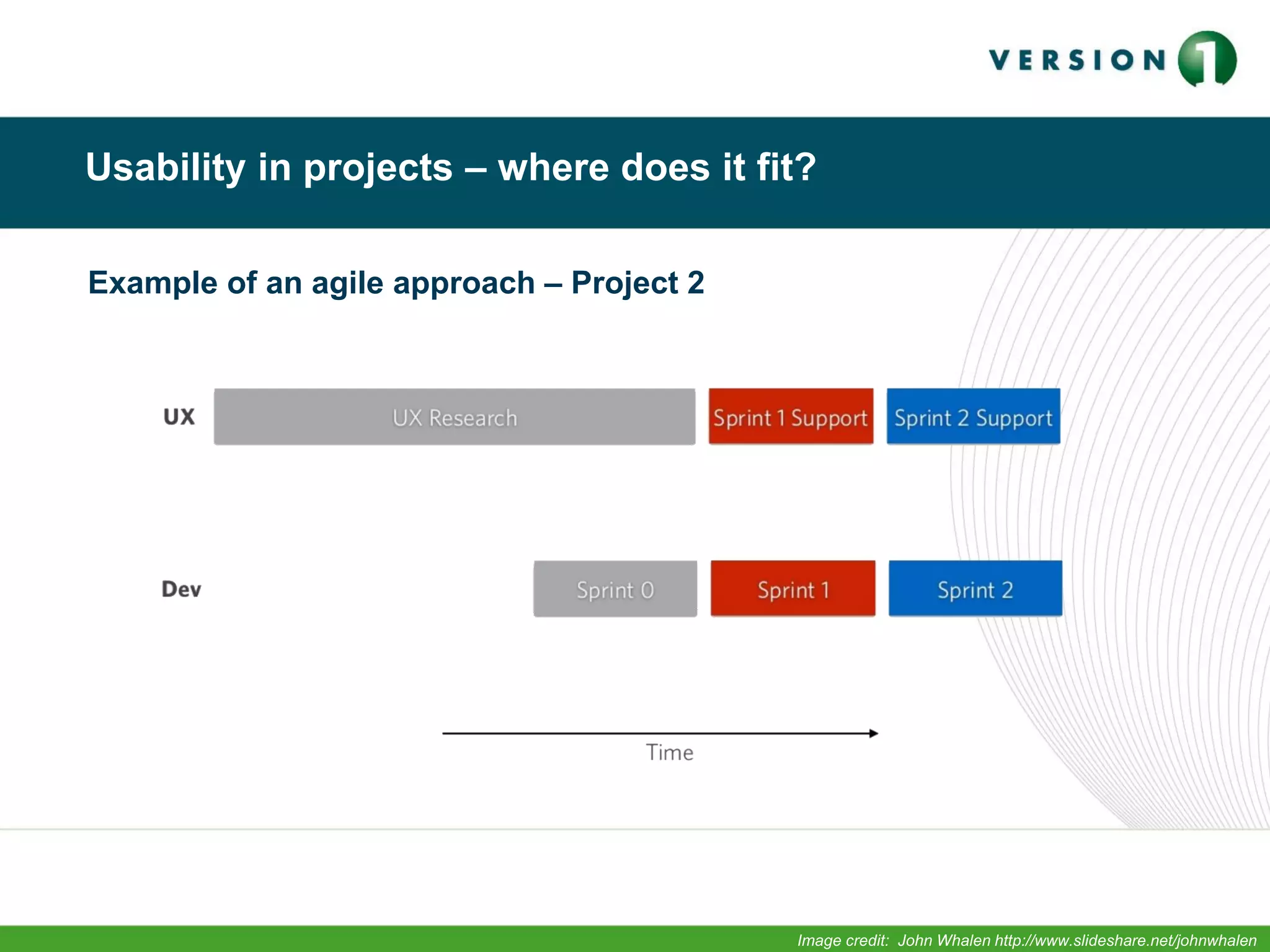
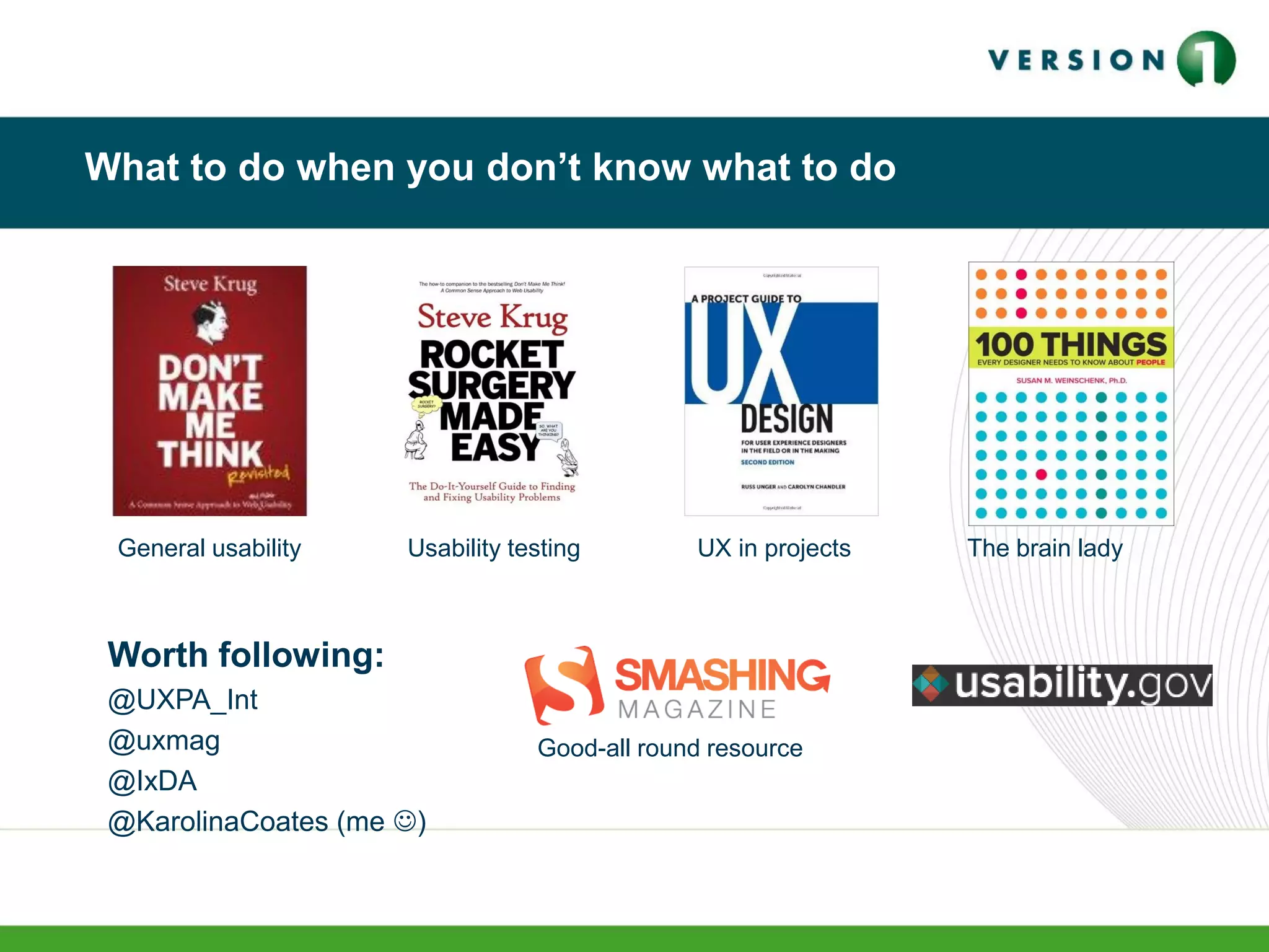
The document provides an overview of usability and how to achieve great usability in projects. It discusses what usability is, including definitions. It outlines a recipe for great usability including knowing your user, keeping things simple, guiding the user and providing feedback. When unsure what to do, it recommends usability testing with users. It discusses incorporating usability into agile projects, with usability work done in parallel sprints. Key takeaways are that usability requires planning and testing with users, and small, frequent tests are effective.


![Laminated_Springs[1]. Machine design practice](https://cdn.slidesharecdn.com/ss_thumbnails/laminatedsprings1-251116120255-2a3c06fb-thumbnail.jpg?width=640&height=640&fit=bounds)

![Copy of Presentation - [Your Organization Name]_20250924_181258_0000.pdf](https://cdn.slidesharecdn.com/ss_thumbnails/copyofpresentation-yourorganizationname202509241812580000-251117131601-9744dd2d-thumbnail.jpg?width=640&height=640&fit=bounds)


