If data is the language of your business, visualization is the translation layer that everyone understands. Data visualization services transform numbers into narratives—so leaders see trends, teams align fast, and actions follow naturally.
www.xbyteanalytics.com
Introduction
Data Visualization ishow we translate numbers into narratives. It helps teams move from “we think” to “we know,” and it does it
quickly. Whether you’re a startup founder tracking growth, a retail ops lead monitoring stockouts, or a CFO comparing margins
across regions, the right visual can compress a page of figures into an “aha!” moment.
Still, many dashboards underperform. They look impressive but don’t get used—or worse, they confuse. This guide shows you how
to build useful, trustworthy visuals: the kinds that answer questions, prompt action, and stand up in executive meetings.
3.
www.xbyteanalytics.com
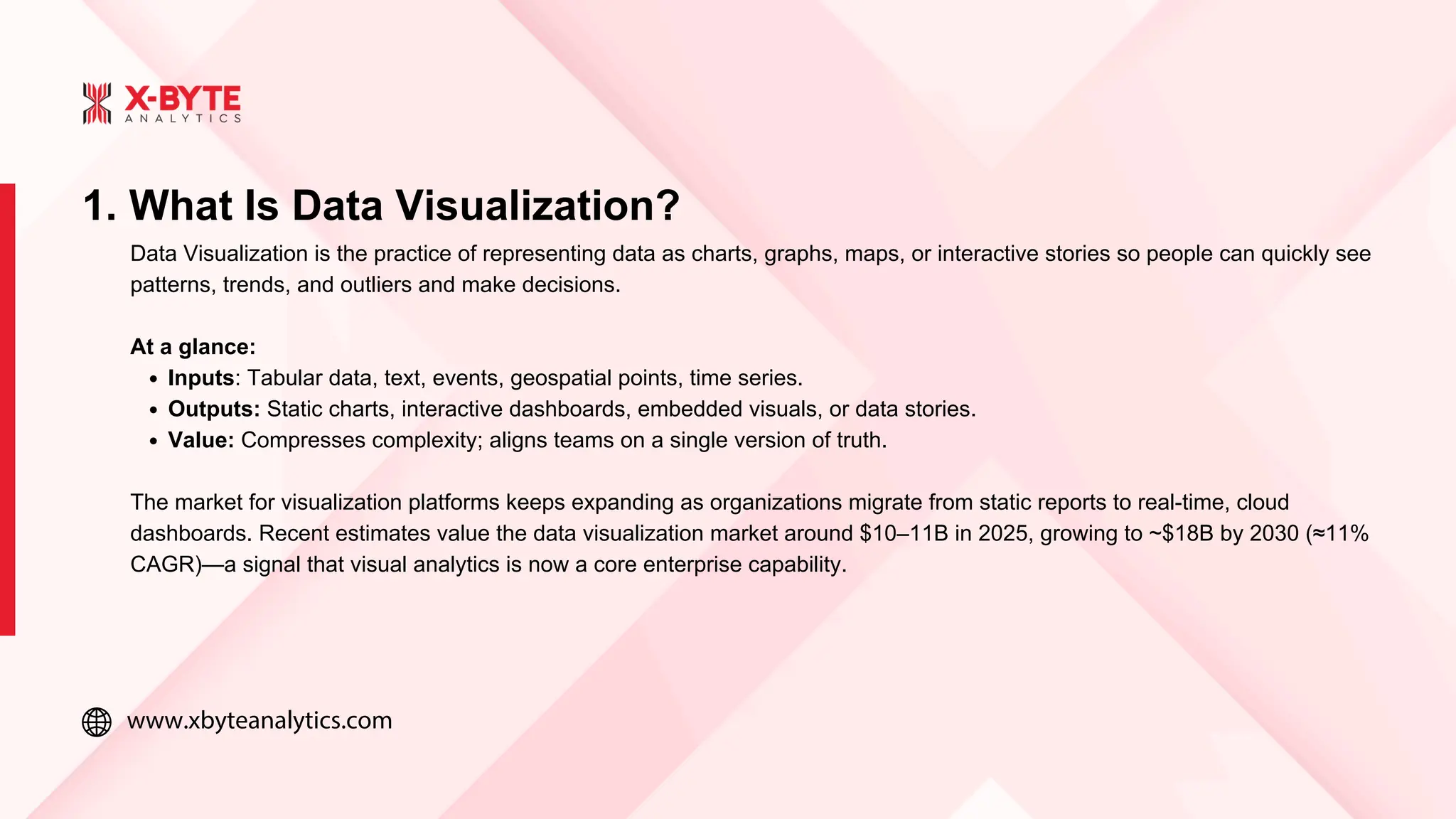
1. What IsData Visualization?
Data Visualization is the practice of representing data as charts, graphs, maps, or interactive stories so people can quickly see
patterns, trends, and outliers and make decisions.
At a glance:
Inputs: Tabular data, text, events, geospatial points, time series.
Outputs: Static charts, interactive dashboards, embedded visuals, or data stories.
Value: Compresses complexity; aligns teams on a single version of truth.
The market for visualization platforms keeps expanding as organizations migrate from static reports to real-time, cloud
dashboards. Recent estimates value the data visualization market around $10–11B in 2025, growing to ~$18B by 2030 (≈11%
CAGR)—a signal that visual analytics is now a core enterprise capability.
4.
www.xbyteanalytics.com
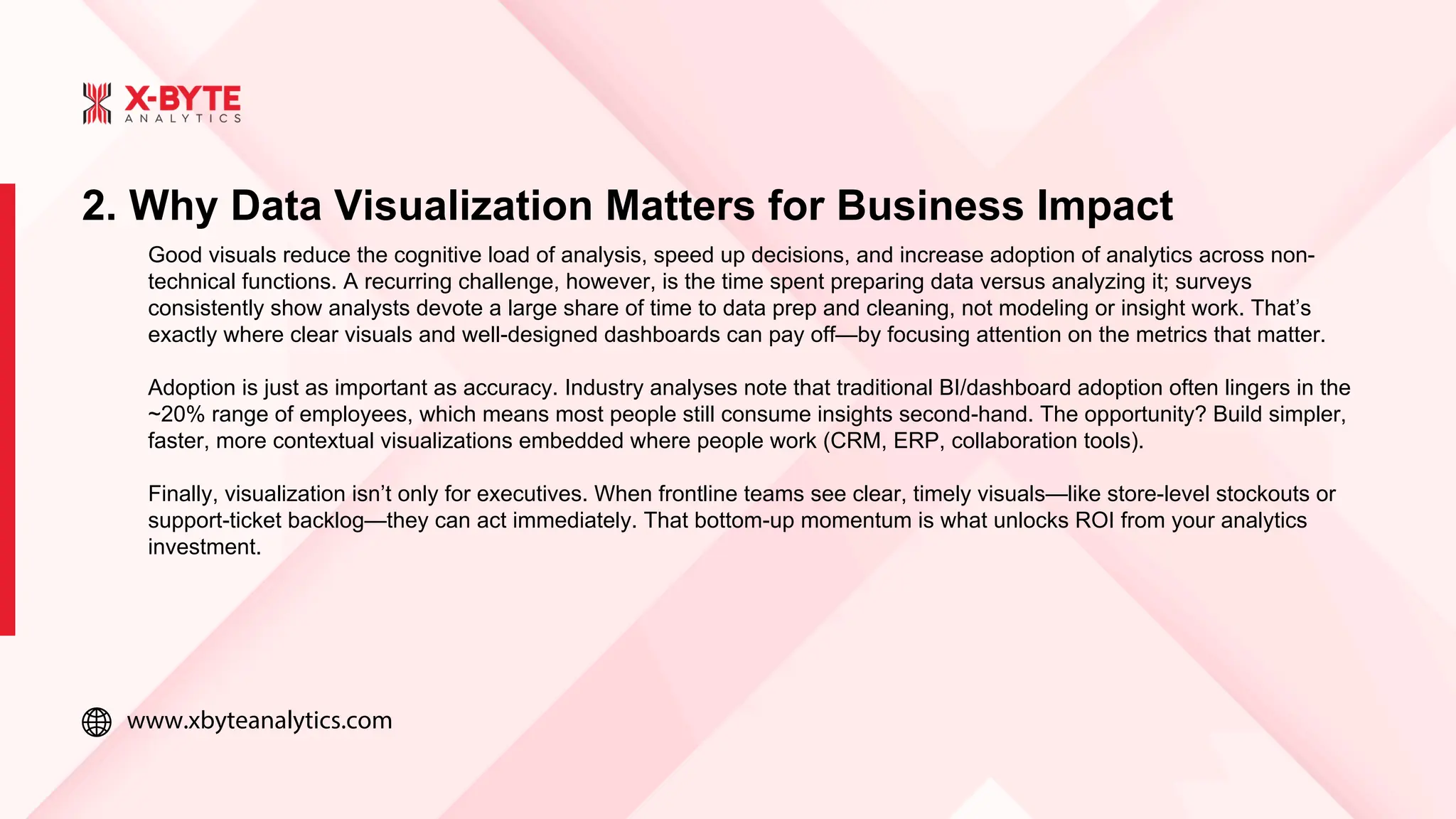
2. Why DataVisualization Matters for Business Impact
Good visuals reduce the cognitive load of analysis, speed up decisions, and increase adoption of analytics across non-
technical functions. A recurring challenge, however, is the time spent preparing data versus analyzing it; surveys
consistently show analysts devote a large share of time to data prep and cleaning, not modeling or insight work. That’s
exactly where clear visuals and well-designed dashboards can pay off—by focusing attention on the metrics that matter.
Adoption is just as important as accuracy. Industry analyses note that traditional BI/dashboard adoption often lingers in the
~20% range of employees, which means most people still consume insights second-hand. The opportunity? Build simpler,
faster, more contextual visualizations embedded where people work (CRM, ERP, collaboration tools).
Finally, visualization isn’t only for executives. When frontline teams see clear, timely visuals—like store-level stockouts or
support-ticket backlog—they can act immediately. That bottom-up momentum is what unlocks ROI from your analytics
investment.
5.
www.xbyteanalytics.com
3. Choosing theRight Chart Type
Picking the right chart is half the battle. Simple defaults usually outperform flashy novelties.
Reliable starters
1.Bar/Column charts: Best for comparing categories; humans read length more accurately than angle or area. Use horizontal
bars for long labels.
2.Line charts: Best for trends over time. Keep intervals consistent; avoid over-smoothing.
3.Scatter plots: Best for relationships and clusters; add a trend line only if it clarifies.
Use thoughtfully
Pie/Donut charts: Only for part-to-whole with a few categories that sum to 100%. If slices are similar, choose a bar chart.
Maps: Great when location changes interpretation (e.g., coverage gaps). Otherwise, a table or bar chart may be clearer.
6.
www.xbyteanalytics.com
4. Design Principles,Accessibility & Mobile-First Visuals
Well-built visuals respect how people read.
Clarity first
One message per chart. Give every chart a job; remove anything that doesn’t serve it.
Order and scale. Sort bars; start axes at zero for bar charts; choose readable intervals.
Declutter. Use light gridlines, tight legends, and short labels.
Color with intent
Use a neutral base (grays) and a single accent color for the key series.
Ensure sufficient contrast ratios; WCAG guidance recommends 4.5:1 (AA) for normal text and 7:1 (AAA) in more stringent
contexts. This applies to labels and any text over colored backgrounds. W3C+1
Mobile matters
Favor fewer, taller charts over dense grids.
Use responsive legends (toggle series on tap) and vertical stacking for small screens.
Keep labels short; prefer inline data labels to hunting in a legend.
7.
www.xbyteanalytics.com
A dependable workflowsaves time and prevents “chart sprawl.”
1) Frame the decision
Start with the questions your audience actually needs answered. For a COO: “Where are delays rising, and what’s the likely
cause?” Document KPIs, users, and refresh cadence.
2) Model & prepare data
Standardize definitions (e.g., active customer), create tidy tables, and test joins. Surveys repeatedly show that data prep
consumes a large fraction of practitioner time—so templatize it early (dbt models, reusable queries).
3) Prototype visuals
Sketch with sample data; validate with a handful of users. If people can’t answer their questions in 60–90 seconds, simplify.
5. From Data to Dashboard: A Practical Workflow
8.
www.xbyteanalytics.com
6. Tools, Platforms& How to Choose
The visualization tools landscape is broad and growing. For a practical comparison across popular platforms and what each
does best, see Top Data Visualization Tools.
Selection criteria
Audience fit: Analysts need flexibility; execs need clarity and speed.
Data gravity: Choose tools that connect natively to your warehouse/lakehouse.
Governance: Row-level security, version control, and certified datasets.
Scale & cost: Consider concurrency, caching, embedded analytics, and licensing.
Market analyses suggest the visualization/tools segment is growing ~11% CAGR into 2030, reflecting continued investment in
easier, cloud-native experiences and embedded analytics.
9.
www.xbyteanalytics.com
7. Measuring Success& Governing Your Visualizations
Dashboards aren’t “done” at launch. Treat them like products.
Adoption & impact KPIs
Active users (weekly/monthly), time to answer (how fast users find what they need), and decision lag (time
from metric change to corrective action).
Task completion rate: Can users answer the top three questions the dashboard promises?
Embedded outcomes: E.g., fewer stockouts, faster resolution, higher conversion.
Governance that scales
Maintain a semantic layer or certified datasets so “Net Revenue” means one thing everywhere.
Track data refresh SLAs, audit permissions, and log changes.
Use vendor guidance (e.g., Microsoft’s adoption-tracking for Power BI/Fabric) to instrument usage and
retirement of low-value content.
10.
www.xbyteanalytics.com
Conclusion
Start with thedecision you need to make; design visuals to answer it.
Use simple chart types and clear labeling; let one chart tell one story.
Plan for mobile and accessibility from day one.
Instrument adoption and impact; prune low-value dashboards regularly.
When evaluating platforms, compare features, governance, and costs with top Data Visualization tools, and
explore implementation help via X-Byte Analytics.