Introduction to Visualization
•Data visualization means showing information using pictures like charts, graphs, and maps. It makes
complex data easier to understand by turning it into visuals. This helps people quickly see patterns,
trends, and unusual points, leading to better and faster decisions. Since every industry produces a lot
of data today, using visuals is important to understand and use that data effectively.
Common Types of Data Visualization
Different types of visuals are used to show data in different ways. Here are the most common
ones:
• Charts: Show comparisons or changes over time. Examples include bar charts, line charts,
and pie charts.
• Graphs: Show relationships between variables to find patterns or trends. Examples are
scatter plots and histograms.
• Maps: Show data based on location, helping to see geographic patterns. Examples are
geographic maps and heat maps.
• Dashboards: Combine many visuals in one place to give a quick and interactive view of
the data.
3.
Why Data VisualizationIs Important
• Makes Data Easy to Understand
Big and complex data is hard to read. Charts and maps make it simple and clear. For example, a
red-colored state on a map quickly shows where sales are low.
• Shows Patterns and Trends
Graphs help us see hidden patterns. For example, you might find that high sales don’t always mean
high profit. This helps businesses make smarter choices.
• Saves Time
Looking at numbers takes time. Visuals highlight the important info right away, so you don’t need
to check each value one by one.
• Easy to Share and Explain
Visuals are easy to show to others, even if they’re not data experts. For example, a big box in a
chart can show the state with the highest sales.
• Tells a Clear Story
Visuals guide people through the data. For example, showing losses in a chart can help explain
why a product isn’t doing well and what to do next.
4.
• Where DataVisualization Is Used
• Business
Companies track sales, profits, and customer data to make better decisions.
• Healthcare
Hospitals use visuals to track patient health and disease spread.
• Sports
Teams use charts to track player stats and plan better game strategies.
• Retail
Stores track which products sell best and adjust stock and ads to meet demand.
5.
Challenges in DataVisualization
• Data Quality: Accuracy of visualizations depends on the quality of the data. If the data is
inaccurate or incomplete, the insights from the visualization will be misleading.
• Over-Simplification: Simplifying data too much can lead to important details being lost
like using a pie chart that oversimplifies complex relationships between categories.
• Choosing the Right Visualization: Using the wrong type of visualization can distort the
message. For example, a pie chart might not work well with many categories which leads
to confusion.
• Overload of Information: Too much information in a visualization can overwhelm
viewers. It's important to focus on key data points and avoid clutter.
6.
Computer-based visualization
• Computer-basedvisualization systems provide visual representations of datasets intended to help
people carry out some task better. These visualization systems are often, but not always interactive.
Resource limitations include the capacity of computers, of humans, and of displays. The space of
possible visualization system designs is huge and full of trade-offs; many of the possibilities are
ineffective.
• Need and purpose
• it is both well characterized and suitable for transmitting information.Data visualization serves a
critical role in helping individuals and organizations make sense of complex data by representing it
visually. The need and purpose of data visualization are intertwined and encompass a range of
objectives:
1. Simplifying Complexity: Complex datasets can be challenging to understand in their raw
form. Visualization simplifies the complexity by presenting data in a visual format, making
patterns, trends, and relationships more apparent.
7.
2. Insight Generation:Data visualization enables the discovery of insights and correlations
within data that might not be immediately evident. These insights can drive informed decision-
making, identify opportunities, and address challenges.
3. Effective Communication: Visualizations facilitate the communication of data-driven
insights to both technical and non-technical audiences. By presenting information visually,
complex concepts can be conveyed more clearly and memorably.
4. Decision-Making Support: Visual representations of data empower decision-makers with the
information needed to make strategic choices. Whether in business, healthcare, policy-making,
or other fields, data-driven decisions are more accurate and reliable.
5. Real-Time Monitoring: Visual dashboards and interactive charts allow for real-time
monitoring of key performance indicators (KPIs) and metrics. This timely information helps
organizations respond promptly to changes or deviations.
8.
6.Identifying Trends andAnomalies: Data visualizations make it easier to spot trends, patterns,
outliers, and anomalies in data, which is crucial for understanding historical behavior and
predicting future trends.Identifying Trends and Anomalies: Data visualizations make it easier to
spot trends, patterns, outliers, and anomalies in data, which is crucial for understanding historical
behavior and predicting future trends.
7. Enhancing Data Exploration: Visualization tools offer interactive features that allow users to
explore data from different angles, drill down into details, and extract specific insights.
8.Storytelling: Visualizations can be used to create compelling narratives around data, enabling
effective storytelling. Whether in presentations, reports, or articles, data visualizations enhance
the narrative and engage the audience
9.Validation and Hypothesis Testing: Visualizations provide a means to validate hypotheses
and test assumptions by visualizing data relationships and interactions.
9.
10. Benchmarking andComparison: Visualizing data across different time periods, regions, or
categories facilitates benchmarking and performance comparison.
11. Public Awareness and Education: Visualizations simplify complex topics for public
consumption, increasing awareness and understanding of issues such as climate change, public
health, and social trends.
12. Scientific Discovery: In research and scientific fields, data visualization plays a crucial role
in identifying novel patterns and relationships, leading to breakthroughs and advancements.
13. Resource Allocation and Optimization: Organizations can optimize resource allocation by
visualizing resource utilization, identifying areas of waste, and reallocating resources for
maximum efficiency.Predictive Analysis: Visualizations help in understanding and evaluating
predictive models by comparing predicted outcomes with actual results.
14. Exploration of Geospatial Data: Geographic visualizations (maps) provide insights into
geographical patterns, distribution, and relationships, aiding in spatial analysis and decision-
making
10.
• In summary,the need and purpose of data visualization revolve around transforming data into
actionable insights, improving communication, supporting decision-making, and facilitating
understanding across various domains and industries. Effective data visualization can drive
innovation, efficiency, and improved outcomes
11.
External Representation
• Externalrepresentations help us go beyond the limits of our memory and thinking. Visualization
allows us to shift some mental effort to our senses by using well-designed images, often called
external memory. These can include physical tools like an abacus or a knotted string.
• Diagrams are useful because they let us easily make sense of information through what we see.
They organize information by location, which helps us find and recognize what we need faster. If
everything related to a task is grouped, it’s easier to solve problems. But if a diagram is poorly
designed, it might mix up unrelated details or lead us to unhelpful conclusions.
12.
Importance of Interactivityin Visualization:
• Interactivity is essential for creating visualization tools that manage complex data.
• Large datasets can't be fully displayed at once due to human and screen limitations, making
interaction necessary.
• A static view shows only one aspect of a dataset, which may be enough for simple data and tasks.
• Interactive displays support many possible queries and flexible data exploration.
• Interaction allows users to explore data at multiple levels—from high-level overviews to detailed
views.
• It also enables switching between different data representations and summaries to understand their
relationships.
• Before fast computer graphics, visualization was limited to static images on paper.
• Computer-based visualization allows for interactivity, greatly expanding the power of visualization
tools.
• Although static visuals are still useful, interaction is now a fundamental part of many visualization
techniques.
13.
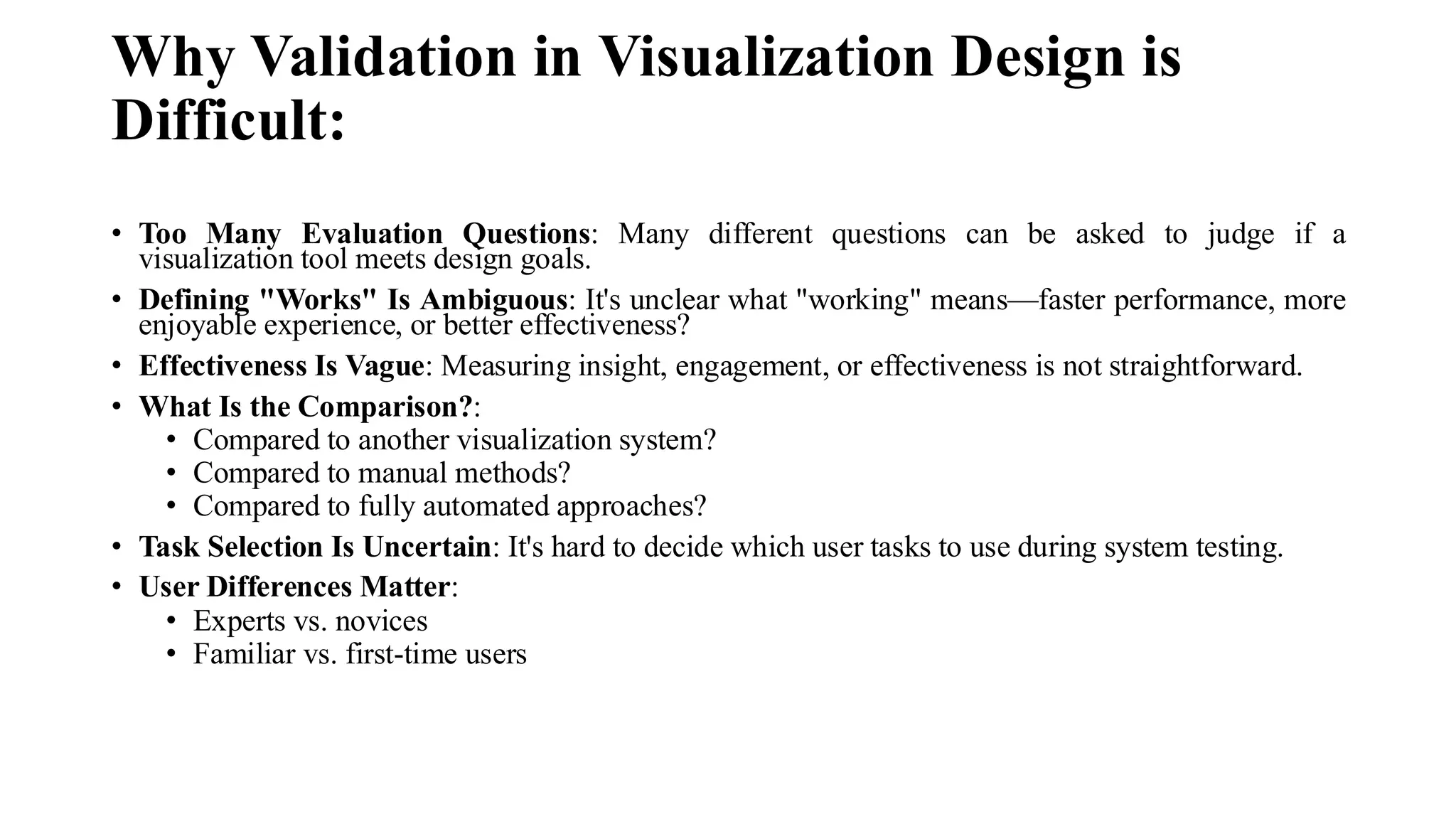
Why Validation inVisualization Design is
Difficult:
• Too Many Evaluation Questions: Many different questions can be asked to judge if a
visualization tool meets design goals.
• Defining "Works" Is Ambiguous: It's unclear what "working" means—faster performance, more
enjoyable experience, or better effectiveness?
• Effectiveness Is Vague: Measuring insight, engagement, or effectiveness is not straightforward.
• What Is the Comparison?:
• Compared to another visualization system?
• Compared to manual methods?
• Compared to fully automated approaches?
• Task Selection Is Uncertain: It's hard to decide which user tasks to use during system testing.
• User Differences Matter:
• Experts vs. novices
• Familiar vs. first-time users
14.
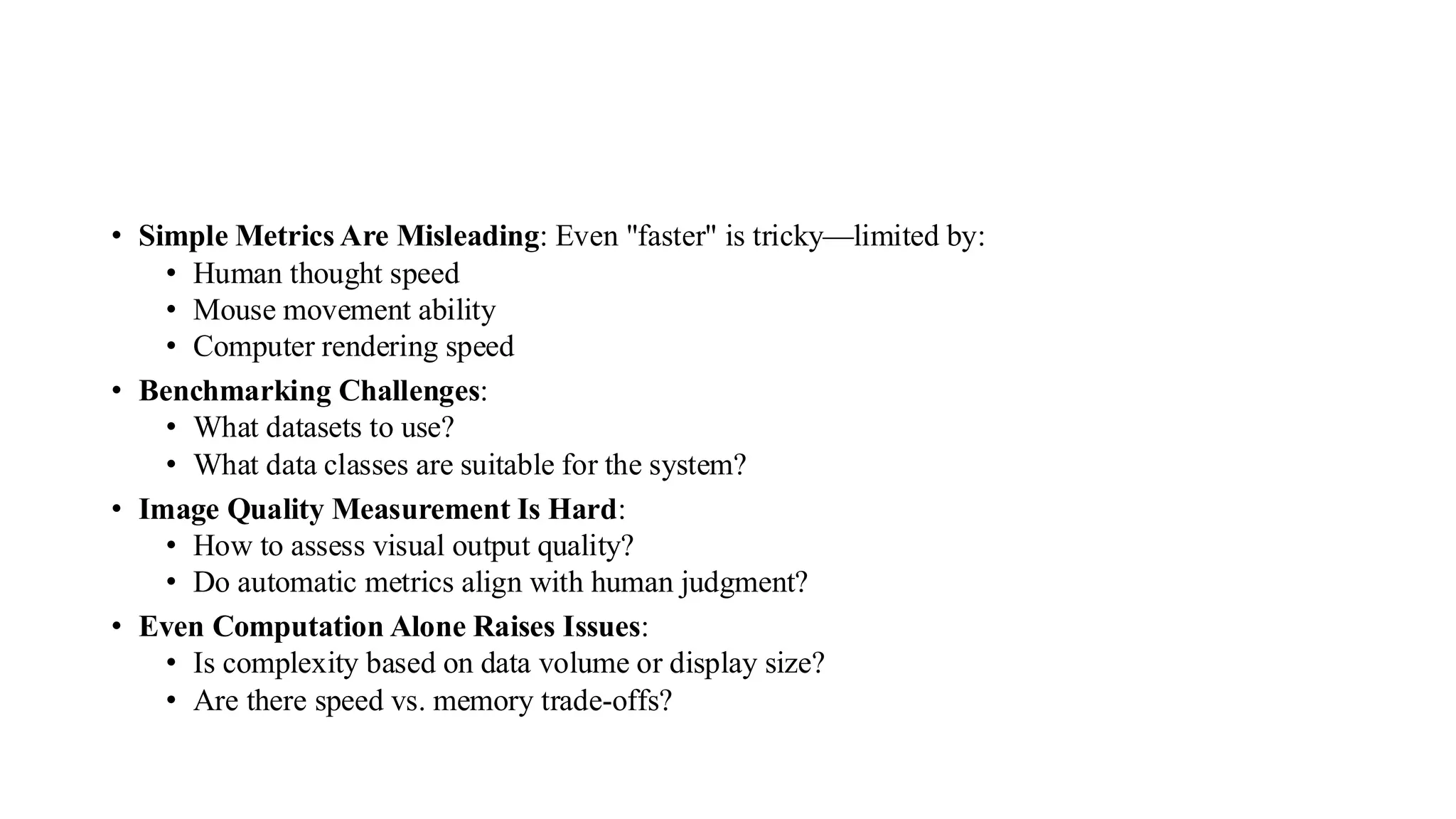
• Simple MetricsAre Misleading: Even "faster" is tricky—limited by:
• Human thought speed
• Mouse movement ability
• Computer rendering speed
• Benchmarking Challenges:
• What datasets to use?
• What data classes are suitable for the system?
• Image Quality Measurement Is Hard:
• How to assess visual output quality?
• Do automatic metrics align with human judgment?
• Even Computation Alone Raises Issues:
• Is complexity based on data volume or display size?
• Are there speed vs. memory trade-offs?
15.
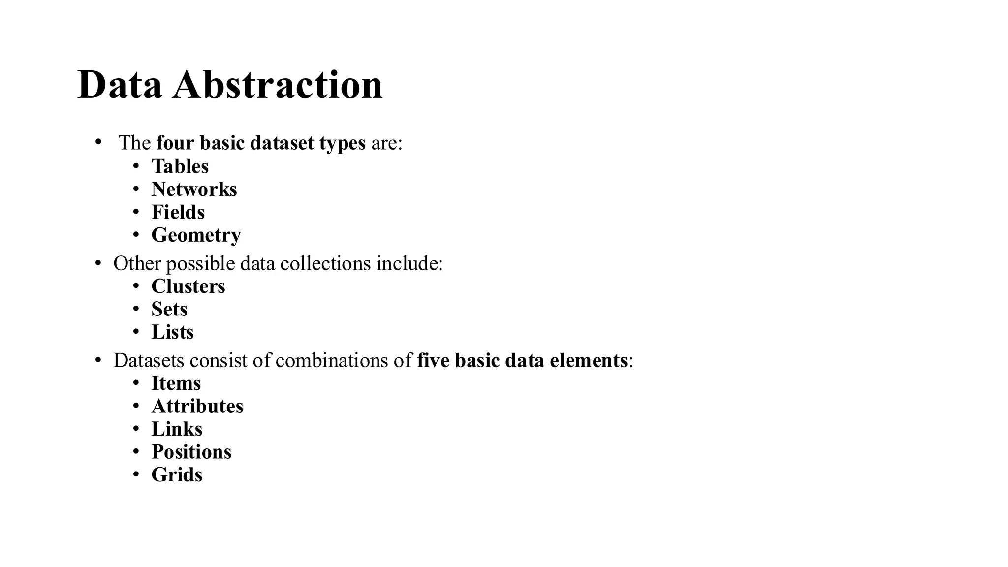
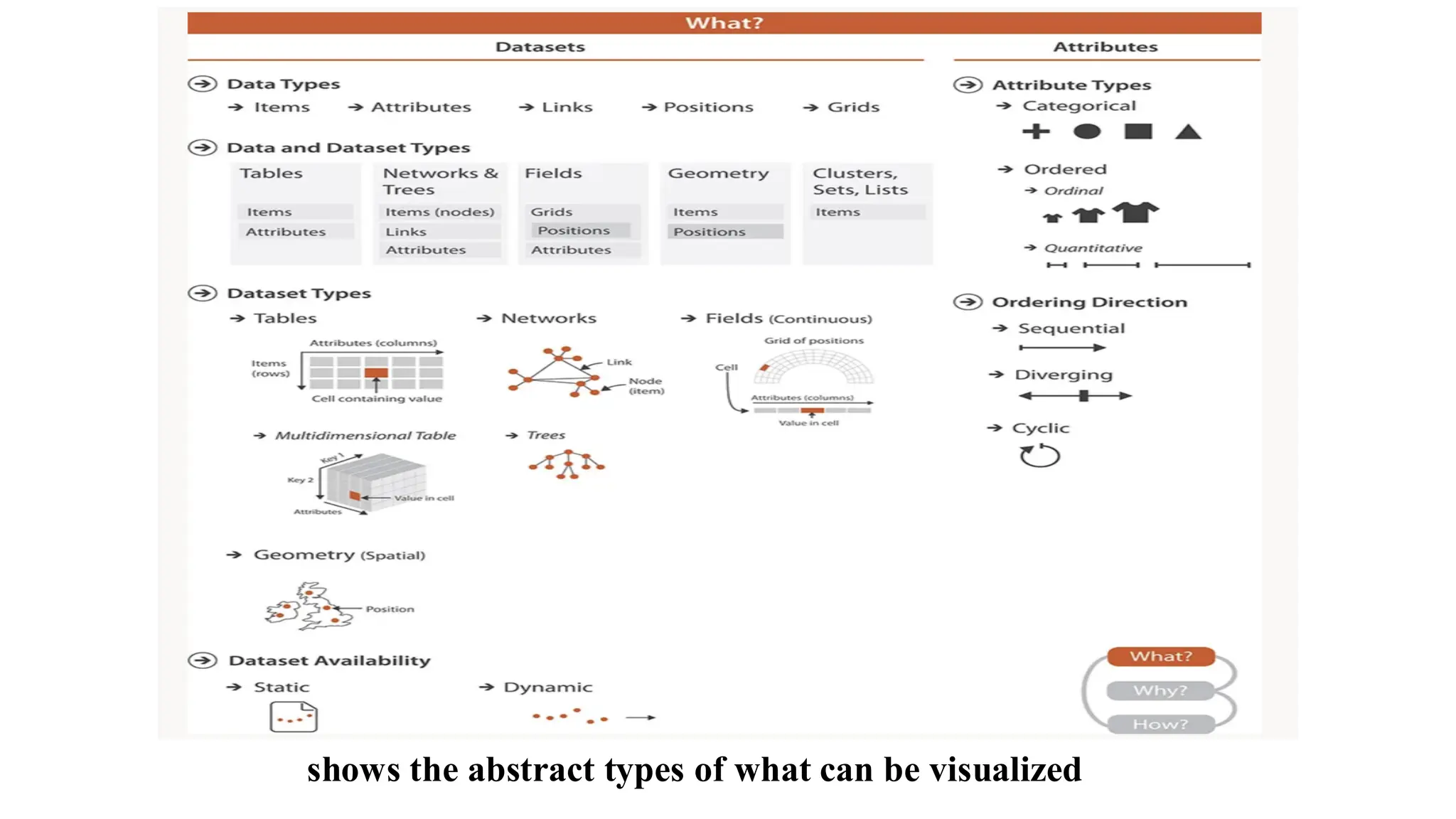
Data Abstraction
• Thefour basic dataset types are:
• Tables
• Networks
• Fields
• Geometry
• Other possible data collections include:
• Clusters
• Sets
• Lists
• Datasets consist of combinations of five basic data elements:
• Items
• Attributes
• Links
• Positions
• Grids
16.
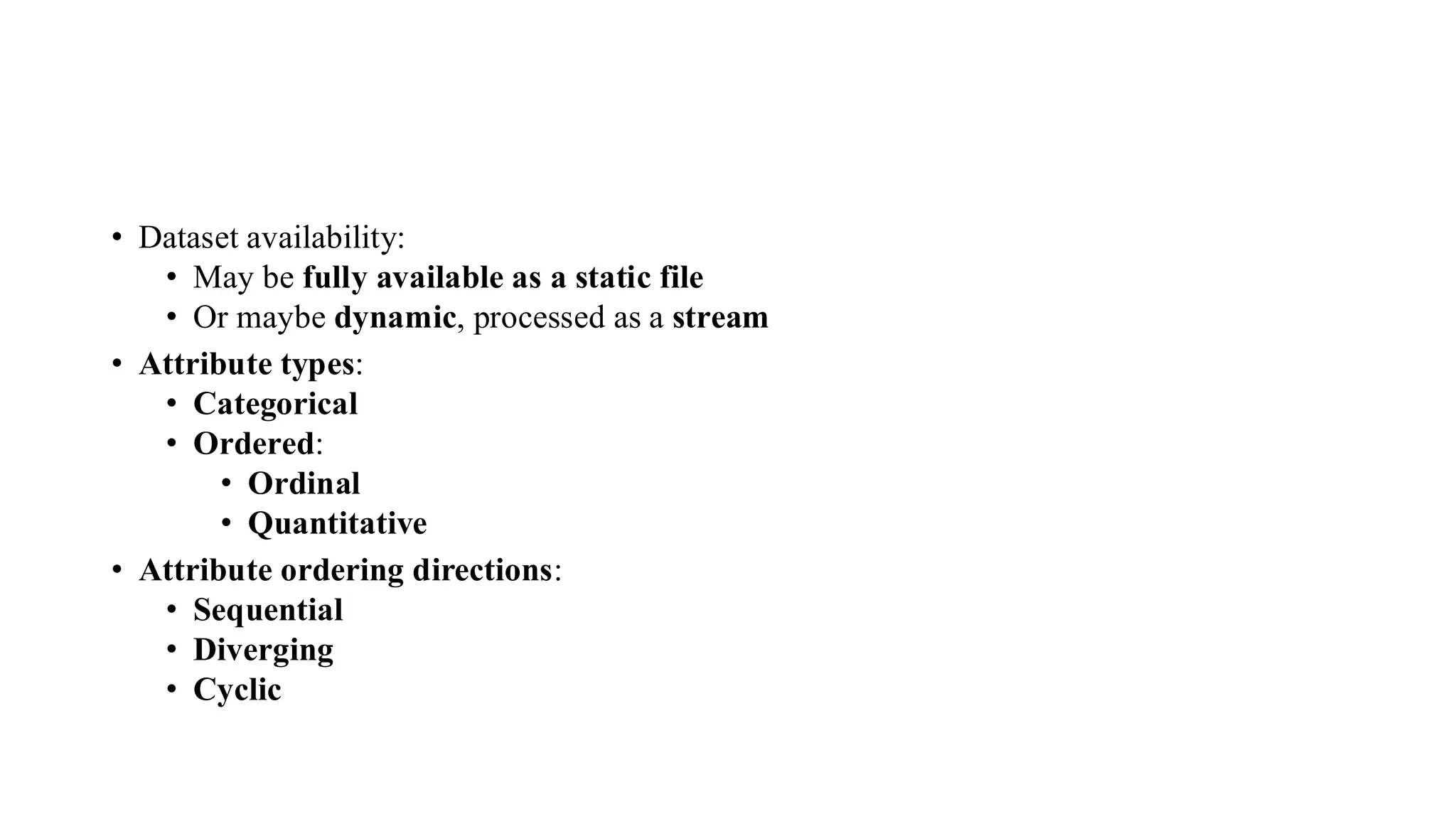
• Dataset availability:
•May be fully available as a static file
• Or maybe dynamic, processed as a stream
• Attribute types:
• Categorical
• Ordered:
• Ordinal
• Quantitative
• Attribute ordering directions:
• Sequential
• Diverging
• Cyclic
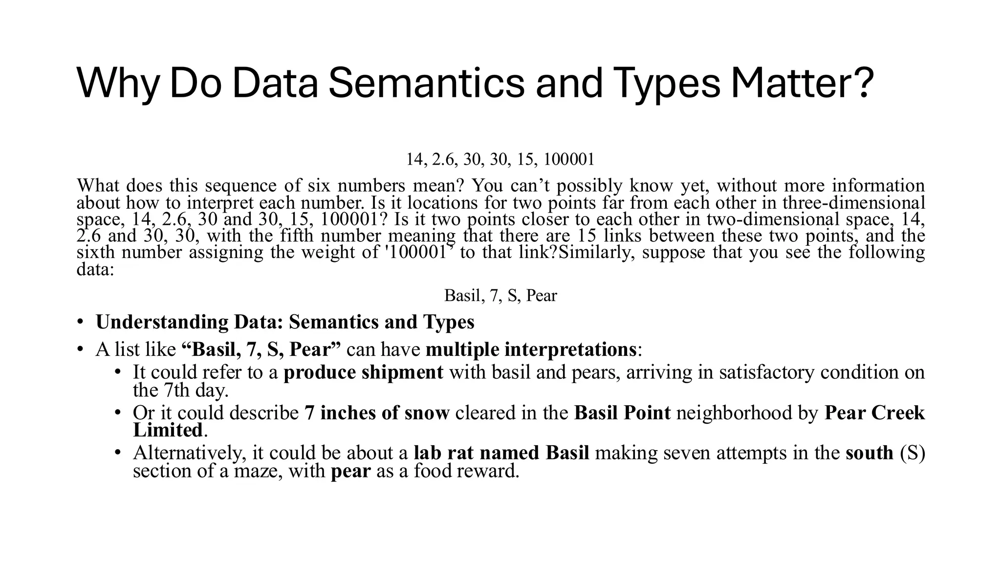
Why Do DataSemantics and Types Matter?
14, 2.6, 30, 30, 15, 100001
What does this sequence of six numbers mean? You can’t possibly know yet, without more information
about how to interpret each number. Is it locations for two points far from each other in three-dimensional
space, 14, 2.6, 30 and 30, 15, 100001? Is it two points closer to each other in two-dimensional space, 14,
2.6 and 30, 30, with the fifth number meaning that there are 15 links between these two points, and the
sixth number assigning the weight of '100001’ to that link?Similarly, suppose that you see the following
data:
Basil, 7, S, Pear
• Understanding Data: Semantics and Types
• A list like “Basil, 7, S, Pear” can have multiple interpretations:
• It could refer to a produce shipment with basil and pears, arriving in satisfactory condition on
the 7th day.
• Or it could describe 7 inches of snow cleared in the Basil Point neighborhood by Pear Creek
Limited.
• Alternatively, it could be about a lab rat named Basil making seven attempts in the south (S)
section of a maze, with pear as a food reward.
19.
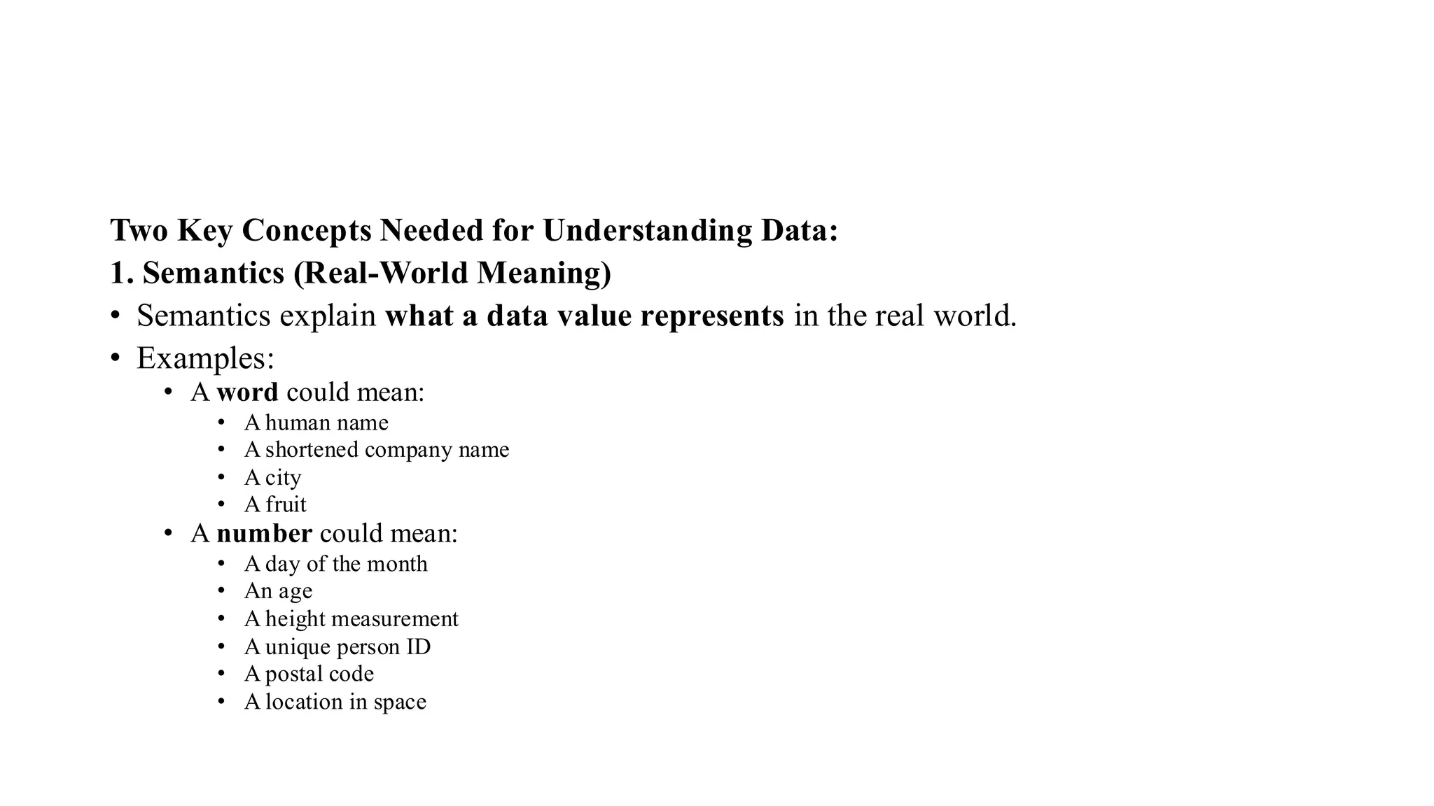
Two Key ConceptsNeeded for Understanding Data:
1. Semantics (Real-World Meaning)
• Semantics explain what a data value represents in the real world.
• Examples:
• A word could mean:
• A human name
• A shortened company name
• A city
• A fruit
• A number could mean:
• A day of the month
• An age
• A height measurement
• A unique person ID
• A postal code
• A location in space
20.
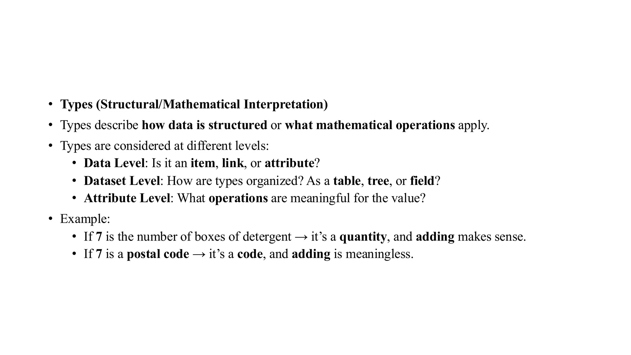
• Types (Structural/MathematicalInterpretation)
• Types describe how data is structured or what mathematical operations apply.
• Types are considered at different levels:
• Data Level: Is it an item, link, or attribute?
• Dataset Level: How are types organized? As a table, tree, or field?
• Attribute Level: What operations are meaningful for the value?
• Example:
• If 7 is the number of boxes of detergent → it’s a quantity, and adding makes sense.
• If 7 is a postal code → it’s a code, and adding is meaningless.
21.
• Importance ofMetadata
• While syntax or variable names can sometimes help infer semantics and types, this is not always
reliable.
• Often, additional information must be supplied with the dataset for correct interpretation.
• This extra information is called metadata.
• The line between data and metadata is often blurry, especially when data is derived or
transformed.
• In the book’s context, all such information is collectively referred to as data, without
distinguishing between data and metadata.
22.
Data Types
• FiveBasic Data Types:
Item:
• A discrete entity in a dataset.
• Often corresponds to: A row in a table ,A node in a network
• Examples:
• People, Stocks, Coffee shops, Genes, Cities
Attribute
• A property or characteristic that can be measured, observed, or logged.
• Describes some aspect of an item.
• Examples:
• Salary, Price, Number of sales, Protein expression level, Temperature
23.
Link
• A relationshipor connection between two or more items.
• Typically found in network datasets.
• Examples:
• Friendships between people
• Hyperlinks between webpages
• Communication between computers
Position
• Refers to spatial information — the location of an item.
• Defined in 2D or 3D space.
• Examples:
• Latitude–longitude coordinates (geographical data)
• Coordinates in medical imaging (CT or MRI scans)
24.
Grid
• A structuredsampling strategy for representing continuous data.
• Defines geometric and topological relationships between cells.
• Often used in:
• Scientific computing
• Image data
• Heat maps
25.
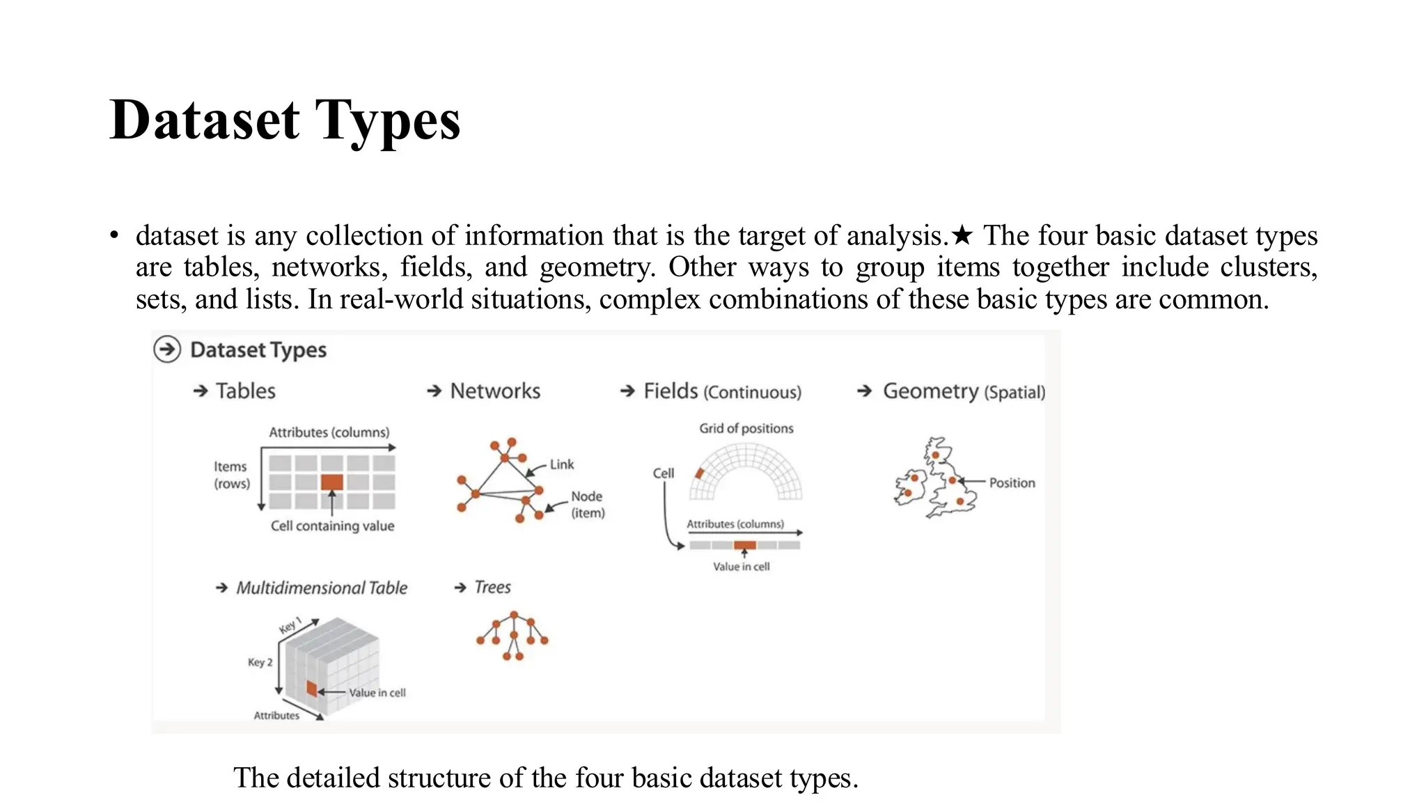
Dataset Types
• datasetis any collection of information that is the target of analysis.★ The four basic dataset types
are tables, networks, fields, and geometry. Other ways to group items together include clusters,
sets, and lists. In real-world situations, complex combinations of these basic types are common.
The detailed structure of the four basic dataset types.
26.
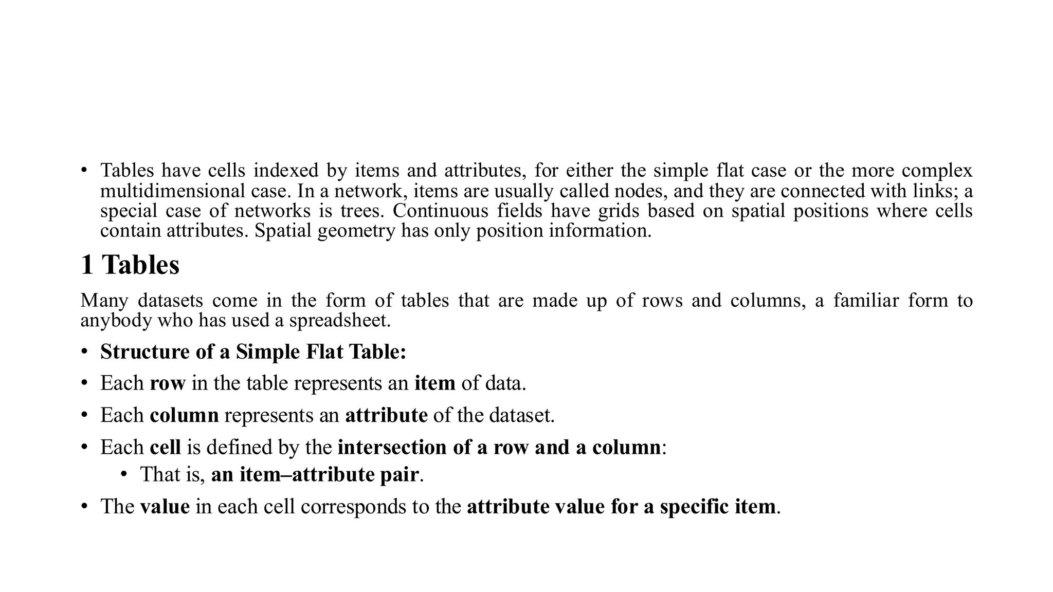
• Tables havecells indexed by items and attributes, for either the simple flat case or the more complex
multidimensional case. In a network, items are usually called nodes, and they are connected with links; a
special case of networks is trees. Continuous fields have grids based on spatial positions where cells
contain attributes. Spatial geometry has only position information.
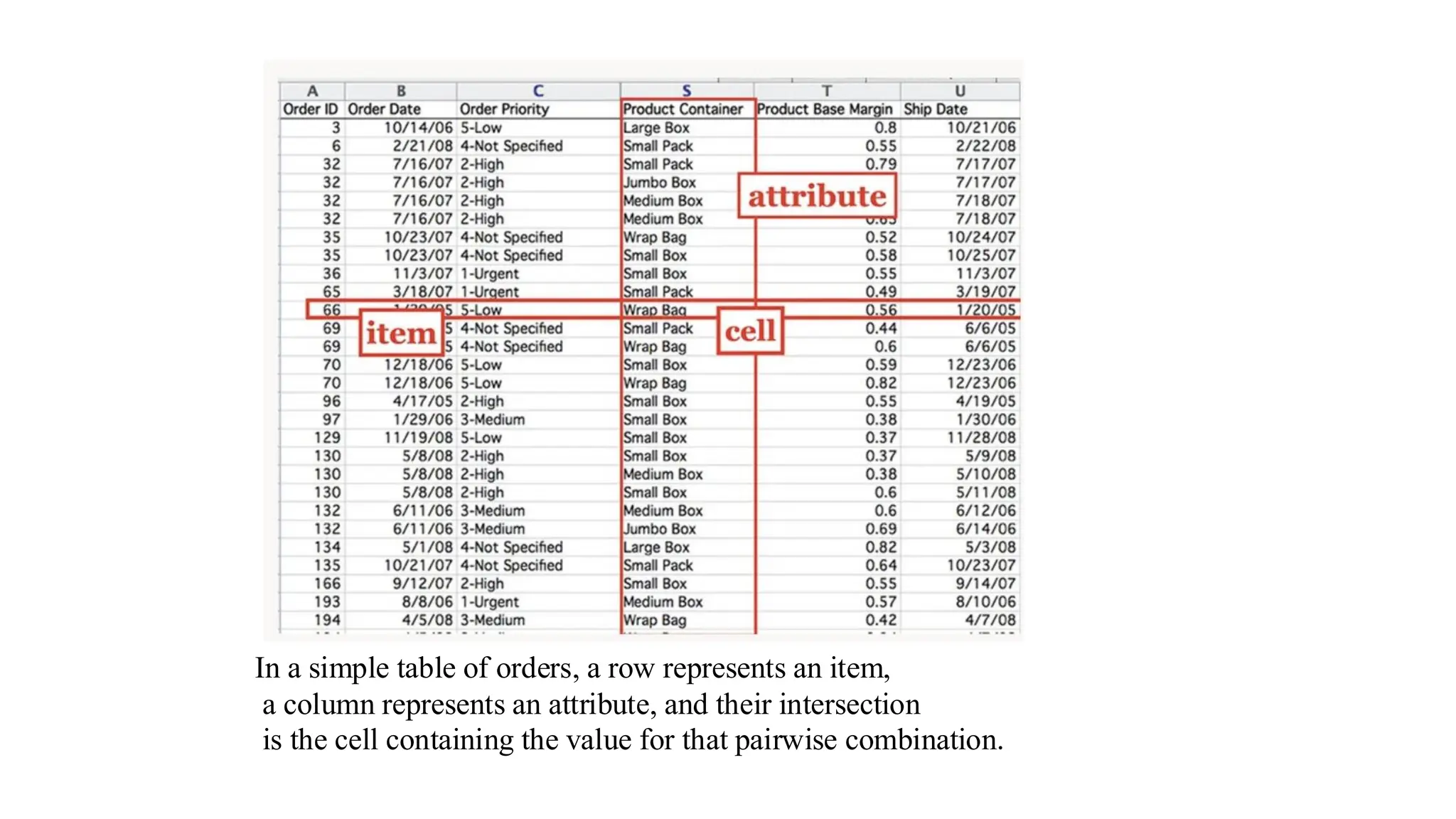
1 Tables
Many datasets come in the form of tables that are made up of rows and columns, a familiar form to
anybody who has used a spreadsheet.
• Structure of a Simple Flat Table:
• Each row in the table represents an item of data.
• Each column represents an attribute of the dataset.
• Each cell is defined by the intersection of a row and a column:
• That is, an item–attribute pair.
• The value in each cell corresponds to the attribute value for a specific item.
27.
In a simpletable of orders, a row represents an item,
a column represents an attribute, and their intersection
is the cell containing the value for that pairwise combination.
28.
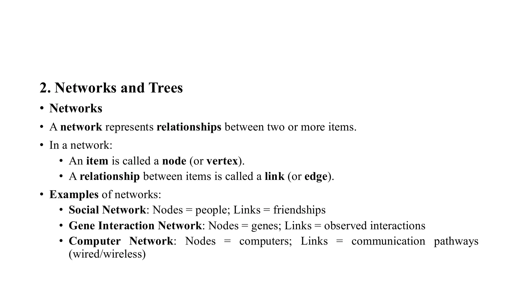
2. Networks andTrees
• Networks
• A network represents relationships between two or more items.
• In a network:
• An item is called a node (or vertex).
• A relationship between items is called a link (or edge).
• Examples of networks:
• Social Network: Nodes = people; Links = friendships
• Gene Interaction Network: Nodes = genes; Links = observed interactions
• Computer Network: Nodes = computers; Links = communication pathways
(wired/wireless)
29.
• Synonym fora network: Graph
• The term "graph" is overloaded:
• In graph theory or graph drawing, refers to networks
• In statistical graphics, refers to charts (e.g., bar graphs, line graphs)
• Nodes and links can both have associated attributes, similar to items in a table.
• A network's visual layout (positions of nodes/edges) is not the same as the abstract
structure.
• Trees (Hierarchical Networks)
• A tree is a type of network with a hierarchical structure.
• Key property: No cycles — each child node has exactly one parent.
• Examples of trees:
• Organizational chart of a company (who reports to whom)
• Biological tree of life (evolutionary relationships, e.g., humans and monkeys
share a primate ancestor)
• Trees are special cases of networks with strict parent–child relationships.
30.
3.Fields
• Definition andKey Characteristics:
• A field is a dataset where attribute values are associated with spatial cells.
• Each cell contains a measurement or calculation from a continuous domain.
• Conceptually, field data supports infinite resolution — new measurements can always be
taken between existing ones.
• Examples of Continuous Phenomena:
• Physical or simulated measurements:
• Temperature
• Pressure
• Speed
• Force
• Density
• Mathematical functions that are continuous in nature
31.
• Relation toMathematics:
• In mathematics, a field represents a mapping from a domain to a range.
• Domain: 1D, 2D, or 3D Euclidean space
• Range: Scalars, vectors, or tensors
• In this context, the term "field" emphasizes continuity of the domain,
regardless of the range.
• Example: Medical Scan (3D Field Dataset):
• A medical scan measuring tissue density throughout a volume of space.
• For instance:
• A low-resolution scan may have 262,144 cells arranged in a 64 × 64 ×
64 grid.
• Each cell corresponds to a specific region in 3D space.
• Higher resolution = closer sampling
• Lower resolution = coarser sampling
32.
• Challenges inHandling Field Data:
• 1. Sampling:
• Decide how often to measure
• Affects data resolution and storage
• 2. Interpolation:
• Estimate values between measured points
• Important for accurate visual reconstruction
• Must avoid misleading representations
• Requires knowledge of signal processing and statistics
• Visualization of Fields:
• Requires understanding of:
• Mathematical principles (e.g., interpolation theory)
• Viewpoint fidelity (visualizations must remain true to the original data)
33.
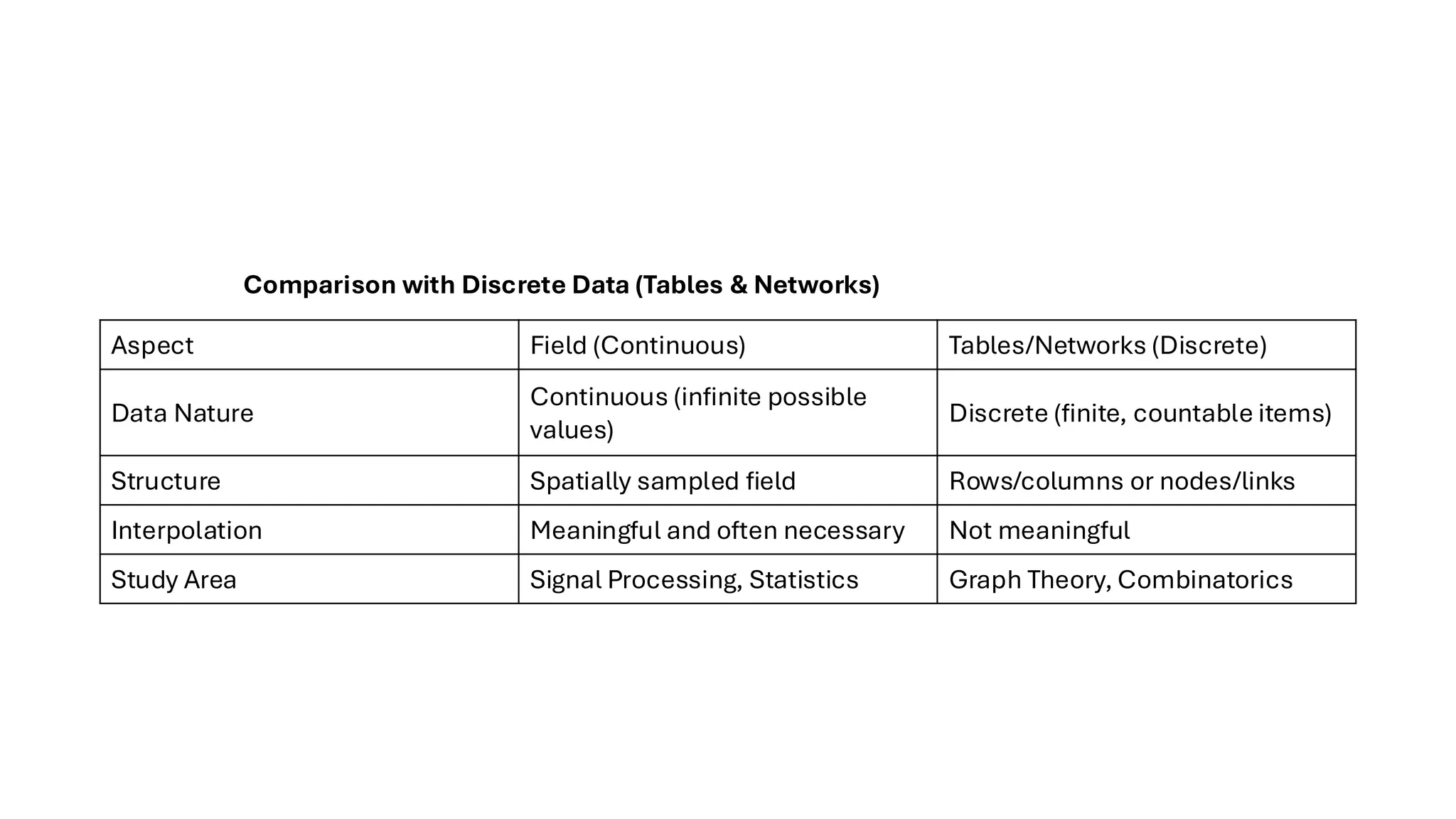
Aspect Field (Continuous)Tables/Networks (Discrete)
Data Nature
Continuous (infinite possible
values)
Discrete (finite, countable items)
Structure Spatially sampled field Rows/columns or nodes/links
Interpolation Meaningful and often necessary Not meaningful
Study Area Signal Processing, Statistics Graph Theory, Combinatorics
Comparison with Discrete Data (Tables & Networks)
34.
4. Geometry DatasetType
• Definition & Core Characteristics:
• Geometry datasets provide explicit spatial information about the shape of items.
• Items can be:
• Points
• Lines or curves (1D)
• Surfaces or regions (2D)
• Volumes (3D)
• Use in Visualization:
• Like spatial fields, geometry datasets are inherently spatial.
• They are typically used for tasks where understanding shape or structure is essential.
• Spatial data often includes hierarchical structures across multiple scales:
• Hierarchies may be intrinsic or derived from the original data.
35.
• Attributes andGeometry:
• Unlike tables, networks, or fields, geometry datasets may not contain attributes.
• Most visualization design challenges focus on encoding attributes, so:
• Pure geometric data becomes interesting only when derived or transformed.
• E.g., when:
• Contours are extracted from a spatial field
• Boundaries (of forests, cities, countries) are generated from raw data
• Road curves are simplified for a specific task or resolution
• Relation to Computer Graphics:
• Rendering a geometric dataset (creating an image from a shape) is typically a computer
graphics problem.
• Visualization and computer graphics are related but distinct:
• Vis focuses on data meaning, and design
• Graphics focuses on visual rendering
• When Geometric Data is Relevant in Vis:
• When shape understanding is central to the task
• When used as a backdrop to overlay attribute data (e.g., plotting data on a map)
36.
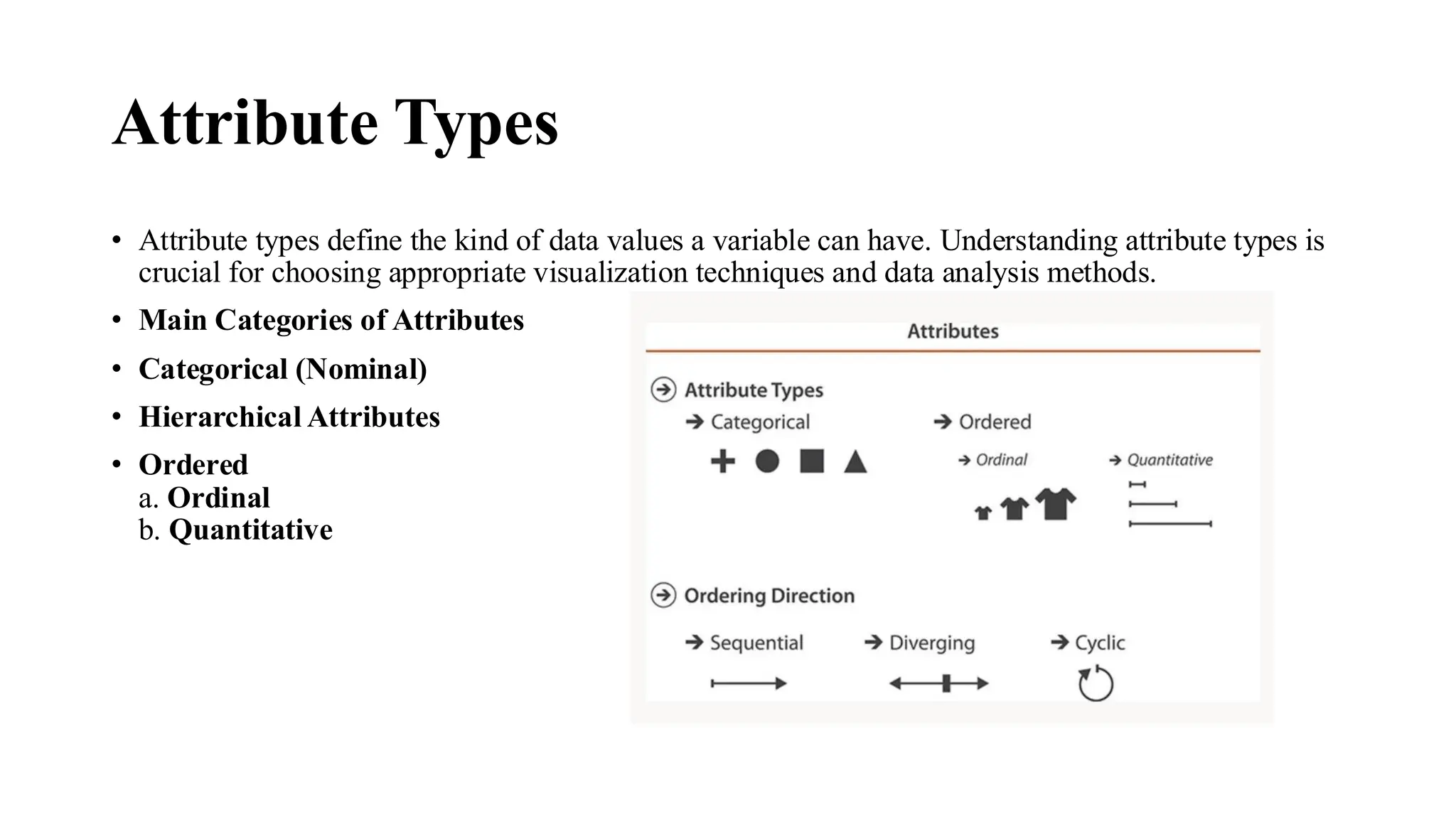
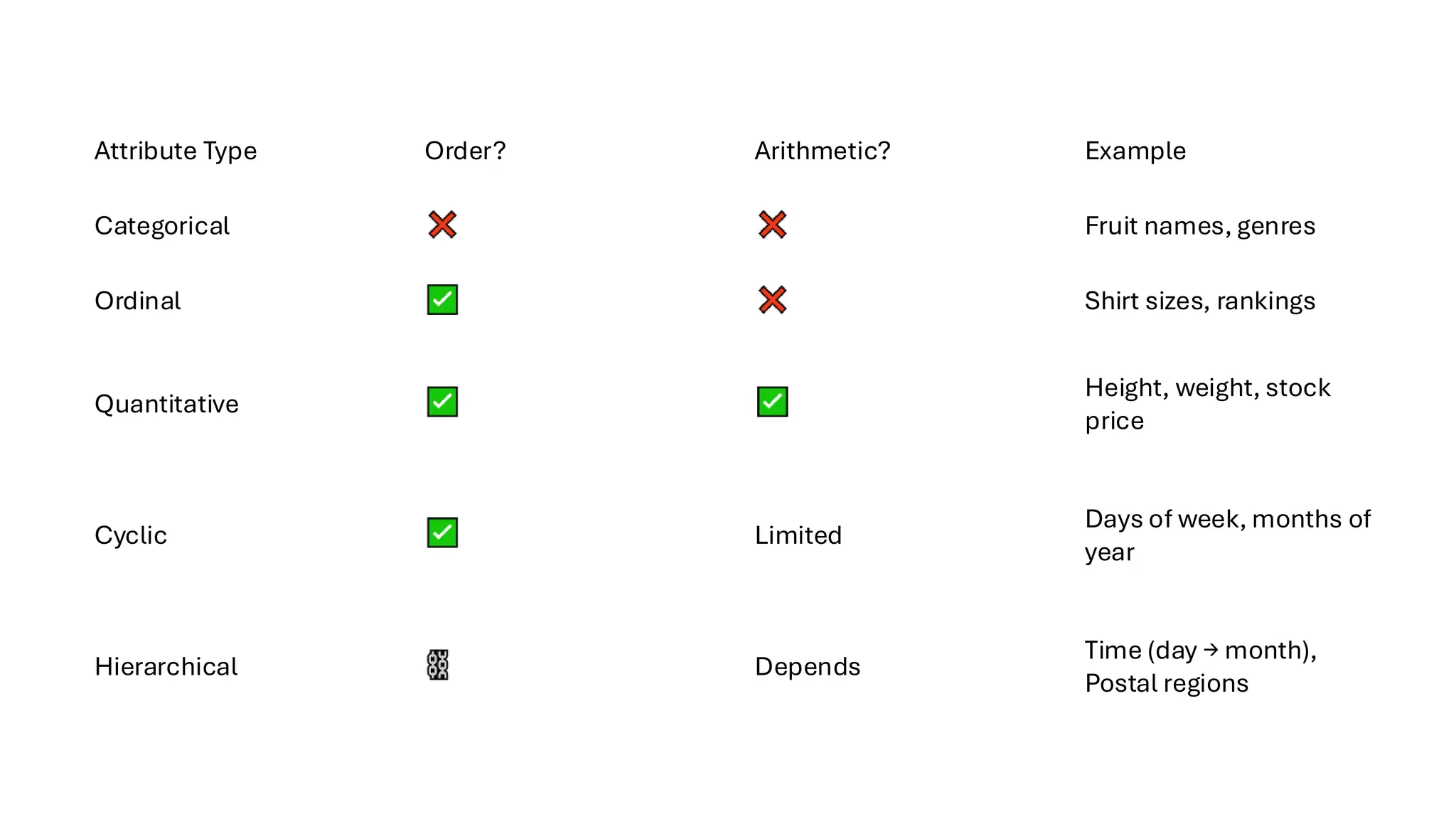
Attribute Types
• Attributetypes define the kind of data values a variable can have. Understanding attribute types is
crucial for choosing appropriate visualization techniques and data analysis methods.
• Main Categories of Attributes
• Categorical (Nominal)
• Hierarchical Attributes
• Ordered
a. Ordinal
b. Quantitative
37.
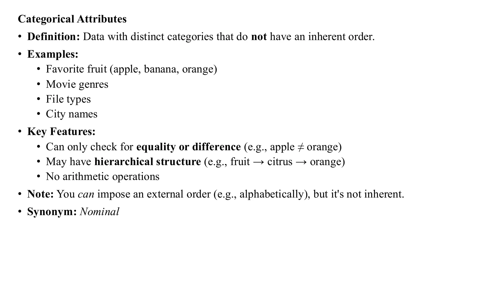
Categorical Attributes
• Definition:Data with distinct categories that do not have an inherent order.
• Examples:
• Favorite fruit (apple, banana, orange)
• Movie genres
• File types
• City names
• Key Features:
• Can only check for equality or difference (e.g., apple ≠ orange)
• May have hierarchical structure (e.g., fruit → citrus → orange)
• No arithmetic operations
• Note: You can impose an external order (e.g., alphabetically), but it's not inherent.
• Synonym: Nominal
38.
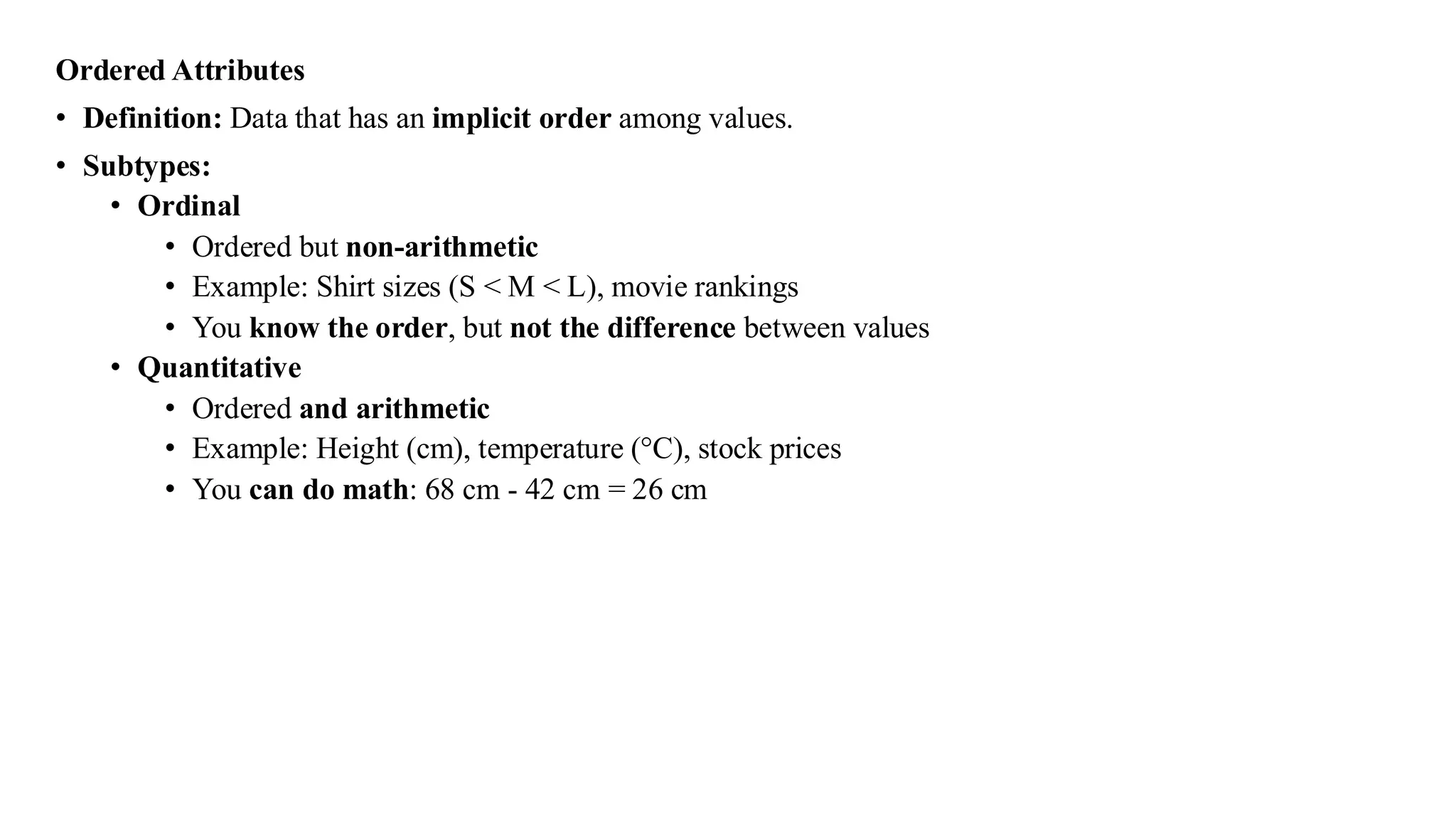
Ordered Attributes
• Definition:Data that has an implicit order among values.
• Subtypes:
• Ordinal
• Ordered but non-arithmetic
• Example: Shirt sizes (S < M < L), movie rankings
• You know the order, but not the difference between values
• Quantitative
• Ordered and arithmetic
• Example: Height (cm), temperature (°C), stock prices
• You can do math: 68 cm - 42 cm = 26 cm
39.
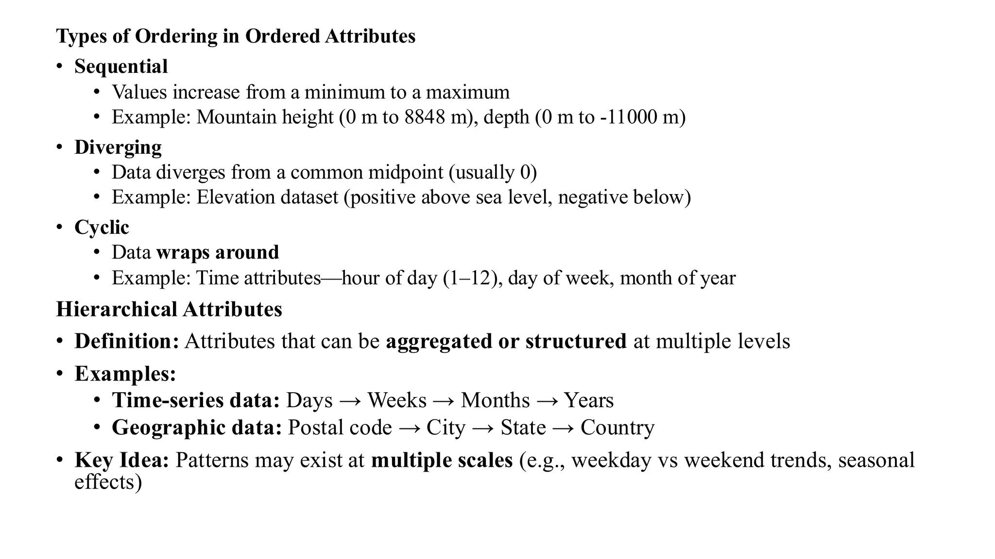
Types of Orderingin Ordered Attributes
• Sequential
• Values increase from a minimum to a maximum
• Example: Mountain height (0 m to 8848 m), depth (0 m to -11000 m)
• Diverging
• Data diverges from a common midpoint (usually 0)
• Example: Elevation dataset (positive above sea level, negative below)
• Cyclic
• Data wraps around
• Example: Time attributes—hour of day (1–12), day of week, month of year
Hierarchical Attributes
• Definition: Attributes that can be aggregated or structured at multiple levels
• Examples:
• Time-series data: Days → Weeks → Months → Years
• Geographic data: Postal code → City → State → Country
• Key Idea: Patterns may exist at multiple scales (e.g., weekday vs weekend trends, seasonal
effects)
40.
Attribute Type Order?Arithmetic? Example
Categorical Fruit names, genres
Ordinal Shirt sizes, rankings
Quantitative
Height, weight, stock
price
Cyclic Limited
Days of week, months of
year
Hierarchical Depends
Time (day → month),
Postal regions
41.
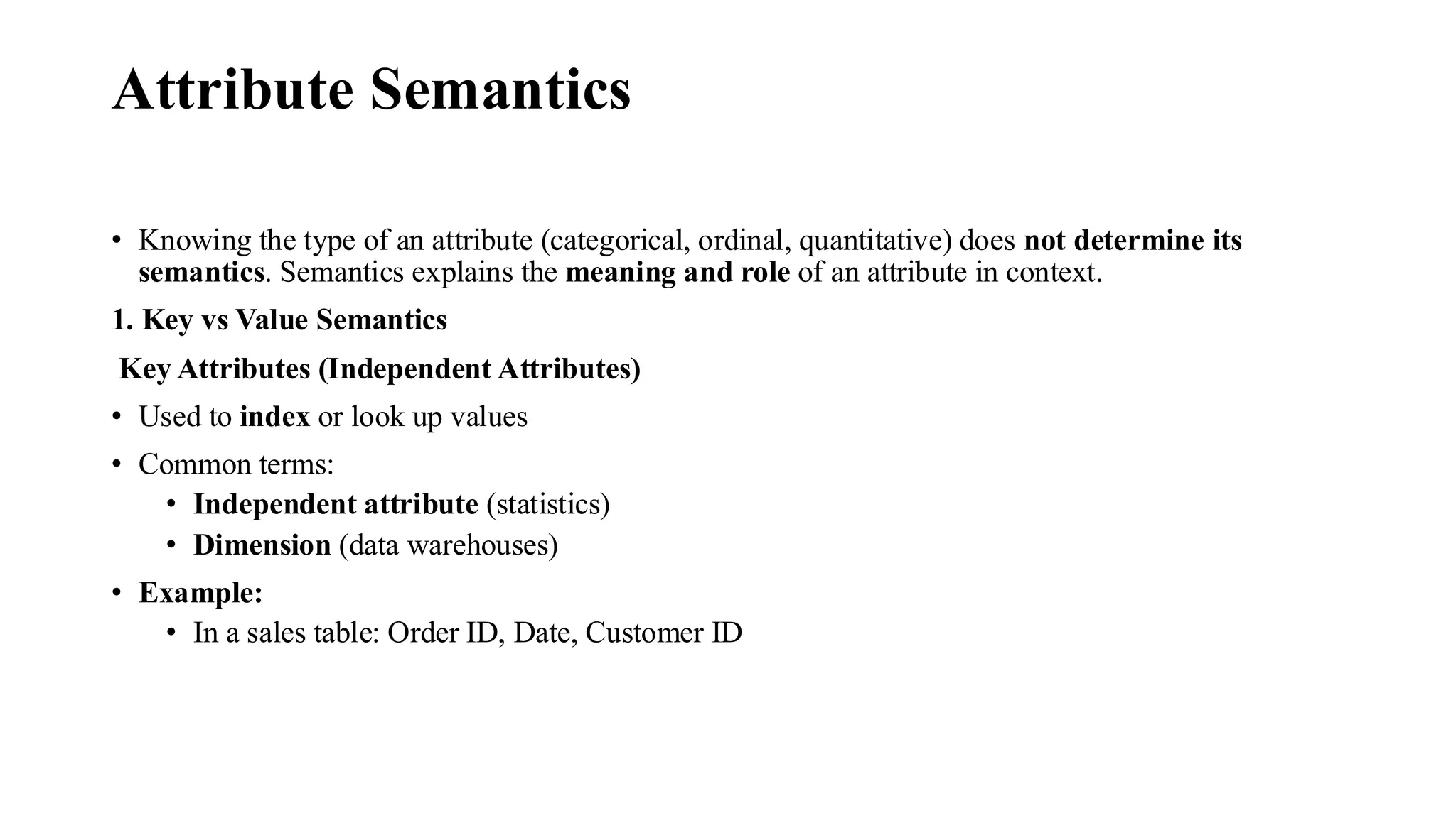
Attribute Semantics
• Knowingthe type of an attribute (categorical, ordinal, quantitative) does not determine its
semantics. Semantics explains the meaning and role of an attribute in context.
1. Key vs Value Semantics
Key Attributes (Independent Attributes)
• Used to index or look up values
• Common terms:
• Independent attribute (statistics)
• Dimension (data warehouses)
• Example:
• In a sales table: Order ID, Date, Customer ID
42.
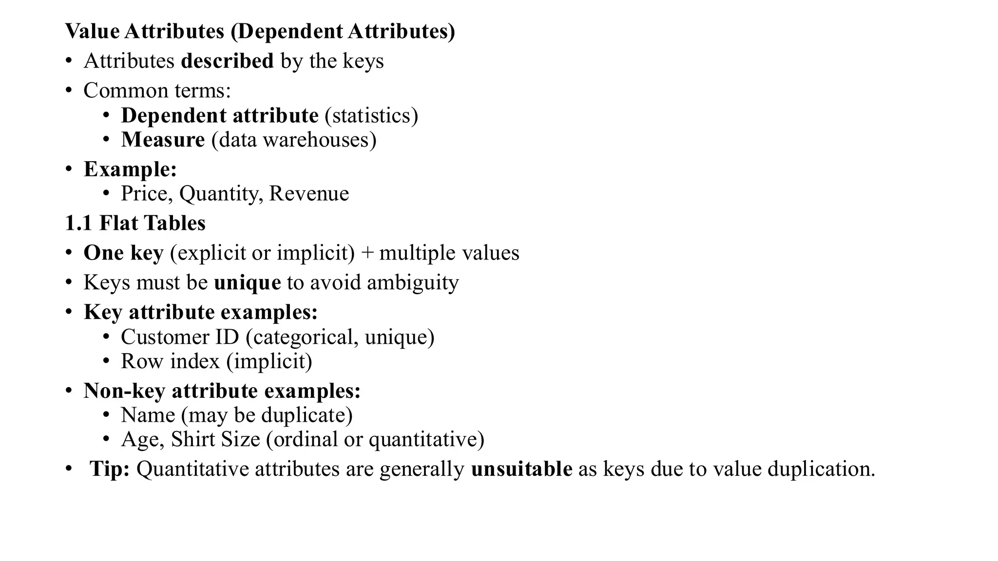
Value Attributes (DependentAttributes)
• Attributes described by the keys
• Common terms:
• Dependent attribute (statistics)
• Measure (data warehouses)
• Example:
• Price, Quantity, Revenue
1.1 Flat Tables
• One key (explicit or implicit) + multiple values
• Keys must be unique to avoid ambiguity
• Key attribute examples:
• Customer ID (categorical, unique)
• Row index (implicit)
• Non-key attribute examples:
• Name (may be duplicate)
• Age, Shirt Size (ordinal or quantitative)
• Tip: Quantitative attributes are generally unsuitable as keys due to value duplication.
43.
1.2 Multidimensional Tables
•Multiple keys needed for unique identification
• Each combination of keys is unique
• Example:
• Gene (key) × Time (key) → Gene activity level (value)
• Often, discovering which attributes are keys/values is part of the visualization analysis process.
1.3 Fields
• Fields differ from tables: they represent continuous data
• Use systematic sampling across space/time
• Key = Spatial location, Value = Measurement
Table Term Field Equivalent
Key Independent variable
Value Dependent variable
44.
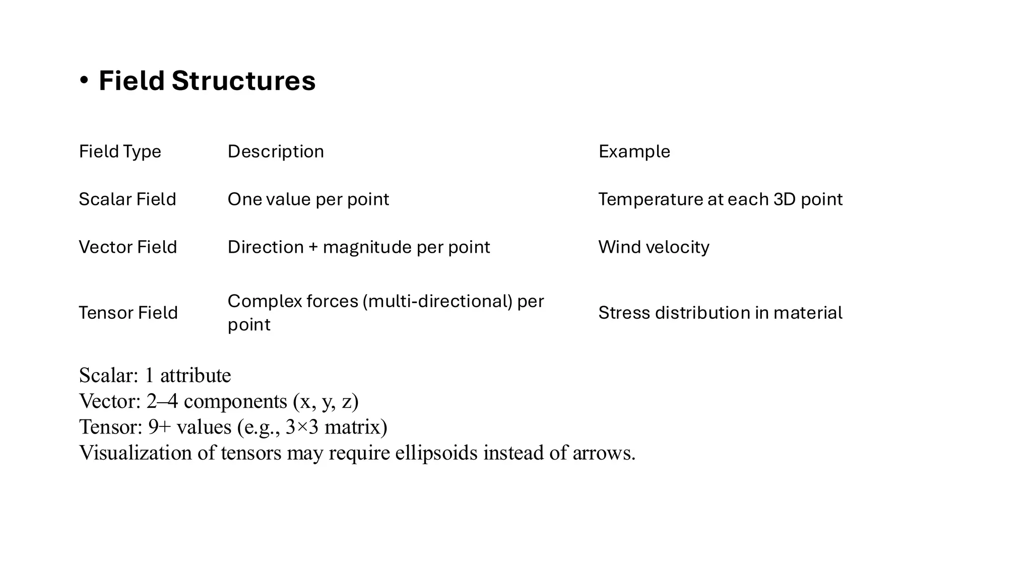
• Field Structures
FieldType Description Example
Scalar Field One value per point Temperature at each 3D point
Vector Field Direction + magnitude per point Wind velocity
Tensor Field
Complex forces (multi-directional) per
point
Stress distribution in material
Scalar: 1 attribute
Vector: 2–4 components (x, y, z)
Tensor: 9+ values (e.g., 3×3 matrix)
Visualization of tensors may require ellipsoids instead of arrows.
45.
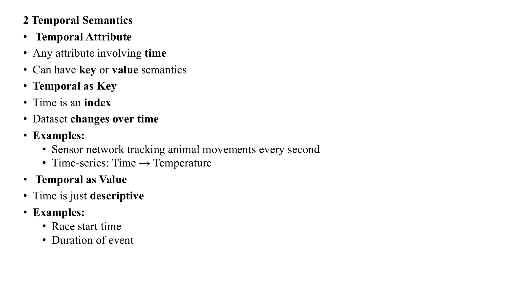
2 Temporal Semantics
•Temporal Attribute
• Any attribute involving time
• Can have key or value semantics
• Temporal as Key
• Time is an index
• Dataset changes over time
• Examples:
• Sensor network tracking animal movements every second
• Time-series: Time → Temperature
• Temporal as Value
• Time is just descriptive
• Examples:
• Race start time
• Duration of event
46.
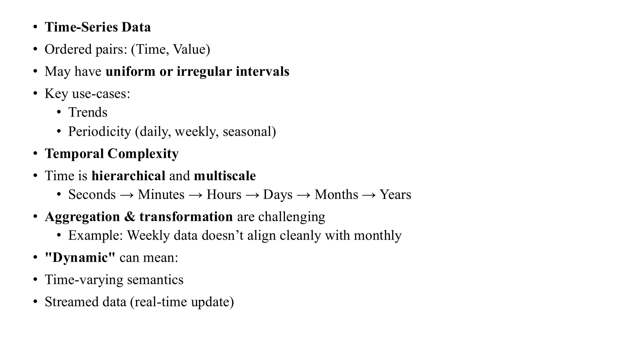
• Time-Series Data
•Ordered pairs: (Time, Value)
• May have uniform or irregular intervals
• Key use-cases:
• Trends
• Periodicity (daily, weekly, seasonal)
• Temporal Complexity
• Time is hierarchical and multiscale
• Seconds → Minutes → Hours → Days → Months → Years
• Aggregation & transformation are challenging
• Example: Weekly data doesn’t align cleanly with monthly
• "Dynamic" can mean:
• Time-varying semantics
• Streamed data (real-time update)
47.
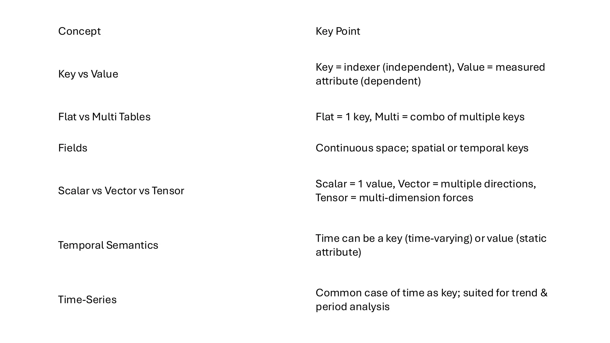
Concept Key Point
Keyvs Value
Key = indexer (independent), Value = measured
attribute (dependent)
Flat vs Multi Tables Flat = 1 key, Multi = combo of multiple keys
Fields Continuous space; spatial or temporal keys
Scalar vs Vector vs Tensor
Scalar = 1 value, Vector = multiple directions,
Tensor = multi-dimension forces
Temporal Semantics
Time can be a key (time-varying) or value (static
attribute)
Time-Series
Common case of time as key; suited for trend &
period analysis
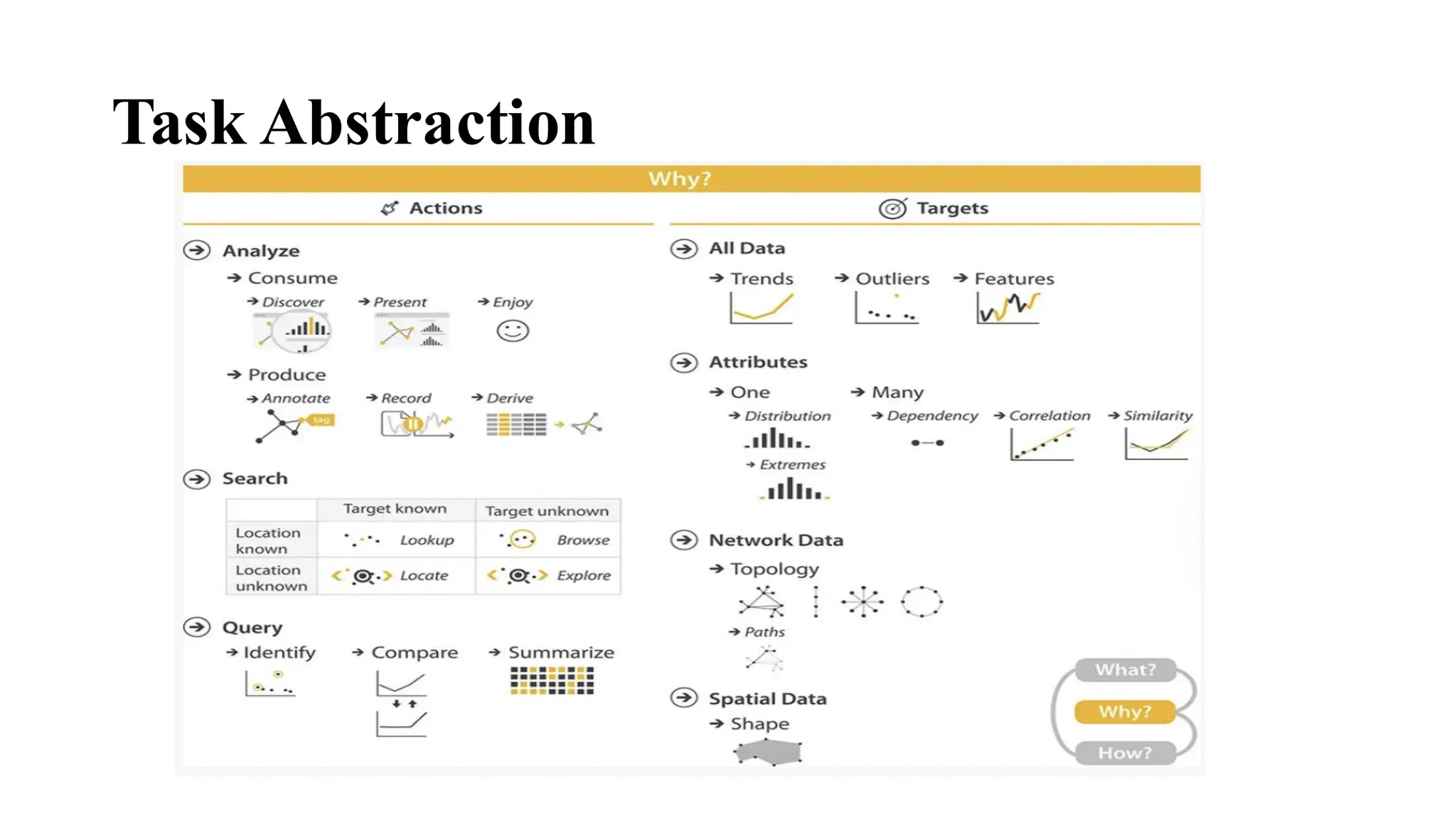
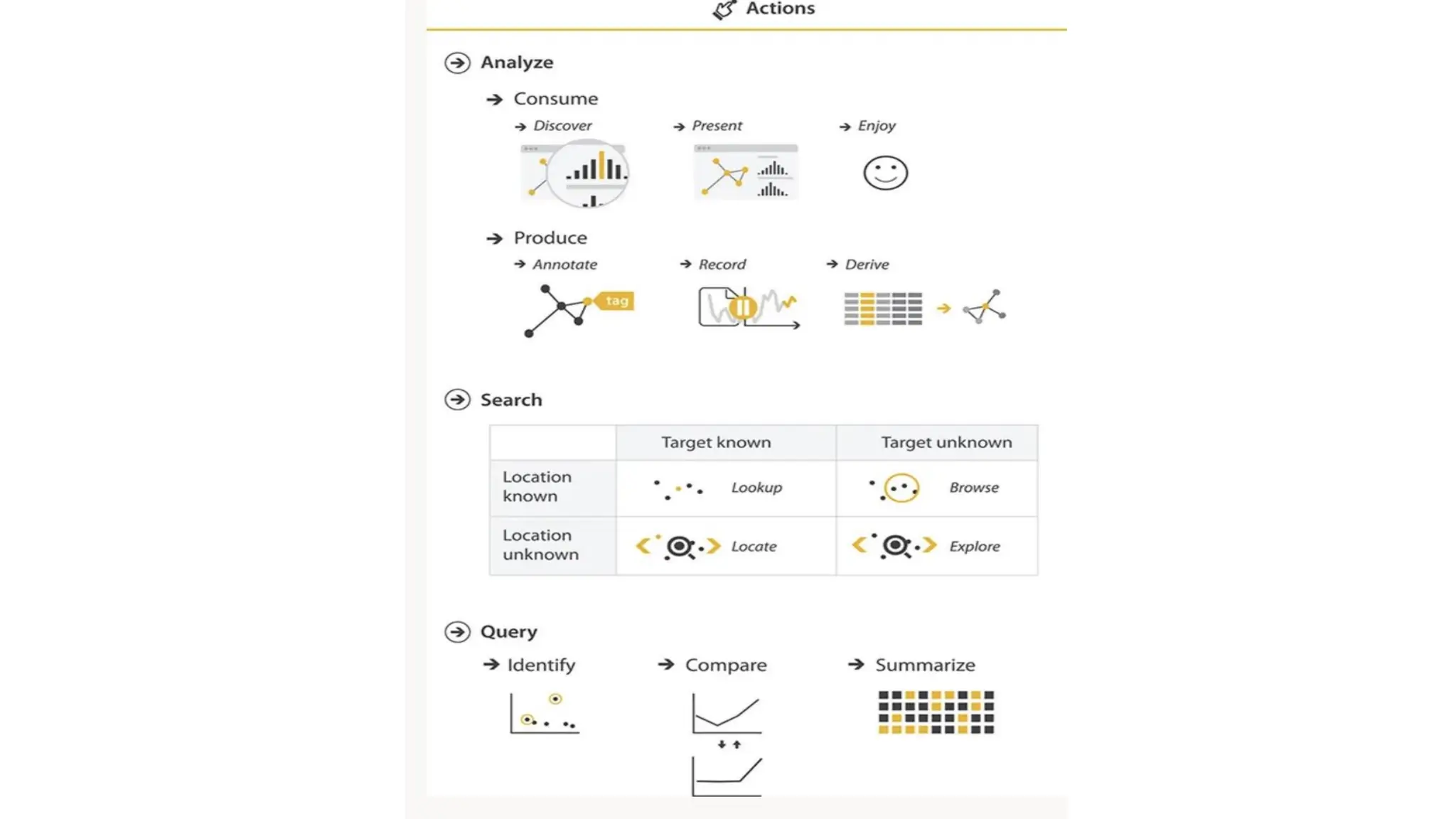
• It describeswhy visualization tools are used by categorizing user goals (called tasks)
into actions and targets across three levels: high, middle, and low.
• 1. High-Level Actions (Purpose of Use)
Visualization is used to consume or produce information.
• Consume includes:
• Present: Show information clearly.
• Discover: Find insights or test hypotheses.
• Enjoy: Engage aesthetically or curiously.
• 2. Middle-Level Actions (Search Classification)
Based on what the user knows about the target and its location:
• Lookup: You know what and where → just retrieve it.
• Locate: You know what you're looking for, but not where it is.
• Browse: You know where to look, but not what exactly.
• Explore: You don't know what you're looking for or where it is.
50.
3. Low-Level Actions(Query Scope)
• Defines the scope of user queries:
• Identify: Find a single target.
• Compare: Examine multiple targets.
• Summarize: Understand all targets in aggregate.
4. Targets (What Is Being Sought)
• The types of data patterns or items users may search for:
• All data types: Trends, outliers.
• One attribute:
• Specific value
• Minimum/maximum
• Overall distribution
• Multiple attributes:
• Dependencies
• Correlations
• Similarities
• Network data:
• Topology
• Paths
• Spatial data:
• Shape
51.
why it isimportant to analyze tasks
abstractly
Abstract task analysis allows us to generalize and compare user goals across different
domains, even when the specific language varies. It helps in designing better, more reusable
visualization tools.
1. Why Use Abstract Task Descriptions?
• People describe tasks using domain-specific language, which makes them seem unrelated.
• Abstracting those descriptions reveals underlying similarities.
• Without abstraction, everything seems different—even when it’s not.
• Example:
An epidemiologist and a biologist may describe their tasks very differently, but both are
essentially performing a comparison between two groups.
• Domain-specific:
• “Contrast prognosis…”
• “See if the results match up…”
• Abstract task: “Compare values between two groups”
52.
2. Benefits ofthe Framework
• Uses a small, consistent vocabulary:
• Verbs for actions (e.g., compare, explore, summarize)
• Nouns for targets (e.g., trends, distributions)
• Helps clearly identify and distinguish user goals.
• Encourages the use of generic terms to improve understanding across domains.
3. Flexible and Modular
• Visualization tools can often serve multiple goals.
• It’s helpful to focus on one goal at a time for analysis and design.
• For complex workflows, you can chain tasks (e.g., explore → compare → summarize).
4. Task Abstraction Guides Data Abstraction
• Understanding the task helps determine:
• What data transformations are needed.
• How to derive new data (e.g., group averages, rankings).
• Example: If the task is summarize, you might derive aggregate statistics.
53.
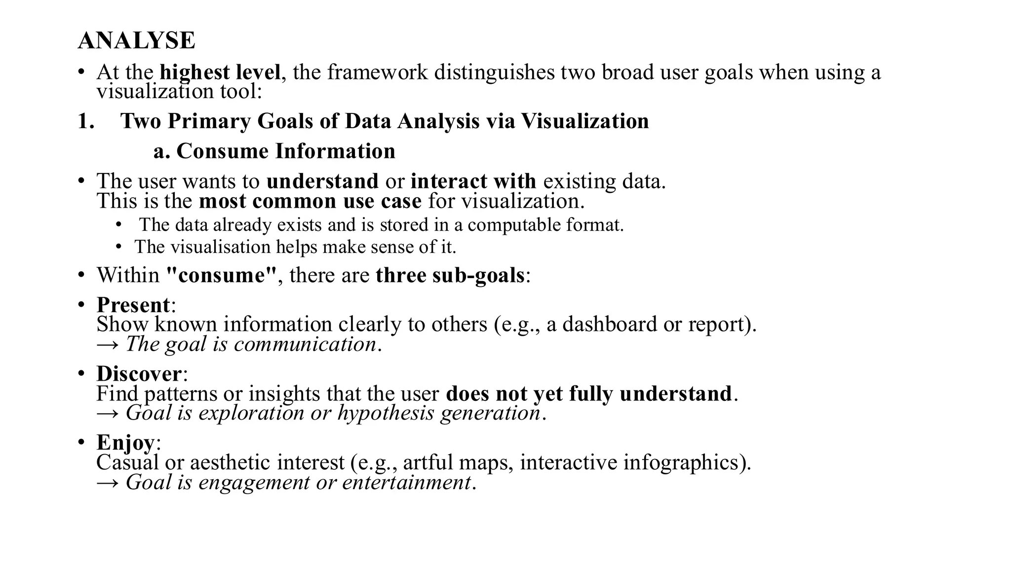
ANALYSE
• At thehighest level, the framework distinguishes two broad user goals when using a
visualization tool:
1. Two Primary Goals of Data Analysis via Visualization
a. Consume Information
• The user wants to understand or interact with existing data.
This is the most common use case for visualization.
• The data already exists and is stored in a computable format.
• The visualisation helps make sense of it.
• Within "consume", there are three sub-goals:
• Present:
Show known information clearly to others (e.g., a dashboard or report).
→ The goal is communication.
• Discover:
Find patterns or insights that the user does not yet fully understand.
→ Goal is exploration or hypothesis generation.
• Enjoy:
Casual or aesthetic interest (e.g., artful maps, interactive infographics).
→ Goal is engagement or entertainment.
54.
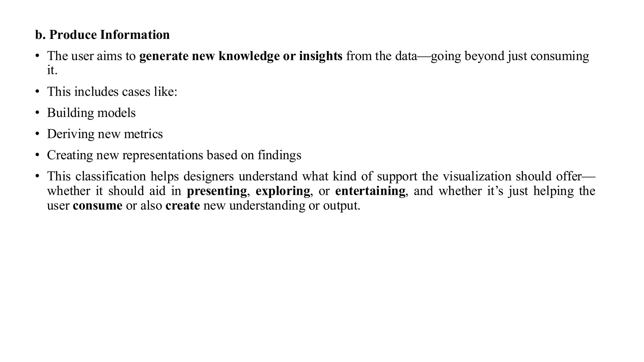
b. Produce Information
•The user aims to generate new knowledge or insights from the data—going beyond just consuming
it.
• This includes cases like:
• Building models
• Deriving new metrics
• Creating new representations based on findings
• This classification helps designers understand what kind of support the visualization should offer—
whether it should aid in presenting, exploring, or entertaining, and whether it’s just helping the
user consume or also create new understanding or output.
56.
• Produce
• Invisualization, we often consume visual information to understand data. But there’s
another major use case—produce—where the user actively creates something new using
the visualization tool.
• What is the Produce Goal?
• Produce means the user is not just looking at visualizations—they are creating or
generating something new with it. This could be:
• Immediate output used in the next step
• A visual or data artifact for future use
• Preparation for other analysis or presentation tasks
• There are three major types of produce goals:
1. Annotate – Add Notes or Labels
• What it is: Adding text or graphic notes to parts of the visualization.
• Why it's used: To highlight, explain, or label important elements.
• Example: Labelling a group of dots in a scatter plot as “Outliers” or “Cluster A.”
• Extra tip: Annotations can act like new attributes for the data.
• Think of it like sticky notes on a chart—helps with memory and communication.
57.
2. Record –Save or Capture
• What it is: Saving a permanent artifact from the visualization.
• Examples include:
• Screenshots
• Bookmarks
• Logs of interactions
• Parameter settings
• Annotated versions
• Why it's used: To track history, document progress, or share results.
• Example Tool: Tableau provides a graphical history—snapshots of every step a user took.
• It's like keeping a photo album of your data exploration session.
3. Derive – Transform or Create New Data
• What it is: Creating new attributes or data types from existing ones.
• Why it matters: Enables better, clearer, or more relevant visualizations.
• Examples:
• Subtracting exports from imports to get trade balance
• Converting temperature from numbers to labels: “Hot,” “Warm,” “Cold”
• Turning city names into latitude and longitude using a database
58.
• How it'sdone:
• Arithmetic (e.g., differences)
• Statistical (e.g., average, correlation)
• Logical operations
• You're not stuck with the raw data—you can mold it into a better form for your task.
• Real-World Example: VxInsight System
• Original data: A table of 6000 yeast genes with 18 experimental conditions.
• Step 1: Compute a similarity score between each gene (derived attribute).
• Step 2: Build a network graph, where nodes are genes and links connect the top 20 similar ones.
• Purpose: Help biologists see gene relationships visually through transformation.
59.
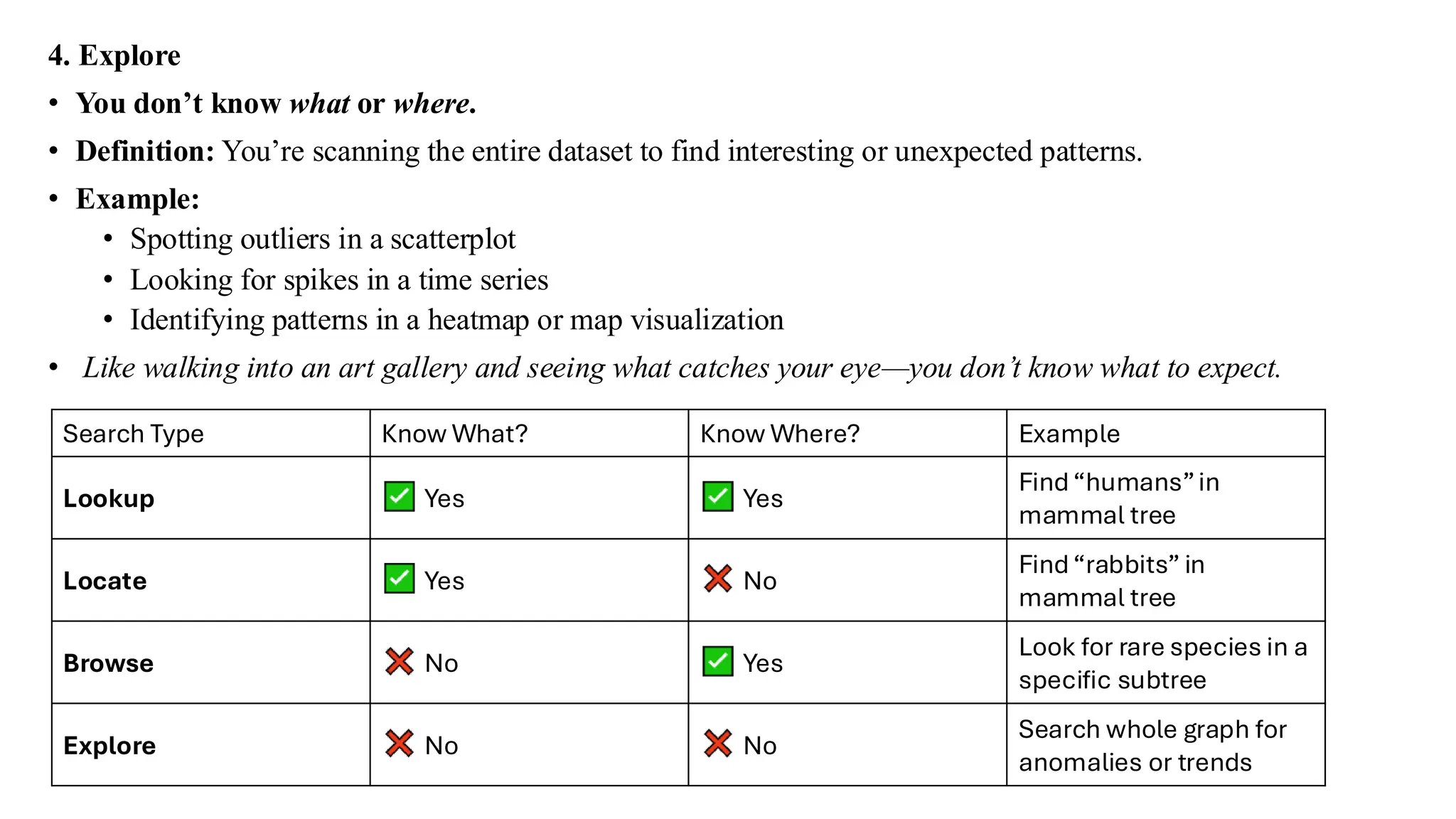
Search
• In visualization,search is a mid-level goal. It happens when users try to find
something within a visual representation of data. The type of search depends on how
much the user already knows about what they’re looking for and where it is.
• There are four types of search tasks:
1. Lookup
• You know what and where.
• Definition: Find a specific known item in a known location.
• Example: In a tree diagram of mammals, looking up "humans" because you already
know they’re under primates.
• Use case: Quick access to known data points.
• It’s like using Ctrl+F when you already know what word to search for in a document.
60.
2. Locate
• Youknow what but not where.
• Definition: You have a known target but its location is unknown.
• Example: Searching for "rabbits" in the same mammal tree, without knowing their exact
classification.
• Use case: Scanning the visualization to find a specific item.
• It’s like trying to find a friend at a busy train station—you know who, but not where.
3. Browse
• You don’t know what exactly, but you know where to look.
• Definition: You're looking for items with specific characteristics in a known area.
• Example: Looking in a certain part of a family tree for species that have few siblings.
• Another example: On a line graph of stock prices, checking prices for June 15—same date,
but different stocks.
• Like flipping through a book section for a good recipe—you don’t know which one yet, but you
know where to look.
61.
4. Explore
• Youdon’t know what or where.
• Definition: You’re scanning the entire dataset to find interesting or unexpected patterns.
• Example:
• Spotting outliers in a scatterplot
• Looking for spikes in a time series
• Identifying patterns in a heatmap or map visualization
• Like walking into an art gallery and seeing what catches your eye—you don’t know what to expect.
Search Type Know What? Know Where? Example
Lookup Yes Yes
Find“humans”in
mammal tree
Locate Yes No
Find“rabbits” in
mammal tree
Browse No Yes
Look for rare species in a
specific subtree
Explore No No
Search whole graph for
anomalies or trends
62.
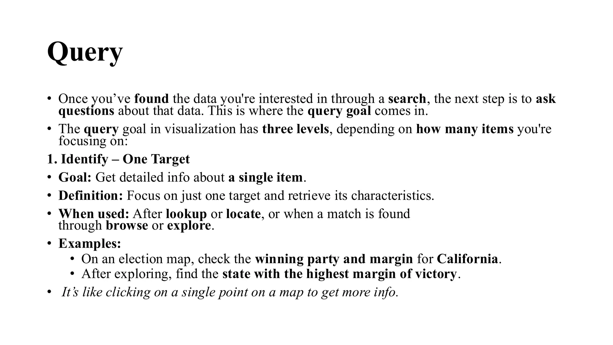
Query
• Once you’vefound the data you're interested in through a search, the next step is to ask
questions about that data. This is where the query goal comes in.
• The query goal in visualization has three levels, depending on how many items you're
focusing on:
1. Identify – One Target
• Goal: Get detailed info about a single item.
• Definition: Focus on just one target and retrieve its characteristics.
• When used: After lookup or locate, or when a match is found
through browse or explore.
• Examples:
• On an election map, check the winning party and margin for California.
• After exploring, find the state with the highest margin of victory.
• It’s like clicking on a single point on a map to get more info.
63.
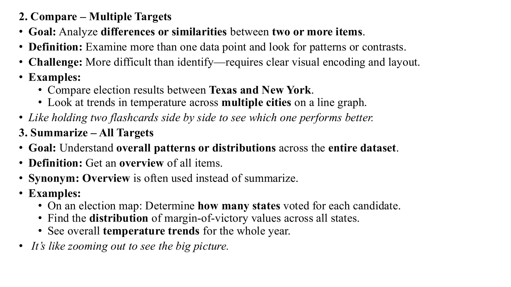
2. Compare –Multiple Targets
• Goal: Analyze differences or similarities between two or more items.
• Definition: Examine more than one data point and look for patterns or contrasts.
• Challenge: More difficult than identify—requires clear visual encoding and layout.
• Examples:
• Compare election results between Texas and New York.
• Look at trends in temperature across multiple cities on a line graph.
• Like holding two flashcards side by side to see which one performs better.
3. Summarize – All Targets
• Goal: Understand overall patterns or distributions across the entire dataset.
• Definition: Get an overview of all items.
• Synonym: Overview is often used instead of summarize.
• Examples:
• On an election map: Determine how many states voted for each candidate.
• Find the distribution of margin-of-victory values across all states.
• See overall temperature trends for the whole year.
• It’s like zooming out to see the big picture.
64.
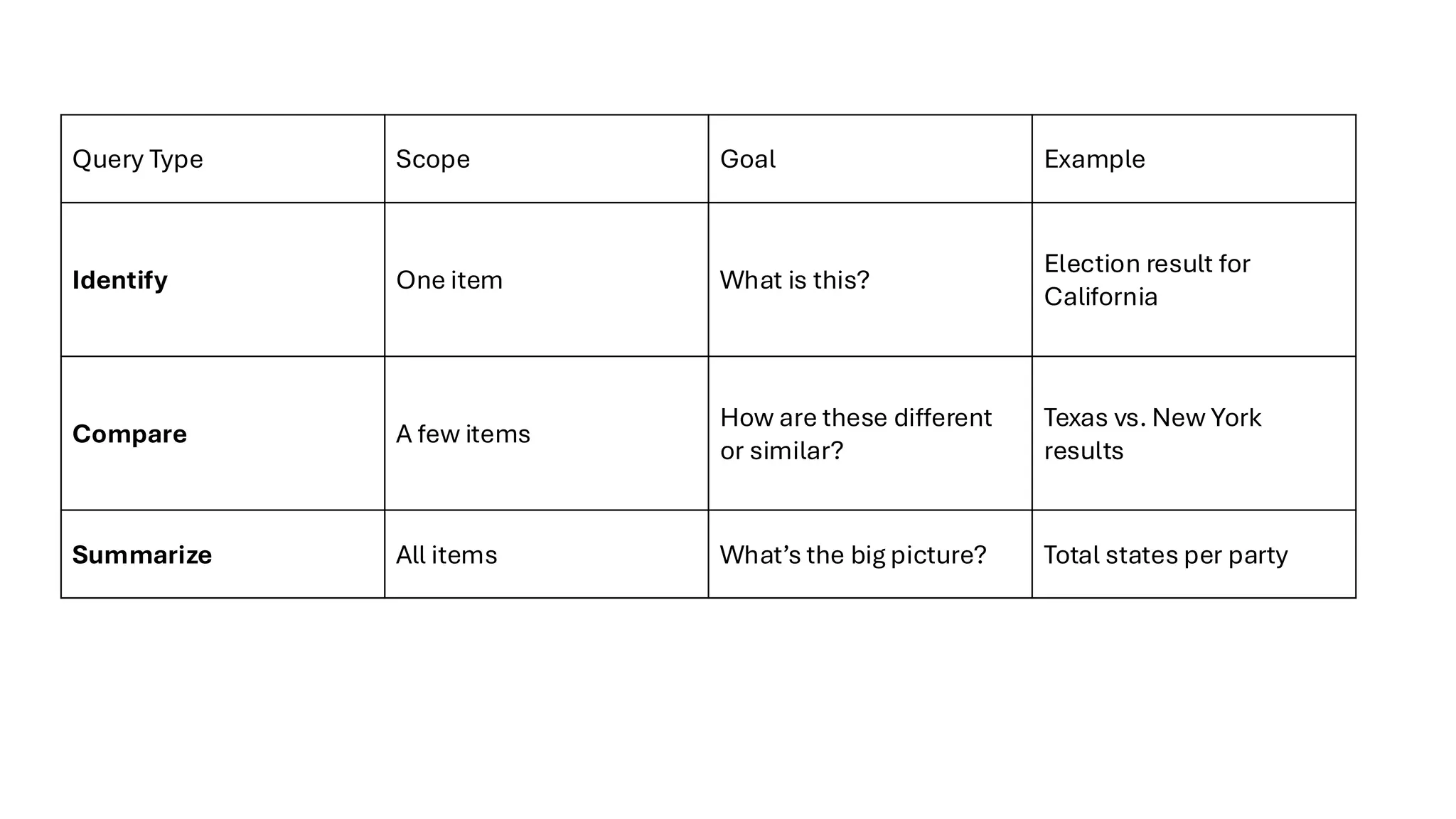
Query Type ScopeGoal Example
Identify One item What is this?
Election result for
California
Compare A few items
How are these different
or similar?
Texas vs. New York
results
Summarize All items What’s the big picture? Total states per party
65.
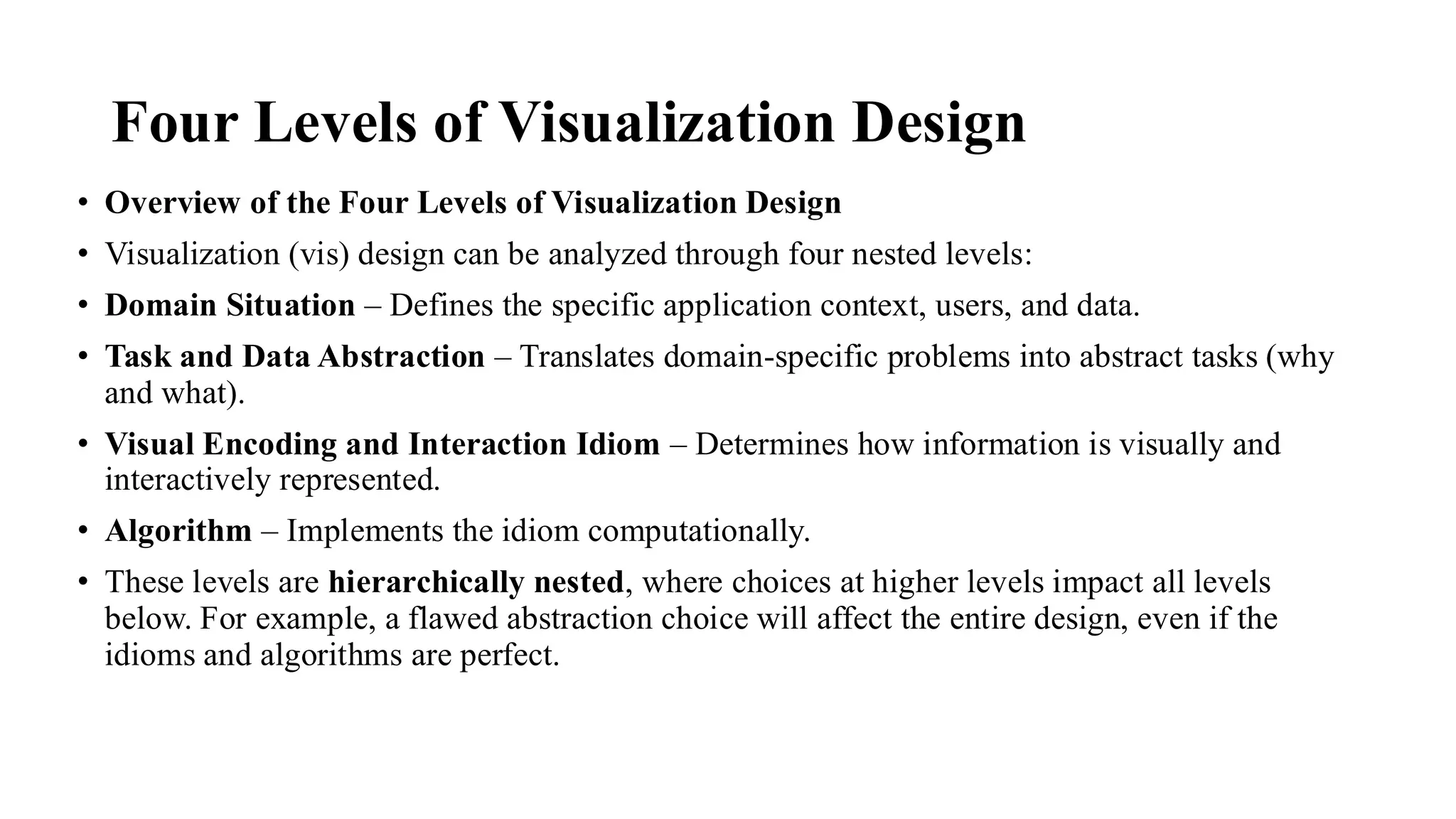
Four Levels ofVisualization Design
• Overview of the Four Levels of Visualization Design
• Visualization (vis) design can be analyzed through four nested levels:
• Domain Situation – Defines the specific application context, users, and data.
• Task and Data Abstraction – Translates domain-specific problems into abstract tasks (why
and what).
• Visual Encoding and Interaction Idiom – Determines how information is visually and
interactively represented.
• Algorithm – Implements the idiom computationally.
• These levels are hierarchically nested, where choices at higher levels impact all levels
below. For example, a flawed abstraction choice will affect the entire design, even if the
idioms and algorithms are perfect.
66.
• 4.1 TheBig Picture
• Each design level presents different threats to validity, and validation methods should be
selected with these levels in mind.
• 4.2 Why Validate?
• Validation is essential due to the vast and complex vis design space—most designs fail
without proper validation.
• Designers are encouraged to consider validation early in the design process and across all
four levels.
• Benefits of the Four-Level Framework
• Provides a systematic way to analyze and separate different concerns in visualization design.
• Encourages iterative refinement, where insights at one level can influence others (design as
redesign).
• Helps identify specific design decisions and their consequences, regardless of design order.
67.
• Level 1:Domain Situation
• Captures the context of target users, their domain-specific needs, and workflows.
• Identified through methods such as interviews, observations, and user research.
• Aims to define specific, actionable questions rather than vague objectives.
• Example: A computational biologist analyzing nucleotide sequences has clear questions like
“Where are the gaps across a chromosome?” rather than broad goals like “Understand genetic
diseases.”
• Design Pitfalls:
• Skipping engagement with users.
• Assuming needs instead of researching them.
• Misinterpreting what users say vs. what they actually do.
68.
• Level 2:Task and Data Abstraction
• Transforms domain-specific needs into abstract tasks (like browse, compare, summarize).
• Task blocks are identified, while data blocks are designed by the vis developer.
• Abstracting data may require transforming raw input into appropriate data types (e.g., tables, graphs,
spatial fields).
• Helps identify commonality across domains—different domains may share the same tasks even if data
differs.
• Design Risks:
• Implicit, unjustified abstractions can mislead the design.
• Example: Early web vis tools assumed that users needed a graph of hyperlink connections—this added
cognitive load rather than helping.
69.
• 4.3.3 VisualEncoding and Interaction Idiom
• At this third design level, you decide how to visually and interactively represent the abstract
data and tasks previously identified.
• Visual Encoding Idioms determine what users see—how the data is mapped visually (e.g.,
graphs, trees, charts).
• Interaction Idioms determine how users manipulate what they see—like filtering, zooming,
or selecting.
• Example: The Word Tree system combines a hierarchical visual encoding of text with
interaction based on keyword navigation.
• Idiom blocks are designed, not just identified.
• Design choices at this level must balance visual clarity and human perceptual limits.
• Considerations include cognitive load, memory, and perception.
• Often, visual encoding and interaction are so interlinked that they should be treated as a single
idiom.
70.
• 4.3.4 Algorithm
•At the innermost level, you define the algorithm—the concrete computational method to
implement the idiom.
• An algorithm is a detailed procedure to realize the chosen idioms efficiently.
• Many algorithms can implement the same idiom; choosing among them depends on:
• Speed
• Memory efficiency
• Accuracy of representation
• Example: For 3D medical scans, direct volume rendering can be implemented through
different algorithms like ray casting or splatting.
• Algorithm design addresses computational concerns, while idiom design focuses on human
perception.
• The levels interact: a great idiom may be useless if it can't be implemented efficiently—but
smart algorithm design (like precomputing data) can solve performance bottlenecks.
71.
Validation Approaches
• Overviewof Validation Approaches
• Different design threats require different validation approaches. These approaches are categorized
by the level of the design process they address. The model distinguishes between:
• Immediate validation – provides partial, quicker feedback.
• Downstream validation – provides stronger evidence but requires more system implementation.
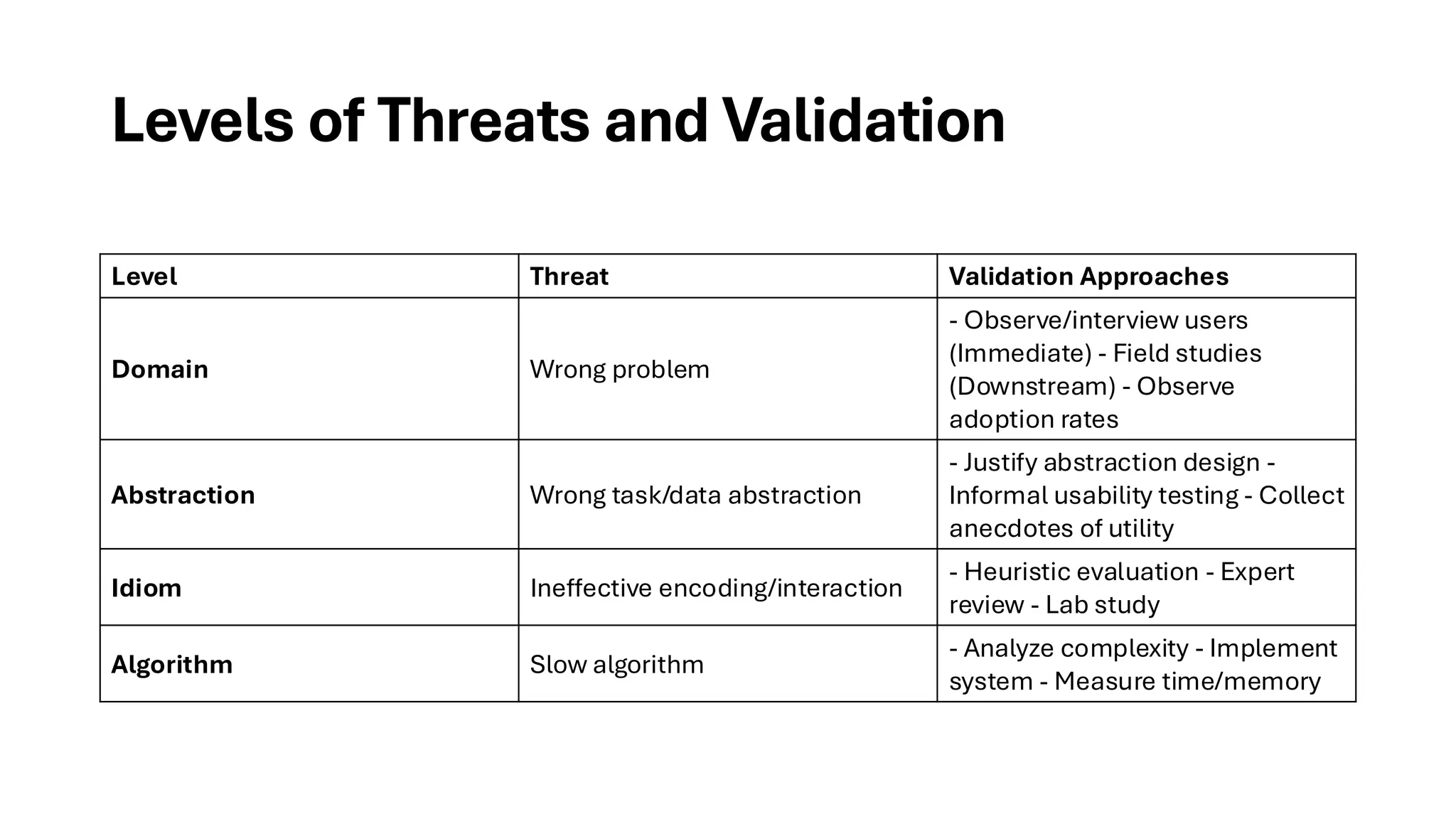
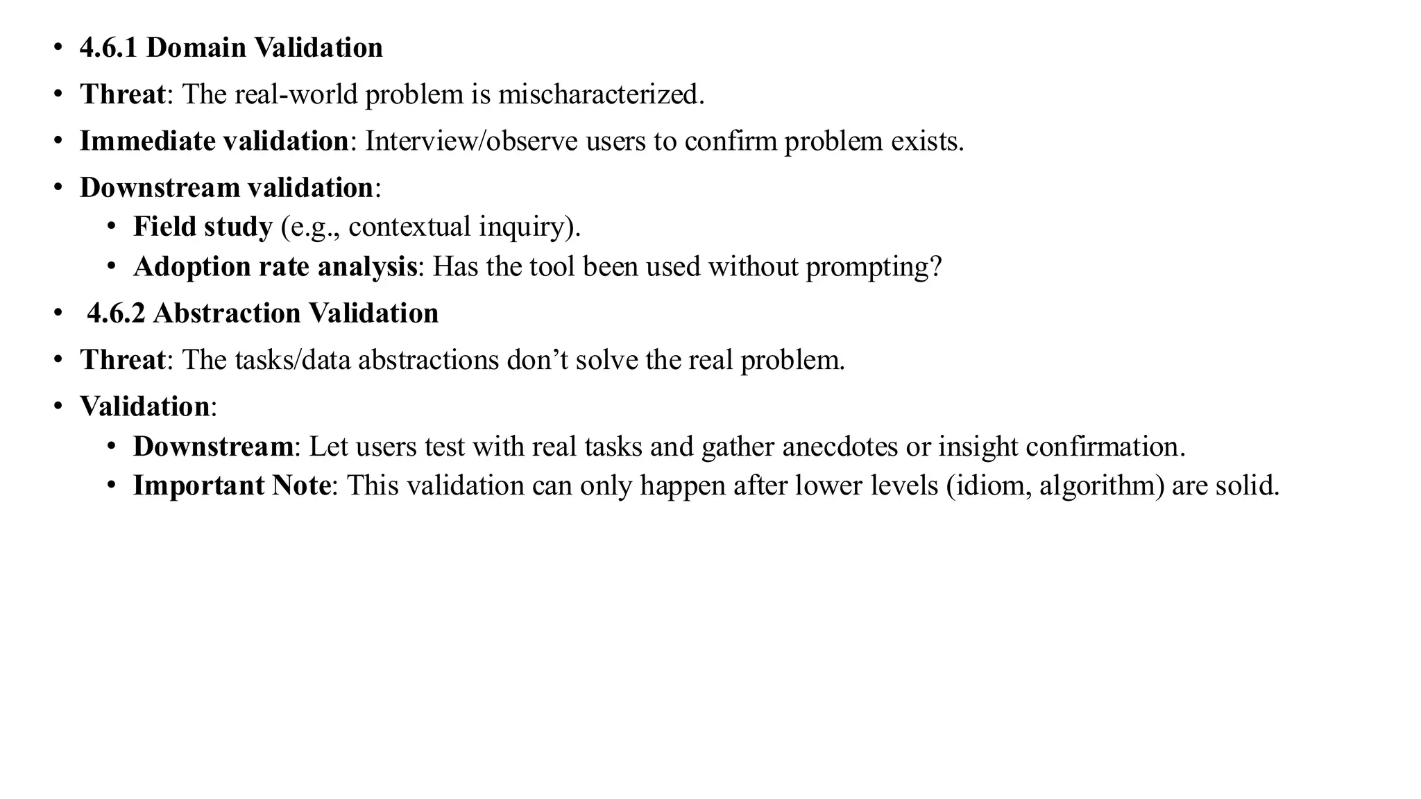
• 4.6.1 DomainValidation
• Threat: The real-world problem is mischaracterized.
• Immediate validation: Interview/observe users to confirm problem exists.
• Downstream validation:
• Field study (e.g., contextual inquiry).
• Adoption rate analysis: Has the tool been used without prompting?
• 4.6.2 Abstraction Validation
• Threat: The tasks/data abstractions don’t solve the real problem.
• Validation:
• Downstream: Let users test with real tasks and gather anecdotes or insight confirmation.
• Important Note: This validation can only happen after lower levels (idiom, algorithm) are solid.
74.
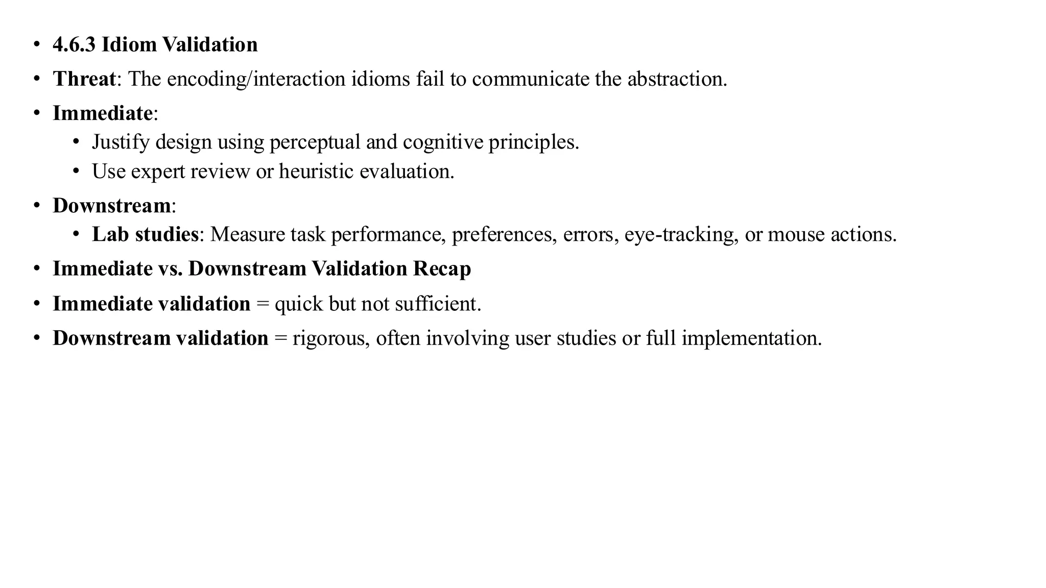
• 4.6.3 IdiomValidation
• Threat: The encoding/interaction idioms fail to communicate the abstraction.
• Immediate:
• Justify design using perceptual and cognitive principles.
• Use expert review or heuristic evaluation.
• Downstream:
• Lab studies: Measure task performance, preferences, errors, eye-tracking, or mouse actions.
• Immediate vs. Downstream Validation Recap
• Immediate validation = quick but not sufficient.
• Downstream validation = rigorous, often involving user studies or full implementation.
75.
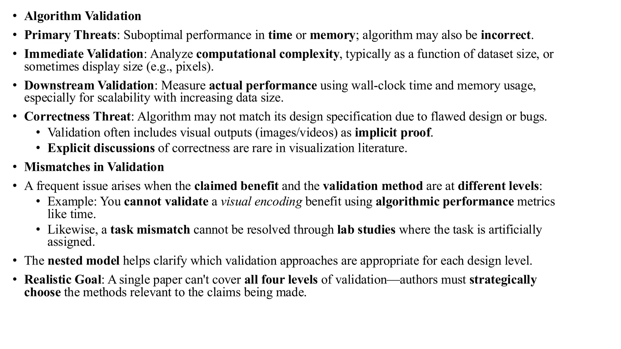
• Algorithm Validation
•Primary Threats: Suboptimal performance in time or memory; algorithm may also be incorrect.
• Immediate Validation: Analyze computational complexity, typically as a function of dataset size, or
sometimes display size (e.g., pixels).
• Downstream Validation: Measure actual performance using wall-clock time and memory usage,
especially for scalability with increasing data size.
• Correctness Threat: Algorithm may not match its design specification due to flawed design or bugs.
• Validation often includes visual outputs (images/videos) as implicit proof.
• Explicit discussions of correctness are rare in visualization literature.
• Mismatches in Validation
• A frequent issue arises when the claimed benefit and the validation method are at different levels:
• Example: You cannot validate a visual encoding benefit using algorithmic performance metrics
like time.
• Likewise, a task mismatch cannot be resolved through lab studies where the task is artificially
assigned.
• The nested model helps clarify which validation approaches are appropriate for each design level.
• Realistic Goal: A single paper can't cover all four levels of validation—authors must strategically
choose the methods relevant to the claims being made.
76.
Validation Examples
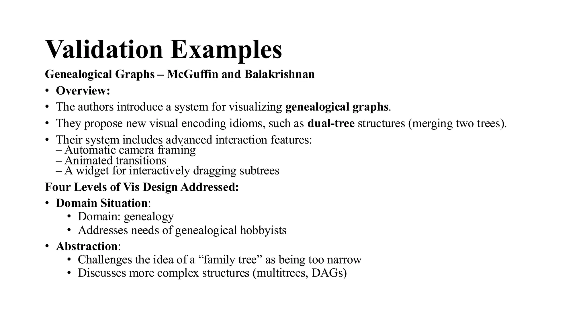
Genealogical Graphs– McGuffin and Balakrishnan
• Overview:
• The authors introduce a system for visualizing genealogical graphs.
• They propose new visual encoding idioms, such as dual-tree structures (merging two trees).
• Their system includes advanced interaction features:
– Automatic camera framing
– Animated transitions
– A widget for interactively dragging subtrees
Four Levels of Vis Design Addressed:
• Domain Situation:
• Domain: genealogy
• Addresses needs of genealogical hobbyists
• Abstraction:
• Challenges the idea of a “family tree” as being too narrow
• Discusses more complex structures (multitrees, DAGs)
77.
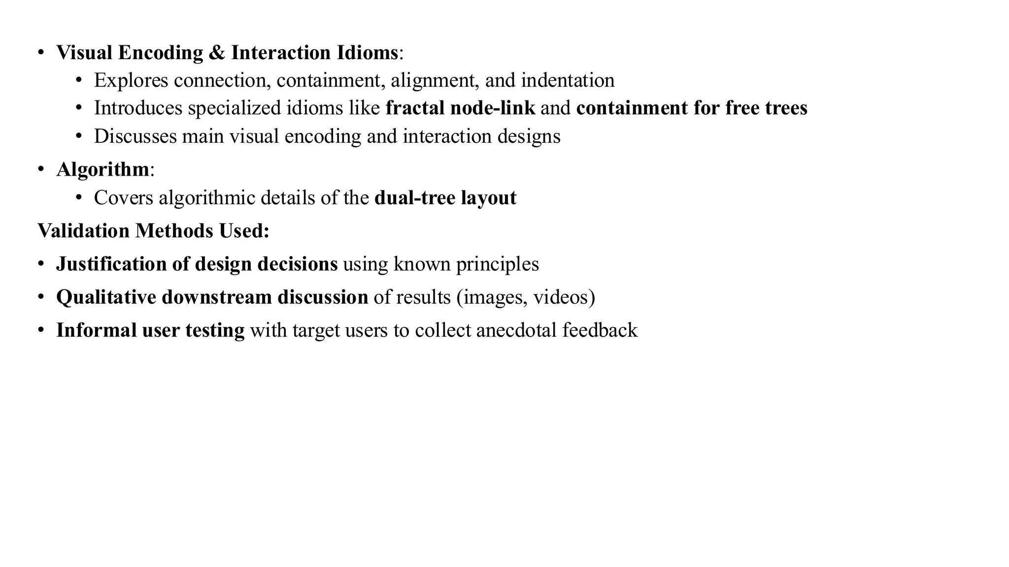
• Visual Encoding& Interaction Idioms:
• Explores connection, containment, alignment, and indentation
• Introduces specialized idioms like fractal node-link and containment for free trees
• Discusses main visual encoding and interaction designs
• Algorithm:
• Covers algorithmic details of the dual-tree layout
Validation Methods Used:
• Justification of design decisions using known principles
• Qualitative downstream discussion of results (images, videos)
• Informal user testing with target users to collect anecdotal feedback
78.
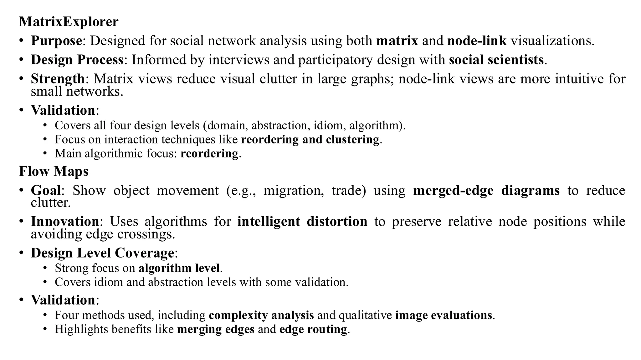
MatrixExplorer
• Purpose: Designedfor social network analysis using both matrix and node-link visualizations.
• Design Process: Informed by interviews and participatory design with social scientists.
• Strength: Matrix views reduce visual clutter in large graphs; node-link views are more intuitive for
small networks.
• Validation:
• Covers all four design levels (domain, abstraction, idiom, algorithm).
• Focus on interaction techniques like reordering and clustering.
• Main algorithmic focus: reordering.
Flow Maps
• Goal: Show object movement (e.g., migration, trade) using merged-edge diagrams to reduce
clutter.
• Innovation: Uses algorithms for intelligent distortion to preserve relative node positions while
avoiding edge crossings.
• Design Level Coverage:
• Strong focus on algorithm level.
• Covers idiom and abstraction levels with some validation.
• Validation:
• Four methods used, including complexity analysis and qualitative image evaluations.
• Highlights benefits like merging edges and edge routing.
79.
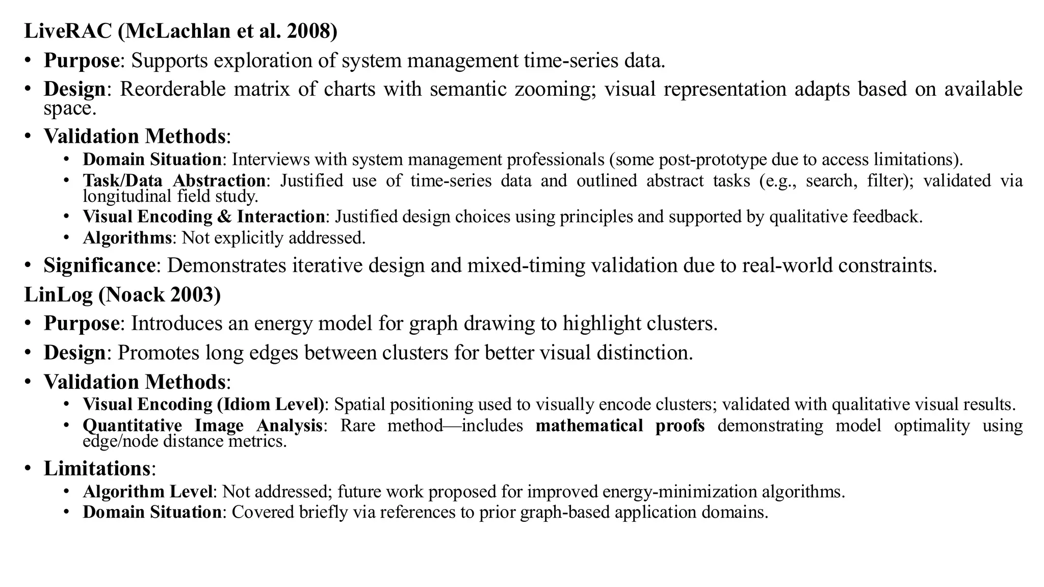
LiveRAC (McLachlan etal. 2008)
• Purpose: Supports exploration of system management time-series data.
• Design: Reorderable matrix of charts with semantic zooming; visual representation adapts based on available
space.
• Validation Methods:
• Domain Situation: Interviews with system management professionals (some post-prototype due to access limitations).
• Task/Data Abstraction: Justified use of time-series data and outlined abstract tasks (e.g., search, filter); validated via
longitudinal field study.
• Visual Encoding & Interaction: Justified design choices using principles and supported by qualitative feedback.
• Algorithms: Not explicitly addressed.
• Significance: Demonstrates iterative design and mixed-timing validation due to real-world constraints.
LinLog (Noack 2003)
• Purpose: Introduces an energy model for graph drawing to highlight clusters.
• Design: Promotes long edges between clusters for better visual distinction.
• Validation Methods:
• Visual Encoding (Idiom Level): Spatial positioning used to visually encode clusters; validated with qualitative visual results.
• Quantitative Image Analysis: Rare method—includes mathematical proofs demonstrating model optimality using
edge/node distance metrics.
• Limitations:
• Algorithm Level: Not addressed; future work proposed for improved energy-minimization algorithms.
• Domain Situation: Covered briefly via references to prior graph-based application domains.
80.
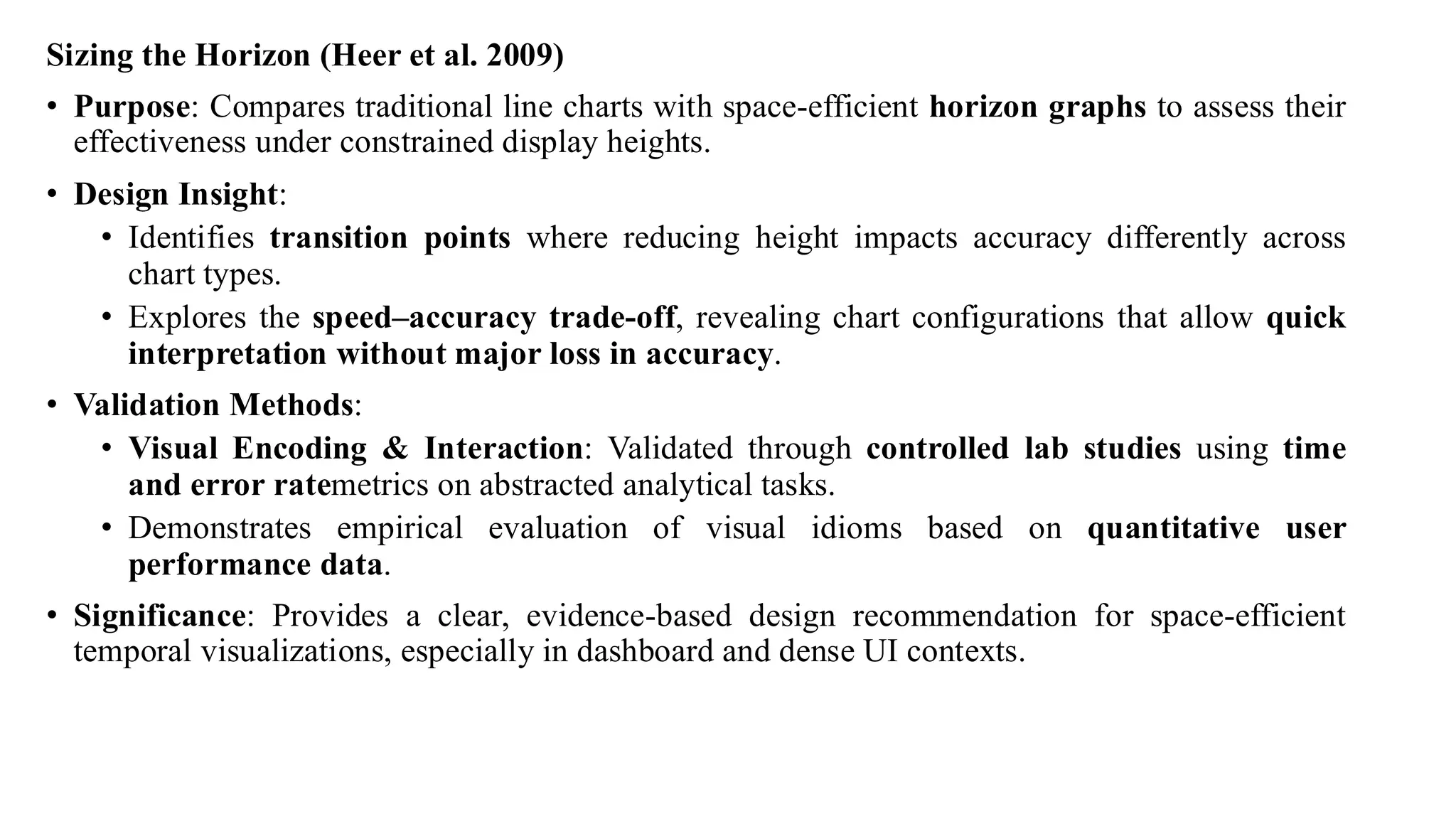
Sizing the Horizon(Heer et al. 2009)
• Purpose: Compares traditional line charts with space-efficient horizon graphs to assess their
effectiveness under constrained display heights.
• Design Insight:
• Identifies transition points where reducing height impacts accuracy differently across
chart types.
• Explores the speed–accuracy trade-off, revealing chart configurations that allow quick
interpretation without major loss in accuracy.
• Validation Methods:
• Visual Encoding & Interaction: Validated through controlled lab studies using time
and error ratemetrics on abstracted analytical tasks.
• Demonstrates empirical evaluation of visual idioms based on quantitative user
performance data.
• Significance: Provides a clear, evidence-based design recommendation for space-efficient
temporal visualizations, especially in dashboard and dense UI contexts.
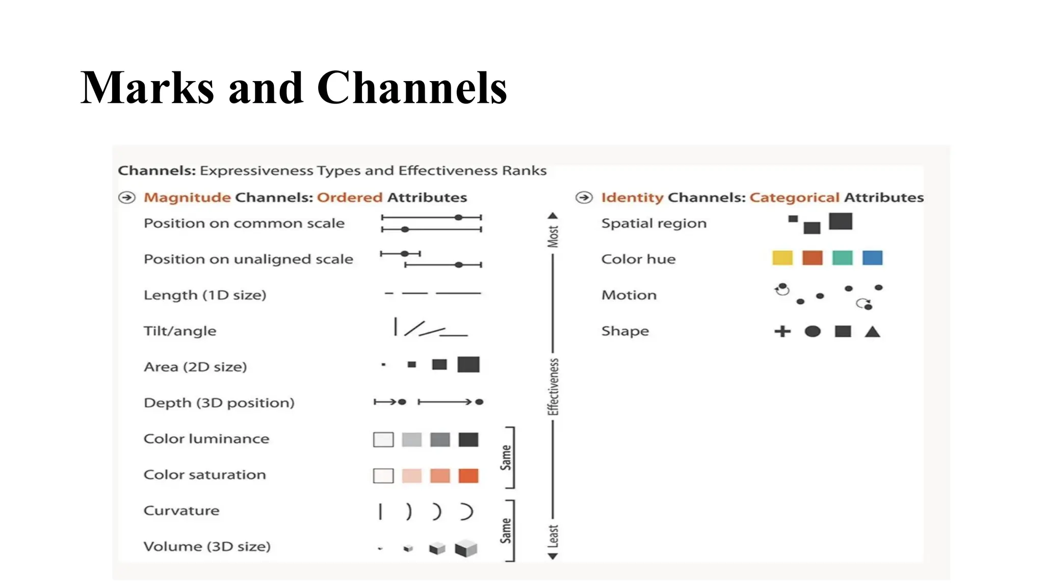
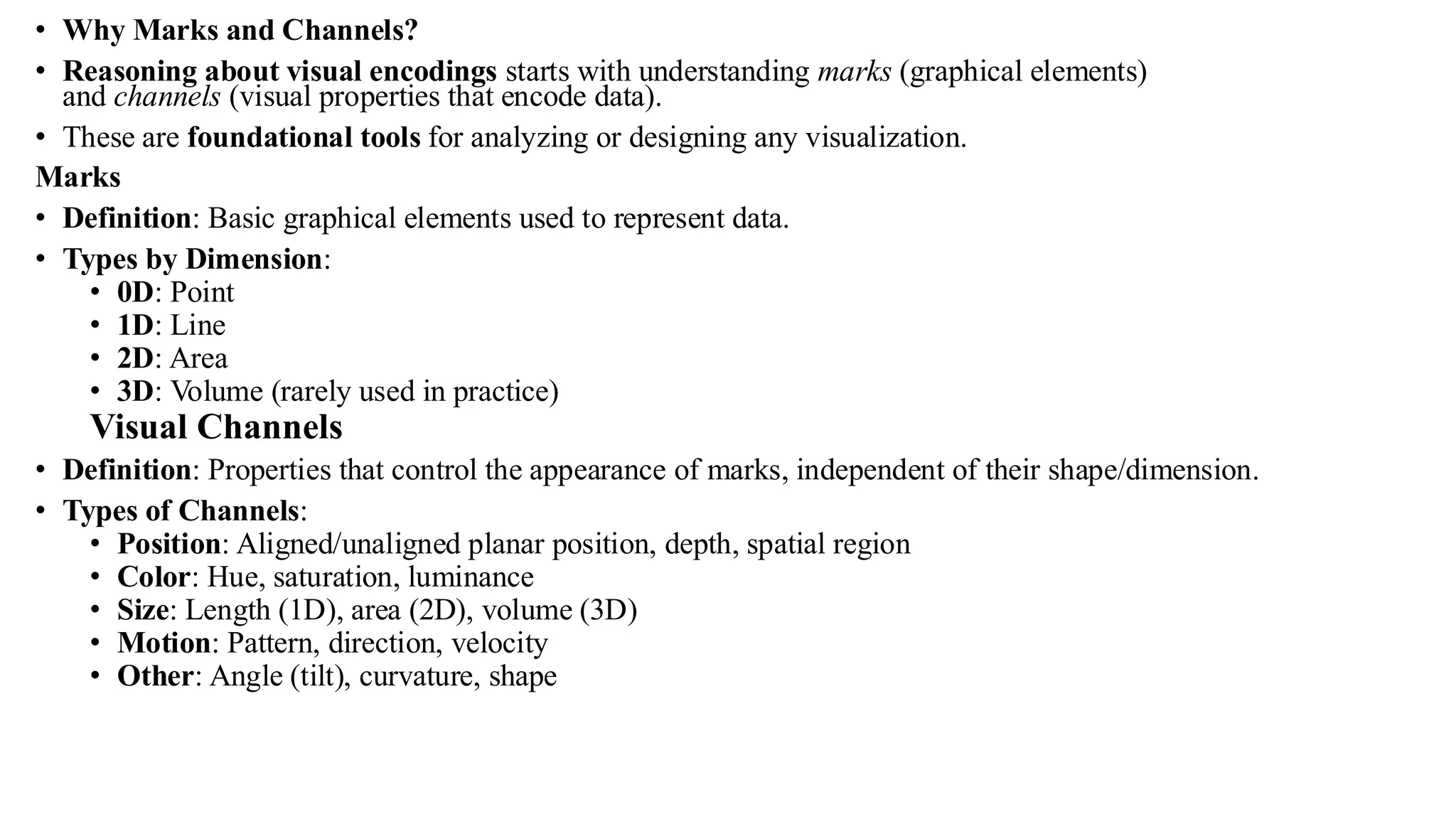
• Why Marksand Channels?
• Reasoning about visual encodings starts with understanding marks (graphical elements)
and channels (visual properties that encode data).
• These are foundational tools for analyzing or designing any visualization.
Marks
• Definition: Basic graphical elements used to represent data.
• Types by Dimension:
• 0D: Point
• 1D: Line
• 2D: Area
• 3D: Volume (rarely used in practice)
Visual Channels
• Definition: Properties that control the appearance of marks, independent of their shape/dimension.
• Types of Channels:
• Position: Aligned/unaligned planar position, depth, spatial region
• Color: Hue, saturation, luminance
• Size: Length (1D), area (2D), volume (3D)
• Motion: Pattern, direction, velocity
• Other: Angle (tilt), curvature, shape
83.
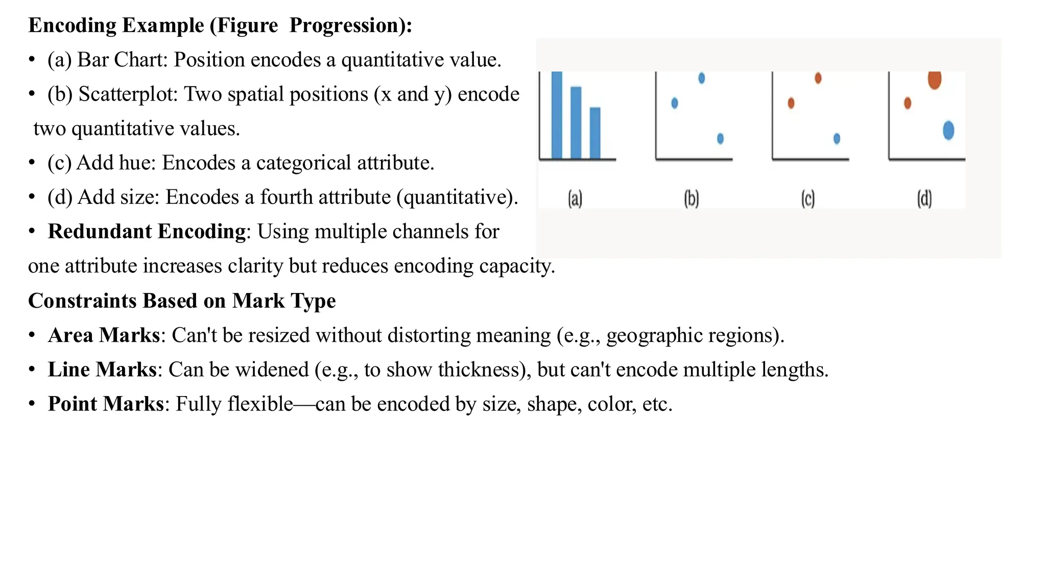
Encoding Example (FigureProgression):
• (a) Bar Chart: Position encodes a quantitative value.
• (b) Scatterplot: Two spatial positions (x and y) encode
two quantitative values.
• (c) Add hue: Encodes a categorical attribute.
• (d) Add size: Encodes a fourth attribute (quantitative).
• Redundant Encoding: Using multiple channels for
one attribute increases clarity but reduces encoding capacity.
Constraints Based on Mark Type
• Area Marks: Can't be resized without distorting meaning (e.g., geographic regions).
• Line Marks: Can be widened (e.g., to show thickness), but can't encode multiple lengths.
• Point Marks: Fully flexible—can be encoded by size, shape, color, etc.
84.
• Channel Types
•The human visual system uses two primary types of perceptual channels:
• Identity Channels
• Help in identifying what something is or where it is.
• Answer qualitative questions (categorical information).
• Examples:
• Shape (circle, triangle, cross)
• Hue (distinct color types)
• Motion pattern
• Spatial region or location
• Magnitude Channels
• Help in perceiving how much of something exists.
• Answer quantitative questions (measurable differences).
• Examples:
• Length (line length)
• Area, Volume (size comparison)
• Luminance (brightness/darkness)
• Saturation (color intensity)
• Tilt and Angle (directional or angular differences)
85.
• Mark Types
•Marks represent visual elements used to depict data items or relationships.
• For Table Datasets
• Marks represent individual data items.
• Types of item marks:
• Point
• Line
• Area
• For Network Datasets
• Marks can represent either:
• Nodes (items)
• Links (relationships between items)
• Types of Link Marks
• Connection:
• Line connecting two nodes
• Represents pairwise relationships
• Containment:
• Areas enclosing other marks
• Represents hierarchical (nested) relationships
• Synonyms: enclosure, nesting
• Note: Links cannot be represented as points; only nodes can be.
86.
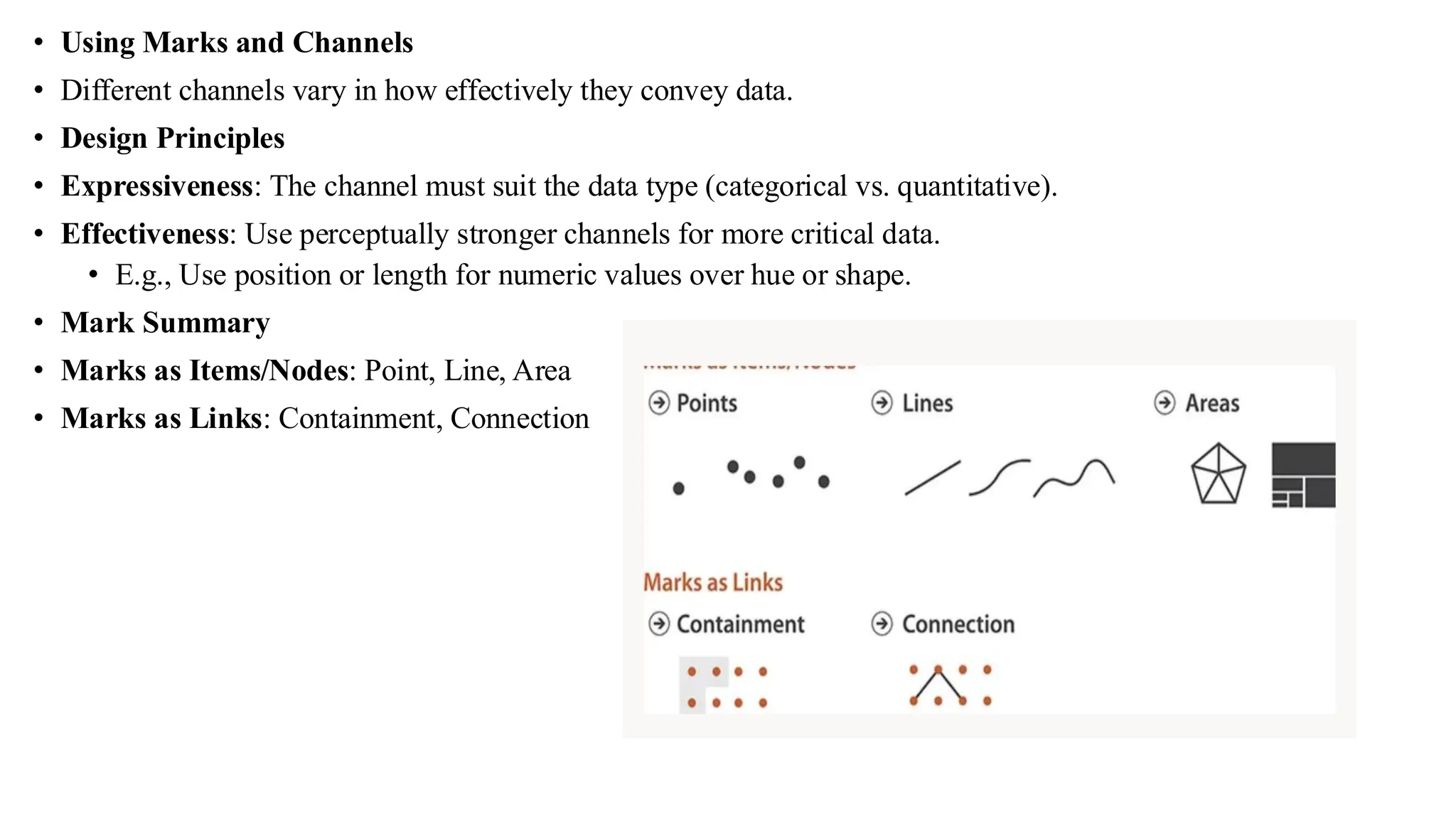
• Using Marksand Channels
• Different channels vary in how effectively they convey data.
• Design Principles
• Expressiveness: The channel must suit the data type (categorical vs. quantitative).
• Effectiveness: Use perceptually stronger channels for more critical data.
• E.g., Use position or length for numeric values over hue or shape.
• Mark Summary
• Marks as Items/Nodes: Point, Line, Area
• Marks as Links: Containment, Connection
87.
Data Visualization Tools
•Data visualization tools are software applications or libraries that allow users to represent
data visually through charts, graphs, maps, and interactive dashboards. These tools help in
identifying patterns, trends, and insights effectively, making data more accessible for
decision-making.
• Top 5 Data Visualization Tools
• Tableau
• User-friendly drag-and-drop interface
• Creates interactive dashboards and visual reports
• Connects to various data sources (Excel, SQL, cloud databases)
• Microsoft Power BI
• Integrates seamlessly with Microsoft Excel and Azure
• Offers real-time dashboard updates and strong analytics
• Suitable for enterprise-level reporting and sharing
88.
• Google DataStudio
• Free and web-based visualization tool by Google
• Connects with Google Sheets, Analytics, BigQuery
• Allows easy sharing and collaboration online
• D3.js
• JavaScript library for custom and interactive visualizations
• Offers full control over HTML, SVG, and CSS elements
• Ideal for developers who need flexibility
• Plotly
• Supports Python, R, and JavaScript
• Creates publication-quality, interactive charts
• Commonly used in data science and web dashboards