To perform basic calculations, descriptive statistics, frequency distribution and plotting various
graphs using R software
MADE BY
SHRIKRISHNA KESHARWANI
A Report On–
EXPERIMENT – 5
(Data Analysis Using R (Basic))
Submitted by-
SHRIKRISHNA KESHARWANI
Roll no.-
22CEM3R23
Subject-
TRANSPORTATION ANALYTICS LABORATORY
Bachelor of Technology
In
TRANSPORTATION ENGINEERING
DEPARTMENT OF CIVIL ENGINEERING
NATIONAL INSTITUTE OF TECHNOLOGY WARANGAL
OCTOBER, 2022
2.
Transportation Analytics Laboratory
SHRIKRISHNAKESHARWANI (22CEM3R23) 2
Table of Contents
i. Objective-...........................................................................................................................4
ii. Software Used-...................................................................................................................4
iii. Concept and Theory...........................................................................................................4
3.1 R language-......................................................................................................................4
3.2 Using R as a calculator ....................................................................................................4
3.3 Descriptive Statistics........................................................................................................4
3.3.1. Mean: .......................................................................................................................4
Mean(x) provides the values of arithmetic mean of the data in data vector x...................4
3.3.2. Median: ....................................................................................................................4
3.3.3 Mode-........................................................................................................................4
3.3.4. Range: ......................................................................................................................4
3.3.5 Class Interval: ...........................................................................................................5
3.3.6 Standard Deviation: ..................................................................................................5
3.3.7 Variance:...................................................................................................................5
3.3.8 Skewness:..................................................................................................................5
3.3.9 Kurtosis:....................................................................................................................5
3.3.10 Histogram:...............................................................................................................6
3.4 Frequency distribution Curve: .........................................................................................7
3.5 Ogive curve/ S curve/ Cumulative frequency curve:.......................................................7
3.6 Graphical tools.................................................................................................................7
3.6.1 - Bar diagrams- .........................................................................................................7
3.6.2 Pie diagrams- ............................................................................................................7
3.6.3 Histogram- ................................................................................................................7
3.6.4 Kernel density-..........................................................................................................7
3.6.7 Stem and leaf plots etc… ..........................................................................................7
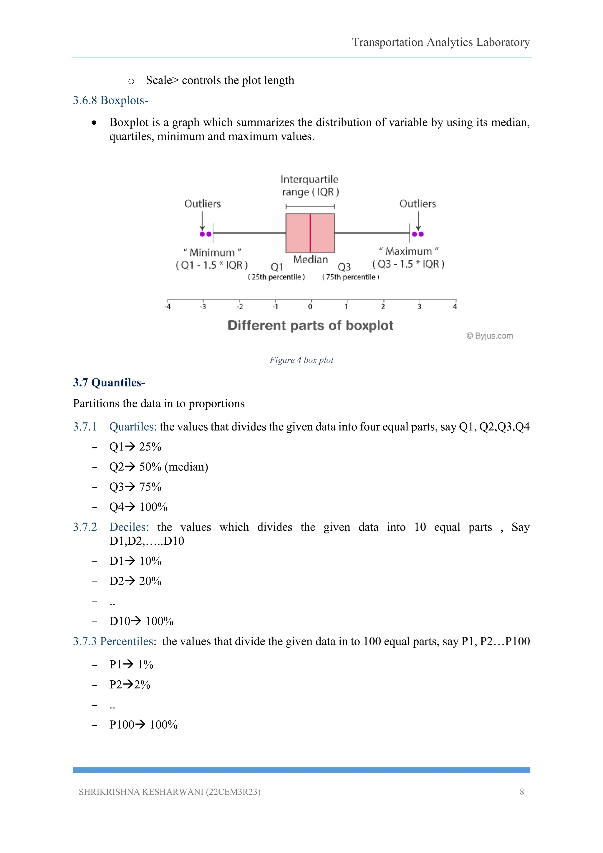
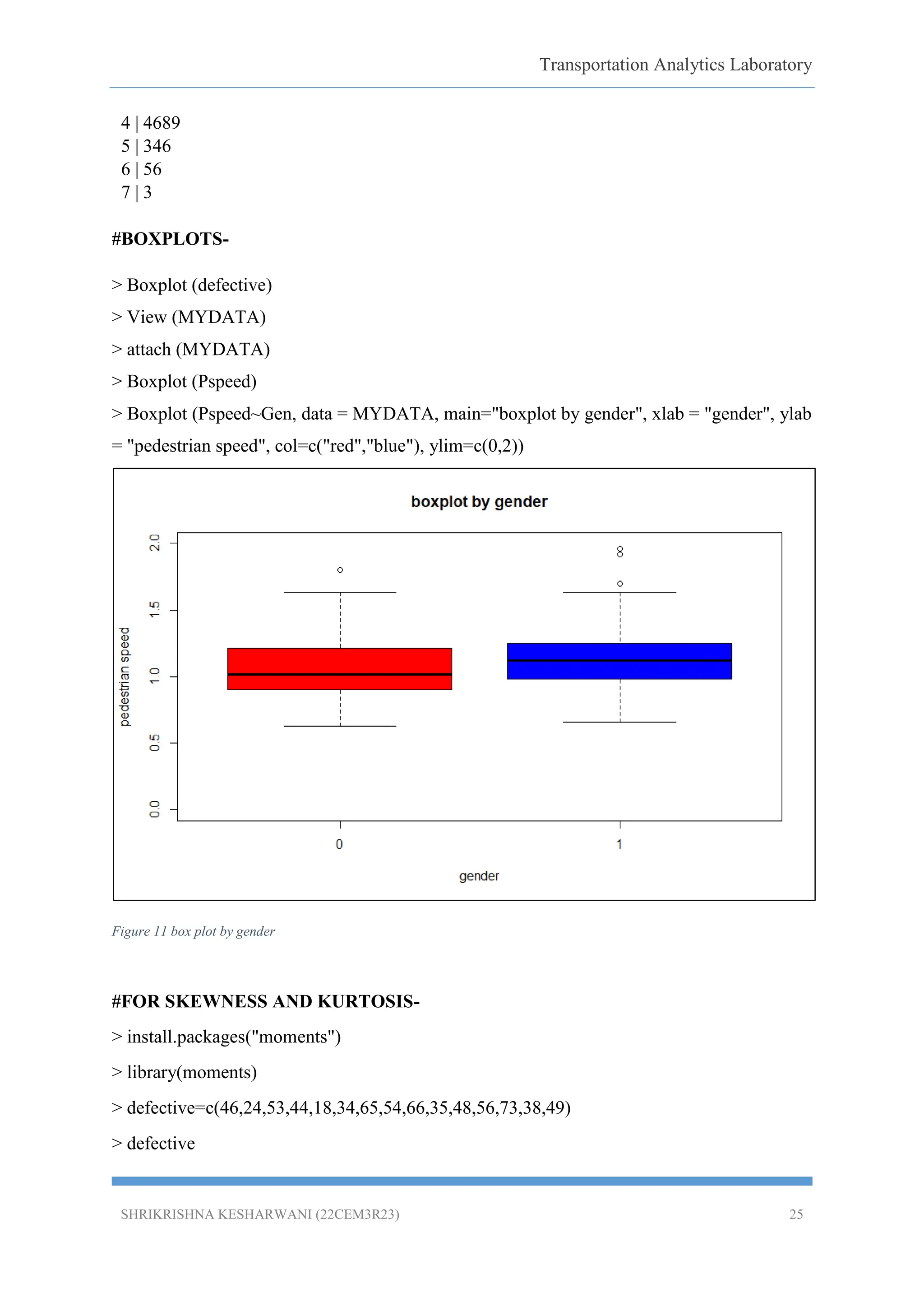
3.6.8 Boxplots-...................................................................................................................8
3.7 Quantiles-.........................................................................................................................8
3.7.1 Quartiles:..............................................................................................................8
3.7.2 Deciles: ................................................................................................................8
3.7.3 Percentiles.................................................................................................................8
iv. Procedure: ..........................................................................................................................9
3.
Transportation Analytics Laboratory
SHRIKRISHNAKESHARWANI (22CEM3R23) 3
v. Data Analysis:....................................................................................................................9
5.1 Basic calculations (codes)- ..............................................................................................9
5.2 Other functions. (Codes)................................................................................................10
5.3 Missing data, Quantiles and descriptive statistics (codes)- ...........................................10
5.4 Frequency distribution and cumulative frequency diagram- .........................................14
5.5 Graphics and plots- ........................................................................................................19
6. Results & Discussion:..........................................................................................................26
7. Conclusion: .........................................................................................................................26
Reference .................................................................................................................................26
List of Figures-
Figure 1 positively and negatively skewed ................................................................................5
Figure 2 Types of Kurtosis.........................................................................................................6
Figure 3 Histogram....................................................................................................................6
Figure 4 box plot........................................................................................................................8
Figure 5 Cumulative frequency for male and females.............................................................19
Figure 6 qualification of persons .............................................................................................20
Figure 7 accident statistics.......................................................................................................21
Figure 8 3D pie chart indicating qualification of person .........................................................22
Figure 9 histogram showing speed of vehicles........................................................................23
Figure 10 kernel density plot ...................................................................................................24
Figure 11 box plot by gender...................................................................................................25
4.
Transportation Analytics Laboratory
SHRIKRISHNAKESHARWANI (22CEM3R23) 4
i. Objective-
To perform basic calculations, descriptive statistics, frequency distribution and plotting various
graphs using R software.
ii. Software Used-
iii. Concept and Theory
3.1 R language-
R is a language and environment for statistical computing and graphics. R provides a wide
variety of statistical (linear and nonlinear modelling, classical statistical tests, time-series
analysis, classification, clustering,) and graphical techniques, and is highly extensible. The S
language is often the vehicle of choice for research in statistical methodology, and R provides
an Open Source route to participation in that activity.
3.2 Using R as a calculator
R can be used as a powerful calculator by entering equations directly at the prompt in the
command console. Simply type your arithmetic expression and press ENTER. R will evaluate
the expressions and respond with the result.
3.3 Descriptive Statistics.
3.3.1. Mean:
Mean(x) provides the values of arithmetic mean of the data in data vector x.
3.3.2. Median:
Median is the value which divides the observations into two equal parts
At least 50% of the values are greater than or equal to the median and
At least 50% of the values are less than or equal to the median
Median is the better average than arithmetic mean in case of Extreme observations.
3.3.3 Mode-
Mode is the value which occurs more frequently in a set of observations
Distributions having one mode are called unimodal and one with two modes are called
bimodal
3.3.4. Range:
The Range is the difference between the lowest and highest values.
5.
Transportation Analytics Laboratory
SHRIKRISHNAKESHARWANI (22CEM3R23) 5
3.3.5 Class Interval:
Class Interval =
Where N is total number of data (Count).
3.3.6 Standard Deviation:
In statistics, the standard deviation is a measure of the amount of variation or dispersion of a
set of values. A low standard deviation indicates that the values tend to be close to the mean of
the set, while a high standard deviation indicates that the values are spread out over a wider
range.
3.3.7 Variance:
In statistics, variance is the expectation of the squared deviation of a random variable from its
mean. Informally, it measures how far a set of numbers is spread out from their average value.
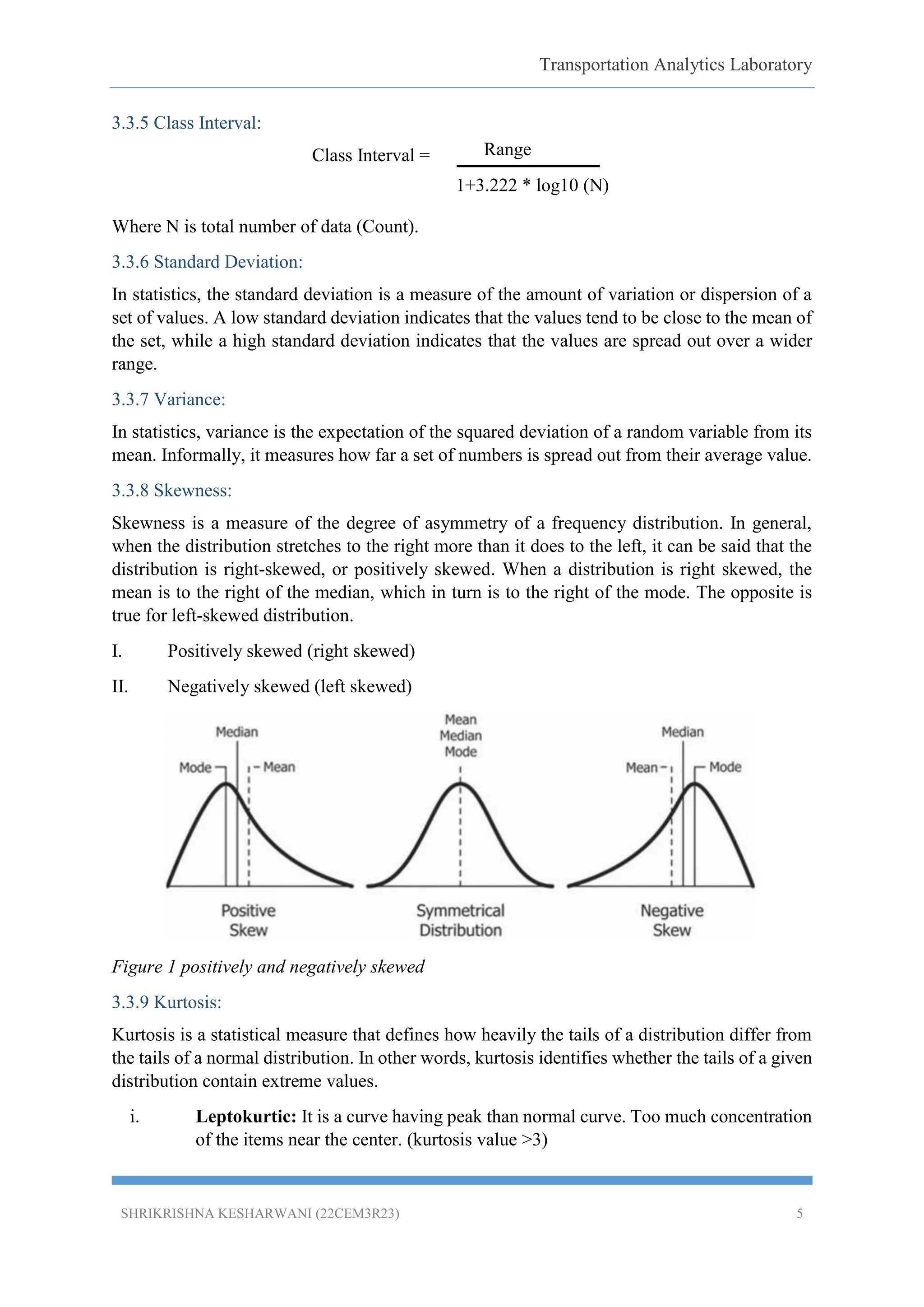
3.3.8 Skewness:
Skewness is a measure of the degree of asymmetry of a frequency distribution. In general,
when the distribution stretches to the right more than it does to the left, it can be said that the
distribution is right-skewed, or positively skewed. When a distribution is right skewed, the
mean is to the right of the median, which in turn is to the right of the mode. The opposite is
true for left-skewed distribution.
I. Positively skewed (right skewed)
II. Negatively skewed (left skewed)
Figure 1 positively and negatively skewed
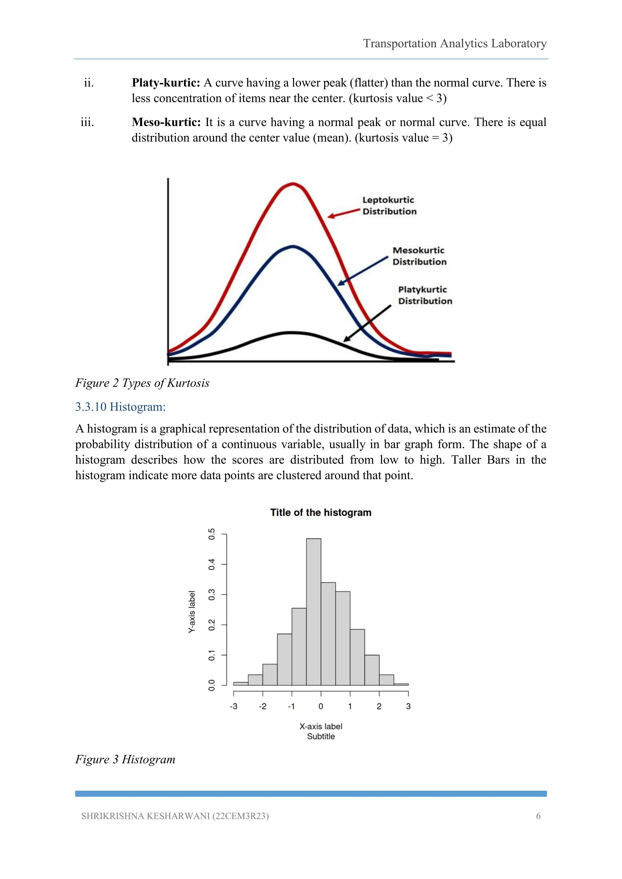
3.3.9 Kurtosis:
Kurtosis is a statistical measure that defines how heavily the tails of a distribution differ from
the tails of a normal distribution. In other words, kurtosis identifies whether the tails of a given
distribution contain extreme values.
i. Leptokurtic: It is a curve having peak than normal curve. Too much concentration
of the items near the center. (kurtosis value >3)
Range
1+3.222 * log10 (N)
6.
Transportation Analytics Laboratory
SHRIKRISHNAKESHARWANI (22CEM3R23) 6
ii. Platy-kurtic: A curve having a lower peak (flatter) than the normal curve. There is
less concentration of items near the center. (kurtosis value < 3)
iii. Meso-kurtic: It is a curve having a normal peak or normal curve. There is equal
distribution around the center value (mean). (kurtosis value = 3)
Figure 2 Types of Kurtosis
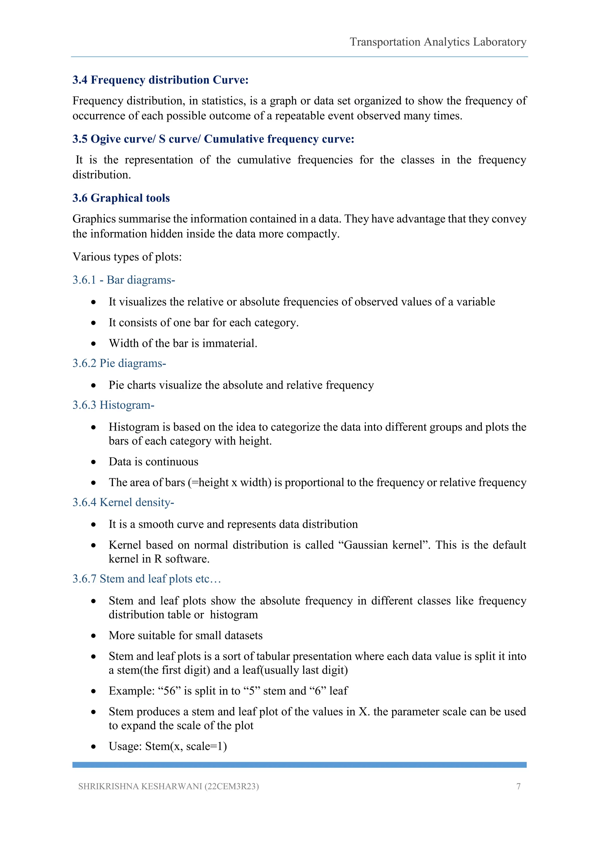
3.3.10 Histogram:
A histogram is a graphical representation of the distribution of data, which is an estimate of the
probability distribution of a continuous variable, usually in bar graph form. The shape of a
histogram describes how the scores are distributed from low to high. Taller Bars in the
histogram indicate more data points are clustered around that point.
Figure 3 Histogram
7.
Transportation Analytics Laboratory
SHRIKRISHNAKESHARWANI (22CEM3R23) 7
3.4 Frequency distribution Curve:
Frequency distribution, in statistics, is a graph or data set organized to show the frequency of
occurrence of each possible outcome of a repeatable event observed many times.
3.5 Ogive curve/ S curve/ Cumulative frequency curve:
It is the representation of the cumulative frequencies for the classes in the frequency
distribution.
3.6 Graphical tools
Graphics summarise the information contained in a data. They have advantage that they convey
the information hidden inside the data more compactly.
Various types of plots:
3.6.1 - Bar diagrams-
It visualizes the relative or absolute frequencies of observed values of a variable
It consists of one bar for each category.
Width of the bar is immaterial.
3.6.2 Pie diagrams-
Pie charts visualize the absolute and relative frequency
3.6.3 Histogram-
Histogram is based on the idea to categorize the data into different groups and plots the
bars of each category with height.
Data is continuous
The area of bars (=height x width) is proportional to the frequency or relative frequency
3.6.4 Kernel density-
It is a smooth curve and represents data distribution
Kernel based on normal distribution is called “Gaussian kernel”. This is the default
kernel in R software.
3.6.7 Stem and leaf plots etc…
Stem and leaf plots show the absolute frequency in different classes like frequency
distribution table or histogram
More suitable for small datasets
Stem and leaf plots is a sort of tabular presentation where each data value is split it into
a stem(the first digit) and a leaf(usually last digit)
Example: “56” is split in to “5” stem and “6” leaf
Stem produces a stem and leaf plot of the values in X. the parameter scale can be used
to expand the scale of the plot
Usage: Stem(x, scale=1)
8.
Transportation Analytics Laboratory
SHRIKRISHNAKESHARWANI (22CEM3R23) 8
o Scale> controls the plot length
3.6.8 Boxplots-
Boxplot is a graph which summarizes the distribution of variable by using its median,
quartiles, minimum and maximum values.
Figure 4 box plot
3.7 Quantiles-
Partitions the data in to proportions
3.7.1 Quartiles: the values that divides the given data into four equal parts, say Q1, Q2,Q3,Q4
– Q1 25%
– Q2 50% (median)
– Q3 75%
– Q4 100%
3.7.2 Deciles: the values which divides the given data into 10 equal parts , Say
D1,D2,…..D10
– D1 10%
– D2 20%
– ..
– D10 100%
3.7.3 Percentiles: the values that divide the given data in to 100 equal parts, say P1, P2…P100
– P1 1%
– P22%
– ..
– P100 100%
9.
Transportation Analytics Laboratory
SHRIKRISHNAKESHARWANI (22CEM3R23) 9
iv. Procedure:
The following is the procedure followed for the analysis:
i. The given data is imported to R studio and it attached using the code> Attach
(filename).
ii. Some of the data has been typed manually in r studio.
iii. Perform basic calculations, descriptive statistics, frequency distribution and
plotting various graphs using various types of codes.
v. Data Analysis:
5.1 Basic calculations (codes)-
Addition: > 2+3
[1] 5
Multiplication: > 2*3
[1] 6
Subtraction: > 2-3
[1] -1
Division: > 2/3
[1] 0.6666
Cube root: > 2^3 or 2**3
[1] 8
Square- c(2,3,5,7)^2 for square of 2,3,5,6
[1] 4 9 25 49
■ > c(2,3,5,7) ^ c(2,3) for 2 square, 3 cube, 5 square and 7 cube
[1] 4 27 25 343
■ >c(2,3,5,7)* c(8,9) for 2x8, 3x9, 5x8, 7x9
[1] 16 27 40 63
■ > c(2,3,5,7)+ c(8,9) for 2+8, 3+9, 5+8, 7+9
10.
Transportation Analytics Laboratory
SHRIKRISHNAKESHARWANI (22CEM3R23) 10
[1] 10 12 13 16
Maximum (max): max (values)
>max (1.2, 3.4,-7.8) or max(c (1.2, 3.4,-7.8))
[1] 3.4
Minimum (min): min (values)
>min (1.2, 3.4,-7.8)
[1] -7.8
5.2 Other functions. (Codes)
Absolute value – abs()
Square root – sqrt()
Rounding – round()
Sum and product – sum(), prod()
Exponential – exp()
Trigonometric functions – sin (), cos () etc.
Hyperbolic functions – sinh(), cosh() etc.
5.3 Missing data, Quantiles and descriptive statistics (codes)-
Table 1 DESCRIPTIVE STATISTICS
Variable Mean Median Mode Std. Dev
Pspeed 1.090429 1.08 1.02, 1.2 0.234301
Vspeed 15.31603 14.06 10.20 4.402192
Vgap 5.058886 4.52 6.48 2.373786
Wtime 8.394057 4.57 10.84 8.209393
time.na=c(NA, 45, 83, 74, 55, 66)
> time.na
[1] NA 45 83 74 55 66
# For mean calculation-
> mean (time.na, na.rm=T)
Transportation Analytics Laboratory
SHRIKRISHNAKESHARWANI (22CEM3R23) 18
> female=MYDATA[MYDATA$Gen==0,]
> View(male)
# for male data
> mydata_male=count(male,'Pspeed')
> View(mydata_male)
> cumu1m=cumsum(mydata_male$freq)
> cumu1percm=cumu1m/nrow(male)
> mydata_male=cbind(mydata_male,cumu1percm)
> View(mydata_male)
#for female data
> View(female)
> mydata_female=count(female,'Pspeed')
> View(mydata_female)
> cumu1f=cumsum(mydata_female$freq)
> cumu1percf=cumu1f/nrow(female)
> mydata_female=cbind(mydata_female,cumu1percf)
> View(mydata_female)
> ggplot()+geom_line(data =
mydata_male,aes(x=Pspeed,y=cumu1percm),color="red")+geom_line(data =
mydata_female,aes(x=Pspeed,y=cumu1percf),color="blue")
> lgd= scale_color_manual("legend",values = c(male="red", female="blue"))
> ggplot()+geom_line(data =
mydata_male,aes(x=Pspeed,y=cumu1percm,color="male"),size=1.3) + geom_line(data =
mydata_female,aes(x=Pspeed,y=cumu1percf,color="female"),size=1.3)+lgd+xlab("Pedestria
n speed")+ylab("cumulative frequency")+ggtitle("CDF curves for male and female")
19.
Transportation Analytics Laboratory
SHRIKRISHNAKESHARWANI (22CEM3R23) 19
Figure 5 Cumulative frequency for male and females.
5.5 Graphics and plots-
#FOR BAR GRAPH PLOT
Example: code of qualification of 10 persons by using, say 1 for graduate (G) and 2 for Non-
graduate (N)
G N G N G G G N G G
1 2 1 2 1 1 1 2 1 1
quali=c(1,2,1,2,1,1,1,2,1,1)
> quali
[1] 1 2 1 2 1 1 1 2 1 1
> barplot(quali)
> barplot(table(quali))
20.
Transportation Analytics Laboratory
SHRIKRISHNAKESHARWANI (22CEM3R23) 20
> barplot(table(quali)/length(quali))
#to give title to the graph
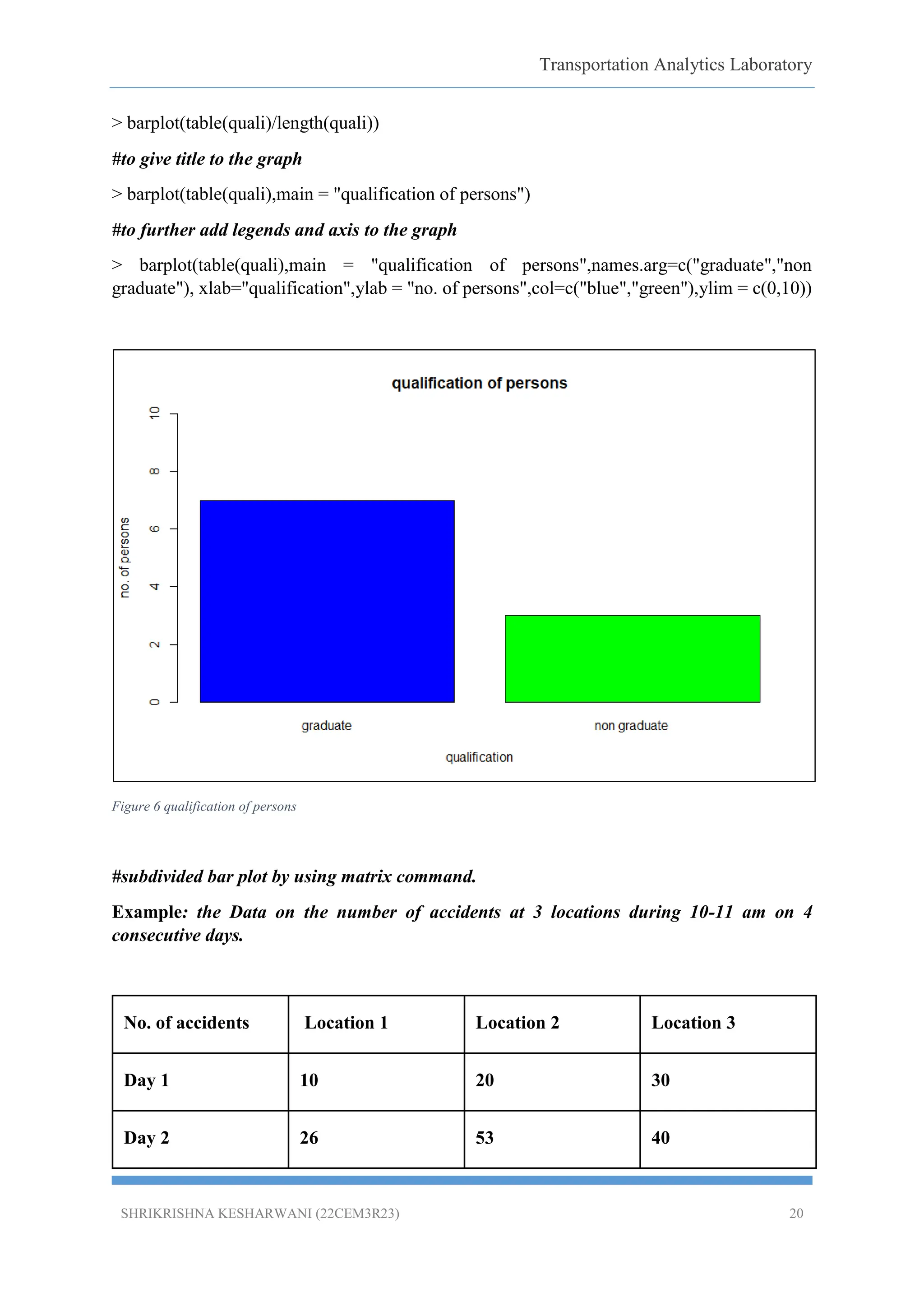
> barplot(table(quali),main = "qualification of persons")
#to further add legends and axis to the graph
> barplot(table(quali),main = "qualification of persons",names.arg=c("graduate","non
graduate"), xlab="qualification",ylab = "no. of persons",col=c("blue","green"),ylim = c(0,10))
Figure 6 qualification of persons
#subdivided bar plot by using matrix command.
Example: the Data on the number of accidents at 3 locations during 10-11 am on 4
consecutive days.
No. of accidents Location 1 Location 2 Location 3
Day 1 10 20 30
Day 2 26 53 40
Transportation Analytics Laboratory
SHRIKRISHNAKESHARWANI (22CEM3R23) 22
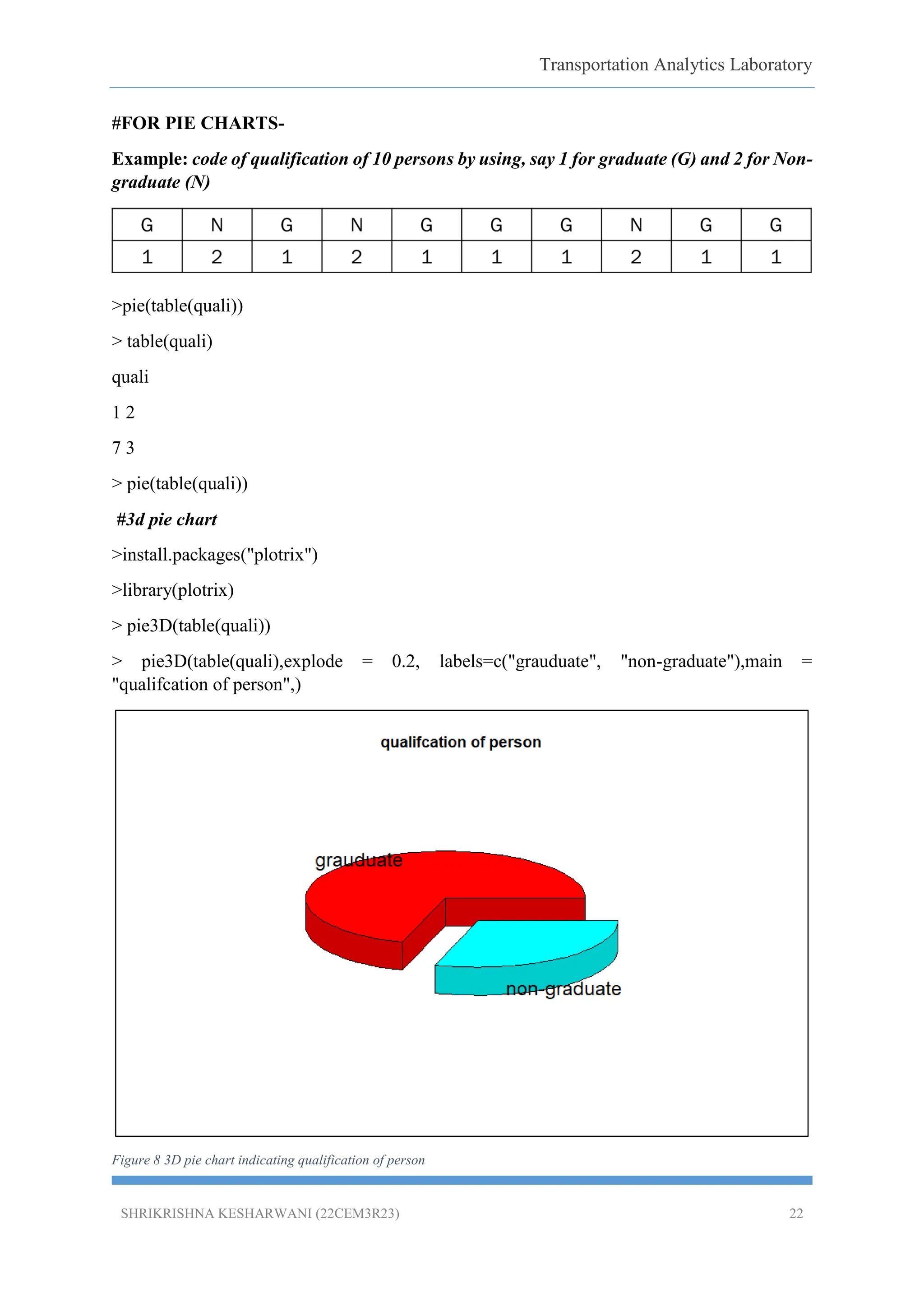
#FOR PIE CHARTS-
Example: code of qualification of 10 persons by using, say 1 for graduate (G) and 2 for Non-
graduate (N)
>pie(table(quali))
> table(quali)
quali
1 2
7 3
> pie(table(quali))
#3d pie chart
>install.packages("plotrix")
>library(plotrix)
> pie3D(table(quali))
> pie3D(table(quali),explode = 0.2, labels=c("grauduate", "non-graduate"),main =
"qualifcation of person",)
Figure 8 3D pie chart indicating qualification of person
Transportation Analytics Laboratory
SHRIKRISHNAKESHARWANI (22CEM3R23) 24
Figure 10 kernel density plot
# Steam or leaf plot-
> defective=c(46,24,53,44,18,34,65,54,66,35,48,56,73,38,49)
> defective
[1] 46 24 53 44 18 34 65 54 66 35 48 56 73 38 49
> stem(defective,scale=1)
The decimal point is 1 digit(s) to the right of the |
0 | 8
2 | 4458
4 | 4689346
6 | 563
> stem(defective,scale=2)
The decimal point is 1 digit(s) to the right of the |
1 | 8
2 | 4
3 | 458
Transportation Analytics Laboratory
SHRIKRISHNAKESHARWANI (22CEM3R23) 26
[1] 46 24 53 44 18 34 65 54 66 35 48 56 73 38 49
> skewness(defective)
[1] -0.1701834
> kurtosis(defective)
[1] 2.38949
6. Results & Discussion:
Cumulative frequency curves graph shows the avg. speed of female pedestrians are mode
than male pedestrians.
Plotted Bar graph and pie chart shows the no. of graduates are more than no. of non-
graduates.
Subdivided bar plot for road accidents shows that there are higher number of road accidents
in lane 3.
7. Conclusion:
1. R Programming is the best mechanism for statistics and data analysis for transport
engineers.
2. Various types of graphs can easily be plotted with the help of r studio.
3. R software is designed to handle larger data sets, to be reproducible and to create more
detailed visualization.
4. Although R is a popular language used by many programmers, it is especially effective
when used for
Data analysis
Statistical inference
Machine learning algorithms.
Reference
1. https://web.cs.ucla.edu/~gulzar/rstudio/basic-tutorial.html.
2. https://cran.r-project.org/doc/contrib/usingR.pdf.
![Transportation Analytics Laboratory
SHRIKRISHNA KESHARWANI (22CEM3R23) 9
iv. Procedure:
The following is the procedure followed for the analysis:
i. The given data is imported to R studio and it attached using the code> Attach
(filename).
ii. Some of the data has been typed manually in r studio.
iii. Perform basic calculations, descriptive statistics, frequency distribution and
plotting various graphs using various types of codes.
v. Data Analysis:
5.1 Basic calculations (codes)-
Addition: > 2+3
[1] 5
Multiplication: > 2*3
[1] 6
Subtraction: > 2-3
[1] -1
Division: > 2/3
[1] 0.6666
Cube root: > 2^3 or 2**3
[1] 8
Square- c(2,3,5,7)^2 for square of 2,3,5,6
[1] 4 9 25 49
■ > c(2,3,5,7) ^ c(2,3) for 2 square, 3 cube, 5 square and 7 cube
[1] 4 27 25 343
■ >c(2,3,5,7)* c(8,9) for 2x8, 3x9, 5x8, 7x9
[1] 16 27 40 63
■ > c(2,3,5,7)+ c(8,9) for 2+8, 3+9, 5+8, 7+9](https://image.slidesharecdn.com/22cem3r23dataanalysisusingrbasic-250713152547-af26bf50/75/Data-Analysis-using-R-BASIC-_R-SOFTWARE-9-2048.jpg)
![Transportation Analytics Laboratory
SHRIKRISHNA KESHARWANI (22CEM3R23) 10
[1] 10 12 13 16
Maximum (max): max (values)
>max (1.2, 3.4,-7.8) or max(c (1.2, 3.4,-7.8))
[1] 3.4
Minimum (min): min (values)
>min (1.2, 3.4,-7.8)
[1] -7.8
5.2 Other functions. (Codes)
Absolute value – abs()
Square root – sqrt()
Rounding – round()
Sum and product – sum(), prod()
Exponential – exp()
Trigonometric functions – sin (), cos () etc.
Hyperbolic functions – sinh(), cosh() etc.
5.3 Missing data, Quantiles and descriptive statistics (codes)-
Table 1 DESCRIPTIVE STATISTICS
Variable Mean Median Mode Std. Dev
Pspeed 1.090429 1.08 1.02, 1.2 0.234301
Vspeed 15.31603 14.06 10.20 4.402192
Vgap 5.058886 4.52 6.48 2.373786
Wtime 8.394057 4.57 10.84 8.209393
time.na=c(NA, 45, 83, 74, 55, 66)
> time.na
[1] NA 45 83 74 55 66
# For mean calculation-
> mean (time.na, na.rm=T)](https://image.slidesharecdn.com/22cem3r23dataanalysisusingrbasic-250713152547-af26bf50/75/Data-Analysis-using-R-BASIC-_R-SOFTWARE-10-2048.jpg)
![Transportation Analytics Laboratory
SHRIKRISHNA KESHARWANI (22CEM3R23) 11
[1] 64.6
> time=c (32,35,55,88,77,54,5,45,5,25,58)
> time
[1] 32 35 55 88 77 54 5 45 5 25 58
# for median calculation-
> median(time)
[1] 45
> time.na=c (NA,NA,45,83,74,55,68,38,35,55,66,65,42,68,72,84,67,36,42,58)
> time.na
[1] NA NA 45 83 74 55 68 38 35 55 66 65 42 68 72 84 67 36 42 58
#for mode calculation-
> data=c(10,10,10,10,2,2,3,4,5,6)
> data
[1] 10 10 10 10 2 2 3 4 5 6
> modetab=table(as.vector(data))
> modetab
2 3 4 5 6 10
2 1 1 1 1 4
> names(modetab)[modetab==max(modetab)]
[1] "10"
#for standard deviation, variance, summary, minimum and maximum value-
> time=c(32,35,45,83,74,55,68,38,35,55,66,65,42,68,72,84,67,36,42,58)
> var(time)
[1] 283.3684
> sd(time)
[1] 16.83355
> min(time)
[1] 32
> max(time)](https://image.slidesharecdn.com/22cem3r23dataanalysisusingrbasic-250713152547-af26bf50/75/Data-Analysis-using-R-BASIC-_R-SOFTWARE-11-2048.jpg)
![Transportation Analytics Laboratory
SHRIKRISHNA KESHARWANI (22CEM3R23) 12
[1] 84
> summary(time)
Min. 1st Qu. Median Mean 3rd Qu. Max.
32.0 41.0 56.5 56.0 68.0 84.0
#Quantiles calculation-
> speed=c(66,25,30,42,47,59,59,47,65,56,49)
> speed
[1] 66 25 30 42 47 59 59 47 65 56 49
> quantile(speed)
0% 25% 50% 75% 100%
25.0 44.5 49.0 59.0 66.0
> #for quartiles divide the data by 0.25
> probs=seq(0,1,by=0.25)
> probs
[1] 0.00 0.25 0.50 0.75 1.00
> quantile(speed, probs=0.25)
25%
44.5
> quantile(speed, probs=seq(0,1,by=0.25))
0% 25% 50% 75% 100%
25.0 44.5 49.0 59.0 66.0
#for deciles divide by 0.1
> quantile(speed, probs=seq(0,1,by=0.10))
0% 10% 20% 30% 40% 50% 60% 70% 80% 90% 100%
25 30 42 47 47 49 56 59 59 65 66
> quantile(speed, probs=seq(0,1,by=0.01))
0% 1% 2% 3% 4% 5% 6% 7% 8% 9% 10% 11% 12% 13% 14% 15% 16%
17% 18% 19% 20% 21%
25.0 25.5 26.0 26.5 27.0 27.5 28.0 28.5 29.0 29.5 30.0 31.2 32.4 33.6 34.8 36.0 37.2 38.4 39.6
40.8 42.0 42.5](https://image.slidesharecdn.com/22cem3r23dataanalysisusingrbasic-250713152547-af26bf50/75/Data-Analysis-using-R-BASIC-_R-SOFTWARE-12-2048.jpg)
![Transportation Analytics Laboratory
SHRIKRISHNA KESHARWANI (22CEM3R23) 13
22% 23% 24% 25% 26% 27% 28% 29% 30% 31% 32% 33% 34% 35% 36% 37%
38% 39% 40% 41% 42% 43%
43.0 43.5 44.0 44.5 45.0 45.5 46.0 46.5 47.0 47.0 47.0 47.0 47.0 47.0 47.0 47.0 47.0 47.0 47.0
47.2 47.4 47.6
44% 45% 46% 47% 48% 49% 50% 51% 52% 53% 54% 55% 56% 57% 58% 59%
60% 61% 62% 63% 64% 65%
47.8 48.0 48.2 48.4 48.6 48.8 49.0 49.7 50.4 51.1 51.8 52.5 53.2 53.9 54.6 55.3 56.0 56.3 56.6
56.9 57.2 57.5
66% 67% 68% 69% 70% 71% 72% 73% 74% 75% 76% 77% 78% 79% 80% 81%
82% 83% 84% 85% 86% 87%
57.8 58.1 58.4 58.7 59.0 59.0 59.0 59.0 59.0 59.0 59.0 59.0 59.0 59.0 59.0 59.6 60.2 60.8 61.4
62.0 62.6 63.2
88% 89% 90% 91% 92% 93% 94% 95% 96% 97% 98% 99% 100%
63.8 64.4 65.0 65.1 65.2 65.3 65.4 65.5 65.6 65.7 65.8 65.9 66.0
> range(time)
[1] 32 84
> summary(time)
Min. 1st Qu. Median Mean 3rd Qu. Max.
32.0 41.0 56.5 56.0 68.0 84.0
> breaks=seq(30,90,by=10)
> breaks
[1] 30 40 50 60 70 80 90
> time.cut=cut(time,breaks,right=FALSE)
> time.cut
[1] [30,40) [30,40) [40,50) [80,90) [70,80) [50,60) [60,70) [30,40) [30,40) [50,60) [60,70)
[60,70) [40,50)
[14] [60,70) [70,80) [80,90) [60,70) [30,40) [40,50) [50,60)
Levels: [30,40) [40,50) [50,60) [60,70) [70,80) [80,90)
> table(time.cut)
time.cut
[30,40) [40,50) [50,60) [60,70) [70,80) [80,90)
5 3 3 5 2 2](https://image.slidesharecdn.com/22cem3r23dataanalysisusingrbasic-250713152547-af26bf50/75/Data-Analysis-using-R-BASIC-_R-SOFTWARE-13-2048.jpg)
![Transportation Analytics Laboratory
SHRIKRISHNA KESHARWANI (22CEM3R23) 14
#to make it in a table form
> cbind(table(time.cut))
[,1]
[30,40) 5
[40,50) 3
[50,60) 3
[60,70) 5
[70,80) 2
[80,90) 2
> #or we can also use transform
> transform(table(time.cut))
time.cut Freq
1 [30,40) 5
2 [40,50) 3
3 [50,60) 3
4 [60,70) 5
5 [70,80) 2
6 [80,90) 2
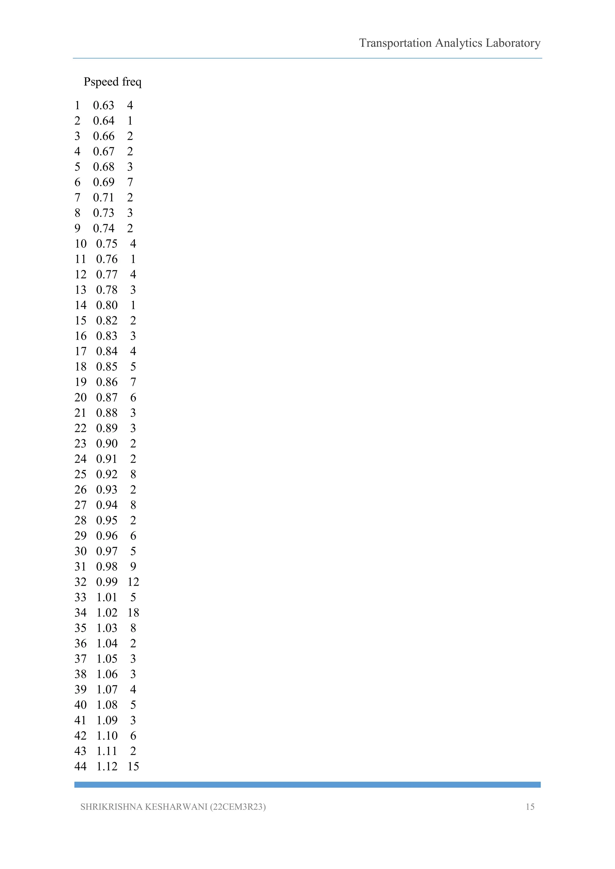
5.4 Frequency distribution and cumulative frequency diagram-
# CUMMULATIVE FREEQUENCY GRAPH PLOT-(CODE USED)-
View(MYDATA)
> attach(MYDATA)
The following objects are masked from MYDATA (pos = 4):
AccLAGGap, Age, COG, DYB, FATM, FD, Gen, NOL, Platoon, POM, PPCC, PRgap,
PSCC, Pspeed, PUC,
TOG, TOV, VGap, Vspeed, WOM, Wtime
> MYDATA2=count(MYDATA,"Pspeed")
> MYDATA2](https://image.slidesharecdn.com/22cem3r23dataanalysisusingrbasic-250713152547-af26bf50/75/Data-Analysis-using-R-BASIC-_R-SOFTWARE-14-2048.jpg)
![Transportation Analytics Laboratory
SHRIKRISHNA KESHARWANI (22CEM3R23) 17
> CUMU1
[1] 4 5 7 9 12 19 21 24 26 30 31 35 38 39 41 44 48 53 60 66 69 72 74 76 84
86
[27] 94 96 102 107 116 128 133 151 159 161 164 167 171 176 179 185 187 202 204 206 210
216 220 226 244 252
[53] 253 261 276 287 289 294 295 297 299 301 307 308 311 318 319 320 322 323 324 325
327 328 329 331 335 338
[79] 339 340 342 343 346 347 348 349 350
> CUMU1PERC=CUMU1/nrow(MYDATA)
> CUMU1PERC
[1] 0.01142857 0.01428571 0.02000000 0.02571429 0.03428571 0.05428571 0.06000000
0.06857143 0.07428571
[10] 0.08571429 0.08857143 0.10000000 0.10857143 0.11142857 0.11714286 0.12571429
0.13714286 0.15142857
[19] 0.17142857 0.18857143 0.19714286 0.20571429 0.21142857 0.21714286 0.24000000
0.24571429 0.26857143
[28] 0.27428571 0.29142857 0.30571429 0.33142857 0.36571429 0.38000000 0.43142857
0.45428571 0.46000000
[37] 0.46857143 0.47714286 0.48857143 0.50285714 0.51142857 0.52857143 0.53428571
0.57714286 0.58285714
[46] 0.58857143 0.60000000 0.61714286 0.62857143 0.64571429 0.69714286 0.72000000
0.72285714 0.74571429
[55] 0.78857143 0.82000000 0.82571429 0.84000000 0.84285714 0.84857143 0.85428571
0.86000000 0.87714286
[64] 0.88000000 0.88857143 0.90857143 0.91142857 0.91428571 0.92000000 0.92285714
0.92571429 0.92857143
[73] 0.93428571 0.93714286 0.94000000 0.94571429 0.95714286 0.96571429 0.96857143
0.97142857 0.97714286
[82] 0.98000000 0.98857143 0.99142857 0.99428571 0.99714286 1.00000000
#add cumulative frequencies column to the initial mydata1 matrix
> MYDATA2=cbind(MYDATA2,CUMU1PERC)
> library(ggplot2)
> ggplot()+geom_line(data = MYDATA2, aes(x= Pspeed, y= CUMU1PERC))
> male=MYDATA[MYDATA$Gen==1,]](https://image.slidesharecdn.com/22cem3r23dataanalysisusingrbasic-250713152547-af26bf50/75/Data-Analysis-using-R-BASIC-_R-SOFTWARE-17-2048.jpg)
![Transportation Analytics Laboratory
SHRIKRISHNA KESHARWANI (22CEM3R23) 18
> female=MYDATA[MYDATA$Gen==0,]
> View(male)
# for male data
> mydata_male=count(male,'Pspeed')
> View(mydata_male)
> cumu1m=cumsum(mydata_male$freq)
> cumu1percm=cumu1m/nrow(male)
> mydata_male=cbind(mydata_male,cumu1percm)
> View(mydata_male)
#for female data
> View(female)
> mydata_female=count(female,'Pspeed')
> View(mydata_female)
> cumu1f=cumsum(mydata_female$freq)
> cumu1percf=cumu1f/nrow(female)
> mydata_female=cbind(mydata_female,cumu1percf)
> View(mydata_female)
> ggplot()+geom_line(data =
mydata_male,aes(x=Pspeed,y=cumu1percm),color="red")+geom_line(data =
mydata_female,aes(x=Pspeed,y=cumu1percf),color="blue")
> lgd= scale_color_manual("legend",values = c(male="red", female="blue"))
> ggplot()+geom_line(data =
mydata_male,aes(x=Pspeed,y=cumu1percm,color="male"),size=1.3) + geom_line(data =
mydata_female,aes(x=Pspeed,y=cumu1percf,color="female"),size=1.3)+lgd+xlab("Pedestria
n speed")+ylab("cumulative frequency")+ggtitle("CDF curves for male and female")](https://image.slidesharecdn.com/22cem3r23dataanalysisusingrbasic-250713152547-af26bf50/75/Data-Analysis-using-R-BASIC-_R-SOFTWARE-18-2048.jpg)
![Transportation Analytics Laboratory
SHRIKRISHNA KESHARWANI (22CEM3R23) 19
Figure 5 Cumulative frequency for male and females.
5.5 Graphics and plots-
#FOR BAR GRAPH PLOT
Example: code of qualification of 10 persons by using, say 1 for graduate (G) and 2 for Non-
graduate (N)
G N G N G G G N G G
1 2 1 2 1 1 1 2 1 1
quali=c(1,2,1,2,1,1,1,2,1,1)
> quali
[1] 1 2 1 2 1 1 1 2 1 1
> barplot(quali)
> barplot(table(quali))](https://image.slidesharecdn.com/22cem3r23dataanalysisusingrbasic-250713152547-af26bf50/75/Data-Analysis-using-R-BASIC-_R-SOFTWARE-19-2048.jpg)
![Transportation Analytics Laboratory
SHRIKRISHNA KESHARWANI (22CEM3R23) 21
Day 3 42 15 25
Day 4 30 75 100
accidents=matrix(nrow=4,ncol = 3,data = c(10,20,30,26,53,40,42,15,25,30,75,100),byrow =
T)
> Accidents
[, 1] [, 2] [, 3]
[1,] 10 20 30
[2,] 26 53 40
[3,] 42 15 25
[4,] 30 75 100
> barplot(accidents,main="accidents statistics", names.arg=c("L1","L2","L3"),xlab="road
locations",ylab="no. of accidents",col=c("blue","green","orange","red"))
Figure 7 accident statistics](https://image.slidesharecdn.com/22cem3r23dataanalysisusingrbasic-250713152547-af26bf50/75/Data-Analysis-using-R-BASIC-_R-SOFTWARE-21-2048.jpg)
![Transportation Analytics Laboratory
SHRIKRISHNA KESHARWANI (22CEM3R23) 23
#HISTOGRAMS
>speed=c(66,25,30,42,47,59,59,47,65,56,49.64,37.66,35,42,33,36,27,43,65,21,42,48,58,46,5
4,57,24,25,58,59,64,43,54,52,41,64,31,52,52,61,43,43,39,31,25,45,40,63)
> speed
[1] 66.00 25.00 30.00 42.00 47.00 59.00 59.00 47.00 65.00 56.00 49.64 37.66 35.00 42.00
33.00 36.00 27.00
[18] 43.00 65.00 21.00 42.00 48.00 58.00 46.00 54.00 57.00 24.00 25.00 58.00 59.00 64.00
43.00 54.00 52.00
[35] 41.00 64.00 31.00 52.00 52.00 61.00 43.00 43.00 39.00 31.00 25.00 45.00 40.00 63.00
> hist(speed, main="speed of vehicles", col="green", xlab="speeds", ylab="no. of persons")
Figure 9 histogram showing speed of vehicles
#KERNEL DENSITY CURVE
> lines(density(speed,adjust = 2))
> plot(density(speed))
> plot(density(speed,adjust=0.5))](https://image.slidesharecdn.com/22cem3r23dataanalysisusingrbasic-250713152547-af26bf50/75/Data-Analysis-using-R-BASIC-_R-SOFTWARE-23-2048.jpg)
![Transportation Analytics Laboratory
SHRIKRISHNA KESHARWANI (22CEM3R23) 24
Figure 10 kernel density plot
# Steam or leaf plot-
> defective=c(46,24,53,44,18,34,65,54,66,35,48,56,73,38,49)
> defective
[1] 46 24 53 44 18 34 65 54 66 35 48 56 73 38 49
> stem(defective,scale=1)
The decimal point is 1 digit(s) to the right of the |
0 | 8
2 | 4458
4 | 4689346
6 | 563
> stem(defective,scale=2)
The decimal point is 1 digit(s) to the right of the |
1 | 8
2 | 4
3 | 458](https://image.slidesharecdn.com/22cem3r23dataanalysisusingrbasic-250713152547-af26bf50/75/Data-Analysis-using-R-BASIC-_R-SOFTWARE-24-2048.jpg)
![Transportation Analytics Laboratory
SHRIKRISHNA KESHARWANI (22CEM3R23) 26
[1] 46 24 53 44 18 34 65 54 66 35 48 56 73 38 49
> skewness(defective)
[1] -0.1701834
> kurtosis(defective)
[1] 2.38949
6. Results & Discussion:
Cumulative frequency curves graph shows the avg. speed of female pedestrians are mode
than male pedestrians.
Plotted Bar graph and pie chart shows the no. of graduates are more than no. of non-
graduates.
Subdivided bar plot for road accidents shows that there are higher number of road accidents
in lane 3.
7. Conclusion:
1. R Programming is the best mechanism for statistics and data analysis for transport
engineers.
2. Various types of graphs can easily be plotted with the help of r studio.
3. R software is designed to handle larger data sets, to be reproducible and to create more
detailed visualization.
4. Although R is a popular language used by many programmers, it is especially effective
when used for
Data analysis
Statistical inference
Machine learning algorithms.
Reference
1. https://web.cs.ucla.edu/~gulzar/rstudio/basic-tutorial.html.
2. https://cran.r-project.org/doc/contrib/usingR.pdf.](https://image.slidesharecdn.com/22cem3r23dataanalysisusingrbasic-250713152547-af26bf50/75/Data-Analysis-using-R-BASIC-_R-SOFTWARE-26-2048.jpg)


![Transportation Analytics Laboratory
SHRIKRISHNA KESHARWANI (22CEM3R23) 9
iv. Procedure:
The following is the procedure followed for the analysis:
i. The given data is imported to R studio and it attached using the code> Attach
(filename).
ii. Some of the data has been typed manually in r studio.
iii. Perform basic calculations, descriptive statistics, frequency distribution and
plotting various graphs using various types of codes.
v. Data Analysis:
5.1 Basic calculations (codes)-
Addition: > 2+3
[1] 5
Multiplication: > 2*3
[1] 6
Subtraction: > 2-3
[1] -1
Division: > 2/3
[1] 0.6666
Cube root: > 2^3 or 2**3
[1] 8
Square- c(2,3,5,7)^2 for square of 2,3,5,6
[1] 4 9 25 49
■ > c(2,3,5,7) ^ c(2,3) for 2 square, 3 cube, 5 square and 7 cube
[1] 4 27 25 343
■ >c(2,3,5,7)* c(8,9) for 2x8, 3x9, 5x8, 7x9
[1] 16 27 40 63
■ > c(2,3,5,7)+ c(8,9) for 2+8, 3+9, 5+8, 7+9](https://crownmelresort.com/image.slidesharecdn.com/22cem3r23dataanalysisusingrbasic-250713152547-af26bf50/75/Data-Analysis-using-R-BASIC-_R-SOFTWARE-9-2048.jpg)
![Transportation Analytics Laboratory
SHRIKRISHNA KESHARWANI (22CEM3R23) 10
[1] 10 12 13 16
Maximum (max): max (values)
>max (1.2, 3.4,-7.8) or max(c (1.2, 3.4,-7.8))
[1] 3.4
Minimum (min): min (values)
>min (1.2, 3.4,-7.8)
[1] -7.8
5.2 Other functions. (Codes)
Absolute value – abs()
Square root – sqrt()
Rounding – round()
Sum and product – sum(), prod()
Exponential – exp()
Trigonometric functions – sin (), cos () etc.
Hyperbolic functions – sinh(), cosh() etc.
5.3 Missing data, Quantiles and descriptive statistics (codes)-
Table 1 DESCRIPTIVE STATISTICS
Variable Mean Median Mode Std. Dev
Pspeed 1.090429 1.08 1.02, 1.2 0.234301
Vspeed 15.31603 14.06 10.20 4.402192
Vgap 5.058886 4.52 6.48 2.373786
Wtime 8.394057 4.57 10.84 8.209393
time.na=c(NA, 45, 83, 74, 55, 66)
> time.na
[1] NA 45 83 74 55 66
# For mean calculation-
> mean (time.na, na.rm=T)](https://crownmelresort.com/image.slidesharecdn.com/22cem3r23dataanalysisusingrbasic-250713152547-af26bf50/75/Data-Analysis-using-R-BASIC-_R-SOFTWARE-10-2048.jpg)
![Transportation Analytics Laboratory
SHRIKRISHNA KESHARWANI (22CEM3R23) 11
[1] 64.6
> time=c (32,35,55,88,77,54,5,45,5,25,58)
> time
[1] 32 35 55 88 77 54 5 45 5 25 58
# for median calculation-
> median(time)
[1] 45
> time.na=c (NA,NA,45,83,74,55,68,38,35,55,66,65,42,68,72,84,67,36,42,58)
> time.na
[1] NA NA 45 83 74 55 68 38 35 55 66 65 42 68 72 84 67 36 42 58
#for mode calculation-
> data=c(10,10,10,10,2,2,3,4,5,6)
> data
[1] 10 10 10 10 2 2 3 4 5 6
> modetab=table(as.vector(data))
> modetab
2 3 4 5 6 10
2 1 1 1 1 4
> names(modetab)[modetab==max(modetab)]
[1] "10"
#for standard deviation, variance, summary, minimum and maximum value-
> time=c(32,35,45,83,74,55,68,38,35,55,66,65,42,68,72,84,67,36,42,58)
> var(time)
[1] 283.3684
> sd(time)
[1] 16.83355
> min(time)
[1] 32
> max(time)](https://crownmelresort.com/image.slidesharecdn.com/22cem3r23dataanalysisusingrbasic-250713152547-af26bf50/75/Data-Analysis-using-R-BASIC-_R-SOFTWARE-11-2048.jpg)
![Transportation Analytics Laboratory
SHRIKRISHNA KESHARWANI (22CEM3R23) 12
[1] 84
> summary(time)
Min. 1st Qu. Median Mean 3rd Qu. Max.
32.0 41.0 56.5 56.0 68.0 84.0
#Quantiles calculation-
> speed=c(66,25,30,42,47,59,59,47,65,56,49)
> speed
[1] 66 25 30 42 47 59 59 47 65 56 49
> quantile(speed)
0% 25% 50% 75% 100%
25.0 44.5 49.0 59.0 66.0
> #for quartiles divide the data by 0.25
> probs=seq(0,1,by=0.25)
> probs
[1] 0.00 0.25 0.50 0.75 1.00
> quantile(speed, probs=0.25)
25%
44.5
> quantile(speed, probs=seq(0,1,by=0.25))
0% 25% 50% 75% 100%
25.0 44.5 49.0 59.0 66.0
#for deciles divide by 0.1
> quantile(speed, probs=seq(0,1,by=0.10))
0% 10% 20% 30% 40% 50% 60% 70% 80% 90% 100%
25 30 42 47 47 49 56 59 59 65 66
> quantile(speed, probs=seq(0,1,by=0.01))
0% 1% 2% 3% 4% 5% 6% 7% 8% 9% 10% 11% 12% 13% 14% 15% 16%
17% 18% 19% 20% 21%
25.0 25.5 26.0 26.5 27.0 27.5 28.0 28.5 29.0 29.5 30.0 31.2 32.4 33.6 34.8 36.0 37.2 38.4 39.6
40.8 42.0 42.5](https://crownmelresort.com/image.slidesharecdn.com/22cem3r23dataanalysisusingrbasic-250713152547-af26bf50/75/Data-Analysis-using-R-BASIC-_R-SOFTWARE-12-2048.jpg)
![Transportation Analytics Laboratory
SHRIKRISHNA KESHARWANI (22CEM3R23) 13
22% 23% 24% 25% 26% 27% 28% 29% 30% 31% 32% 33% 34% 35% 36% 37%
38% 39% 40% 41% 42% 43%
43.0 43.5 44.0 44.5 45.0 45.5 46.0 46.5 47.0 47.0 47.0 47.0 47.0 47.0 47.0 47.0 47.0 47.0 47.0
47.2 47.4 47.6
44% 45% 46% 47% 48% 49% 50% 51% 52% 53% 54% 55% 56% 57% 58% 59%
60% 61% 62% 63% 64% 65%
47.8 48.0 48.2 48.4 48.6 48.8 49.0 49.7 50.4 51.1 51.8 52.5 53.2 53.9 54.6 55.3 56.0 56.3 56.6
56.9 57.2 57.5
66% 67% 68% 69% 70% 71% 72% 73% 74% 75% 76% 77% 78% 79% 80% 81%
82% 83% 84% 85% 86% 87%
57.8 58.1 58.4 58.7 59.0 59.0 59.0 59.0 59.0 59.0 59.0 59.0 59.0 59.0 59.0 59.6 60.2 60.8 61.4
62.0 62.6 63.2
88% 89% 90% 91% 92% 93% 94% 95% 96% 97% 98% 99% 100%
63.8 64.4 65.0 65.1 65.2 65.3 65.4 65.5 65.6 65.7 65.8 65.9 66.0
> range(time)
[1] 32 84
> summary(time)
Min. 1st Qu. Median Mean 3rd Qu. Max.
32.0 41.0 56.5 56.0 68.0 84.0
> breaks=seq(30,90,by=10)
> breaks
[1] 30 40 50 60 70 80 90
> time.cut=cut(time,breaks,right=FALSE)
> time.cut
[1] [30,40) [30,40) [40,50) [80,90) [70,80) [50,60) [60,70) [30,40) [30,40) [50,60) [60,70)
[60,70) [40,50)
[14] [60,70) [70,80) [80,90) [60,70) [30,40) [40,50) [50,60)
Levels: [30,40) [40,50) [50,60) [60,70) [70,80) [80,90)
> table(time.cut)
time.cut
[30,40) [40,50) [50,60) [60,70) [70,80) [80,90)
5 3 3 5 2 2](https://crownmelresort.com/image.slidesharecdn.com/22cem3r23dataanalysisusingrbasic-250713152547-af26bf50/75/Data-Analysis-using-R-BASIC-_R-SOFTWARE-13-2048.jpg)
![Transportation Analytics Laboratory
SHRIKRISHNA KESHARWANI (22CEM3R23) 14
#to make it in a table form
> cbind(table(time.cut))
[,1]
[30,40) 5
[40,50) 3
[50,60) 3
[60,70) 5
[70,80) 2
[80,90) 2
> #or we can also use transform
> transform(table(time.cut))
time.cut Freq
1 [30,40) 5
2 [40,50) 3
3 [50,60) 3
4 [60,70) 5
5 [70,80) 2
6 [80,90) 2
5.4 Frequency distribution and cumulative frequency diagram-
# CUMMULATIVE FREEQUENCY GRAPH PLOT-(CODE USED)-
View(MYDATA)
> attach(MYDATA)
The following objects are masked from MYDATA (pos = 4):
AccLAGGap, Age, COG, DYB, FATM, FD, Gen, NOL, Platoon, POM, PPCC, PRgap,
PSCC, Pspeed, PUC,
TOG, TOV, VGap, Vspeed, WOM, Wtime
> MYDATA2=count(MYDATA,"Pspeed")
> MYDATA2](https://crownmelresort.com/image.slidesharecdn.com/22cem3r23dataanalysisusingrbasic-250713152547-af26bf50/75/Data-Analysis-using-R-BASIC-_R-SOFTWARE-14-2048.jpg)


![Transportation Analytics Laboratory
SHRIKRISHNA KESHARWANI (22CEM3R23) 17
> CUMU1
[1] 4 5 7 9 12 19 21 24 26 30 31 35 38 39 41 44 48 53 60 66 69 72 74 76 84
86
[27] 94 96 102 107 116 128 133 151 159 161 164 167 171 176 179 185 187 202 204 206 210
216 220 226 244 252
[53] 253 261 276 287 289 294 295 297 299 301 307 308 311 318 319 320 322 323 324 325
327 328 329 331 335 338
[79] 339 340 342 343 346 347 348 349 350
> CUMU1PERC=CUMU1/nrow(MYDATA)
> CUMU1PERC
[1] 0.01142857 0.01428571 0.02000000 0.02571429 0.03428571 0.05428571 0.06000000
0.06857143 0.07428571
[10] 0.08571429 0.08857143 0.10000000 0.10857143 0.11142857 0.11714286 0.12571429
0.13714286 0.15142857
[19] 0.17142857 0.18857143 0.19714286 0.20571429 0.21142857 0.21714286 0.24000000
0.24571429 0.26857143
[28] 0.27428571 0.29142857 0.30571429 0.33142857 0.36571429 0.38000000 0.43142857
0.45428571 0.46000000
[37] 0.46857143 0.47714286 0.48857143 0.50285714 0.51142857 0.52857143 0.53428571
0.57714286 0.58285714
[46] 0.58857143 0.60000000 0.61714286 0.62857143 0.64571429 0.69714286 0.72000000
0.72285714 0.74571429
[55] 0.78857143 0.82000000 0.82571429 0.84000000 0.84285714 0.84857143 0.85428571
0.86000000 0.87714286
[64] 0.88000000 0.88857143 0.90857143 0.91142857 0.91428571 0.92000000 0.92285714
0.92571429 0.92857143
[73] 0.93428571 0.93714286 0.94000000 0.94571429 0.95714286 0.96571429 0.96857143
0.97142857 0.97714286
[82] 0.98000000 0.98857143 0.99142857 0.99428571 0.99714286 1.00000000
#add cumulative frequencies column to the initial mydata1 matrix
> MYDATA2=cbind(MYDATA2,CUMU1PERC)
> library(ggplot2)
> ggplot()+geom_line(data = MYDATA2, aes(x= Pspeed, y= CUMU1PERC))
> male=MYDATA[MYDATA$Gen==1,]](https://crownmelresort.com/image.slidesharecdn.com/22cem3r23dataanalysisusingrbasic-250713152547-af26bf50/75/Data-Analysis-using-R-BASIC-_R-SOFTWARE-17-2048.jpg)
![Transportation Analytics Laboratory
SHRIKRISHNA KESHARWANI (22CEM3R23) 18
> female=MYDATA[MYDATA$Gen==0,]
> View(male)
# for male data
> mydata_male=count(male,'Pspeed')
> View(mydata_male)
> cumu1m=cumsum(mydata_male$freq)
> cumu1percm=cumu1m/nrow(male)
> mydata_male=cbind(mydata_male,cumu1percm)
> View(mydata_male)
#for female data
> View(female)
> mydata_female=count(female,'Pspeed')
> View(mydata_female)
> cumu1f=cumsum(mydata_female$freq)
> cumu1percf=cumu1f/nrow(female)
> mydata_female=cbind(mydata_female,cumu1percf)
> View(mydata_female)
> ggplot()+geom_line(data =
mydata_male,aes(x=Pspeed,y=cumu1percm),color="red")+geom_line(data =
mydata_female,aes(x=Pspeed,y=cumu1percf),color="blue")
> lgd= scale_color_manual("legend",values = c(male="red", female="blue"))
> ggplot()+geom_line(data =
mydata_male,aes(x=Pspeed,y=cumu1percm,color="male"),size=1.3) + geom_line(data =
mydata_female,aes(x=Pspeed,y=cumu1percf,color="female"),size=1.3)+lgd+xlab("Pedestria
n speed")+ylab("cumulative frequency")+ggtitle("CDF curves for male and female")](https://crownmelresort.com/image.slidesharecdn.com/22cem3r23dataanalysisusingrbasic-250713152547-af26bf50/75/Data-Analysis-using-R-BASIC-_R-SOFTWARE-18-2048.jpg)
![Transportation Analytics Laboratory
SHRIKRISHNA KESHARWANI (22CEM3R23) 19
Figure 5 Cumulative frequency for male and females.
5.5 Graphics and plots-
#FOR BAR GRAPH PLOT
Example: code of qualification of 10 persons by using, say 1 for graduate (G) and 2 for Non-
graduate (N)
G N G N G G G N G G
1 2 1 2 1 1 1 2 1 1
quali=c(1,2,1,2,1,1,1,2,1,1)
> quali
[1] 1 2 1 2 1 1 1 2 1 1
> barplot(quali)
> barplot(table(quali))](https://crownmelresort.com/image.slidesharecdn.com/22cem3r23dataanalysisusingrbasic-250713152547-af26bf50/75/Data-Analysis-using-R-BASIC-_R-SOFTWARE-19-2048.jpg)

![Transportation Analytics Laboratory
SHRIKRISHNA KESHARWANI (22CEM3R23) 21
Day 3 42 15 25
Day 4 30 75 100
accidents=matrix(nrow=4,ncol = 3,data = c(10,20,30,26,53,40,42,15,25,30,75,100),byrow =
T)
> Accidents
[, 1] [, 2] [, 3]
[1,] 10 20 30
[2,] 26 53 40
[3,] 42 15 25
[4,] 30 75 100
> barplot(accidents,main="accidents statistics", names.arg=c("L1","L2","L3"),xlab="road
locations",ylab="no. of accidents",col=c("blue","green","orange","red"))
Figure 7 accident statistics](https://crownmelresort.com/image.slidesharecdn.com/22cem3r23dataanalysisusingrbasic-250713152547-af26bf50/75/Data-Analysis-using-R-BASIC-_R-SOFTWARE-21-2048.jpg)

![Transportation Analytics Laboratory
SHRIKRISHNA KESHARWANI (22CEM3R23) 23
#HISTOGRAMS
>speed=c(66,25,30,42,47,59,59,47,65,56,49.64,37.66,35,42,33,36,27,43,65,21,42,48,58,46,5
4,57,24,25,58,59,64,43,54,52,41,64,31,52,52,61,43,43,39,31,25,45,40,63)
> speed
[1] 66.00 25.00 30.00 42.00 47.00 59.00 59.00 47.00 65.00 56.00 49.64 37.66 35.00 42.00
33.00 36.00 27.00
[18] 43.00 65.00 21.00 42.00 48.00 58.00 46.00 54.00 57.00 24.00 25.00 58.00 59.00 64.00
43.00 54.00 52.00
[35] 41.00 64.00 31.00 52.00 52.00 61.00 43.00 43.00 39.00 31.00 25.00 45.00 40.00 63.00
> hist(speed, main="speed of vehicles", col="green", xlab="speeds", ylab="no. of persons")
Figure 9 histogram showing speed of vehicles
#KERNEL DENSITY CURVE
> lines(density(speed,adjust = 2))
> plot(density(speed))
> plot(density(speed,adjust=0.5))](https://crownmelresort.com/image.slidesharecdn.com/22cem3r23dataanalysisusingrbasic-250713152547-af26bf50/75/Data-Analysis-using-R-BASIC-_R-SOFTWARE-23-2048.jpg)
![Transportation Analytics Laboratory
SHRIKRISHNA KESHARWANI (22CEM3R23) 24
Figure 10 kernel density plot
# Steam or leaf plot-
> defective=c(46,24,53,44,18,34,65,54,66,35,48,56,73,38,49)
> defective
[1] 46 24 53 44 18 34 65 54 66 35 48 56 73 38 49
> stem(defective,scale=1)
The decimal point is 1 digit(s) to the right of the |
0 | 8
2 | 4458
4 | 4689346
6 | 563
> stem(defective,scale=2)
The decimal point is 1 digit(s) to the right of the |
1 | 8
2 | 4
3 | 458](https://crownmelresort.com/image.slidesharecdn.com/22cem3r23dataanalysisusingrbasic-250713152547-af26bf50/75/Data-Analysis-using-R-BASIC-_R-SOFTWARE-24-2048.jpg)

![Transportation Analytics Laboratory
SHRIKRISHNA KESHARWANI (22CEM3R23) 26
[1] 46 24 53 44 18 34 65 54 66 35 48 56 73 38 49
> skewness(defective)
[1] -0.1701834
> kurtosis(defective)
[1] 2.38949
6. Results & Discussion:
Cumulative frequency curves graph shows the avg. speed of female pedestrians are mode
than male pedestrians.
Plotted Bar graph and pie chart shows the no. of graduates are more than no. of non-
graduates.
Subdivided bar plot for road accidents shows that there are higher number of road accidents
in lane 3.
7. Conclusion:
1. R Programming is the best mechanism for statistics and data analysis for transport
engineers.
2. Various types of graphs can easily be plotted with the help of r studio.
3. R software is designed to handle larger data sets, to be reproducible and to create more
detailed visualization.
4. Although R is a popular language used by many programmers, it is especially effective
when used for
Data analysis
Statistical inference
Machine learning algorithms.
Reference
1. https://web.cs.ucla.edu/~gulzar/rstudio/basic-tutorial.html.
2. https://cran.r-project.org/doc/contrib/usingR.pdf.](https://crownmelresort.com/image.slidesharecdn.com/22cem3r23dataanalysisusingrbasic-250713152547-af26bf50/75/Data-Analysis-using-R-BASIC-_R-SOFTWARE-26-2048.jpg)