Download to read offline
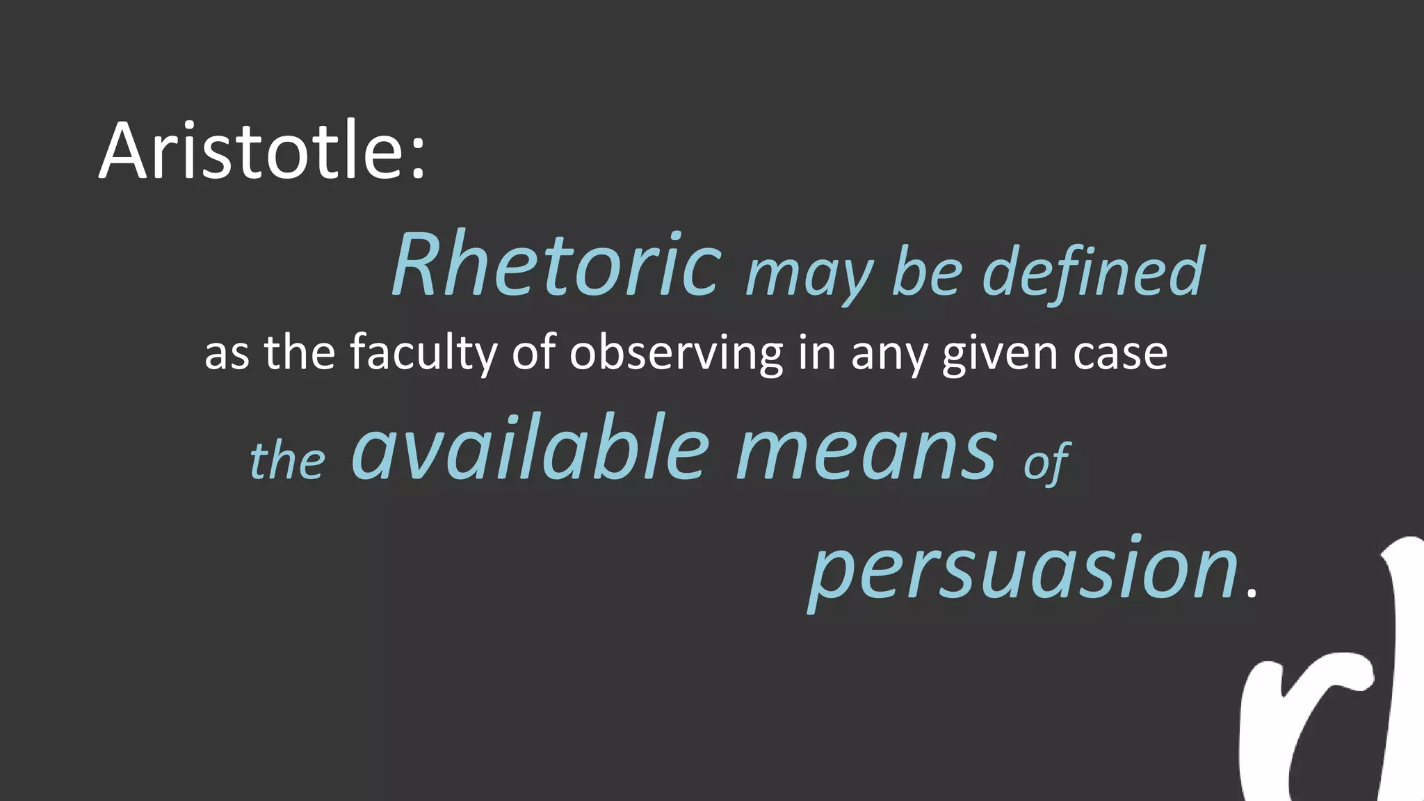
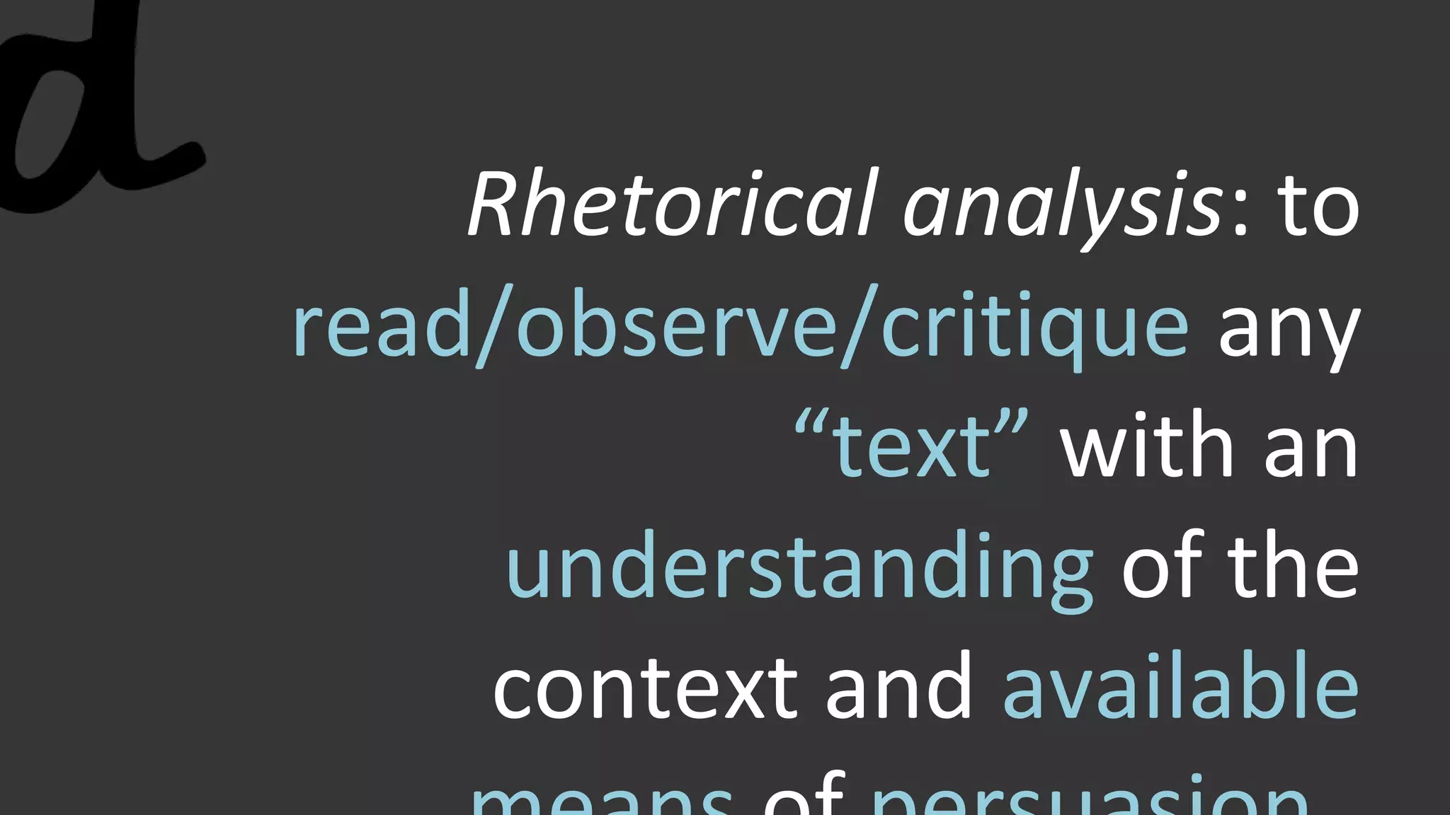


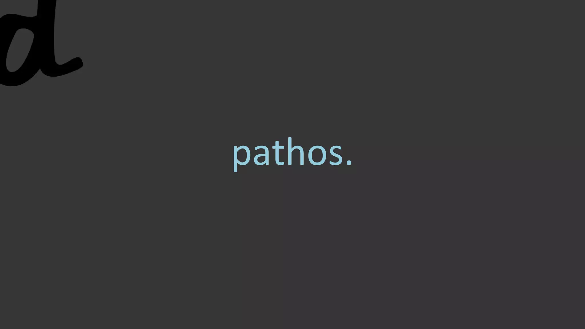


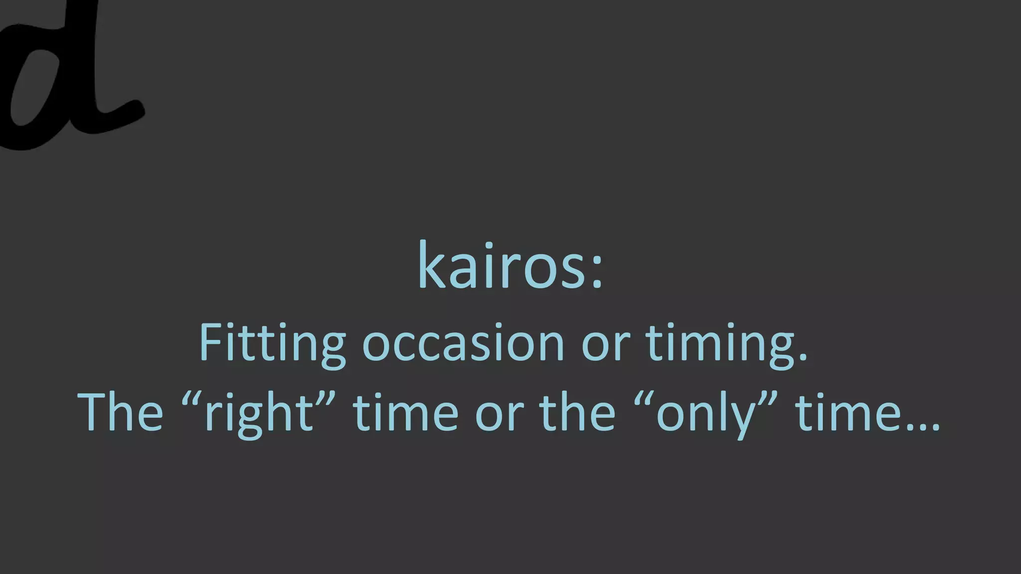


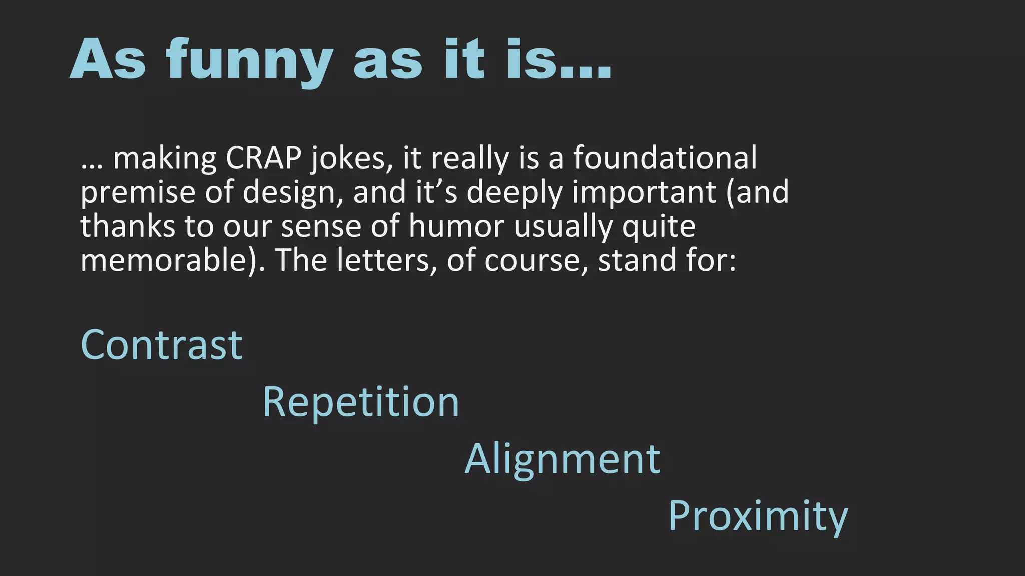
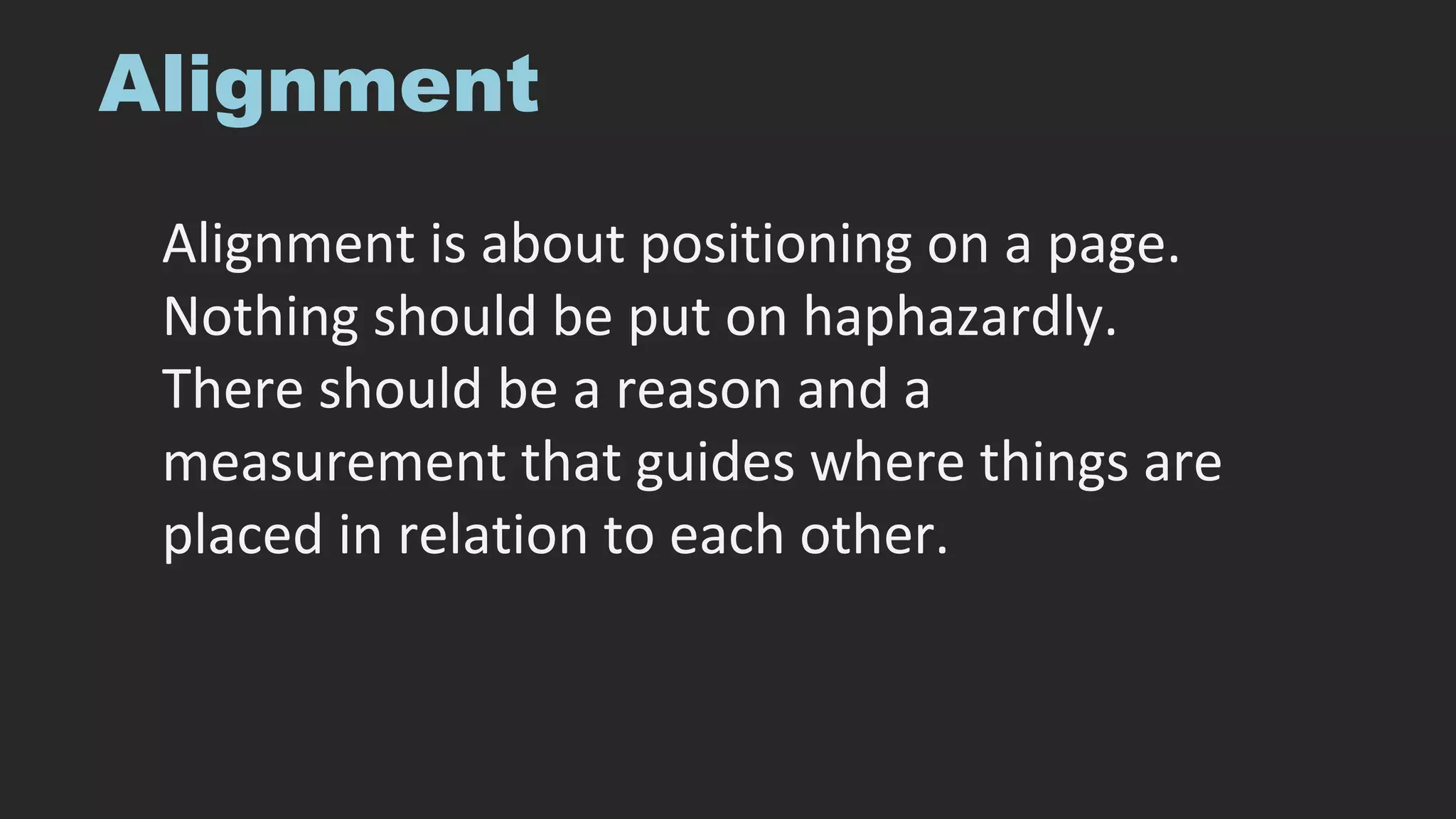
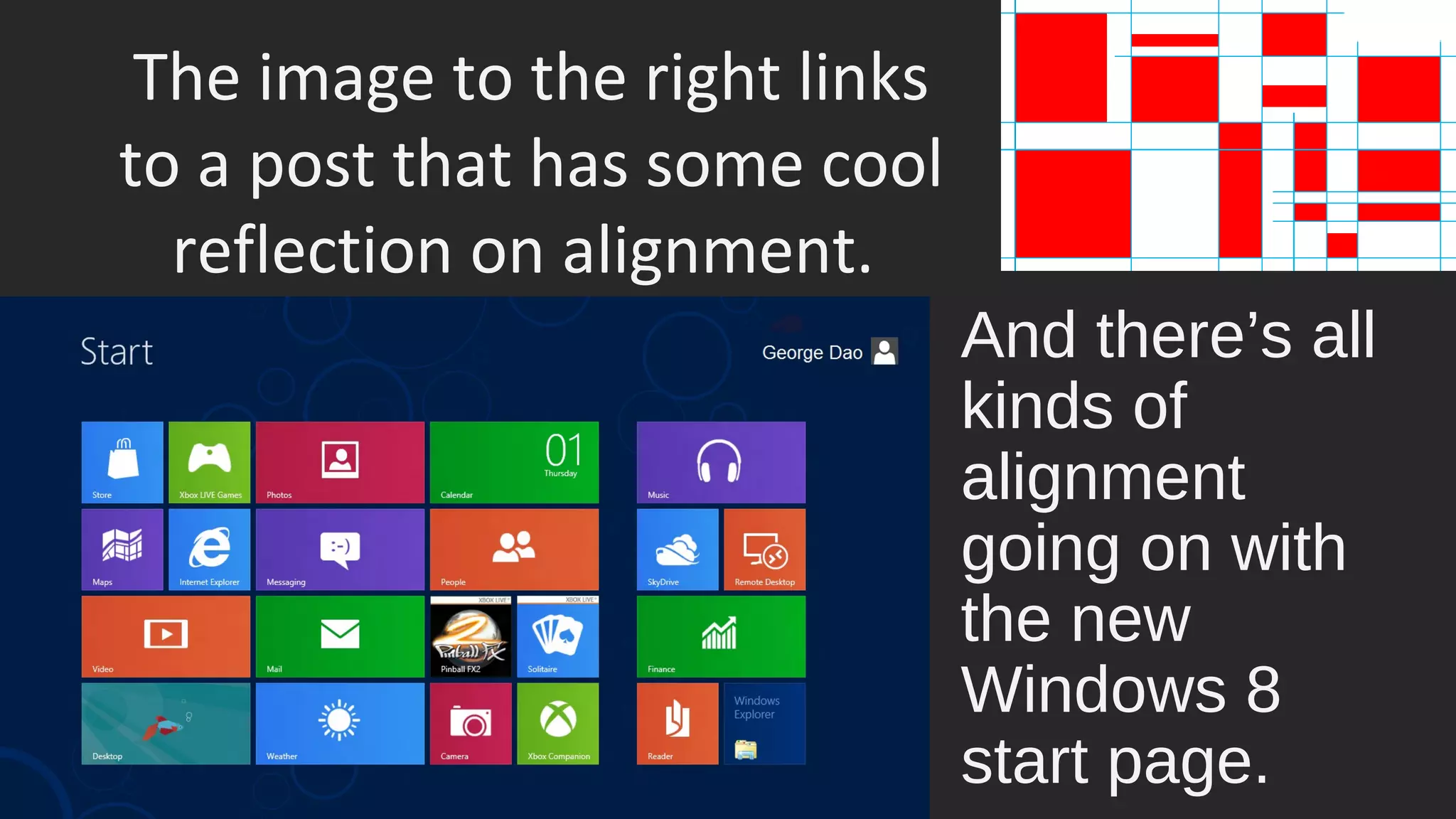
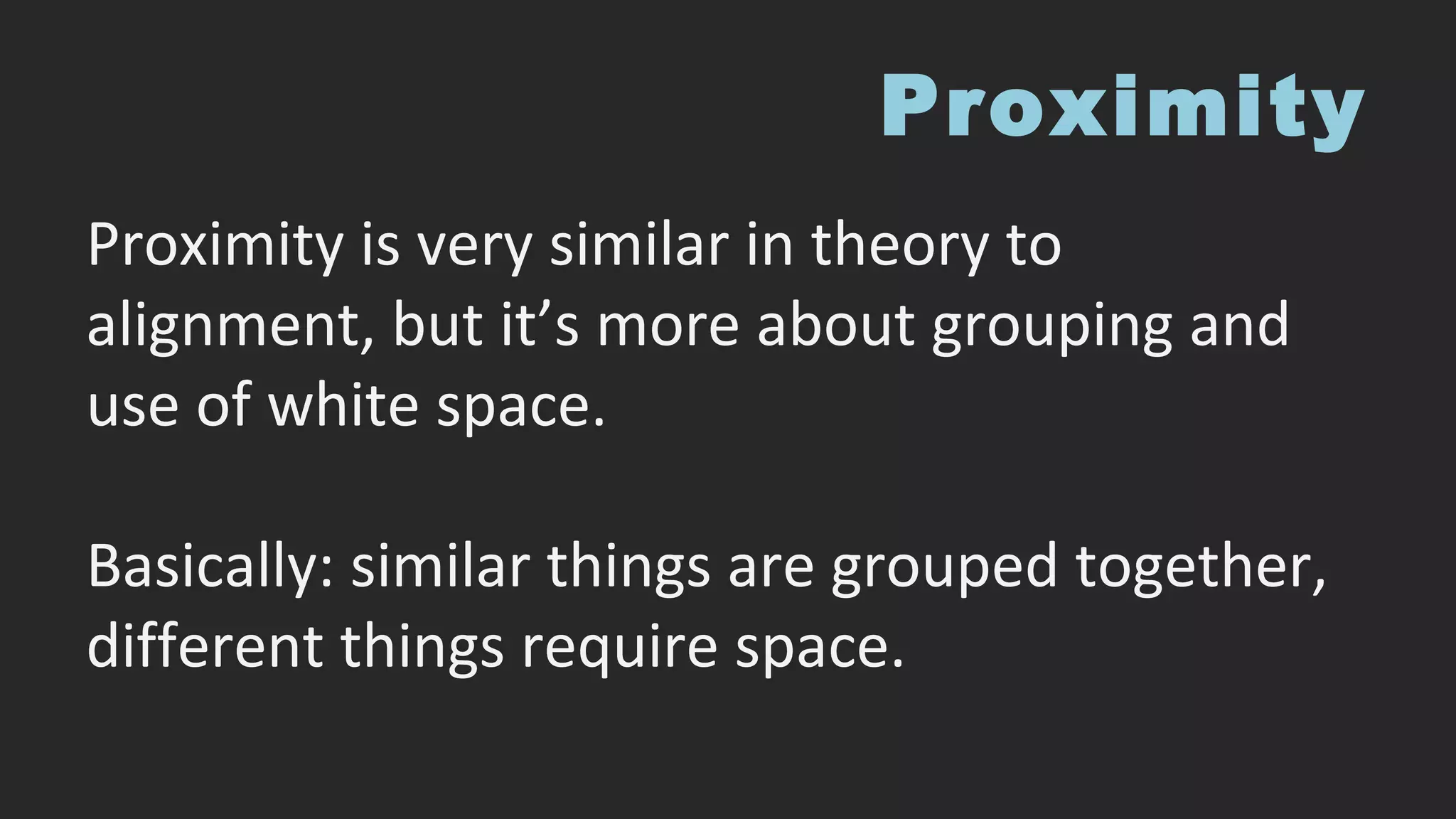
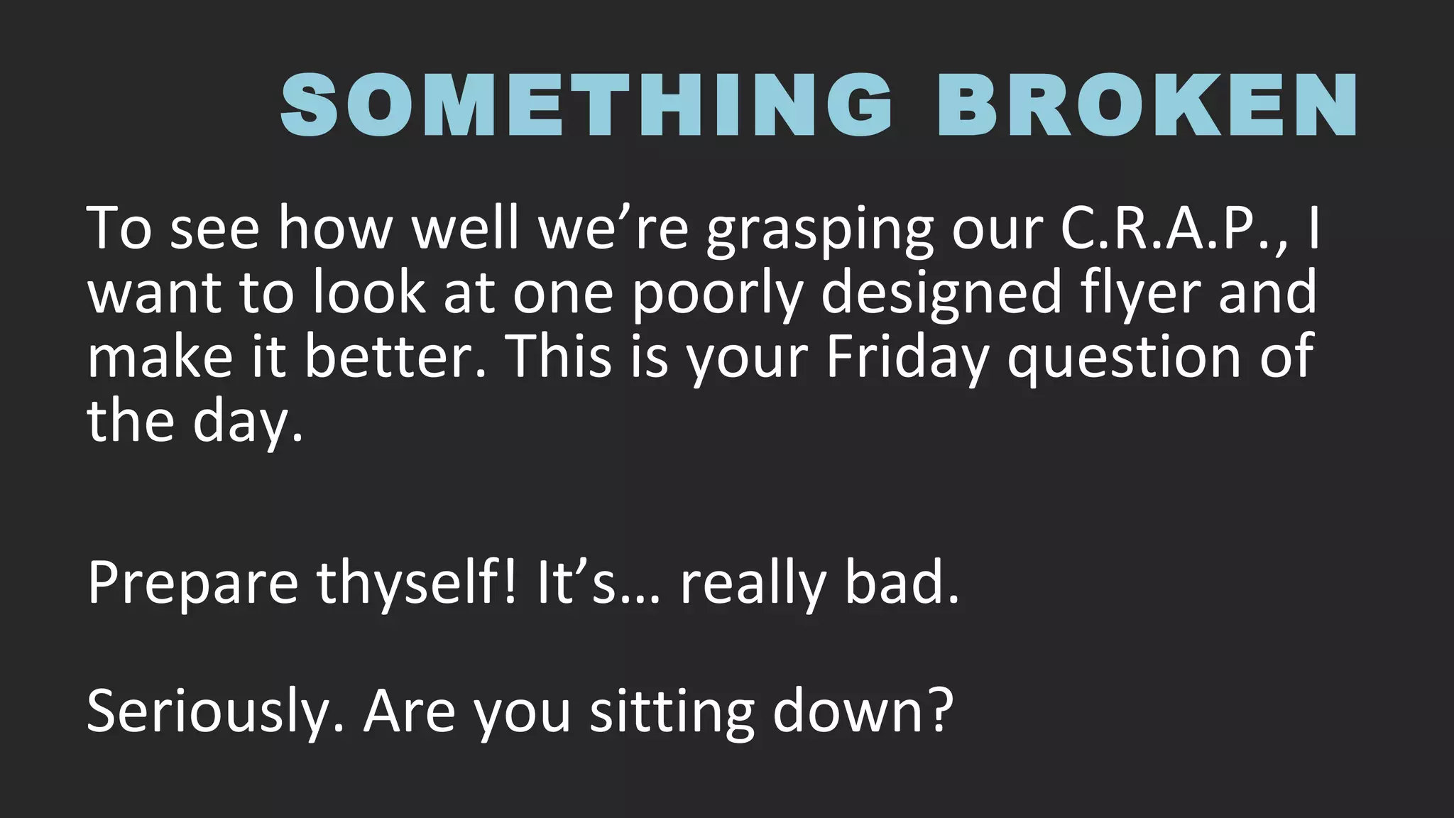


This document provides an overview of rhetorical analysis and key concepts related to analyzing any text. It discusses Aristotle's definition of rhetoric as observing means of persuasion. Rhetorical analysis involves reading and critiquing a text while understanding its context and persuasive techniques. Key aspects that should be analyzed include ethos, pathos, logos, kairos, style, audience, purpose, context, metaphor, story, delivery, and culture. Examples are provided of analyzing a movie poster to demonstrate these concepts. Basic principles of design such as contrast, repetition, alignment, and proximity are also explained. Readers are then asked to redesign a poorly designed event flyer using these analytical and design skills.