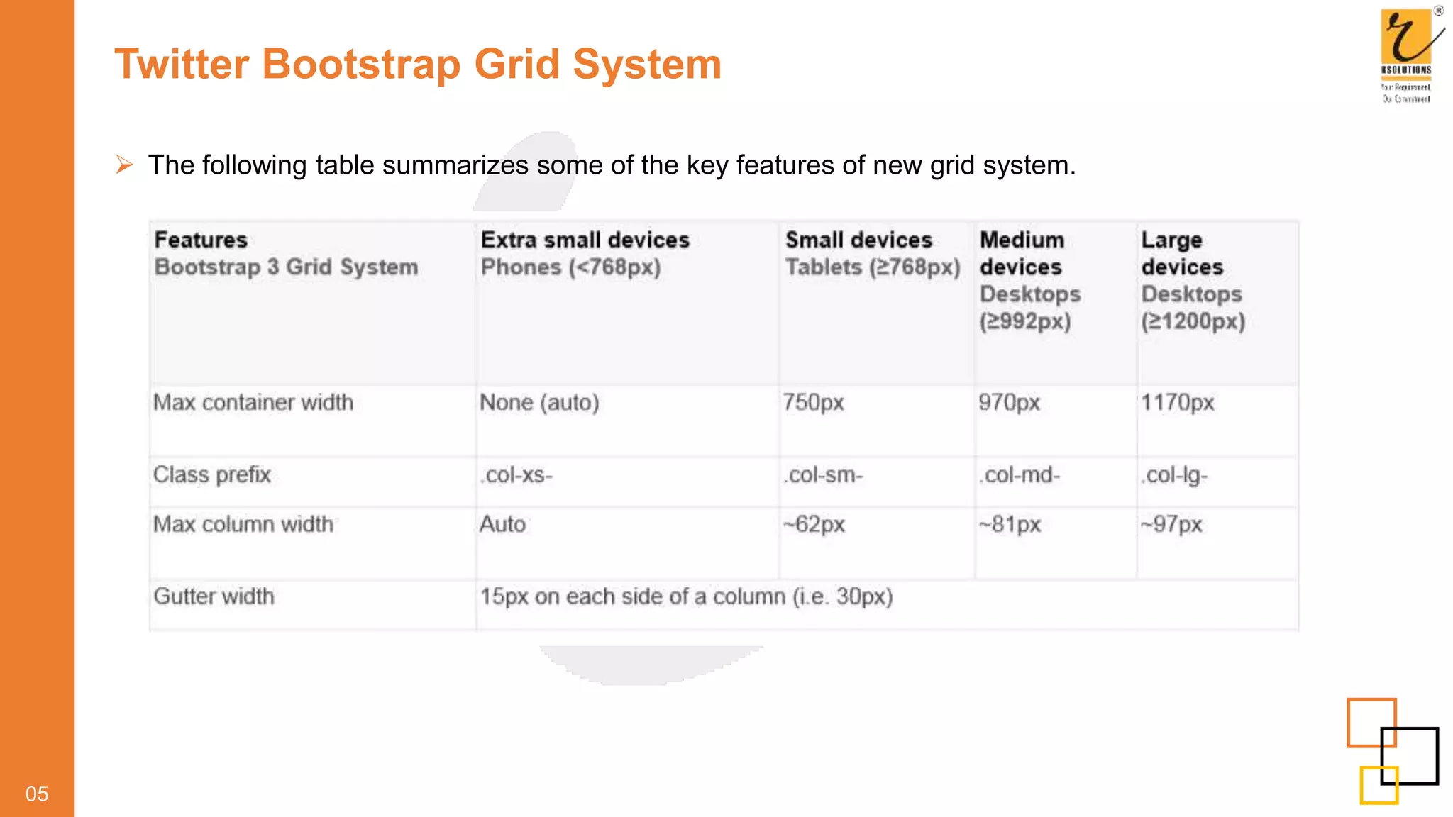
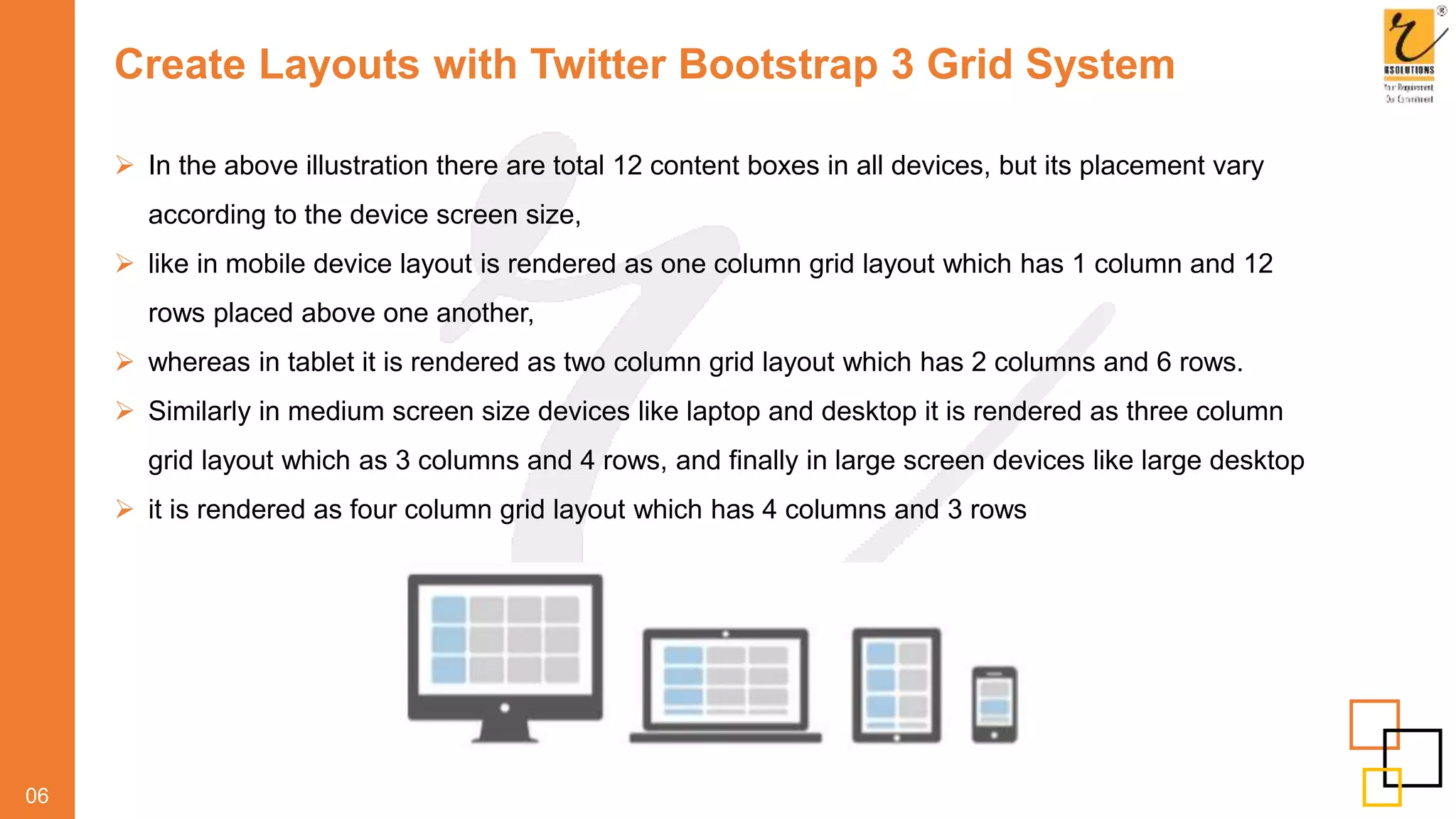
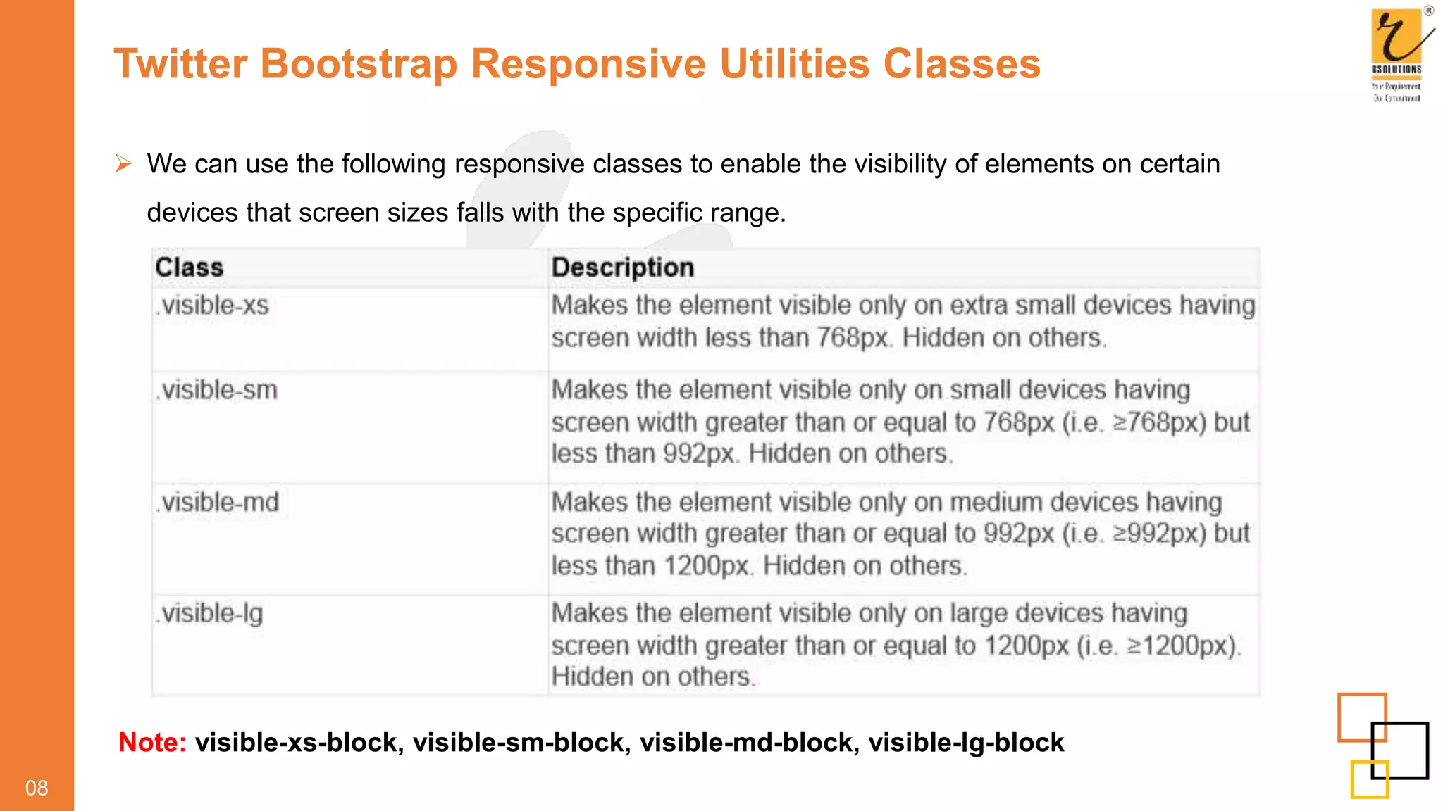
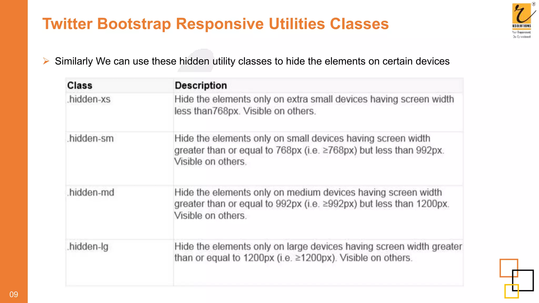
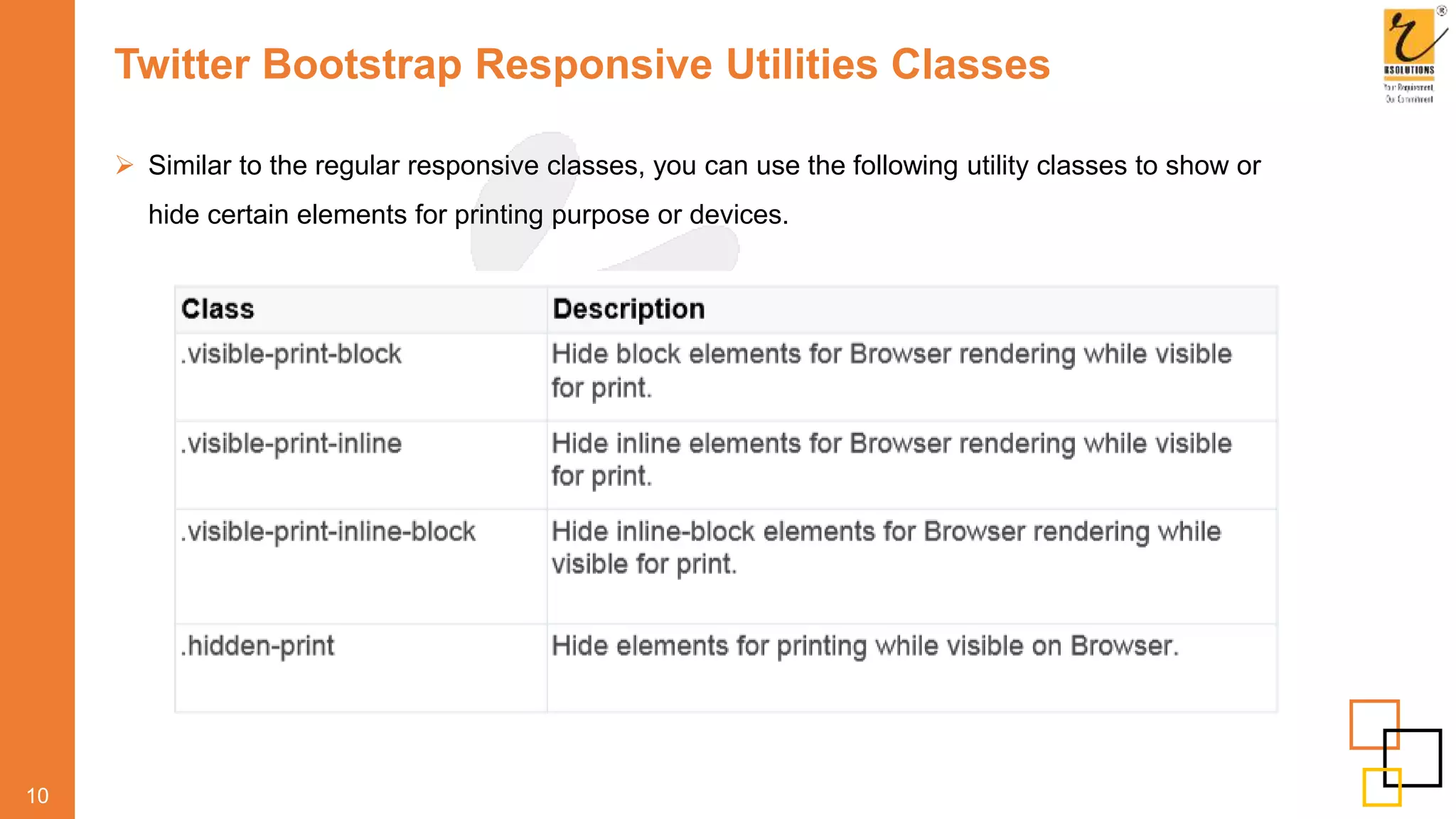
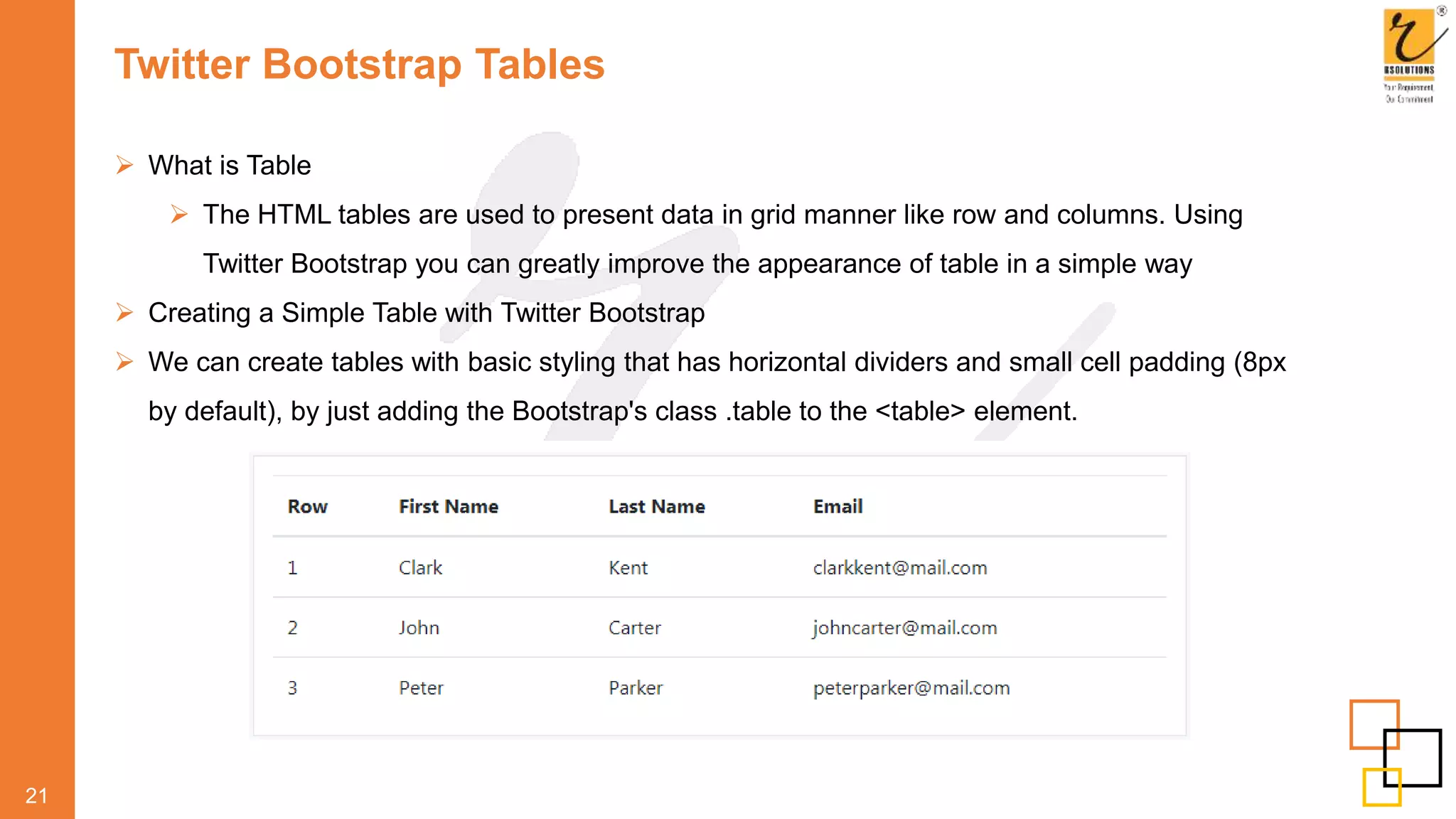
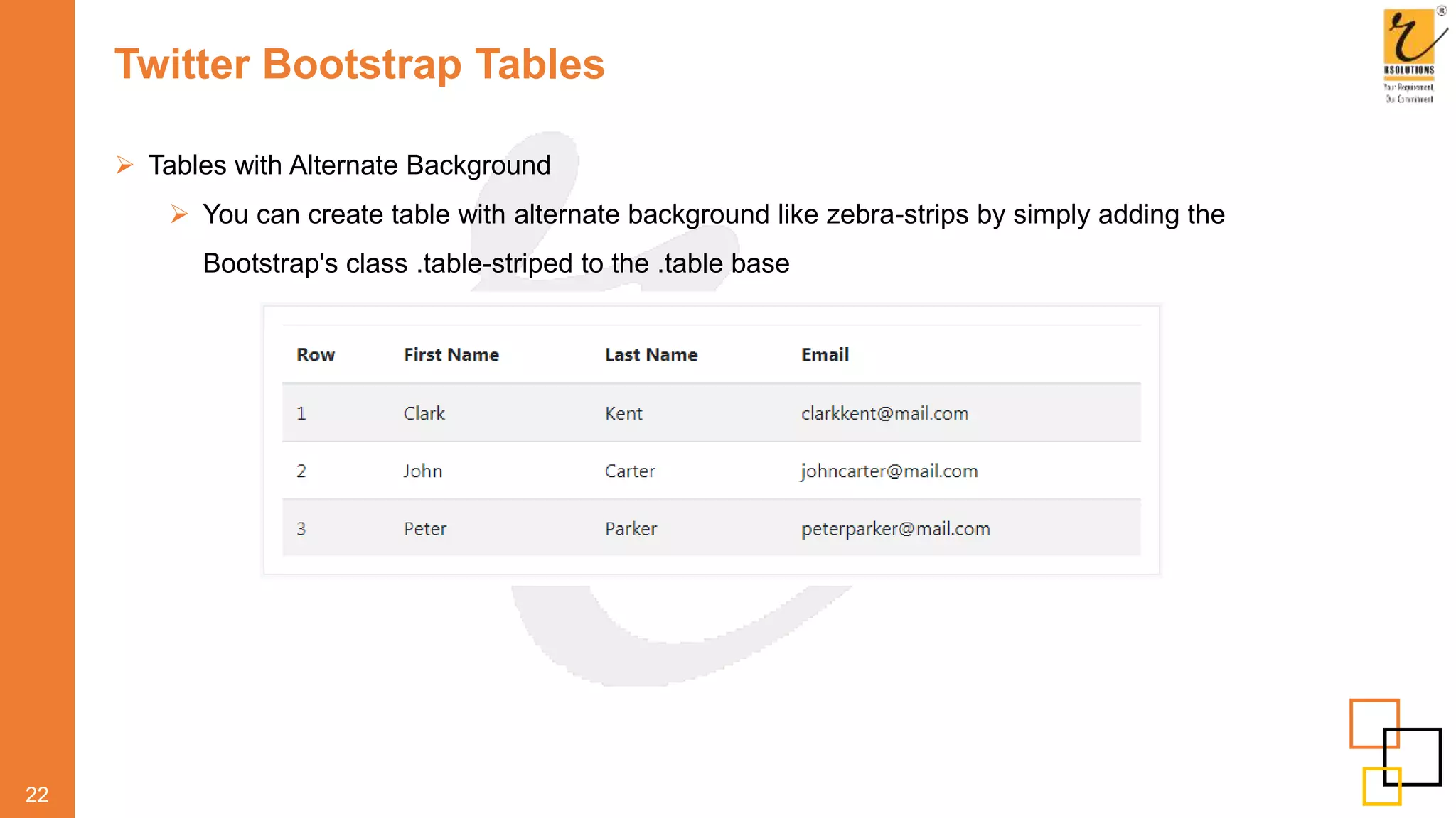
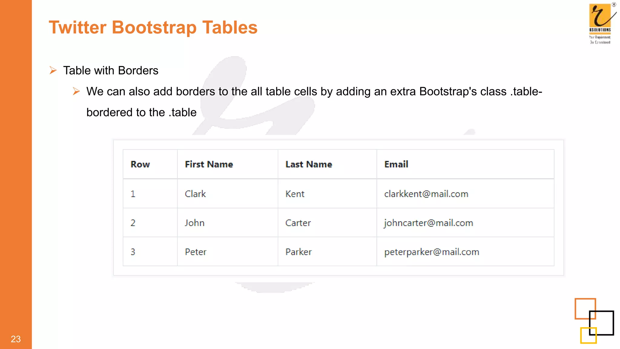
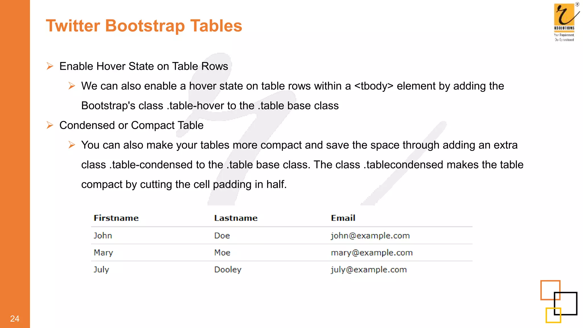
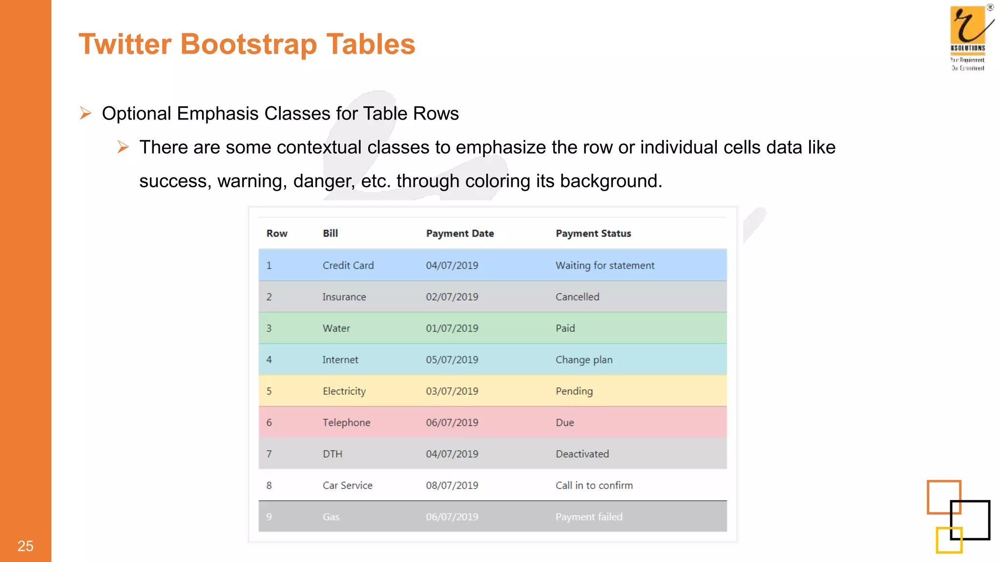
Your Requirement. Our Commitment.
Index No Index No
Twitter Bootstrap Introduction 01 Twitter Bootstrap Breadcrumbs 49
Advantages of Twitter Bootstrap 02-03 Twitter Bootstrap Pagination 50-51
Twitter Bootstrap Grid System 04-05 Twitter Bootstrap Labels and Badges 52-54
Create Layouts with Twitter Bootstrap 3 Grid System 06-07 Twitter Bootstrap Progress Bars 55
Twitter Bootstrap Responsive Utilities Classes 08-10 Twitter Bootstrap Miscellaneous 56
Twitter Bootstrap Fixed Layout 11 Twitter Bootstrap Buttons 57-58
Twitter Bootstrap Fluid Layout 12 Twitter Bootstrap Dropdowns 59
Twitter Bootstrap Typography 13-20 Twitter Bootstrap Tooltips 60
Twitter Bootstrap Tables 21-25 Twitter Bootstrap Popovers 61
Twitter Bootstrap Lists 26-28 Twitter Bootstrap Alerts 62
Twitter Bootstrap Forms 29-35 Twitter Bootstrap Modals 63
Twitter Bootstrap Images 36-37 Twitter Bootstrap Tabs 64
Twitter Bootstrap Icons 38 Twitter Bootstrap Carousel 65
Twitter Bootstrap Nav: Tabs, and Pills 39-42 Twitter Bootstrap Typeahead 66
Twitter Bootstrap Navbar 43-47 Twitter Bootstrap ScrollSpy 67
Twitter Bootstrap Panels 48
Twitter Bootstrap Introduction
 Twitter Bootstrap comes equipped with HTML, CSS, and JavaScript for various web and user
interface components
 What is Twitter Bootstrap?
 Bootstrap is a powerful front-end framework for faster and easier web development.
 It includes HTML and CSS based design templates for common user interface components
like Typography, Forms, Buttons, Tables, Navigations, Dropdowns, Alerts, Modals, Tabs,
Accordion, Carousel and many other as well as optional JavaScript extensions.
01
Advantages of Twitter Bootstrap
 The biggest advantage of using Twitter Bootstrap is that it comes with free set of tools for
creating flexible and responsive web layouts as well as common interface components.
 Additionally, using the Bootstrap data APIs you can create advance interface components like
Scrollspy and Typeaheads without writing a single line of JavaScript.
 Here are some more advantages, why one should opt for Twitter Bootstrap:
 Save lots of time - You can save lots of time and efforts using the Bootstrap predefined design
templates and classes and concentrate on other development work.
 Responsive features - Using Bootstrap you can easily create responsive designs. Bootstrap
responsive features make your web pages to appear more appropriately on different devices
and screen resolutions without any change in markup.
 Consistent design — All Bootstrap components share the same design templates and styles
through a central library, so that the designs and layouts of your web pages are consistent
throughout your development.
02
Advantages of Twitter Bootstrap
 Easy to use - Bootstrap is very easy to use. Anybody with the basic working knowledge of
HTML and CSS can start development with Twitter Bootstrap.
 Compatible with browsers - Twitter Bootstrap is created with modern browsers in mind and it
is compatible with all modern browsers such as Mozilla Firefox, Google Chrome, Safari, Internet
Explorer, and Opera.
 Open Source - And the best part is, it is completely free to download and use.
03
Note:
Some CSS3 properties such as properties for rounded corners, gradients and shadows are used
by the Twitter Bootstrap but not supported in older versions of web browsers especially Internet
Explorer
Twitter Bootstrap Grid System
 Twitter Bootstrap grid system is the fastest and easy way to create layout.
 How to Create Layouts with Twitter Bootstrap Grid System ?
 Twitter Bootstrap grid system provides the fastest and easy way to create layouts of web
pages
 Twitter Bootstrap 3 introduces the responsive mobile first fluid grid system that
appropriately scales up to 12 columns as the device or viewport size increases.
 Twitter Bootstrap 3 includes predefined grid classes for quickly making grid layouts for
different types of devices like cell phones, tablets, desktops, etc.
 For example, you can use the .col-xs- class to create grid columns for extra small devices
like cell phone similarly the .col-sm- for small screen devices like tablets, the .col-md-
class for medium size devices like desktop and the .col-lg- for large desktop screens
04
Twitter Bootstrap Grid System
 The following table summarizes some of the key features of new grid system.
05
Create Layouts with Twitter Bootstrap 3 Grid System
 In the above illustration there are total 12 content boxes in all devices, but its placement vary
according to the device screen size,
 like in mobile device layout is rendered as one column grid layout which has 1 column and 12
rows placed above one another,
 whereas in tablet it is rendered as two column grid layout which has 2 columns and 6 rows.
 Similarly in medium screen size devices like laptop and desktop it is rendered as three column
grid layout which as 3 columns and 4 rows, and finally in large screen devices like large desktop
 it is rendered as four column grid layout which has 4 columns and 3 rows
06
Create Layouts with Twitter Bootstrap 3 Grid System
 Now the question arises how we can create such responsive layouts using this Twitter Bootstrap
new mobile first grid system.
 Let's start with the medium device that can be a laptop or normal desktop.
 Since our medium device layout has 3 columns and 4 rows (i.e. 3x4 grid layout).
07
Twitter Bootstrap Responsive Utilities Classes
 We can use the following responsive classes to enable the visibility of elements on certain
devices that screen sizes falls with the specific range.
08
Note: visible-xs-block, visible-sm-block, visible-md-block, visible-lg-block
Twitter Bootstrap Responsive Utilities Classes
 Similarly We can use these hidden utility classes to hide the elements on certain devices
09
Twitter Bootstrap Responsive Utilities Classes
 Similar to the regular responsive classes, you can use the following utility classes to show or
hide certain elements for printing purpose or devices.
10
Twitter Bootstrap Fixed Layout
 Fixed width responsive layout that is 750px pixels wide on small devices like tablet having
screen width ≥768px.
 whereas 970px wide on medium devices like desktop and laptop having screen width ≥992px.
 1170px wide on large devices like large desktops having screen width ≥1200px.
 However the layout width will be automatically calculated for devices that has screen width
<768px like cell phones.
11
Twitter Bootstrap Fluid Layout
 In Twitter Bootstrap 3.2 you can use the class .container-fluid create the fluid layouts in order to
utilize the 100% width of the viewport.
 The class .container-fluid simply applies the horizontal margin with the value auto and left and
right padding of 15px on element to offset the left and right margin of -15px (i.e. margin: 0 -
15px;) used on .rows.
12
Twitter Bootstrap Typography
 Working with Heading
 You can define all HTML headings, <h1> through <h6> - In the same way you define in
simple HTML document.
 You can also utilize the heading classes .h1 through .h6 on other elements, if you want to
apply the style on element's text same as headings.
13
Twitter Bootstrap Typography
 Moreover you can use the <small> tag or <span> tag with .small class to display the secondary
text of any heading in a smaller and lighter variation.
14
Twitter Bootstrap Typography
 Creating Page Headers
 We can make your <h1> heading appear differently than rest of the headings on a page
using the page header component.
 We can also utilize <small> tag to mark header subtext
15
<div class="page-header">
<h1>Twitter Bootstrap <small>An intuitive front-end framework</small></h1>
</div>
 Working with Paragraphs
 Bootstrap's global default font-size is 14px, with a line-height of 1.428. This is applied to the
<body> and all paragraphs. In addition to that a bottom margin of half their line-height (10px by
default) is applied to the all paragraphs (<p>).
 We can also make a paragraph stand out by just adding the class .lead
Twitter Bootstrap Typography
 Twitter Bootstrap Text Formatting
 We are free to use text formatting tags like <strong>, <i>, <small> to make your text bold,
italic, small and so on, in the same way you do in simple HTML.
16
<p><b>This is bold text</b></p>
<p><code>This is computer code</code></p>
<p><em>This is emphasized text</em></p>
<p><i>This is italic text</i></p>
<p><mark>This is highlighted text</mark></p>
<p><small>This is small text</small></p>
<p><strong>This is strongly emphasized text</strong></p>
<p>This is <sub>subscript</sub> and <sup>superscript</sup></p>
<p><ins>This text is inserted to the document</ins></p>
<p><del>This text is deleted from the document</del></p>
Twitter Bootstrap Typography
 Text Transformation Classes
 We can also transform the text to lowercase, uppercase or make them capitalize.
 Text Emphasis Classes
 Colors are the powerful method of conveying important information in website design.
 Bootstrap has handful of emphasis utility classes that can be used for this purpose such as
showing success message in green color, warning or error message in red color, etc.
17
Twitter Bootstrap Typography
 Styling Blockquotes
 We can also give pretty look to your blockquotes - Just define the blockquotes using the
standard <blockquote> element and bootstrap's style sheet will do the rest
18
Example
Output
Twitter Bootstrap Typography
 More Typography classes
19
Class Description
.lead Makes a paragraph stand out
.small Indicates smaller text (set to 85% of the size of the parent)
.text-left Indicates left-aligned text
.text-center Indicates center-aligned text
.text-right Indicates right-aligned text
.text-justify Indicates justified text
.text-nowrap Indicates no wrap text
.text-lowercase Indicates lowercased text
.text-uppercase Indicates uppercased text
.text-capitalize Indicates capitalized text
.initialism Displays the text inside an <abbr> element in a slightly smaller font size
Twitter Bootstrap Typography
20
Class Description
.list-unstyled Removes the default list-style and left margin on list items (works on
both <ul> and <ol>). This class only applies to immediate children list items (to
remove the default list-style from any nested lists, apply this class to any nested lists
as well)
.list-inline Places all list items on a single line
.dl-horizontal Lines up the terms (<dt>) and descriptions (<dd>) in <dl> elements side-by-side.
Starts off like default <dl>s, but when the browser window expands, it will line up
side-by-side
.pre-scrollable Makes a <pre> element scrollable
Twitter Bootstrap Tables
 What is Table
 The HTML tables are used to present data in grid manner like row and columns. Using
Twitter Bootstrap you can greatly improve the appearance of table in a simple way
 Creating a Simple Table with Twitter Bootstrap
 We can create tables with basic styling that has horizontal dividers and small cell padding (8px
by default), by just adding the Bootstrap's class .table to the <table> element.
21
Twitter Bootstrap Tables
 Tables with Alternate Background
 You can create table with alternate background like zebra-strips by simply adding the
Bootstrap's class .table-striped to the .table base
22
Twitter Bootstrap Tables
 Table with Borders
 We can also add borders to the all table cells by adding an extra Bootstrap's class .table-
bordered to the .table
23
Twitter Bootstrap Tables
 Enable Hover State on Table Rows
 We can also enable a hover state on table rows within a <tbody> element by adding the
Bootstrap's class .table-hover to the .table base class
 Condensed or Compact Table
 You can also make your tables more compact and save the space through adding an extra
class .table-condensed to the .table base class. The class .tablecondensed makes the table
compact by cutting the cell padding in half.
24
Twitter Bootstrap Tables
 Optional Emphasis Classes for Table Rows
 There are some contextual classes to emphasize the row or individual cells data like
success, warning, danger, etc. through coloring its background.
25
Twitter Bootstrap Lists
 We can define the three different types of lists:
 Unordered lists - A list of items in which the order does not explicitly matter. The list items
in unordered lists are marked with bullets.
 Ordered lists - A list of items in which the order does explicitly matter. The list items in
ordered lists are marked with numbers.
 Definition list - A list of terms with their associated descriptions.
 Unstyled Ordered and Unordered Lists
 Sometimes We might need to remove the default styling form the list items. You can do this
by simply applying the class .list-unstyled to the respective <ul> or <ol> elements.
26
Twitter Bootstrap Lists
 Placing Ordered and Unordered List Items Inline
 If we want to create a horizontal menu using ordered or unordered list we need to place all
list items in a single line i.e. side by side.
 we can do this by simply applying the Bootstrap's class .list-inline to the respective <ul> or
<ol> elements. The .list-inline class also adds some left and right padding (5px by default)
to the all list items
 Creating Horizontal Definition Lists
 The terms and descriptions in definition lists can also be placed side-byside using the
Bootstrap's class .dl-horizontal.
 The terms in horizontal definition lists will be truncated if is too long to fit in the left column
(160px by default), however in narrower viewports they will change to the default stacked layout.
26
Twitter Bootstrap Lists
 Twitter Bootstrap List Groups
 The list groups are very useful component for displaying lists of items in a beautiful manner. In
most basic form a list group is simply an unordered list with list items and proper classes.
 Further you can hyperlink list group items with the little change in HTML markup.
 Just replace the <li> with <a> tag and use <div> element as a parent instead of <ul>. You can
also add icons and badges to this list group to make it more elegant. The badges component
will automatically be positioned on the right
 We can also add other HTML elements like headings and paragraph within these list groups.
27
Twitter Bootstrap Forms
 Creating Forms with Twitter Bootstrap
 HTML forms are the integral part of the web pages, but styling the form controls manually
one by one using CSS can be a tedious process.
 Twitter Bootstrap greatly simplifies the styling process of form controls like inputboxes,
selectboxes, textareas, etc.
 Twitter Bootstrap provides three different types of form layouts:
 Vertical Form (default form layout)
 Horizontal Form
 Inline Form
28
Twitter Bootstrap Forms
 Vertical Form Layout
 This is the default Bootstrap form layout in which styles are applied to form controls without
adding any base class to the <form> element or any large changes in the markup.
 The form controls in this layout are stacked with left-aligned labels on the top.
29
Example Output
Twitter Bootstrap Forms
 Horizontal Form Layout
 In horizontal form layout labels are right aligned and floated to left to make them appear on
the same line as form controls.
 The horizontal form layout requires the various mark-up changes from a default form layout.
Steps to achieve this layout are listed below:
 Add the class .form-horizontal to the <form> element.
 Wrap labels and form controls in a <div> element and apply the class . form-group.
 Use Bootstrap's predefined grid classes to align labels and form controls.
 Add the class .control-label to the <label> element.
 Inline Form Layout
 Sometimes you might require to place the form controls side-by-side to compact the layout. You
can do this easily by adding the Bootstrap class . form-inline to the <form> element.
 Note: It is recommended to include a label for every form inputs otherwise screen readers will have trouble
with your forms. However in case of inline form layout you can hide these labels using the .sr-only class.
30
Twitter Bootstrap Forms
 Height sizing of Inputs and Select Boxes
 We can easily control the height of our input and select boxes to match the button sizes.
The Bootstrap's relative sizing classes like . input-lg, .input-sm can be used both on <input>
and <select> boxes to create it's larger or smaller sizes.
31
 Grid sizing of Inputs, Textareas and Select Boxes
 You can also match the sizes of your form controls to the Bootstrap grid column sizes. Just
wrap your form controls (i.e. <input>, <textarea>, and <select>) in grid columns, or any
custom element and apply the grid classes on it.
Twitter Bootstrap Forms
 Extending Form Controls with Twitter Bootstrap
 Bootstrap includes some other useful form components to make your form more attractive.
 Creating Prepended and Appended Inputs
 We can add text and icons or buttons before or after any text-based input.
 To prepend or append text and icons to an input:
 Warp the text or icon within a <span> element having the class .input-groupaddon and place it
before or after the <input> element.
 Wrap both the <span> and text-based <input> element within a <div> element and apply the
class .input-group on it.
32
Twitter Bootstrap Forms
 Creating Disabled Inputs
 To create disabled inputs just add the attributes disabled to the <input> element and
Bootstrap will do the rest.
 Creating Disabled Fieldsets
 Rather than disabling the form controls individually, you can also disable all form
controls within a fieldset at once by adding the disabled attribute to the <fieldset>
element.
33
Twitter Bootstrap Forms
 Twitter Bootstrap Form Validation States
 Bootstrap provides easy to use and powerful mechanism for styling input controls to
present different validation states. Bootstrap includes validation styles for error, warning,
and success messages. To use, just add the appropriate class to the surrounding .form-
group.
34
Twitter Bootstrap Images
 Styling Images with Twitter Bootstrap
 Images are very common in modern web design. So styling images and placing it properly
on the web pages is very important for improving the user experience.
 Using the Bootstrap built-in classes you can easily style images such as making the round
cornered or circular images, or give them effect like thumbnails.
35
Warning: The classes .img-rounded and .img-circle do not
work in IE8 and lower versions due to lack of support for
CSS border-radius property
 Twitter Bootstrap Thumbnails
 Twitter Bootstrap thumbnails component is very useful for creating grids of images or
videos, lists of products, portfolios, and much more. The following example will show you
how to create thumbnails to showcase linked images.
Tip:The thumbnails component uses existing grid classes like .col-xs-*, .col-sm*, .col-md-*,
.col-lg-*, etc. for controlling the dimensions of thumbnails.
Twitter Bootstrap Images
 Twitter Bootstrap Media Objects
 Sometimes you may want to create a layout that contains left- or rightaligned image along
with the textual content like blog comments. You can do this easily through the newly
introduced Bootstrap media component, like this.
36
Twitter Bootstrap Icons
 Icons by Glyphicons
 Twitter Bootstrap includes 200 Glyphicons. As opposed to previous sprite version these icons
are available in font format for better usability and scalability.
 Since these Glyphicons are font based now you can create icons of any color just applying the
CSS color property on the specific element.
37
Tip: Twitter Bootstrap icons are provided by Glyphicons. However you are free to use these icons in
your project but as a courtesy you can consider to include a link back to Glyphicons whenever
practical
 How to Use Icons in Your Code
 To use the Bootstrap icons you will require an <span> tag along with a base class glyphicon and
an individual icon class glyphicon-*. The general syntax for using Bootstrap icons is:
<span class="glyphicon glyphicon-class-name"></span>
Note: Remember to leave a space after the closing tag of icon element (i.e. after </span> tag) when using icons
along with the strings of text such as inside buttons or navigation links, to ensure proper spacing.
Twitter Bootstrap Nav: Tabs, and Pills
 Twitter Bootstrap Nav Components
 Twitter Bootstrap provides an easy way to create basic nav components like as tabs and
pills. All the Bootstrap's nav components—tabs and pillss—share the same base markup
and styles through the .nav class.
 Creating Basic Tabs with Twitter Bootstrap
38
<ul class="nav nav-tabs">
<li class="active"><a href="#">Home</a></li>
<li><a href="#">Profile</a></li>
<li><a href="#">Messages</a></li>
</ul>
Output
 Adding Icons to Tabs
 You can also add icons to your tabs to make it more attractive.
<ul class="nav nav-tabs">
<li class="active"><a href="#"><span class="glyphicon glyphicon-home"></span> Home</a></li>
<li><a href="#"><span class="glyphicon glyphicon-user"></span> Profile</a></li>
<li><a href="#"><span class="glyphicon glyphicon-envelope"></span> Messages</a></li>
Twitter Bootstrap Nav: Tabs, and Pills
 Adding Icons to Tabs
 You can also add icons to your tabs to make it more attractive.
39
Output
<ul class="nav nav-tabs">
<li class="active"><a href="#"><span class="glyphicon glyphicon-home"></span> Home</a></li>
<li><a href="#"><span class="glyphicon glyphicon-user"></span> Profile</a></li>
<li><a href="#"><span class="glyphicon glyphicon-envelope"></span> Messages</a></li>
</ul>
 Creating Basic Pills Nav with Twitter Bootstrap
 Similarly you can create a basic pill based navigation using the base class .nav-pills
instead of .nav-tabs, without any further change in markup.
Output class="nav nav-pills"
Twitter Bootstrap Nav: Tabs, and Pills
 Adding Icons to Pills Nav:
40
Output
<ul class="nav nav-pills">
<li class="active"><a href="#"><span class="glyphicon glyphicon-home"></span> Home</a></li>
<li><a href="#"><span class="glyphicon glyphicon-user"></span> Profile</a></li>
<li><a href="#"><span class="glyphicon glyphicon-envelope"></span> Messages</a></li>
</ul>
 Tabs and Pills Nav with Dropdown Menus
 We can add dropdown menus to a link inside tabs and pills navigation with a little extra
markup and including the JavaScript files jquery.js and bootstrap.js in your HTML file.
 The four CSS classes .dropdown, .dropdown-toggle, .dropdown-menu and .caret are
required in addition to the .nav, .nav-tabs, .nav-pills to create a simple dropdown menu.
Twitter Bootstrap Nav: Tabs, and Pills
 Tabs and Pills Nav with Dropdown Menus
41
Output
<ul class="nav nav-tabs">
<li class="active"><a href="#">Home</a></li>
<li><a href="#">Profile</a></li>
<li class="dropdown">
<a href="#" data-toggle="dropdown" class="dropdown-toggle">Messages <b class="caret"></b></a>
<ul class="dropdown-menu">
<li><a href="#">Inbox</a></li>
<li><a href="#">Drafts</a></li>
<li><a href="#">Sent Items</a></li>
<li class="divider"></li>
<li><a href="#">Trash</a></li>
</ul>
</li>
</ul>
Twitter Bootstrap Navbar
 Creating A Simple Navbar with Twitter Bootstrap
 Twitter Bootstrap enables you to create different variations of navbars quickly and without
too much effort. You create static navbars with simple navigation as well as navbars with
dropdown menus and search boxes.
42
Output
Twitter Bootstrap Navbar
 Example of Navbar
 Twitter Bootstrap Fixed Navbar
 Twitter Bootstrap also provides mechanism to create navbar that is fixed on the top or
bottom of the viewport and will scroll with the content on the page.
 Creating Navbar Fixed to Top
 Add an extra class .navbar-fixed-top in addition to the . navbar and .navbar-default
base class to create navbars that is fixed on the top.
43
Inverted Navigation Bar
If you don't like the style of the default navigation bar, Bootstrap provides an alternative, black
navbar:
Class: .navbar-default into .navbar-inverse
Twitter Bootstrap Navbar
44
Navigation Bar With Dropdown
If you don't like the style of the default navigation bar, Bootstrap provides an alternative, black navbar:
Class: .navbar-default into .navbar-inverse
Right-Aligned Navigation Bar
In the following example we insert a "Sign Up" button and a "Login" button to the right in the navigation
bar. We also add a glyphicon on each of the two new buttons:
Class: .navbar-right
Twitter Bootstrap Navbar
45
Navbar Buttons
Used to add buttons inside the navbar
Class: .navbar-btn
Navbar Forms
To add form elements inside the navbar, add the .navbar-form class to a form element and add an
input(s). Note that we have added a .form-group class to the div container holding the input. This adds
proper padding if you have more than one inputs (you will learn more about this in the Forms chapter).
Twitter Bootstrap Navbar
45
Fixed Navigation Bar
The navigation bar can also be fixed at the top or at the bottom of the page.
Class: .navbar-fixed-top
Collapsing The Navigation Bar
 The navigation bar often takes up too much space on a small screen.
 We should hide the navigation bar; and only show it when it is needed.
 In the following example the navigation bar is replaced by a button in the top right corner. Only when
the button is clicked, the navigation bar will be displayed:
Twitter Bootstrap Panels
46
 Introducing Twitter Bootstrap 3 Panels
 Sometimes you might require to put your content in box for certain reason. In such situation
the panel component can be very useful. In most basic form the panel component apply
some border and padding around the content.
<div class="panel panel-default">
<div class="panel-body">Look, I'm in a panel!</div>
</div>
Output
 Types of classes
 Panel-default (Used for Disable purpose)
 Class: "panel panel-default"
Output
Twitter Bootstrap Breadcrumbs
47
 Creating Breadcrumbs with Twitter Bootstrap
 A breadcrumb is a navigation scheme that indicates the user's location in a website or web
application. Breadcrumb navigation can greatly enhance the accessibility of websites
having large number of pages.
 Class: “breadcrumb”
Twitter Bootstrap Pagination
48
 Creating Pagination with Twitter Bootstrap
 Pagination is the process of organizing content by dividing it into separate pages.
 Pagination is used in some or other form quite often in almost every web application, for
instance it is used by search engines for displaying a limited number of results on search
results pages, or showing a limited number of posts for every page on a blog or forum
 Class: “pagination”
Twitter Bootstrap Pagination
49
 Twitter Bootstrap Pager
 Sometimes you may simply require previous and next links on your website to provide
simple and quick navigation to the user instead of the complex pagination as we discussed
above.
 Class: “pager”
Twitter Bootstrap Labels and Badges
50
 Creating Inline Labels
 Inline labels are generally used to indicate some valuable information on the web pages such
as important notes, warning messages, etc.
 Class: "label label-default"
Twitter Bootstrap Labels and Badges
51
 Creating Inline Labels
 Inline labels are generally used to indicate some valuable information on the web pages such
as important notes, warning messages, etc.
 Class:
 "label label-default"
 "label label-primary"
 "label label-success"
 "label label-info"
 "label label-warning"
 "label label-danger"
Twitter Bootstrap Labels and Badges
52
 Creating Inline Badges
 Similarly you can create inline badges to provide important notification to the user such as
mails received or unread messages, number of friend requests etc. They're most commonly
found in email client and social networking websites.
 Class: “badge"
Twitter Bootstrap Progress Bars
53
 Creating Progress Bar with Twitter Bootstrap
 Progress bars can be used for loading, redirecting, or showing action status to the users.
The following example will show how you can create a simple progress bar with vertical
gradient.
 Class: “progress progress-bar"
 Creating Stripped Progress Bar
 To create the stripped progress bar just add an extra class .progressstriped to the .progress
base class.
 Class: “progress progress-striped"
 Creating Stacked Progress Bar
 We can also place multiple bars into the same progress bar to stack them.
 Class: “progress progress-bar-success / info / warning / primary / success"
Twitter Bootstrap Miscellaneous
54
 Twitter Bootstrap Utility Components
 Twitter Bootstrap provides a handful of lightweight utility components for common usages.
 Jumbotron
 The Bootstrap jumbotron component provides an excellent way to showcase the key content or
information on a website like hero unit. Just wrap your featured content in a <div> element and
apply the class .jumbotron on it.
 Class: "jumbotron“
 Wells Component
 You can give a simple inset effect to the element by using the Bootstrap .well class.
 Tip: We can further control the padding and rounded corners of wells with two optional modifier
classes .well-large and .well-small.
 Close Icons
 Bootstrap provides a generic close icon that can be used for dismissing modals and alerts.
Twitter Bootstrap Buttons
55
 Creating Buttons with Twitter Bootstrap
 Buttons are the integral part of an HTML form whether it is a login or a simple contact form.
 Buttons are used for various purposes like submit or reset a form, indicating an important
action or to fire an event to do something on a web page.
 Different styles for buttons are available in Twitter Bootstrap to indicate different states of a
button.
 Button styles can be applied to any element. However, it is applied normally to the <a>,
<input>, and <button> elements for the best rendering.
Twitter Bootstrap Buttons
56
 Changing the Sizes of Buttons
 Bootstrap gives you option further to scaling a button up or down. You can a make buttons
larger or smaller through adding an extra class . btn-lg, .btn-sm, or .btn-xs.
 Block level button
 We can also create block level buttons (buttons that covers the full width of the parent
elements) by adding an extra class .btnblock.
Twitter Bootstrap Dropdowns
57
 Creating Dropdown Menus with Twitter Bootstrap
 Using Twitter Bootstrap dropdown plug-in you can add dropdown menus to almost anything
such as buttons, navbar, tabs and pills etc.
 Dropdowns within Buttons
 The following examples will show you how to add dropdowns to buttons.
Twitter Bootstrap Tooltips
58
 Creating Tooltips With Twitter Bootstrap
 A tooltip is a small pop-up that appears when user places the mouse pointer over an element
such as link or buttons to provide hint or information about the element being hovered.
 Tooltips can be very helpful for the new visitors of your website because they enable the user
to know the purpose of icons and links by placing the mouse pointer over them.
 We can Set the Position of Tooltips
 We can set tooltips to appear on top, right, bottom and left sides of an element.
Twitter Bootstrap Popovers
59
 Creating Popovers with Twitter Bootstrap
 Popover is a small overlay of content that is used to display secondary information of any
element when it is clicked by a user, like those on the iPad.
 Triggering the Popovers
 Popovers can be triggered via JavaScript — just call the popover() Bootstrap method with the
"id" or "class" selector of the required element in your JavaScript code.
Script
Twitter Bootstrap Alerts
60
 Creating Alert Messages with Twitter Bootstrap
 Alert messages are used quite often to stand out the information that requires immediate
attention of the end users such as warning or confirmation messages.
 Warning Alerts
 You can create a simple warning alert message using the class .alert. You can also add an
optional dismiss button to close the alert message box.
 Dismiss Alerts via Data Attribute
 Data attributes provides an easy way to enable close functionality of an alert message box —
just add data-dismiss="alert" to the close button and it will automatically enable the dismissal of
an alert message box.
Class: alert alert-success / alert-danger / alert-warning / alert-info / alert-dismissible
Twitter Bootstrap Modals
61
 Twitter Bootstrap Modals
 Modals are basically a dialog box that is used to provide important information to the user or
prompt user to take necessary actions before moving on.
 Modal windows are widely used to warn users for situations like session time out or to receive
their final confirmation before going to perform any critical actions such as saving or deleting
important data.
 Using Twitter Bootstrap you can create very smart and flexible dialog boxes with the minimum
efforts.
Twitter Bootstrap Tabs
62
 Tab based navigations provides an easy and powerful mechanism to handle huge amount of content
within a small area through separating content into different panes where each pane is viewable one at a
time.
 The user can quickly access the content through switching between the panes without leaving the page.
 The following example will show you how to create the basic tabs using the Bootstrap tab component.
 Class: nav nav-tabs / nav nav-pills
Twitter Bootstrap Carousel
63
 Creating Carousels with Twitter Bootstrap
 The carousels popularly known as slide
shows are some of the best ways of
showcasing huge amount of contents within
a small space on the web pages.
 It is a dynamic presentation of contents
where text and images are made visible or
accessible to the user by cycling through
several items
Twitter Bootstrap Typeahead
64
 Creating Typeaheads with Twitter Bootstrap
 The typeahead input fields are very popular in modern web forms.
 Main purpose of using typeahead is to improve the user experience by supplying hints or a list
of possible choices based on the text they've entered while filling a from or searching
something — like the Google instant search
 It also saves time and reduces the number of potential errors, because the user has less
likelihood of making a spelling mistake.
Tip: Set autocomplete="off" for the input box if you want to preavent default browser menus
from appearing over the Bootstrap type-ahead dropdown.
Twitter Bootstrap ScrollSpy
65
 Creating ScrollSpy with Twitter Bootstrap
 The scrollspy is a navigation mechanism that directing visitors to the different sections of a
page that has huge amount of content.
 Also the menu targets based on the scrolling position will be automatically highlighted to
indicate the visitors where they are currently on the page.
 It saves the time and makes the content of your pages more accessible to the visitor.
Class: data-spy="scroll" data-offset="15" data-target="#myScrollspy"
Mob : +91 98440 18630 / 99000 98630
Mail : enquiry@rsolutions-india.com
Url : www.rsolutions-india.com

Web Development Course - Twitter Bootstrap by RSOLUTIONS

  • 1.
  • 2.
    Index No IndexNo Twitter Bootstrap Introduction 01 Twitter Bootstrap Breadcrumbs 49 Advantages of Twitter Bootstrap 02-03 Twitter Bootstrap Pagination 50-51 Twitter Bootstrap Grid System 04-05 Twitter Bootstrap Labels and Badges 52-54 Create Layouts with Twitter Bootstrap 3 Grid System 06-07 Twitter Bootstrap Progress Bars 55 Twitter Bootstrap Responsive Utilities Classes 08-10 Twitter Bootstrap Miscellaneous 56 Twitter Bootstrap Fixed Layout 11 Twitter Bootstrap Buttons 57-58 Twitter Bootstrap Fluid Layout 12 Twitter Bootstrap Dropdowns 59 Twitter Bootstrap Typography 13-20 Twitter Bootstrap Tooltips 60 Twitter Bootstrap Tables 21-25 Twitter Bootstrap Popovers 61 Twitter Bootstrap Lists 26-28 Twitter Bootstrap Alerts 62 Twitter Bootstrap Forms 29-35 Twitter Bootstrap Modals 63 Twitter Bootstrap Images 36-37 Twitter Bootstrap Tabs 64 Twitter Bootstrap Icons 38 Twitter Bootstrap Carousel 65 Twitter Bootstrap Nav: Tabs, and Pills 39-42 Twitter Bootstrap Typeahead 66 Twitter Bootstrap Navbar 43-47 Twitter Bootstrap ScrollSpy 67 Twitter Bootstrap Panels 48
  • 3.
    Twitter Bootstrap Introduction Twitter Bootstrap comes equipped with HTML, CSS, and JavaScript for various web and user interface components  What is Twitter Bootstrap?  Bootstrap is a powerful front-end framework for faster and easier web development.  It includes HTML and CSS based design templates for common user interface components like Typography, Forms, Buttons, Tables, Navigations, Dropdowns, Alerts, Modals, Tabs, Accordion, Carousel and many other as well as optional JavaScript extensions. 01
  • 4.
    Advantages of TwitterBootstrap  The biggest advantage of using Twitter Bootstrap is that it comes with free set of tools for creating flexible and responsive web layouts as well as common interface components.  Additionally, using the Bootstrap data APIs you can create advance interface components like Scrollspy and Typeaheads without writing a single line of JavaScript.  Here are some more advantages, why one should opt for Twitter Bootstrap:  Save lots of time - You can save lots of time and efforts using the Bootstrap predefined design templates and classes and concentrate on other development work.  Responsive features - Using Bootstrap you can easily create responsive designs. Bootstrap responsive features make your web pages to appear more appropriately on different devices and screen resolutions without any change in markup.  Consistent design — All Bootstrap components share the same design templates and styles through a central library, so that the designs and layouts of your web pages are consistent throughout your development. 02
  • 5.
    Advantages of TwitterBootstrap  Easy to use - Bootstrap is very easy to use. Anybody with the basic working knowledge of HTML and CSS can start development with Twitter Bootstrap.  Compatible with browsers - Twitter Bootstrap is created with modern browsers in mind and it is compatible with all modern browsers such as Mozilla Firefox, Google Chrome, Safari, Internet Explorer, and Opera.  Open Source - And the best part is, it is completely free to download and use. 03 Note: Some CSS3 properties such as properties for rounded corners, gradients and shadows are used by the Twitter Bootstrap but not supported in older versions of web browsers especially Internet Explorer
  • 6.
    Twitter Bootstrap GridSystem  Twitter Bootstrap grid system is the fastest and easy way to create layout.  How to Create Layouts with Twitter Bootstrap Grid System ?  Twitter Bootstrap grid system provides the fastest and easy way to create layouts of web pages  Twitter Bootstrap 3 introduces the responsive mobile first fluid grid system that appropriately scales up to 12 columns as the device or viewport size increases.  Twitter Bootstrap 3 includes predefined grid classes for quickly making grid layouts for different types of devices like cell phones, tablets, desktops, etc.  For example, you can use the .col-xs- class to create grid columns for extra small devices like cell phone similarly the .col-sm- for small screen devices like tablets, the .col-md- class for medium size devices like desktop and the .col-lg- for large desktop screens 04
  • 7.
    Twitter Bootstrap GridSystem  The following table summarizes some of the key features of new grid system. 05
  • 8.
    Create Layouts withTwitter Bootstrap 3 Grid System  In the above illustration there are total 12 content boxes in all devices, but its placement vary according to the device screen size,  like in mobile device layout is rendered as one column grid layout which has 1 column and 12 rows placed above one another,  whereas in tablet it is rendered as two column grid layout which has 2 columns and 6 rows.  Similarly in medium screen size devices like laptop and desktop it is rendered as three column grid layout which as 3 columns and 4 rows, and finally in large screen devices like large desktop  it is rendered as four column grid layout which has 4 columns and 3 rows 06
  • 9.
    Create Layouts withTwitter Bootstrap 3 Grid System  Now the question arises how we can create such responsive layouts using this Twitter Bootstrap new mobile first grid system.  Let's start with the medium device that can be a laptop or normal desktop.  Since our medium device layout has 3 columns and 4 rows (i.e. 3x4 grid layout). 07
  • 10.
    Twitter Bootstrap ResponsiveUtilities Classes  We can use the following responsive classes to enable the visibility of elements on certain devices that screen sizes falls with the specific range. 08 Note: visible-xs-block, visible-sm-block, visible-md-block, visible-lg-block
  • 11.
    Twitter Bootstrap ResponsiveUtilities Classes  Similarly We can use these hidden utility classes to hide the elements on certain devices 09
  • 12.
    Twitter Bootstrap ResponsiveUtilities Classes  Similar to the regular responsive classes, you can use the following utility classes to show or hide certain elements for printing purpose or devices. 10
  • 13.
    Twitter Bootstrap FixedLayout  Fixed width responsive layout that is 750px pixels wide on small devices like tablet having screen width ≥768px.  whereas 970px wide on medium devices like desktop and laptop having screen width ≥992px.  1170px wide on large devices like large desktops having screen width ≥1200px.  However the layout width will be automatically calculated for devices that has screen width <768px like cell phones. 11
  • 14.
    Twitter Bootstrap FluidLayout  In Twitter Bootstrap 3.2 you can use the class .container-fluid create the fluid layouts in order to utilize the 100% width of the viewport.  The class .container-fluid simply applies the horizontal margin with the value auto and left and right padding of 15px on element to offset the left and right margin of -15px (i.e. margin: 0 - 15px;) used on .rows. 12
  • 15.
    Twitter Bootstrap Typography Working with Heading  You can define all HTML headings, <h1> through <h6> - In the same way you define in simple HTML document.  You can also utilize the heading classes .h1 through .h6 on other elements, if you want to apply the style on element's text same as headings. 13
  • 16.
    Twitter Bootstrap Typography Moreover you can use the <small> tag or <span> tag with .small class to display the secondary text of any heading in a smaller and lighter variation. 14
  • 17.
    Twitter Bootstrap Typography Creating Page Headers  We can make your <h1> heading appear differently than rest of the headings on a page using the page header component.  We can also utilize <small> tag to mark header subtext 15 <div class="page-header"> <h1>Twitter Bootstrap <small>An intuitive front-end framework</small></h1> </div>  Working with Paragraphs  Bootstrap's global default font-size is 14px, with a line-height of 1.428. This is applied to the <body> and all paragraphs. In addition to that a bottom margin of half their line-height (10px by default) is applied to the all paragraphs (<p>).  We can also make a paragraph stand out by just adding the class .lead
  • 18.
    Twitter Bootstrap Typography Twitter Bootstrap Text Formatting  We are free to use text formatting tags like <strong>, <i>, <small> to make your text bold, italic, small and so on, in the same way you do in simple HTML. 16 <p><b>This is bold text</b></p> <p><code>This is computer code</code></p> <p><em>This is emphasized text</em></p> <p><i>This is italic text</i></p> <p><mark>This is highlighted text</mark></p> <p><small>This is small text</small></p> <p><strong>This is strongly emphasized text</strong></p> <p>This is <sub>subscript</sub> and <sup>superscript</sup></p> <p><ins>This text is inserted to the document</ins></p> <p><del>This text is deleted from the document</del></p>
  • 19.
    Twitter Bootstrap Typography Text Transformation Classes  We can also transform the text to lowercase, uppercase or make them capitalize.  Text Emphasis Classes  Colors are the powerful method of conveying important information in website design.  Bootstrap has handful of emphasis utility classes that can be used for this purpose such as showing success message in green color, warning or error message in red color, etc. 17
  • 20.
    Twitter Bootstrap Typography Styling Blockquotes  We can also give pretty look to your blockquotes - Just define the blockquotes using the standard <blockquote> element and bootstrap's style sheet will do the rest 18 Example Output
  • 21.
    Twitter Bootstrap Typography More Typography classes 19 Class Description .lead Makes a paragraph stand out .small Indicates smaller text (set to 85% of the size of the parent) .text-left Indicates left-aligned text .text-center Indicates center-aligned text .text-right Indicates right-aligned text .text-justify Indicates justified text .text-nowrap Indicates no wrap text .text-lowercase Indicates lowercased text .text-uppercase Indicates uppercased text .text-capitalize Indicates capitalized text .initialism Displays the text inside an <abbr> element in a slightly smaller font size
  • 22.
    Twitter Bootstrap Typography 20 ClassDescription .list-unstyled Removes the default list-style and left margin on list items (works on both <ul> and <ol>). This class only applies to immediate children list items (to remove the default list-style from any nested lists, apply this class to any nested lists as well) .list-inline Places all list items on a single line .dl-horizontal Lines up the terms (<dt>) and descriptions (<dd>) in <dl> elements side-by-side. Starts off like default <dl>s, but when the browser window expands, it will line up side-by-side .pre-scrollable Makes a <pre> element scrollable
  • 23.
    Twitter Bootstrap Tables What is Table  The HTML tables are used to present data in grid manner like row and columns. Using Twitter Bootstrap you can greatly improve the appearance of table in a simple way  Creating a Simple Table with Twitter Bootstrap  We can create tables with basic styling that has horizontal dividers and small cell padding (8px by default), by just adding the Bootstrap's class .table to the <table> element. 21
  • 24.
    Twitter Bootstrap Tables Tables with Alternate Background  You can create table with alternate background like zebra-strips by simply adding the Bootstrap's class .table-striped to the .table base 22
  • 25.
    Twitter Bootstrap Tables Table with Borders  We can also add borders to the all table cells by adding an extra Bootstrap's class .table- bordered to the .table 23
  • 26.
    Twitter Bootstrap Tables Enable Hover State on Table Rows  We can also enable a hover state on table rows within a <tbody> element by adding the Bootstrap's class .table-hover to the .table base class  Condensed or Compact Table  You can also make your tables more compact and save the space through adding an extra class .table-condensed to the .table base class. The class .tablecondensed makes the table compact by cutting the cell padding in half. 24
  • 27.
    Twitter Bootstrap Tables Optional Emphasis Classes for Table Rows  There are some contextual classes to emphasize the row or individual cells data like success, warning, danger, etc. through coloring its background. 25
  • 28.
    Twitter Bootstrap Lists We can define the three different types of lists:  Unordered lists - A list of items in which the order does not explicitly matter. The list items in unordered lists are marked with bullets.  Ordered lists - A list of items in which the order does explicitly matter. The list items in ordered lists are marked with numbers.  Definition list - A list of terms with their associated descriptions.  Unstyled Ordered and Unordered Lists  Sometimes We might need to remove the default styling form the list items. You can do this by simply applying the class .list-unstyled to the respective <ul> or <ol> elements. 26
  • 29.
    Twitter Bootstrap Lists Placing Ordered and Unordered List Items Inline  If we want to create a horizontal menu using ordered or unordered list we need to place all list items in a single line i.e. side by side.  we can do this by simply applying the Bootstrap's class .list-inline to the respective <ul> or <ol> elements. The .list-inline class also adds some left and right padding (5px by default) to the all list items  Creating Horizontal Definition Lists  The terms and descriptions in definition lists can also be placed side-byside using the Bootstrap's class .dl-horizontal.  The terms in horizontal definition lists will be truncated if is too long to fit in the left column (160px by default), however in narrower viewports they will change to the default stacked layout. 26
  • 30.
    Twitter Bootstrap Lists Twitter Bootstrap List Groups  The list groups are very useful component for displaying lists of items in a beautiful manner. In most basic form a list group is simply an unordered list with list items and proper classes.  Further you can hyperlink list group items with the little change in HTML markup.  Just replace the <li> with <a> tag and use <div> element as a parent instead of <ul>. You can also add icons and badges to this list group to make it more elegant. The badges component will automatically be positioned on the right  We can also add other HTML elements like headings and paragraph within these list groups. 27
  • 31.
    Twitter Bootstrap Forms Creating Forms with Twitter Bootstrap  HTML forms are the integral part of the web pages, but styling the form controls manually one by one using CSS can be a tedious process.  Twitter Bootstrap greatly simplifies the styling process of form controls like inputboxes, selectboxes, textareas, etc.  Twitter Bootstrap provides three different types of form layouts:  Vertical Form (default form layout)  Horizontal Form  Inline Form 28
  • 32.
    Twitter Bootstrap Forms Vertical Form Layout  This is the default Bootstrap form layout in which styles are applied to form controls without adding any base class to the <form> element or any large changes in the markup.  The form controls in this layout are stacked with left-aligned labels on the top. 29 Example Output
  • 33.
    Twitter Bootstrap Forms Horizontal Form Layout  In horizontal form layout labels are right aligned and floated to left to make them appear on the same line as form controls.  The horizontal form layout requires the various mark-up changes from a default form layout. Steps to achieve this layout are listed below:  Add the class .form-horizontal to the <form> element.  Wrap labels and form controls in a <div> element and apply the class . form-group.  Use Bootstrap's predefined grid classes to align labels and form controls.  Add the class .control-label to the <label> element.  Inline Form Layout  Sometimes you might require to place the form controls side-by-side to compact the layout. You can do this easily by adding the Bootstrap class . form-inline to the <form> element.  Note: It is recommended to include a label for every form inputs otherwise screen readers will have trouble with your forms. However in case of inline form layout you can hide these labels using the .sr-only class. 30
  • 34.
    Twitter Bootstrap Forms Height sizing of Inputs and Select Boxes  We can easily control the height of our input and select boxes to match the button sizes. The Bootstrap's relative sizing classes like . input-lg, .input-sm can be used both on <input> and <select> boxes to create it's larger or smaller sizes. 31  Grid sizing of Inputs, Textareas and Select Boxes  You can also match the sizes of your form controls to the Bootstrap grid column sizes. Just wrap your form controls (i.e. <input>, <textarea>, and <select>) in grid columns, or any custom element and apply the grid classes on it.
  • 35.
    Twitter Bootstrap Forms Extending Form Controls with Twitter Bootstrap  Bootstrap includes some other useful form components to make your form more attractive.  Creating Prepended and Appended Inputs  We can add text and icons or buttons before or after any text-based input.  To prepend or append text and icons to an input:  Warp the text or icon within a <span> element having the class .input-groupaddon and place it before or after the <input> element.  Wrap both the <span> and text-based <input> element within a <div> element and apply the class .input-group on it. 32
  • 36.
    Twitter Bootstrap Forms Creating Disabled Inputs  To create disabled inputs just add the attributes disabled to the <input> element and Bootstrap will do the rest.  Creating Disabled Fieldsets  Rather than disabling the form controls individually, you can also disable all form controls within a fieldset at once by adding the disabled attribute to the <fieldset> element. 33
  • 37.
    Twitter Bootstrap Forms Twitter Bootstrap Form Validation States  Bootstrap provides easy to use and powerful mechanism for styling input controls to present different validation states. Bootstrap includes validation styles for error, warning, and success messages. To use, just add the appropriate class to the surrounding .form- group. 34
  • 38.
    Twitter Bootstrap Images Styling Images with Twitter Bootstrap  Images are very common in modern web design. So styling images and placing it properly on the web pages is very important for improving the user experience.  Using the Bootstrap built-in classes you can easily style images such as making the round cornered or circular images, or give them effect like thumbnails. 35 Warning: The classes .img-rounded and .img-circle do not work in IE8 and lower versions due to lack of support for CSS border-radius property  Twitter Bootstrap Thumbnails  Twitter Bootstrap thumbnails component is very useful for creating grids of images or videos, lists of products, portfolios, and much more. The following example will show you how to create thumbnails to showcase linked images. Tip:The thumbnails component uses existing grid classes like .col-xs-*, .col-sm*, .col-md-*, .col-lg-*, etc. for controlling the dimensions of thumbnails.
  • 39.
    Twitter Bootstrap Images Twitter Bootstrap Media Objects  Sometimes you may want to create a layout that contains left- or rightaligned image along with the textual content like blog comments. You can do this easily through the newly introduced Bootstrap media component, like this. 36
  • 40.
    Twitter Bootstrap Icons Icons by Glyphicons  Twitter Bootstrap includes 200 Glyphicons. As opposed to previous sprite version these icons are available in font format for better usability and scalability.  Since these Glyphicons are font based now you can create icons of any color just applying the CSS color property on the specific element. 37 Tip: Twitter Bootstrap icons are provided by Glyphicons. However you are free to use these icons in your project but as a courtesy you can consider to include a link back to Glyphicons whenever practical  How to Use Icons in Your Code  To use the Bootstrap icons you will require an <span> tag along with a base class glyphicon and an individual icon class glyphicon-*. The general syntax for using Bootstrap icons is: <span class="glyphicon glyphicon-class-name"></span> Note: Remember to leave a space after the closing tag of icon element (i.e. after </span> tag) when using icons along with the strings of text such as inside buttons or navigation links, to ensure proper spacing.
  • 41.
    Twitter Bootstrap Nav:Tabs, and Pills  Twitter Bootstrap Nav Components  Twitter Bootstrap provides an easy way to create basic nav components like as tabs and pills. All the Bootstrap's nav components—tabs and pillss—share the same base markup and styles through the .nav class.  Creating Basic Tabs with Twitter Bootstrap 38 <ul class="nav nav-tabs"> <li class="active"><a href="#">Home</a></li> <li><a href="#">Profile</a></li> <li><a href="#">Messages</a></li> </ul> Output  Adding Icons to Tabs  You can also add icons to your tabs to make it more attractive. <ul class="nav nav-tabs"> <li class="active"><a href="#"><span class="glyphicon glyphicon-home"></span> Home</a></li> <li><a href="#"><span class="glyphicon glyphicon-user"></span> Profile</a></li> <li><a href="#"><span class="glyphicon glyphicon-envelope"></span> Messages</a></li>
  • 42.
    Twitter Bootstrap Nav:Tabs, and Pills  Adding Icons to Tabs  You can also add icons to your tabs to make it more attractive. 39 Output <ul class="nav nav-tabs"> <li class="active"><a href="#"><span class="glyphicon glyphicon-home"></span> Home</a></li> <li><a href="#"><span class="glyphicon glyphicon-user"></span> Profile</a></li> <li><a href="#"><span class="glyphicon glyphicon-envelope"></span> Messages</a></li> </ul>  Creating Basic Pills Nav with Twitter Bootstrap  Similarly you can create a basic pill based navigation using the base class .nav-pills instead of .nav-tabs, without any further change in markup. Output class="nav nav-pills"
  • 43.
    Twitter Bootstrap Nav:Tabs, and Pills  Adding Icons to Pills Nav: 40 Output <ul class="nav nav-pills"> <li class="active"><a href="#"><span class="glyphicon glyphicon-home"></span> Home</a></li> <li><a href="#"><span class="glyphicon glyphicon-user"></span> Profile</a></li> <li><a href="#"><span class="glyphicon glyphicon-envelope"></span> Messages</a></li> </ul>  Tabs and Pills Nav with Dropdown Menus  We can add dropdown menus to a link inside tabs and pills navigation with a little extra markup and including the JavaScript files jquery.js and bootstrap.js in your HTML file.  The four CSS classes .dropdown, .dropdown-toggle, .dropdown-menu and .caret are required in addition to the .nav, .nav-tabs, .nav-pills to create a simple dropdown menu.
  • 44.
    Twitter Bootstrap Nav:Tabs, and Pills  Tabs and Pills Nav with Dropdown Menus 41 Output <ul class="nav nav-tabs"> <li class="active"><a href="#">Home</a></li> <li><a href="#">Profile</a></li> <li class="dropdown"> <a href="#" data-toggle="dropdown" class="dropdown-toggle">Messages <b class="caret"></b></a> <ul class="dropdown-menu"> <li><a href="#">Inbox</a></li> <li><a href="#">Drafts</a></li> <li><a href="#">Sent Items</a></li> <li class="divider"></li> <li><a href="#">Trash</a></li> </ul> </li> </ul>
  • 45.
    Twitter Bootstrap Navbar Creating A Simple Navbar with Twitter Bootstrap  Twitter Bootstrap enables you to create different variations of navbars quickly and without too much effort. You create static navbars with simple navigation as well as navbars with dropdown menus and search boxes. 42 Output
  • 46.
    Twitter Bootstrap Navbar Example of Navbar  Twitter Bootstrap Fixed Navbar  Twitter Bootstrap also provides mechanism to create navbar that is fixed on the top or bottom of the viewport and will scroll with the content on the page.  Creating Navbar Fixed to Top  Add an extra class .navbar-fixed-top in addition to the . navbar and .navbar-default base class to create navbars that is fixed on the top. 43 Inverted Navigation Bar If you don't like the style of the default navigation bar, Bootstrap provides an alternative, black navbar: Class: .navbar-default into .navbar-inverse
  • 47.
    Twitter Bootstrap Navbar 44 NavigationBar With Dropdown If you don't like the style of the default navigation bar, Bootstrap provides an alternative, black navbar: Class: .navbar-default into .navbar-inverse Right-Aligned Navigation Bar In the following example we insert a "Sign Up" button and a "Login" button to the right in the navigation bar. We also add a glyphicon on each of the two new buttons: Class: .navbar-right
  • 48.
    Twitter Bootstrap Navbar 45 NavbarButtons Used to add buttons inside the navbar Class: .navbar-btn Navbar Forms To add form elements inside the navbar, add the .navbar-form class to a form element and add an input(s). Note that we have added a .form-group class to the div container holding the input. This adds proper padding if you have more than one inputs (you will learn more about this in the Forms chapter).
  • 49.
    Twitter Bootstrap Navbar 45 FixedNavigation Bar The navigation bar can also be fixed at the top or at the bottom of the page. Class: .navbar-fixed-top Collapsing The Navigation Bar  The navigation bar often takes up too much space on a small screen.  We should hide the navigation bar; and only show it when it is needed.  In the following example the navigation bar is replaced by a button in the top right corner. Only when the button is clicked, the navigation bar will be displayed:
  • 50.
    Twitter Bootstrap Panels 46 Introducing Twitter Bootstrap 3 Panels  Sometimes you might require to put your content in box for certain reason. In such situation the panel component can be very useful. In most basic form the panel component apply some border and padding around the content. <div class="panel panel-default"> <div class="panel-body">Look, I'm in a panel!</div> </div> Output  Types of classes  Panel-default (Used for Disable purpose)  Class: "panel panel-default" Output
  • 51.
    Twitter Bootstrap Breadcrumbs 47 Creating Breadcrumbs with Twitter Bootstrap  A breadcrumb is a navigation scheme that indicates the user's location in a website or web application. Breadcrumb navigation can greatly enhance the accessibility of websites having large number of pages.  Class: “breadcrumb”
  • 52.
    Twitter Bootstrap Pagination 48 Creating Pagination with Twitter Bootstrap  Pagination is the process of organizing content by dividing it into separate pages.  Pagination is used in some or other form quite often in almost every web application, for instance it is used by search engines for displaying a limited number of results on search results pages, or showing a limited number of posts for every page on a blog or forum  Class: “pagination”
  • 53.
    Twitter Bootstrap Pagination 49 Twitter Bootstrap Pager  Sometimes you may simply require previous and next links on your website to provide simple and quick navigation to the user instead of the complex pagination as we discussed above.  Class: “pager”
  • 54.
    Twitter Bootstrap Labelsand Badges 50  Creating Inline Labels  Inline labels are generally used to indicate some valuable information on the web pages such as important notes, warning messages, etc.  Class: "label label-default"
  • 55.
    Twitter Bootstrap Labelsand Badges 51  Creating Inline Labels  Inline labels are generally used to indicate some valuable information on the web pages such as important notes, warning messages, etc.  Class:  "label label-default"  "label label-primary"  "label label-success"  "label label-info"  "label label-warning"  "label label-danger"
  • 56.
    Twitter Bootstrap Labelsand Badges 52  Creating Inline Badges  Similarly you can create inline badges to provide important notification to the user such as mails received or unread messages, number of friend requests etc. They're most commonly found in email client and social networking websites.  Class: “badge"
  • 57.
    Twitter Bootstrap ProgressBars 53  Creating Progress Bar with Twitter Bootstrap  Progress bars can be used for loading, redirecting, or showing action status to the users. The following example will show how you can create a simple progress bar with vertical gradient.  Class: “progress progress-bar"  Creating Stripped Progress Bar  To create the stripped progress bar just add an extra class .progressstriped to the .progress base class.  Class: “progress progress-striped"  Creating Stacked Progress Bar  We can also place multiple bars into the same progress bar to stack them.  Class: “progress progress-bar-success / info / warning / primary / success"
  • 58.
    Twitter Bootstrap Miscellaneous 54 Twitter Bootstrap Utility Components  Twitter Bootstrap provides a handful of lightweight utility components for common usages.  Jumbotron  The Bootstrap jumbotron component provides an excellent way to showcase the key content or information on a website like hero unit. Just wrap your featured content in a <div> element and apply the class .jumbotron on it.  Class: "jumbotron“  Wells Component  You can give a simple inset effect to the element by using the Bootstrap .well class.  Tip: We can further control the padding and rounded corners of wells with two optional modifier classes .well-large and .well-small.  Close Icons  Bootstrap provides a generic close icon that can be used for dismissing modals and alerts.
  • 59.
    Twitter Bootstrap Buttons 55 Creating Buttons with Twitter Bootstrap  Buttons are the integral part of an HTML form whether it is a login or a simple contact form.  Buttons are used for various purposes like submit or reset a form, indicating an important action or to fire an event to do something on a web page.  Different styles for buttons are available in Twitter Bootstrap to indicate different states of a button.  Button styles can be applied to any element. However, it is applied normally to the <a>, <input>, and <button> elements for the best rendering.
  • 60.
    Twitter Bootstrap Buttons 56 Changing the Sizes of Buttons  Bootstrap gives you option further to scaling a button up or down. You can a make buttons larger or smaller through adding an extra class . btn-lg, .btn-sm, or .btn-xs.  Block level button  We can also create block level buttons (buttons that covers the full width of the parent elements) by adding an extra class .btnblock.
  • 61.
    Twitter Bootstrap Dropdowns 57 Creating Dropdown Menus with Twitter Bootstrap  Using Twitter Bootstrap dropdown plug-in you can add dropdown menus to almost anything such as buttons, navbar, tabs and pills etc.  Dropdowns within Buttons  The following examples will show you how to add dropdowns to buttons.
  • 62.
    Twitter Bootstrap Tooltips 58 Creating Tooltips With Twitter Bootstrap  A tooltip is a small pop-up that appears when user places the mouse pointer over an element such as link or buttons to provide hint or information about the element being hovered.  Tooltips can be very helpful for the new visitors of your website because they enable the user to know the purpose of icons and links by placing the mouse pointer over them.  We can Set the Position of Tooltips  We can set tooltips to appear on top, right, bottom and left sides of an element.
  • 63.
    Twitter Bootstrap Popovers 59 Creating Popovers with Twitter Bootstrap  Popover is a small overlay of content that is used to display secondary information of any element when it is clicked by a user, like those on the iPad.  Triggering the Popovers  Popovers can be triggered via JavaScript — just call the popover() Bootstrap method with the "id" or "class" selector of the required element in your JavaScript code. Script
  • 64.
    Twitter Bootstrap Alerts 60 Creating Alert Messages with Twitter Bootstrap  Alert messages are used quite often to stand out the information that requires immediate attention of the end users such as warning or confirmation messages.  Warning Alerts  You can create a simple warning alert message using the class .alert. You can also add an optional dismiss button to close the alert message box.  Dismiss Alerts via Data Attribute  Data attributes provides an easy way to enable close functionality of an alert message box — just add data-dismiss="alert" to the close button and it will automatically enable the dismissal of an alert message box. Class: alert alert-success / alert-danger / alert-warning / alert-info / alert-dismissible
  • 65.
    Twitter Bootstrap Modals 61 Twitter Bootstrap Modals  Modals are basically a dialog box that is used to provide important information to the user or prompt user to take necessary actions before moving on.  Modal windows are widely used to warn users for situations like session time out or to receive their final confirmation before going to perform any critical actions such as saving or deleting important data.  Using Twitter Bootstrap you can create very smart and flexible dialog boxes with the minimum efforts.
  • 66.
    Twitter Bootstrap Tabs 62 Tab based navigations provides an easy and powerful mechanism to handle huge amount of content within a small area through separating content into different panes where each pane is viewable one at a time.  The user can quickly access the content through switching between the panes without leaving the page.  The following example will show you how to create the basic tabs using the Bootstrap tab component.  Class: nav nav-tabs / nav nav-pills
  • 67.
    Twitter Bootstrap Carousel 63 Creating Carousels with Twitter Bootstrap  The carousels popularly known as slide shows are some of the best ways of showcasing huge amount of contents within a small space on the web pages.  It is a dynamic presentation of contents where text and images are made visible or accessible to the user by cycling through several items
  • 68.
    Twitter Bootstrap Typeahead 64 Creating Typeaheads with Twitter Bootstrap  The typeahead input fields are very popular in modern web forms.  Main purpose of using typeahead is to improve the user experience by supplying hints or a list of possible choices based on the text they've entered while filling a from or searching something — like the Google instant search  It also saves time and reduces the number of potential errors, because the user has less likelihood of making a spelling mistake. Tip: Set autocomplete="off" for the input box if you want to preavent default browser menus from appearing over the Bootstrap type-ahead dropdown.
  • 69.
    Twitter Bootstrap ScrollSpy 65 Creating ScrollSpy with Twitter Bootstrap  The scrollspy is a navigation mechanism that directing visitors to the different sections of a page that has huge amount of content.  Also the menu targets based on the scrolling position will be automatically highlighted to indicate the visitors where they are currently on the page.  It saves the time and makes the content of your pages more accessible to the visitor. Class: data-spy="scroll" data-offset="15" data-target="#myScrollspy"
  • 70.
    Mob : +9198440 18630 / 99000 98630 Mail : enquiry@rsolutions-india.com Url : www.rsolutions-india.com