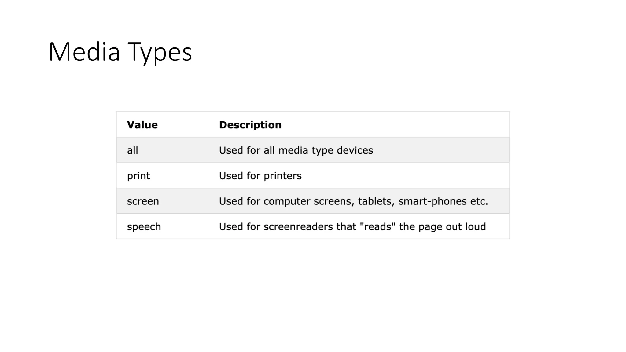
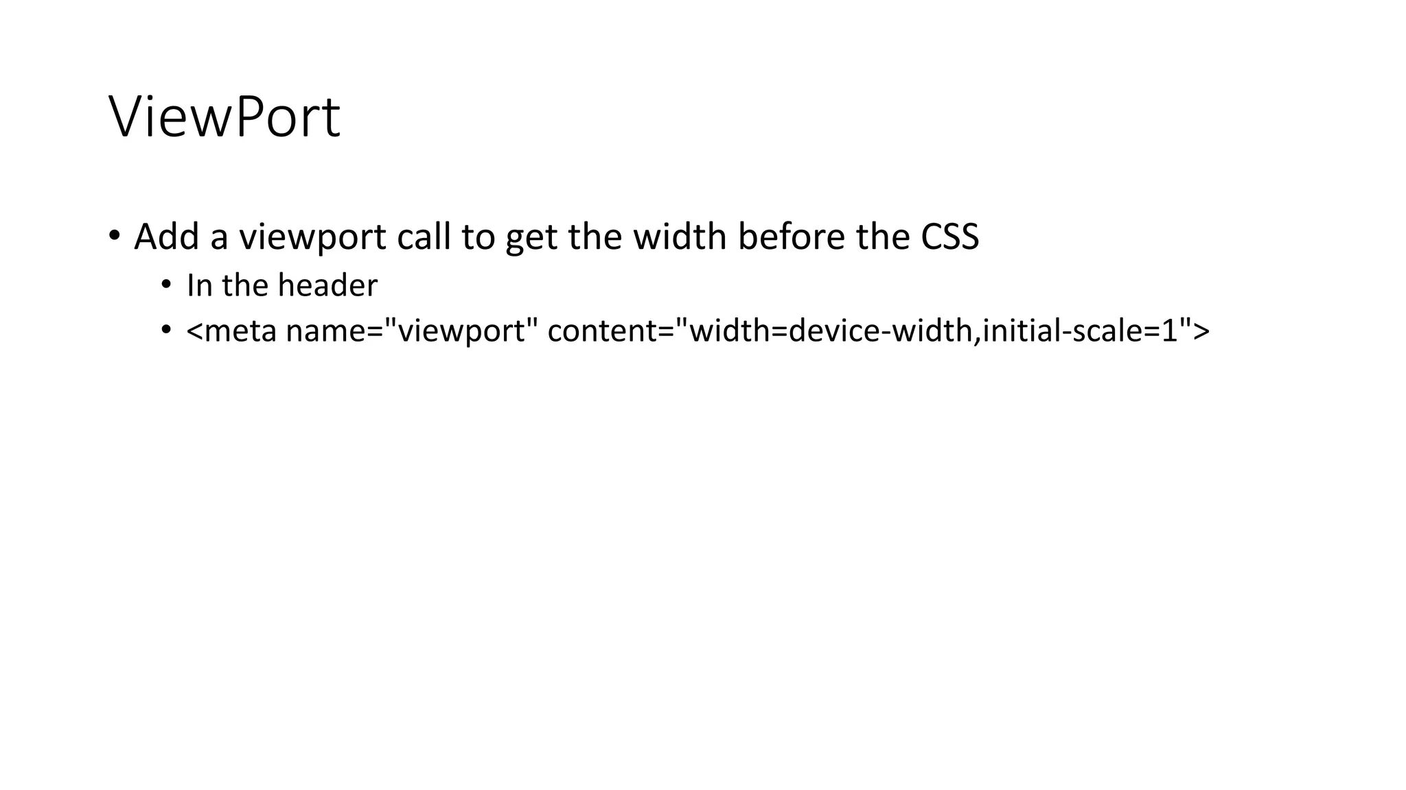
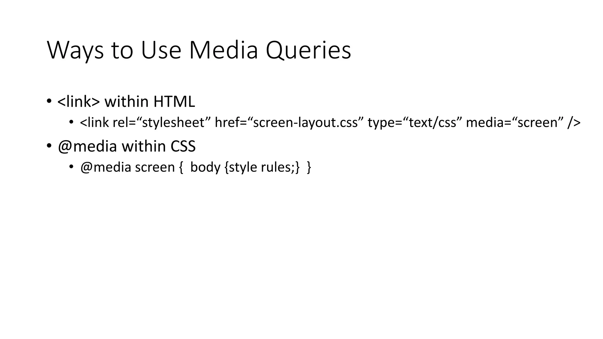
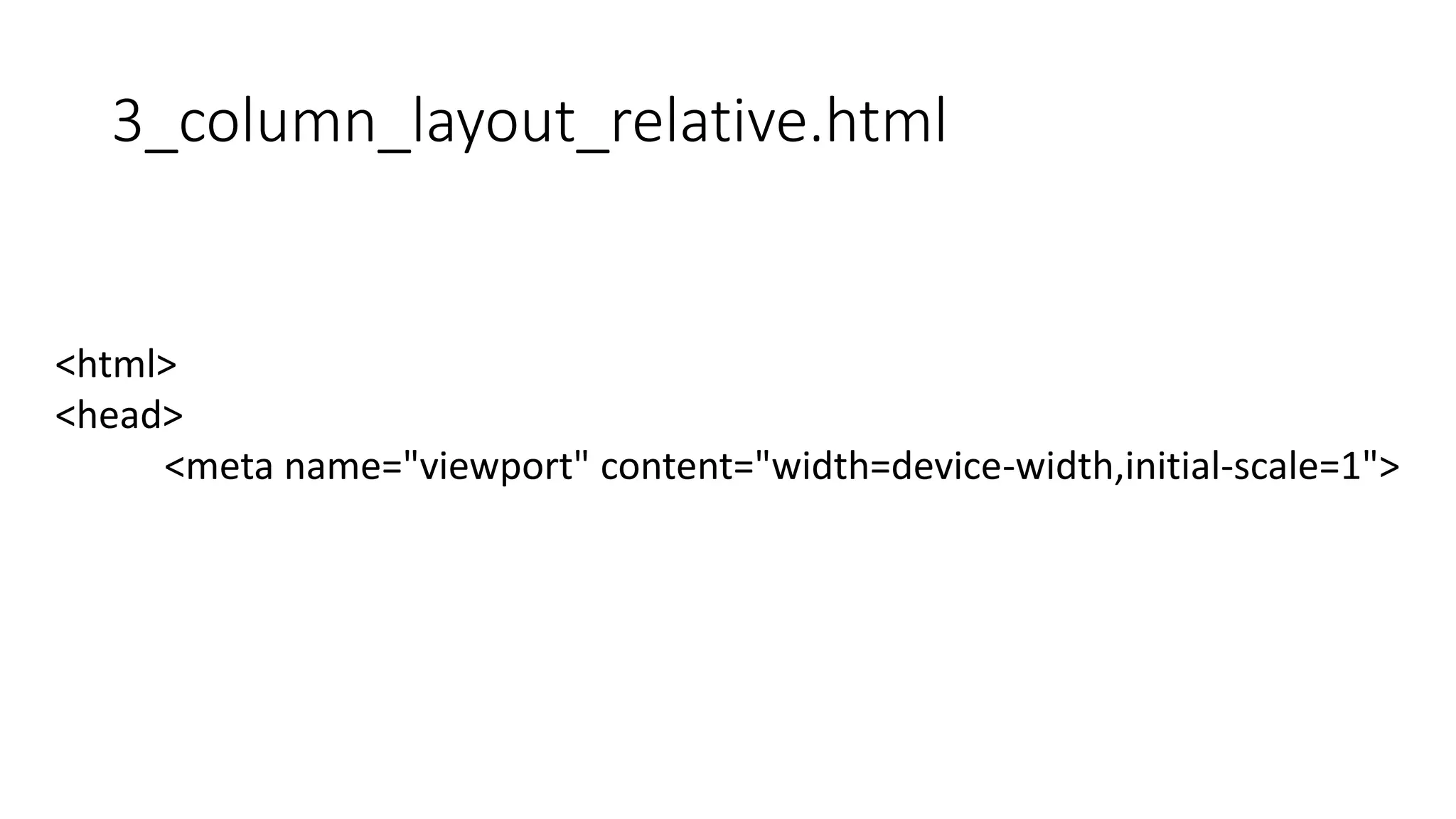
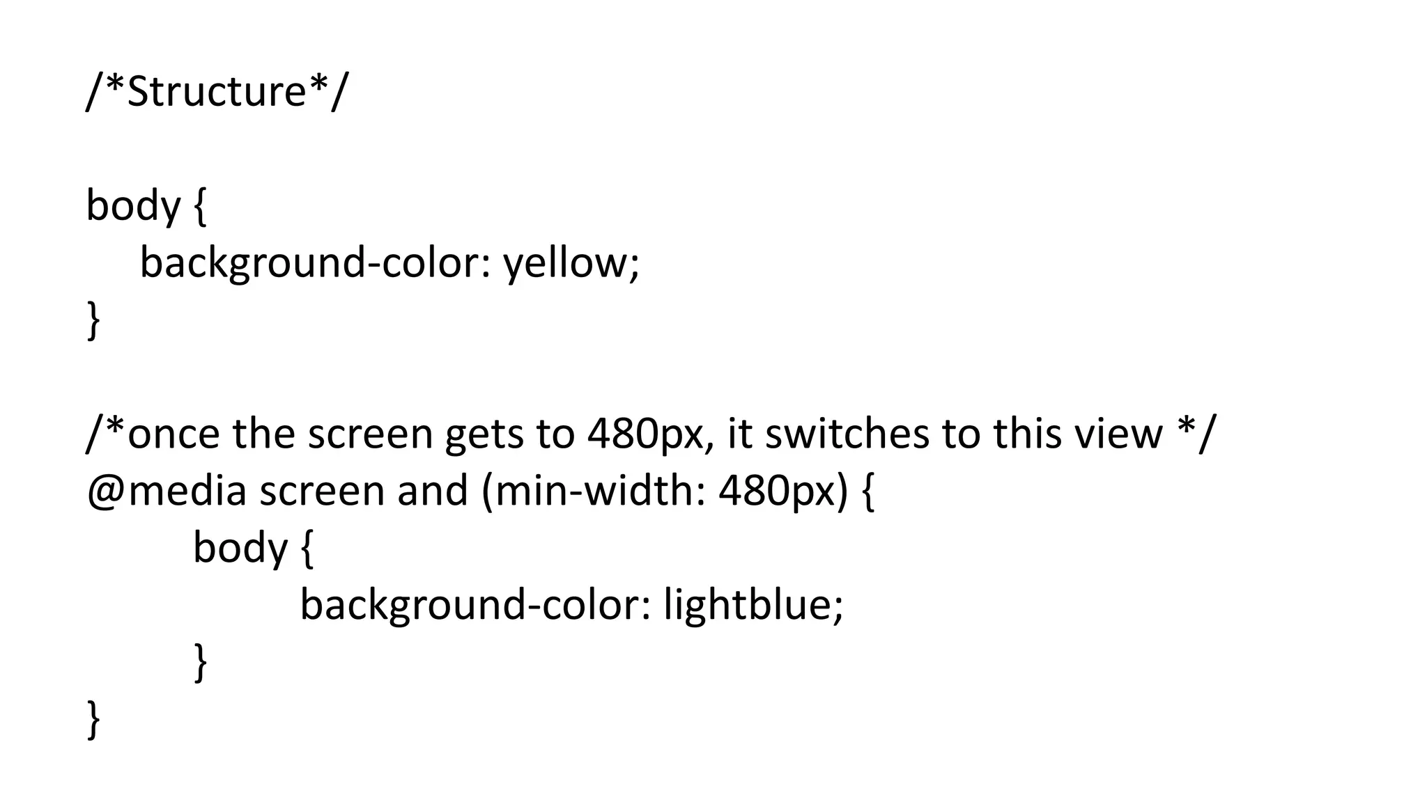
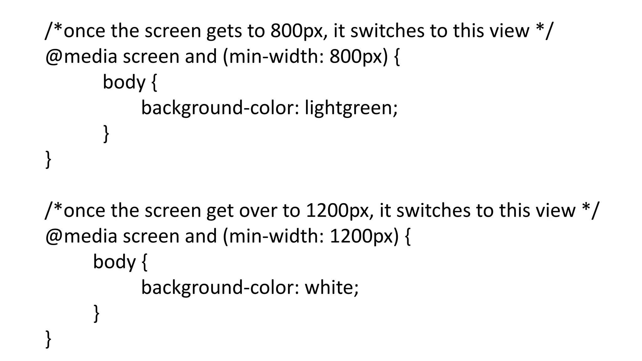
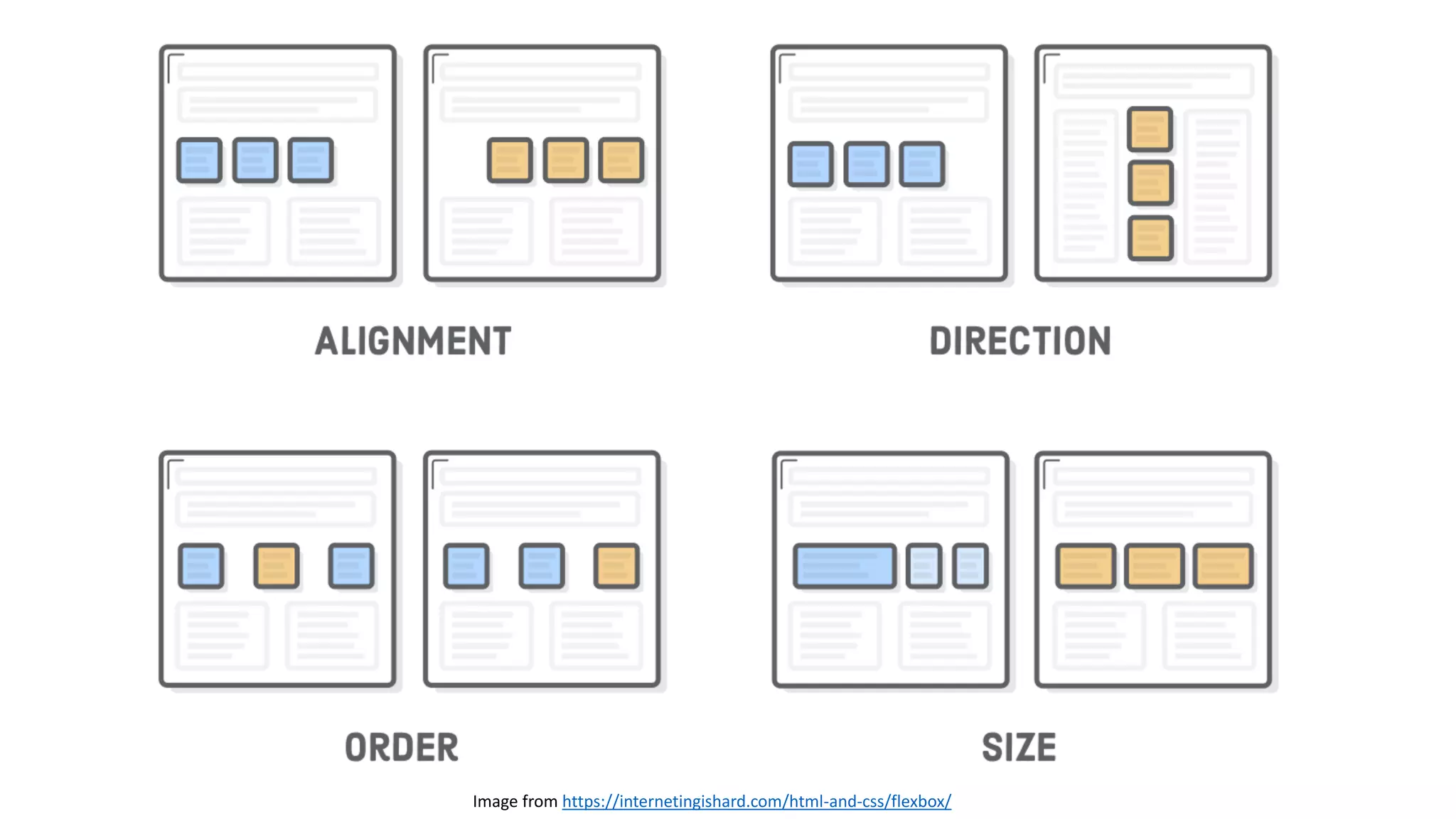
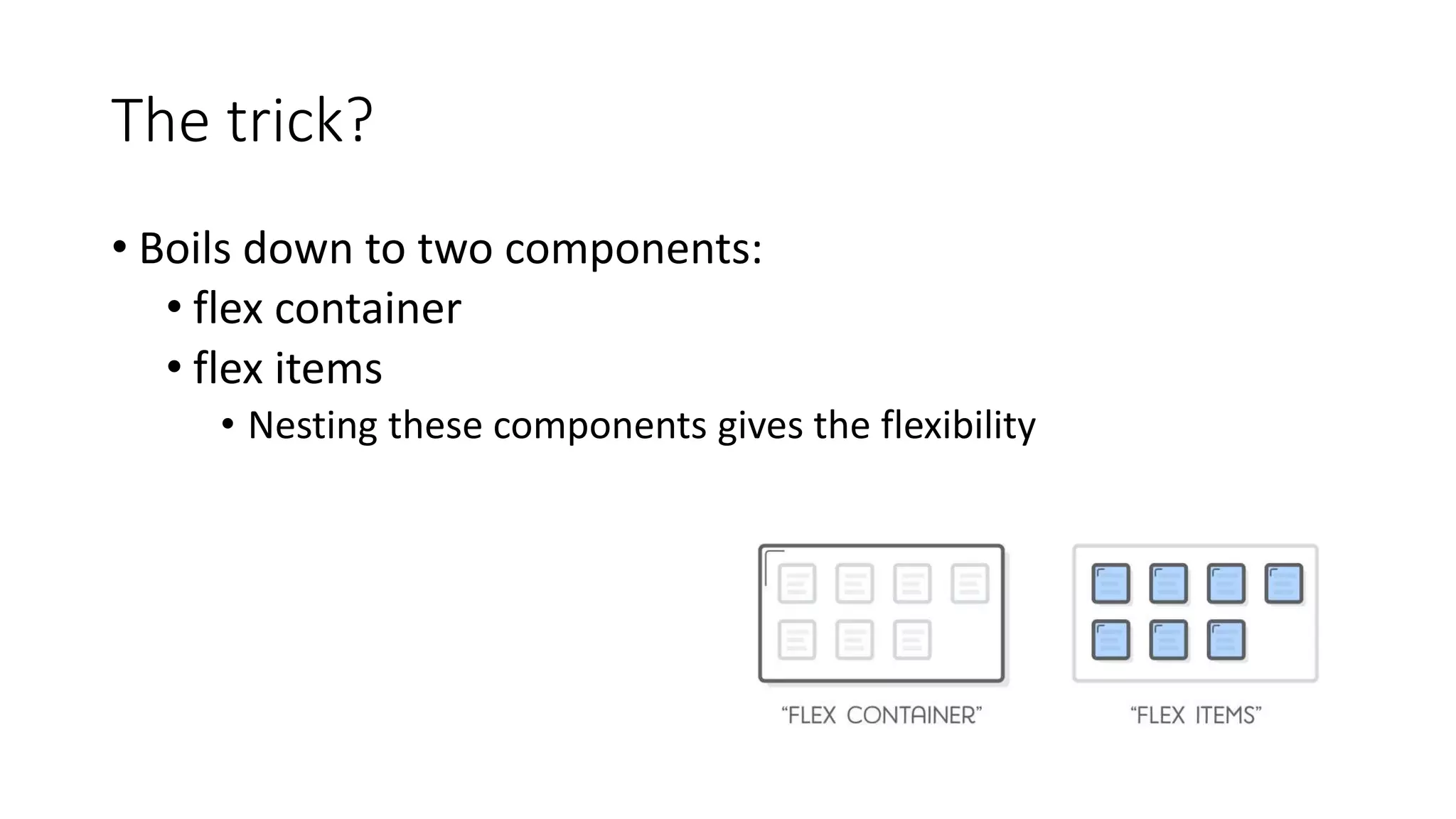
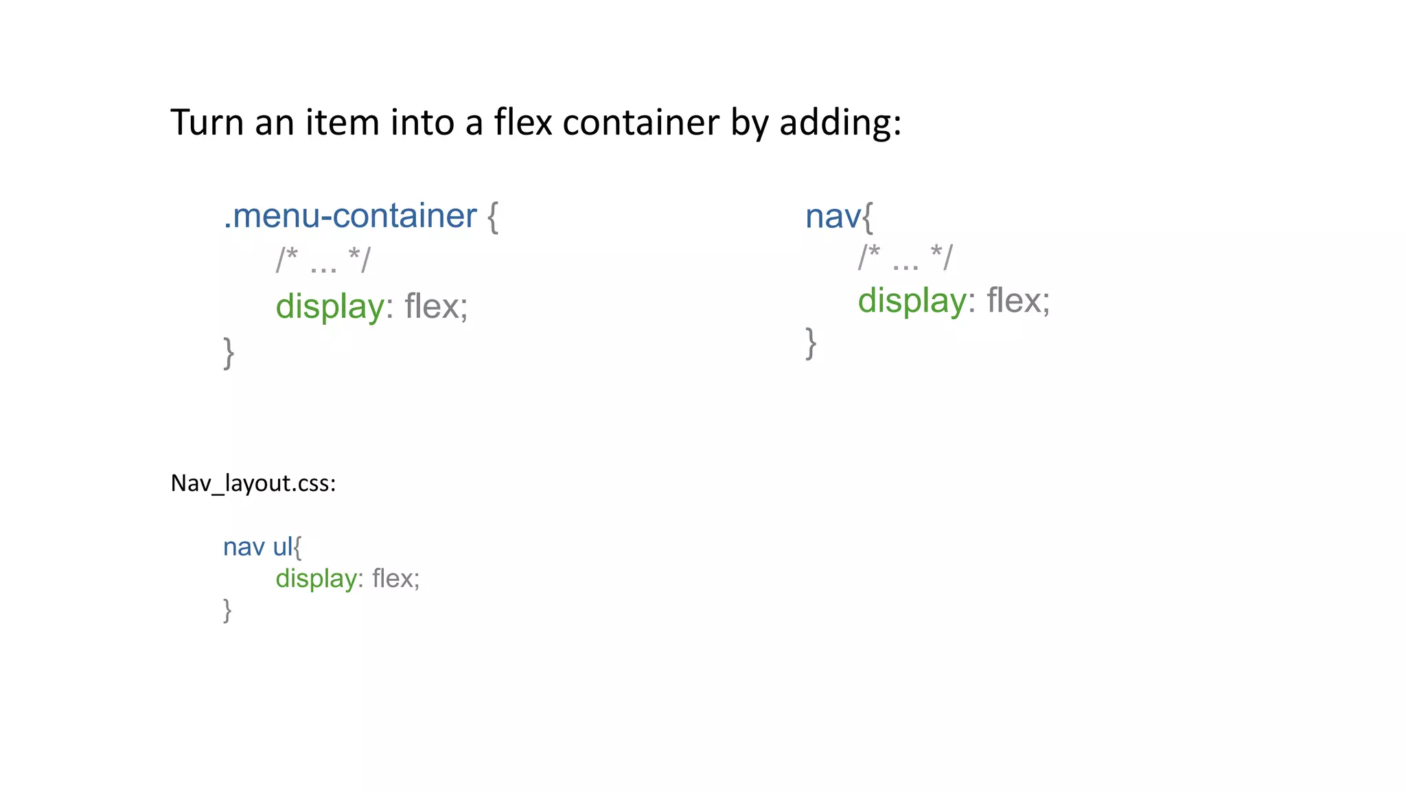
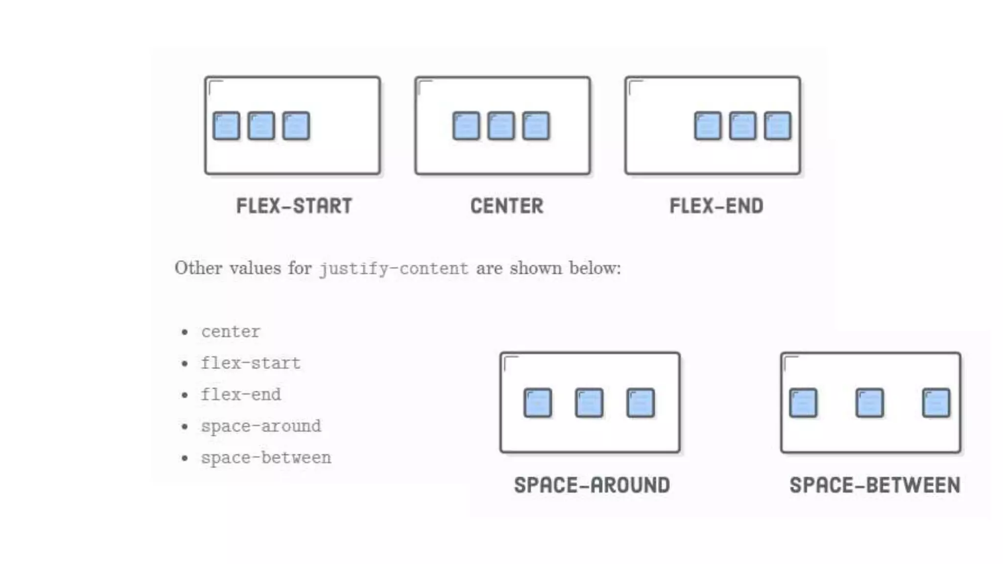
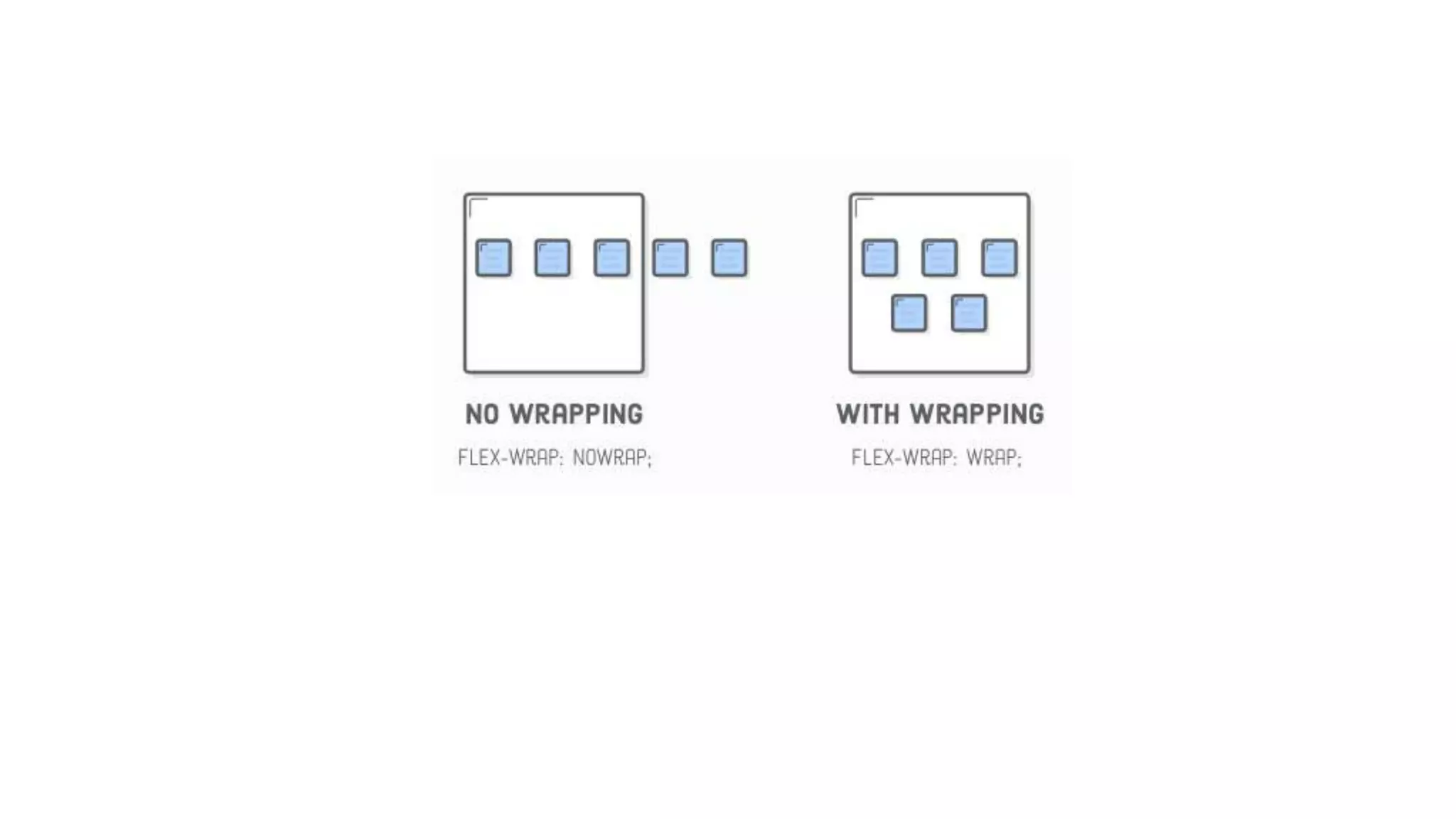
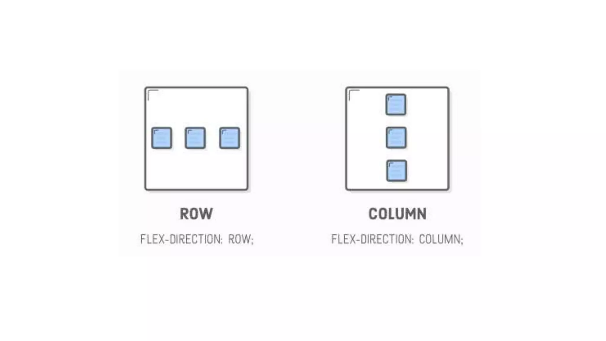
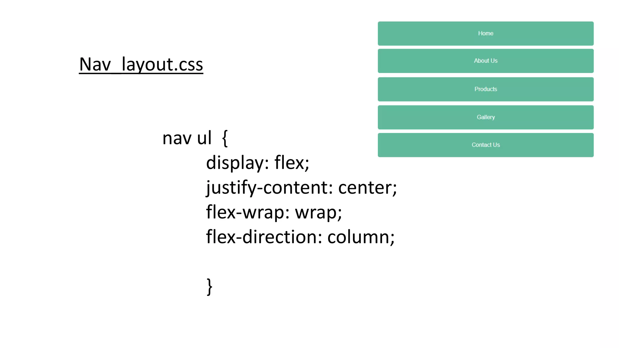
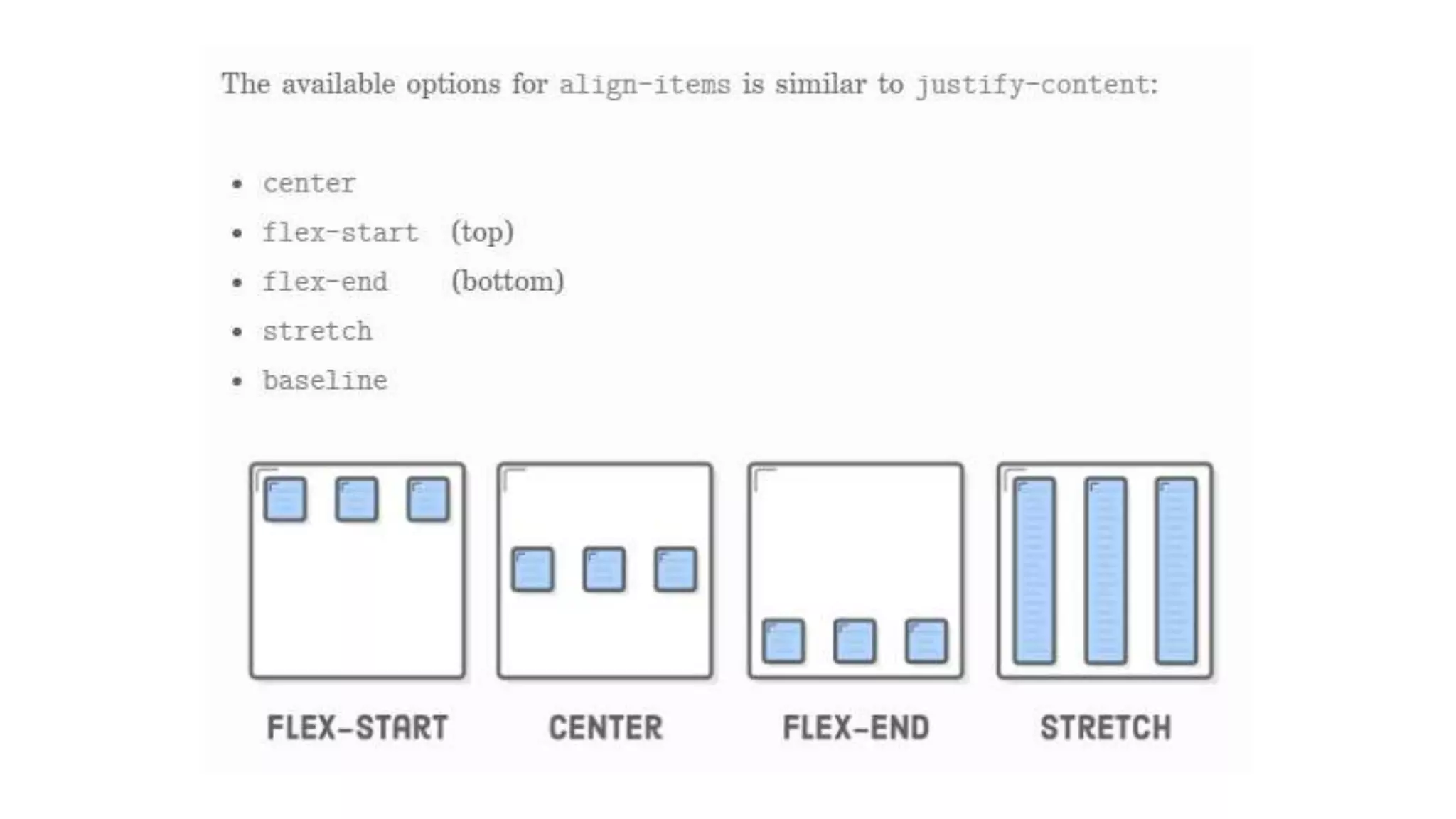
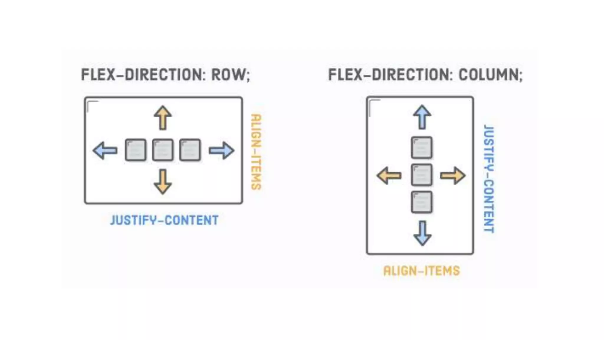
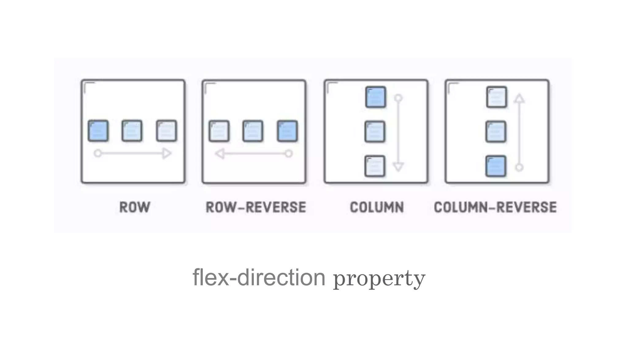
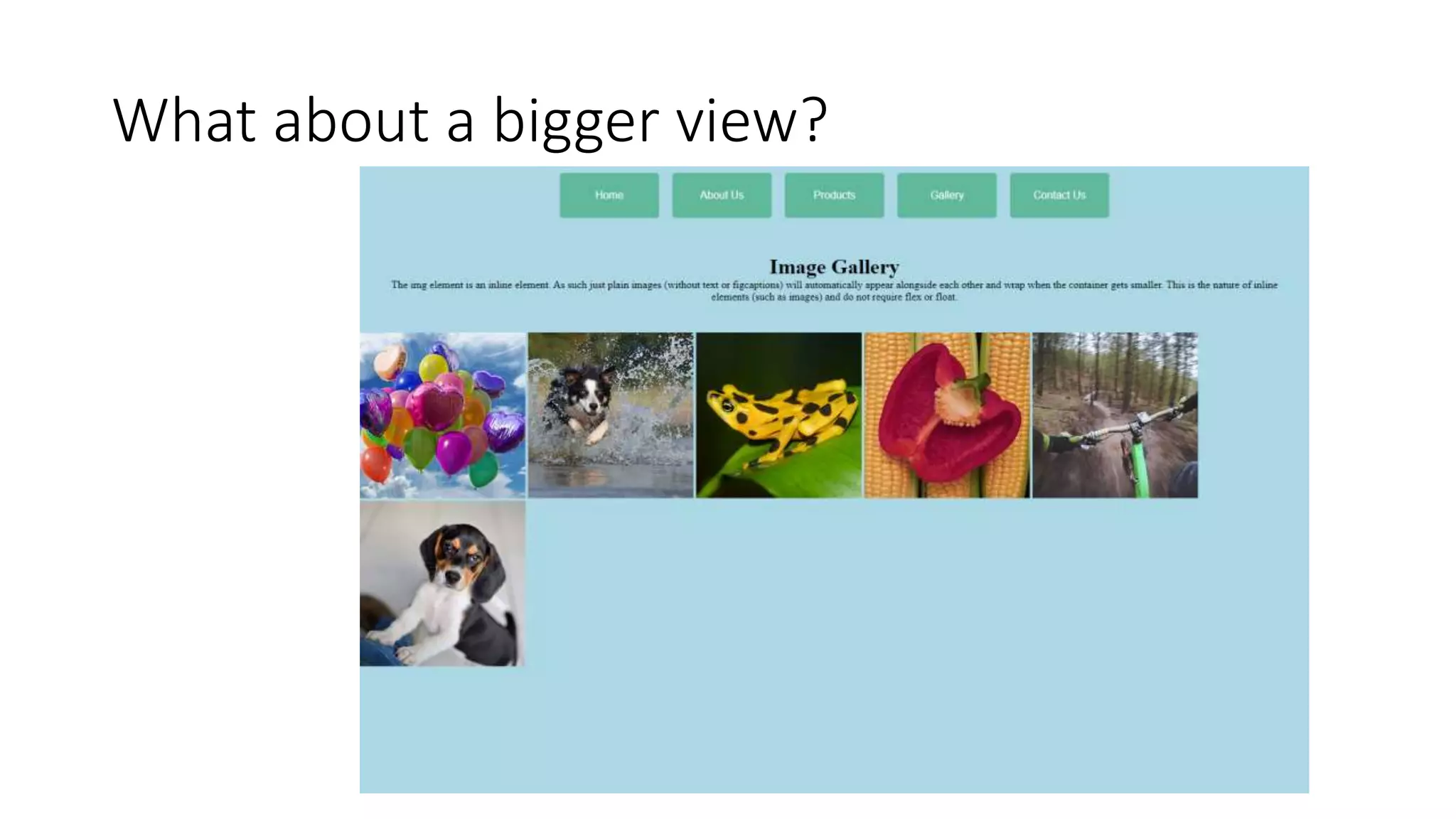
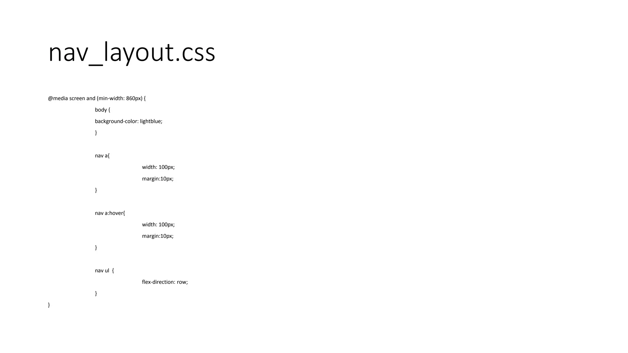
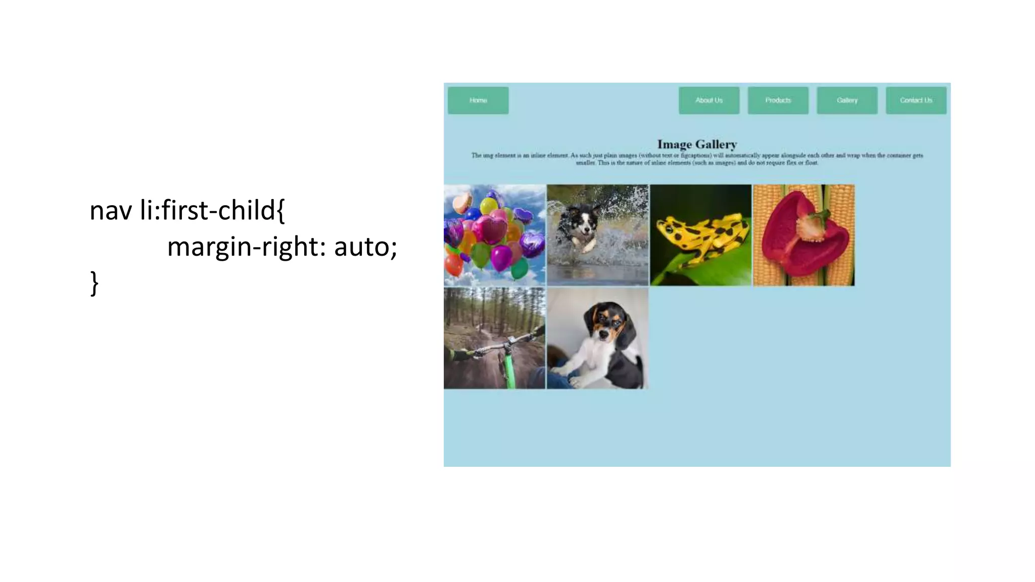
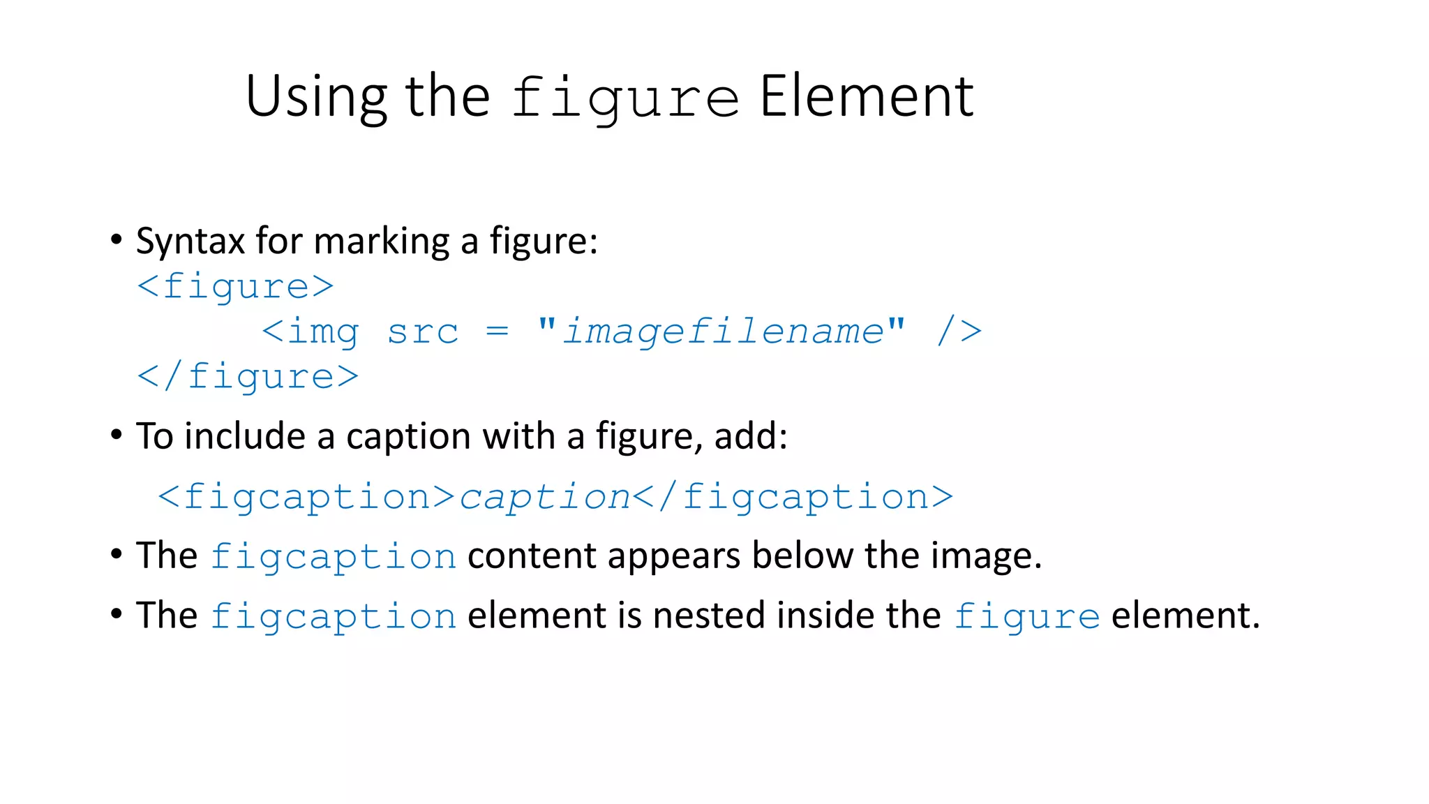
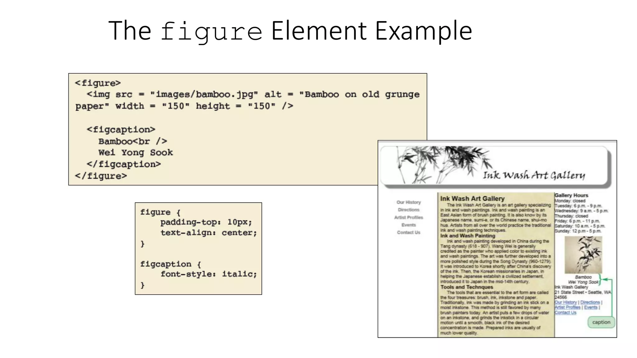
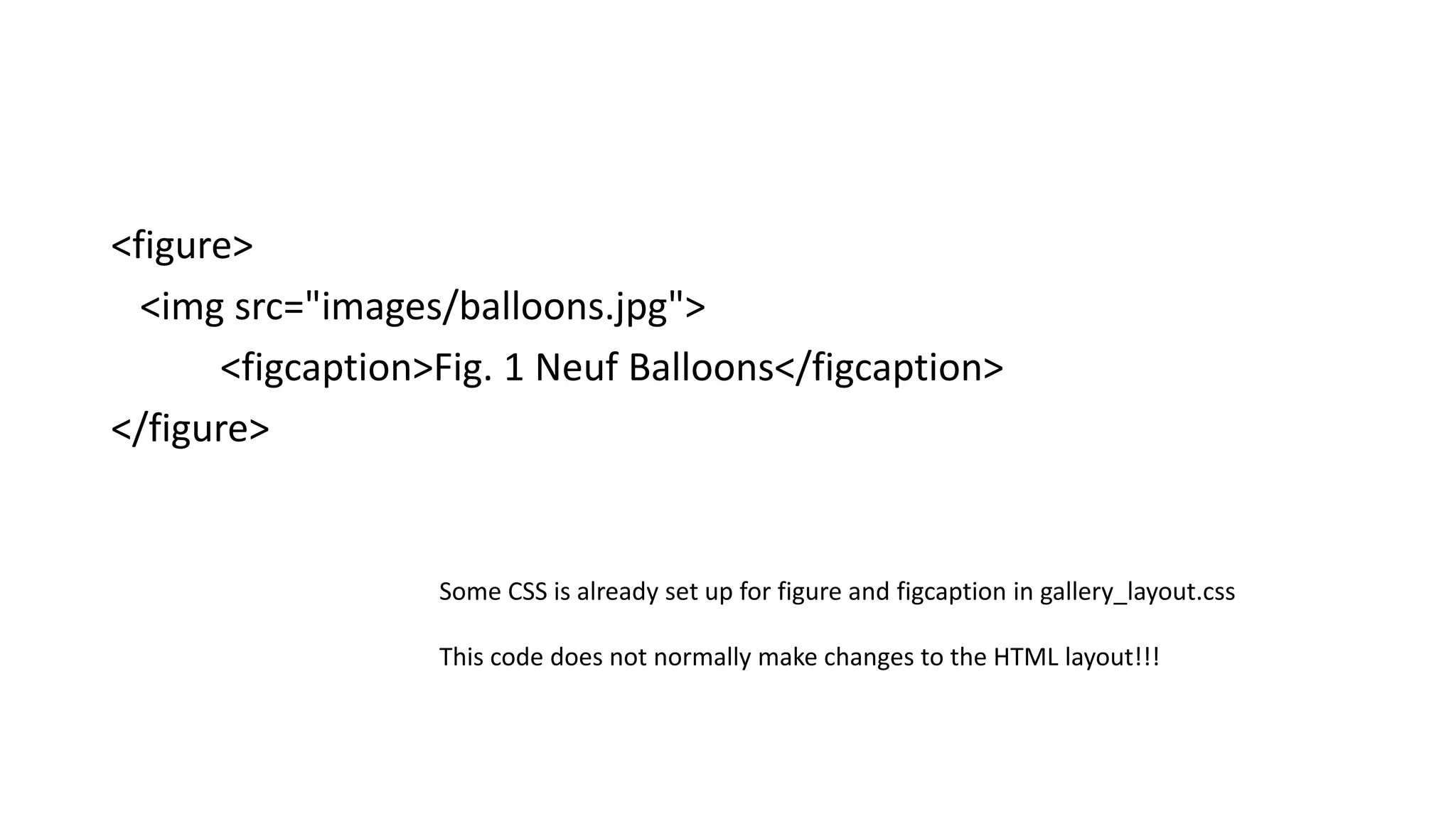
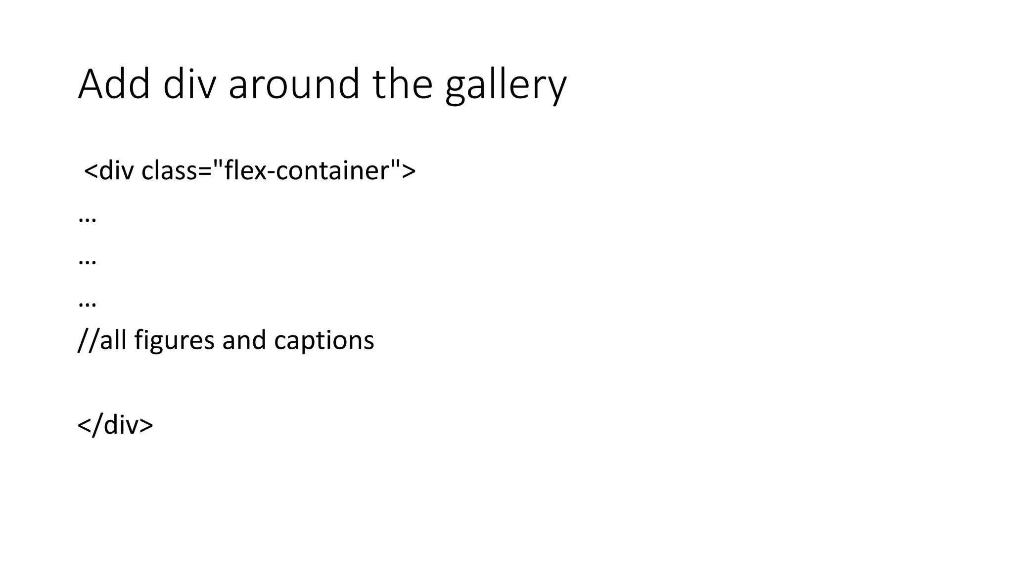
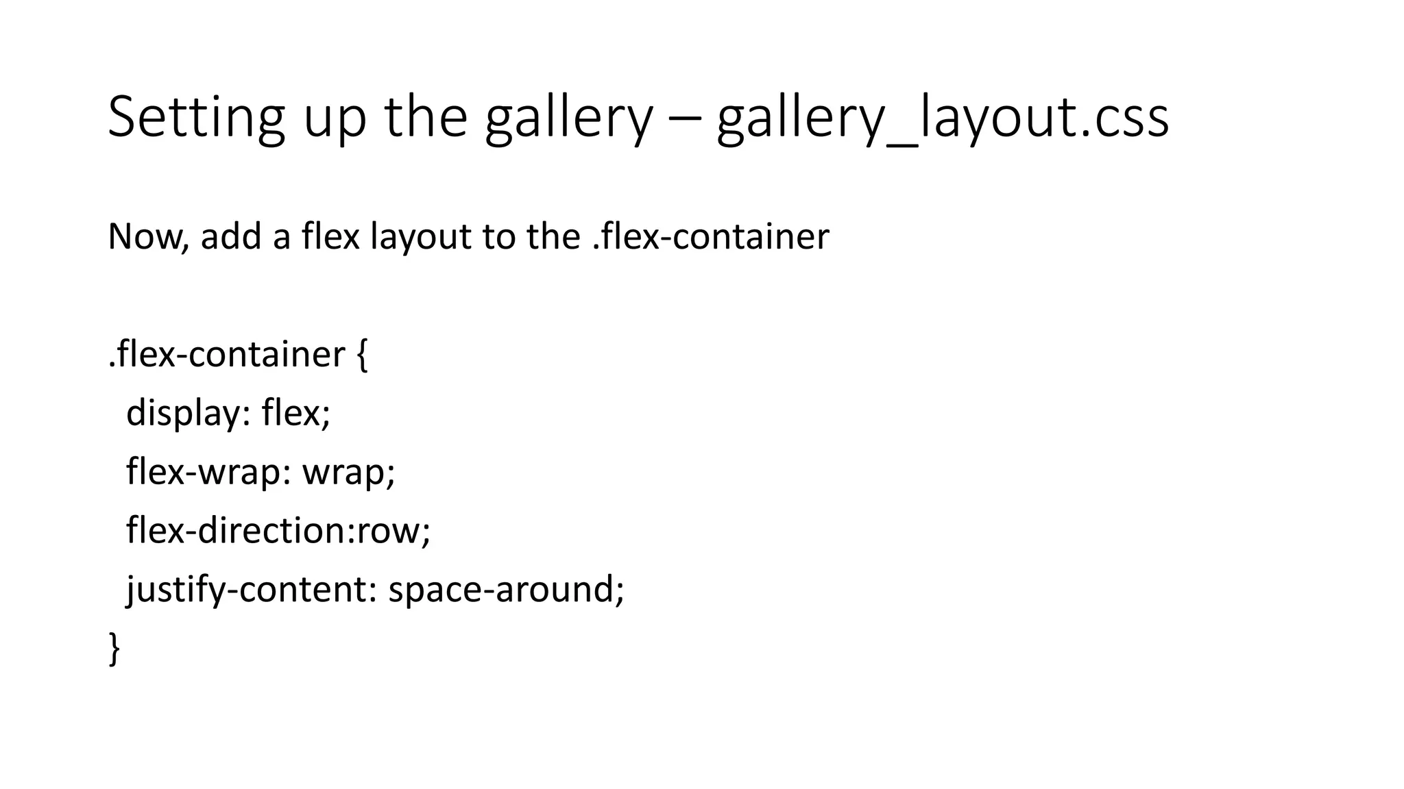
Media Queries
Allow us to change the layout without changing the content
Layout differs based on screen size
Media Types
ViewPort
• Add a viewport call to get the width before the CSS
• In the header
• <meta name="viewport" content="width=device-width,initial-scale=1">
Ways to Use Media Queries
• <link> within HTML
• <link rel=“stylesheet” href=“screen-layout.css” type=“text/css” media=“screen” />
• @media within CSS
• @media screen { body {style rules;} }
3_column_layout_relative.html
<html>
<head>
<meta name="viewport" content="width=device-width,initial-scale=1">
/*Structure*/
body {
background-color: yellow;
}
/*once the screen gets to 480px, it switches to this view */
@media screen and (min-width: 480px) {
body {
background-color: lightblue;
}
}
/*once the screen gets to 800px, it switches to this view */
@media screen and (min-width: 800px) {
body {
background-color: lightgreen;
}
}
/*once the screen get over to 1200px, it switches to this view */
@media screen and (min-width: 1200px) {
body {
background-color: white;
}
}
CSS Flexbox
A Layout Alternative to Floats
Why?
• Easier to change layout to mobile
• Gives us control over appearance
Image from https://internetingishard.com/html-and-css/flexbox/
The trick?
• Boils down to two components:
• flex container
• flex items
• Nesting these components gives the flexibility
Turn an item into a flex container by adding:
.menu-container {
/* ... */
display: flex;
}
nav{
/* ... */
display: flex;
}
Nav_layout.css:
nav ul{
display: flex;
}
nav ul {
display: flex;
justify-content: center;
flex-wrap: wrap;
flex-direction: column;
}
Nav_layout.css
flex-direction property
Nesting Elements
• Flex containers only know how to position elements that are one level
deep (i.e., their child elements).
• They don’t care one bit about what’s inside their flex items.
• Wrapping a bunch of items in an extra <div> results in a totally
different web page.
What about a bigger view?
nav_layout.css
@media screen and (min-width: 860px) {
body {
background-color: lightblue;
}
nav a{
width: 100px;
margin:10px;
}
nav a:hover{
width: 100px;
margin:10px;
}
nav ul {
flex-direction: row;
}
}
nav li:first-child{
margin-right: auto;
}
Using the figure Element
• An image can be used as a logo, a background image, a bullet for a list
item, or the basis of an image map.
• When an image is provided for informational purposes, it can be
marked with the figure element rather than a paragraph or
another block-level element.
• The figure element can also include a caption, which you mark
using the figcaption element.
Using the figure Element
• Syntax for marking a figure:
<figure>
<img src = "imagefilename" />
</figure>
• To include a caption with a figure, add:
<figcaption>caption</figcaption>
• The figcaption content appears below the image.
• The figcaption element is nested inside the figure element.
The figure Element Example
<figure>
<img src="images/balloons.jpg">
<figcaption>Fig. 1 Neuf Balloons</figcaption>
</figure>
Some CSS is already set up for figure and figcaption in gallery_layout.css
This code does not normally make changes to the HTML layout!!!
Add div around the gallery
<div class="flex-container">
…
…
…
//all figures and captions
</div>
Setting up the gallery – gallery_layout.css
Now, add a flex layout to the .flex-container
.flex-container {
display: flex;
flex-wrap: wrap;
flex-direction:row;
justify-content: space-around;
}

Layouts Part 2

  • 1.
    Media Queries Allow usto change the layout without changing the content
  • 2.
    Layout differs basedon screen size
  • 3.
  • 4.
    ViewPort • Add aviewport call to get the width before the CSS • In the header • <meta name="viewport" content="width=device-width,initial-scale=1">
  • 5.
    Ways to UseMedia Queries • <link> within HTML • <link rel=“stylesheet” href=“screen-layout.css” type=“text/css” media=“screen” /> • @media within CSS • @media screen { body {style rules;} }
  • 6.
  • 7.
    /*Structure*/ body { background-color: yellow; } /*oncethe screen gets to 480px, it switches to this view */ @media screen and (min-width: 480px) { body { background-color: lightblue; } }
  • 8.
    /*once the screengets to 800px, it switches to this view */ @media screen and (min-width: 800px) { body { background-color: lightgreen; } } /*once the screen get over to 1200px, it switches to this view */ @media screen and (min-width: 1200px) { body { background-color: white; } }
  • 9.
    CSS Flexbox A LayoutAlternative to Floats
  • 10.
    Why? • Easier tochange layout to mobile • Gives us control over appearance
  • 11.
  • 12.
    The trick? • Boilsdown to two components: • flex container • flex items • Nesting these components gives the flexibility
  • 13.
    Turn an iteminto a flex container by adding: .menu-container { /* ... */ display: flex; } nav{ /* ... */ display: flex; } Nav_layout.css: nav ul{ display: flex; }
  • 17.
    nav ul { display:flex; justify-content: center; flex-wrap: wrap; flex-direction: column; } Nav_layout.css
  • 20.
  • 21.
    Nesting Elements • Flexcontainers only know how to position elements that are one level deep (i.e., their child elements). • They don’t care one bit about what’s inside their flex items. • Wrapping a bunch of items in an extra <div> results in a totally different web page.
  • 22.
    What about abigger view?
  • 23.
    nav_layout.css @media screen and(min-width: 860px) { body { background-color: lightblue; } nav a{ width: 100px; margin:10px; } nav a:hover{ width: 100px; margin:10px; } nav ul { flex-direction: row; } }
  • 24.
  • 25.
    Using the figureElement • An image can be used as a logo, a background image, a bullet for a list item, or the basis of an image map. • When an image is provided for informational purposes, it can be marked with the figure element rather than a paragraph or another block-level element. • The figure element can also include a caption, which you mark using the figcaption element.
  • 26.
    Using the figureElement • Syntax for marking a figure: <figure> <img src = "imagefilename" /> </figure> • To include a caption with a figure, add: <figcaption>caption</figcaption> • The figcaption content appears below the image. • The figcaption element is nested inside the figure element.
  • 27.
  • 28.
    <figure> <img src="images/balloons.jpg"> <figcaption>Fig. 1Neuf Balloons</figcaption> </figure> Some CSS is already set up for figure and figcaption in gallery_layout.css This code does not normally make changes to the HTML layout!!!
  • 29.
    Add div aroundthe gallery <div class="flex-container"> … … … //all figures and captions </div>
  • 30.
    Setting up thegallery – gallery_layout.css Now, add a flex layout to the .flex-container .flex-container { display: flex; flex-wrap: wrap; flex-direction:row; justify-content: space-around; }