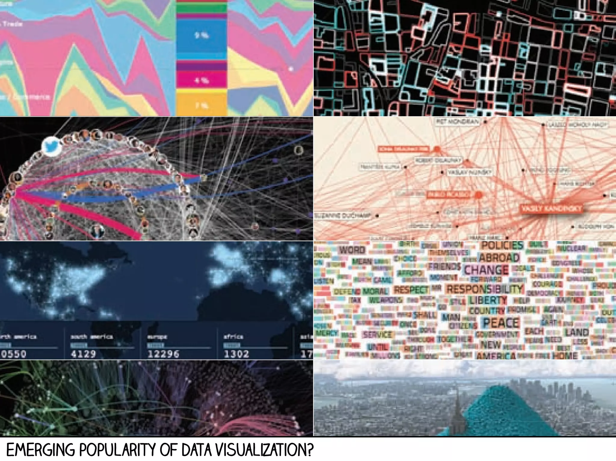
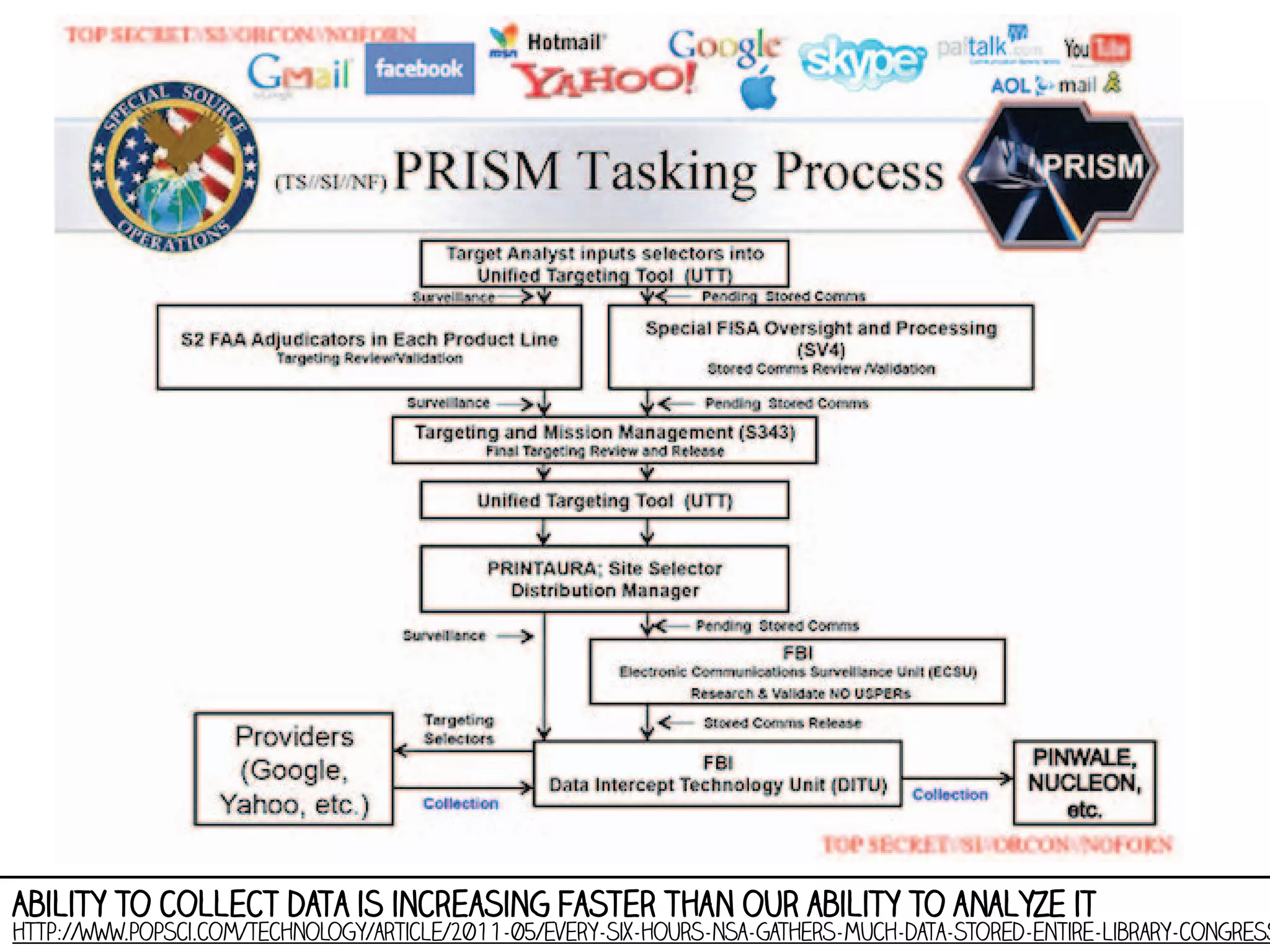
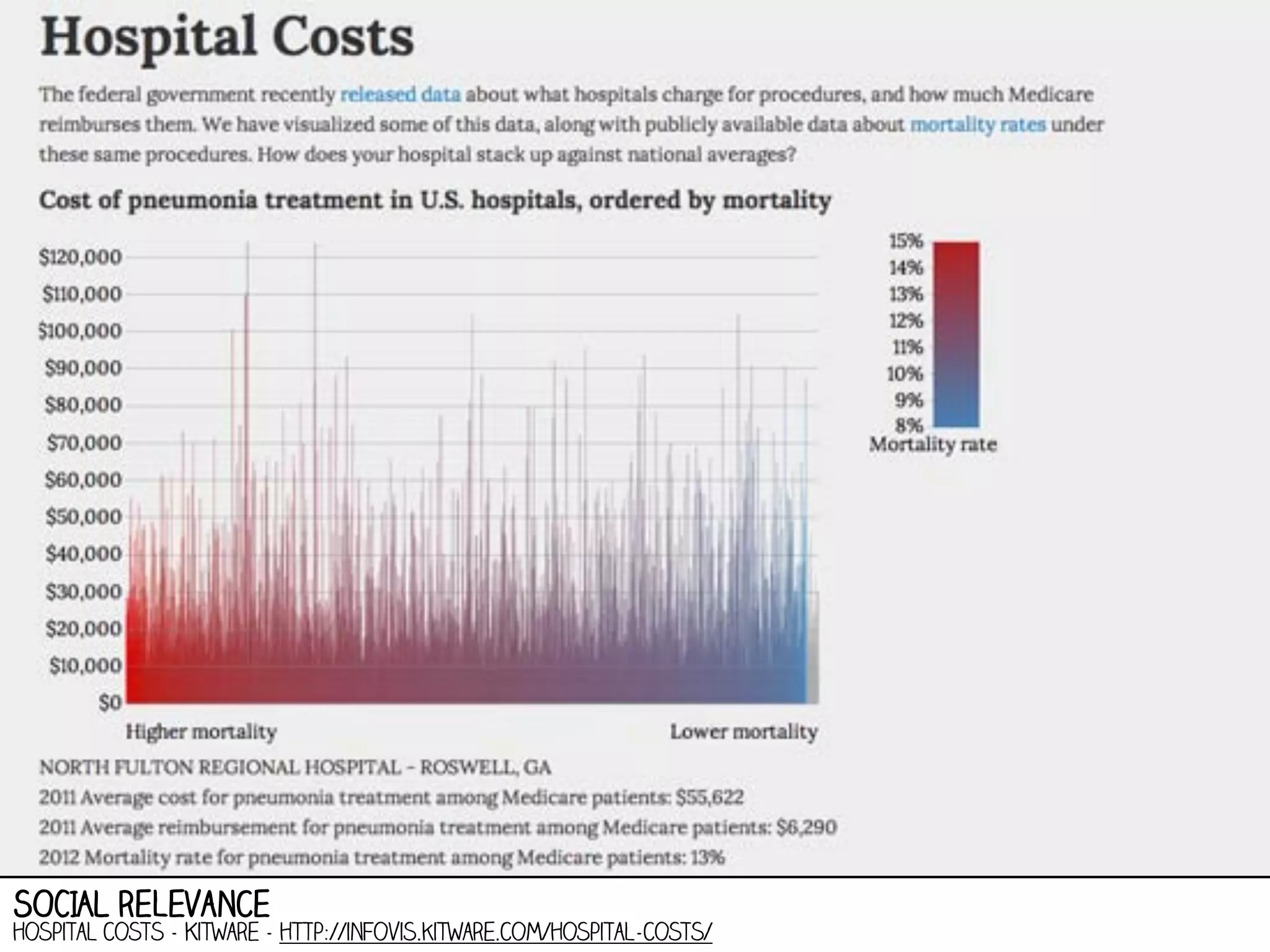
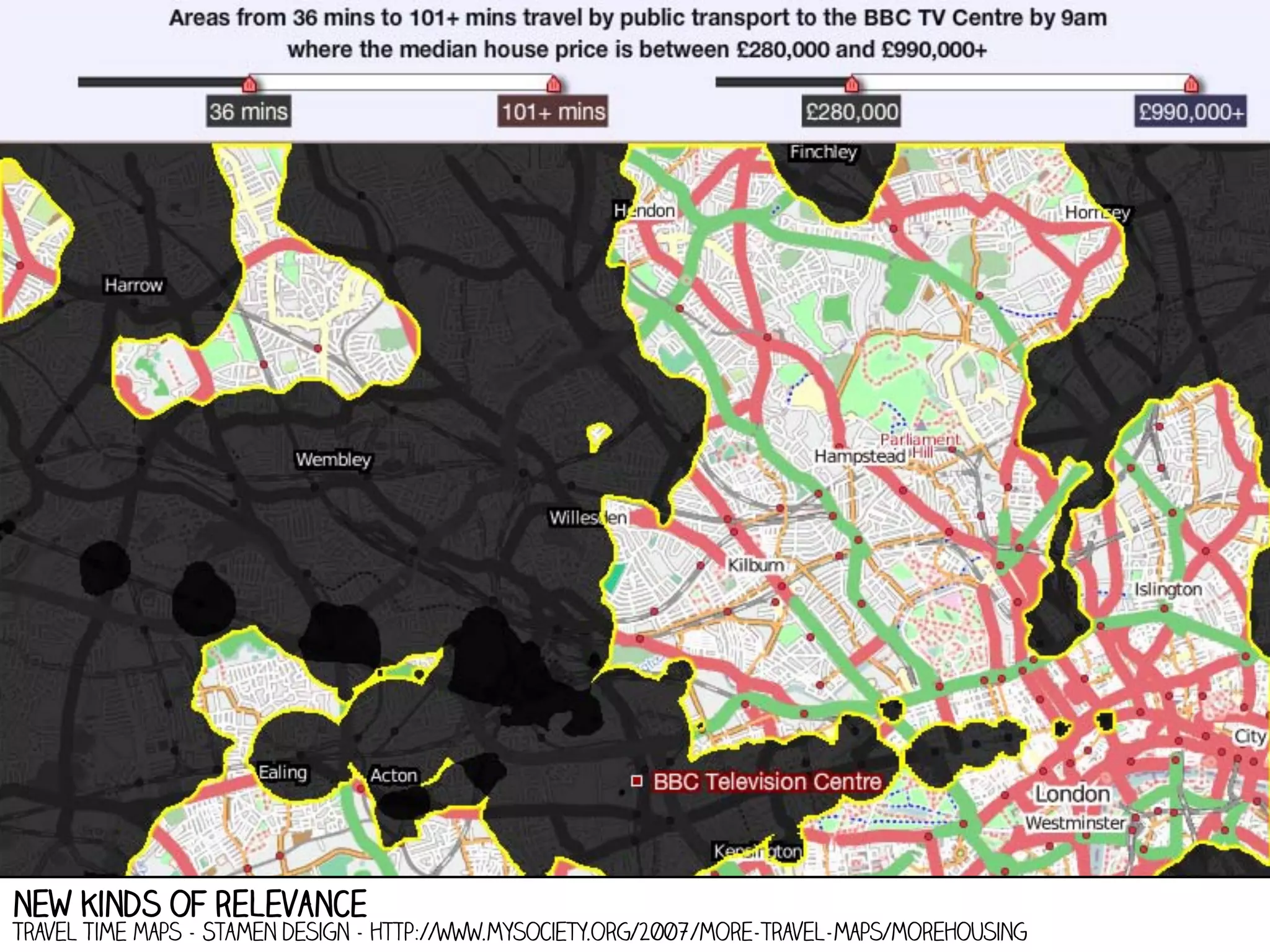
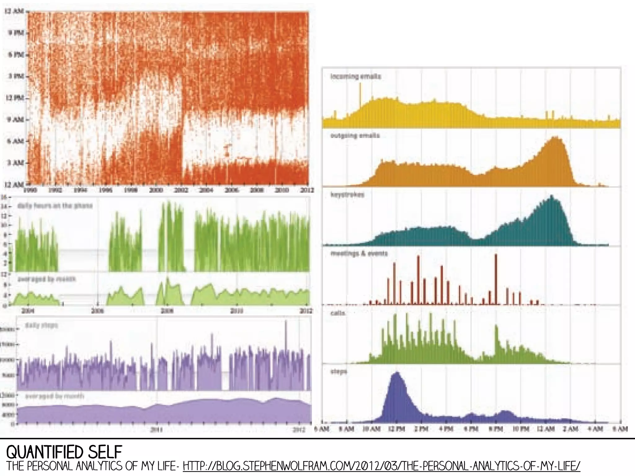
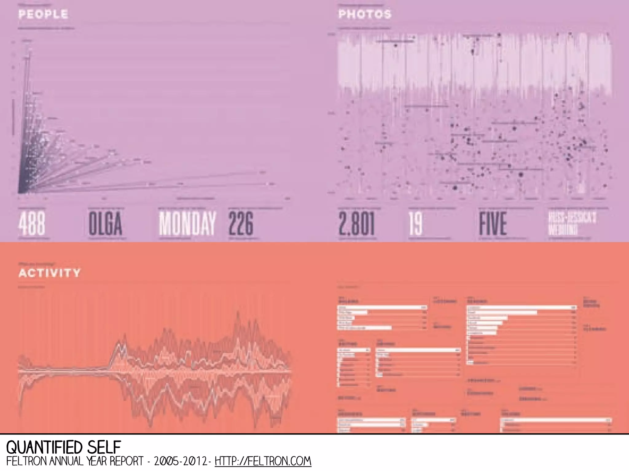
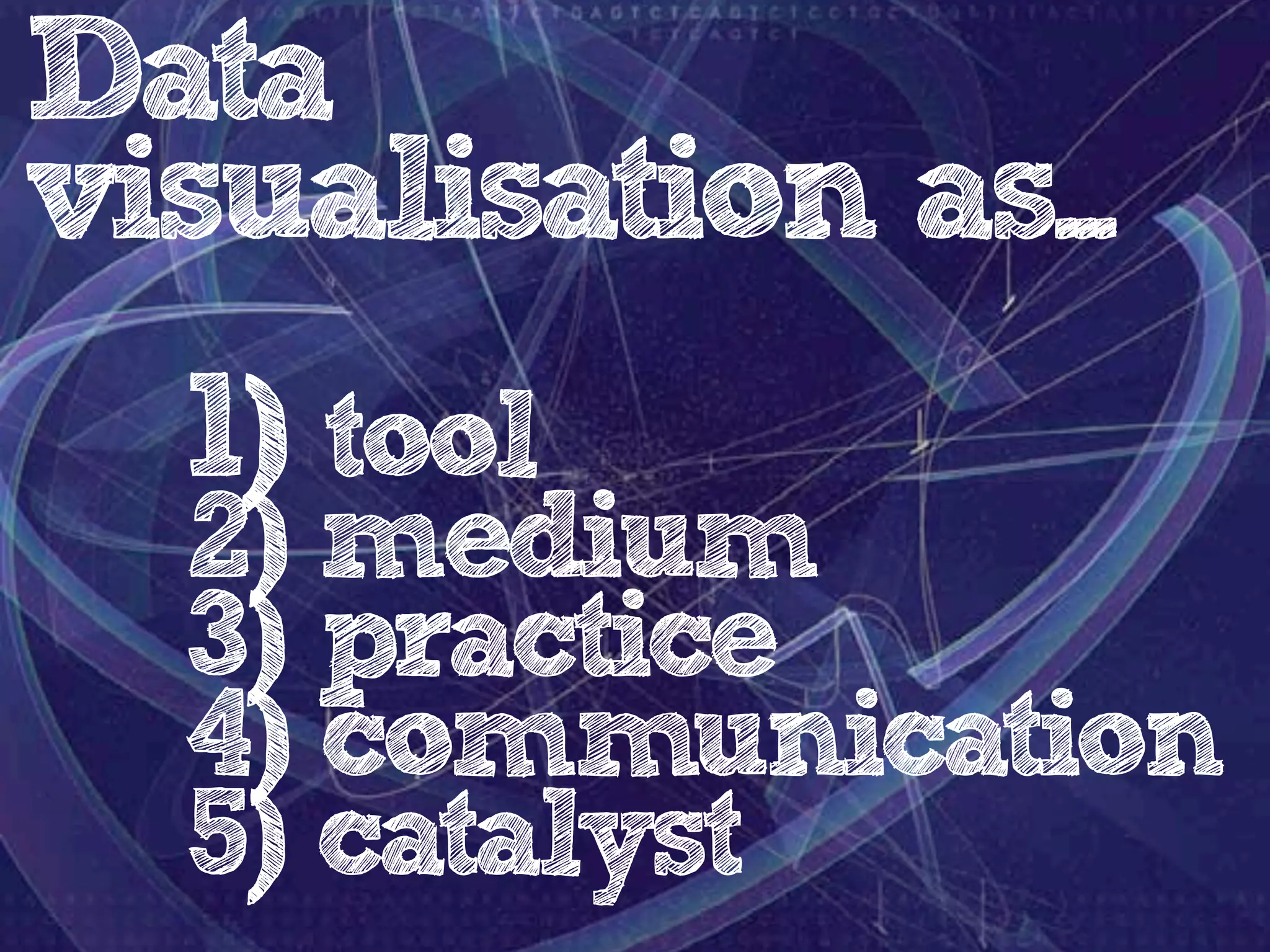
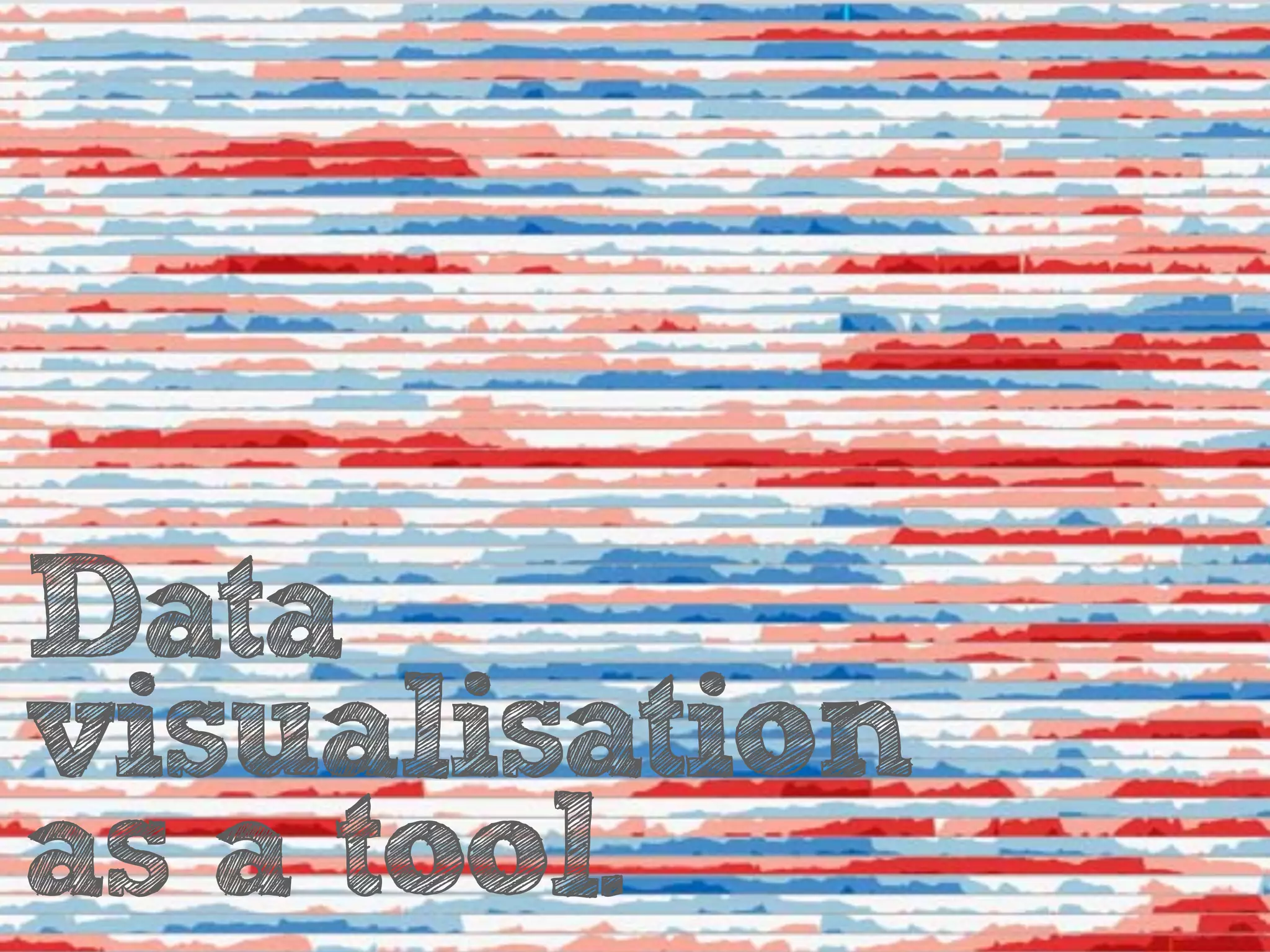
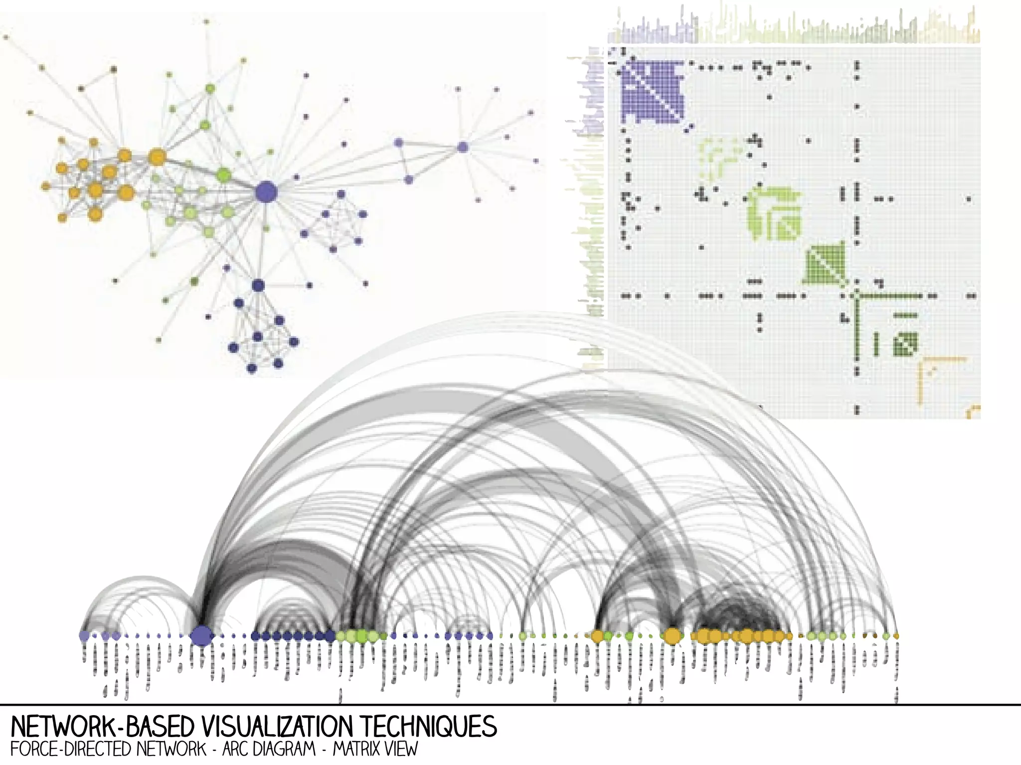
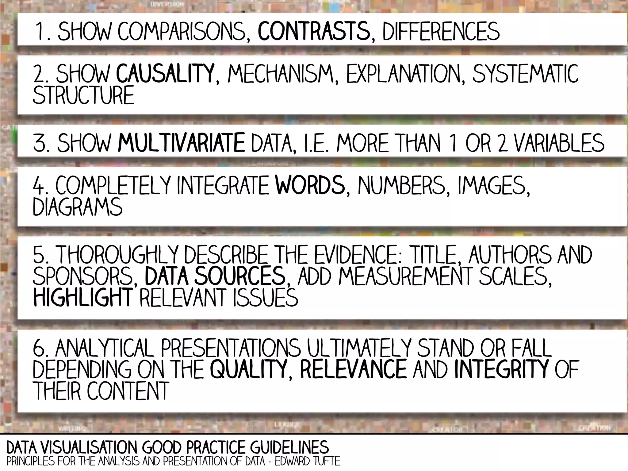
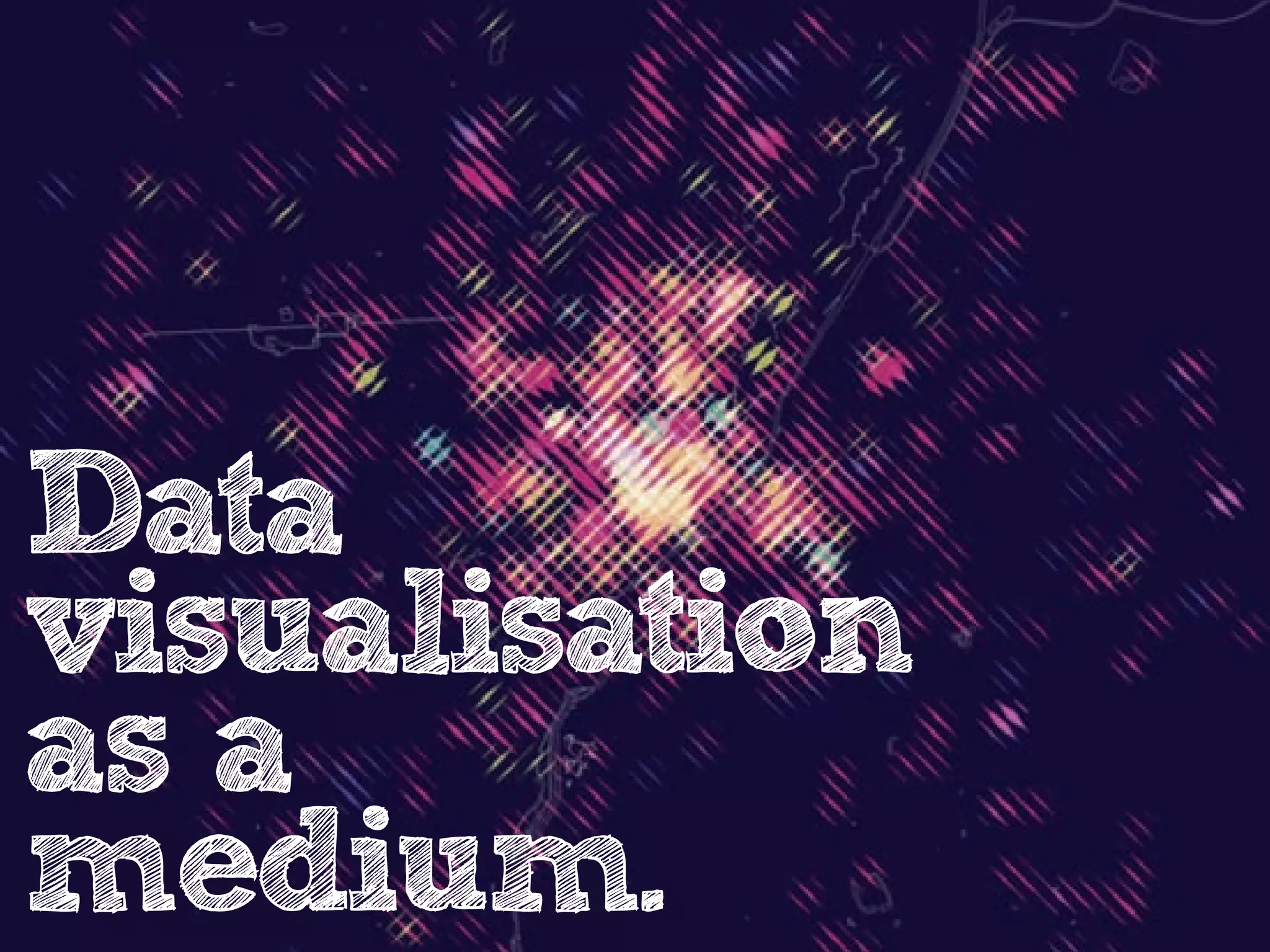
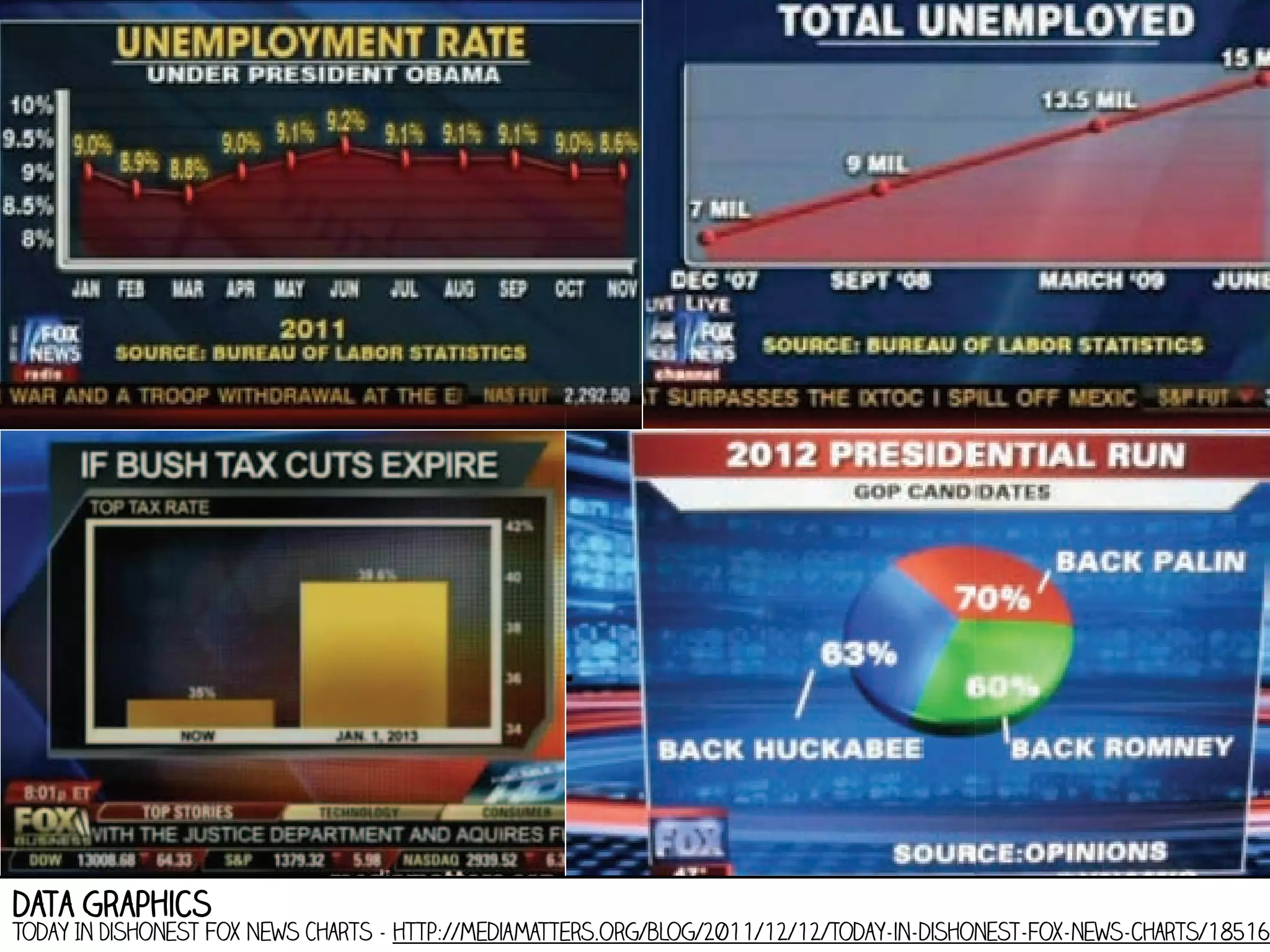
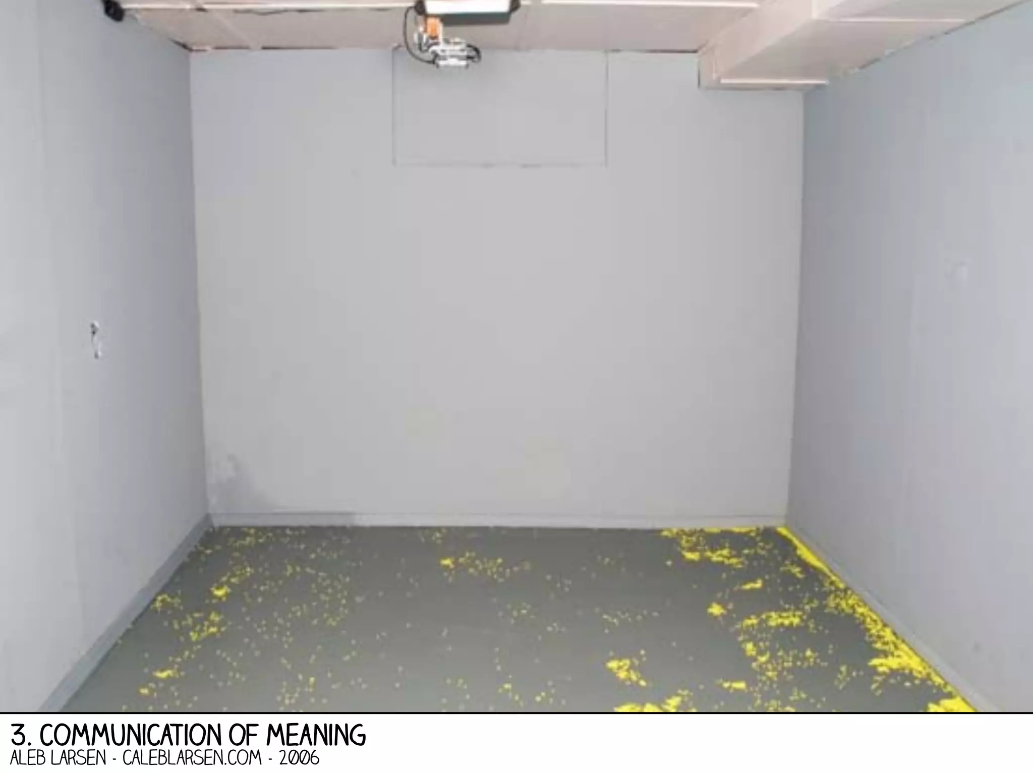
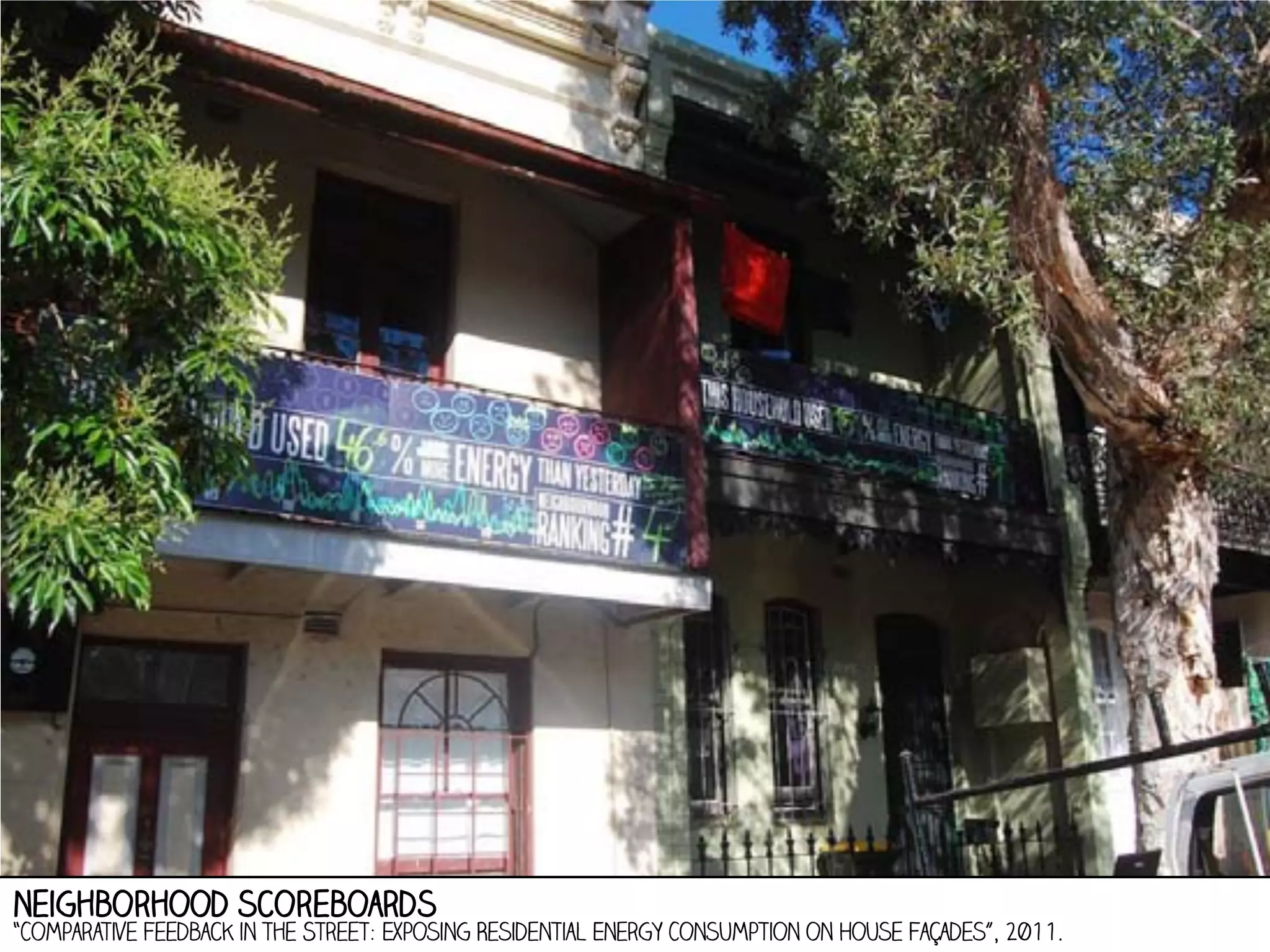
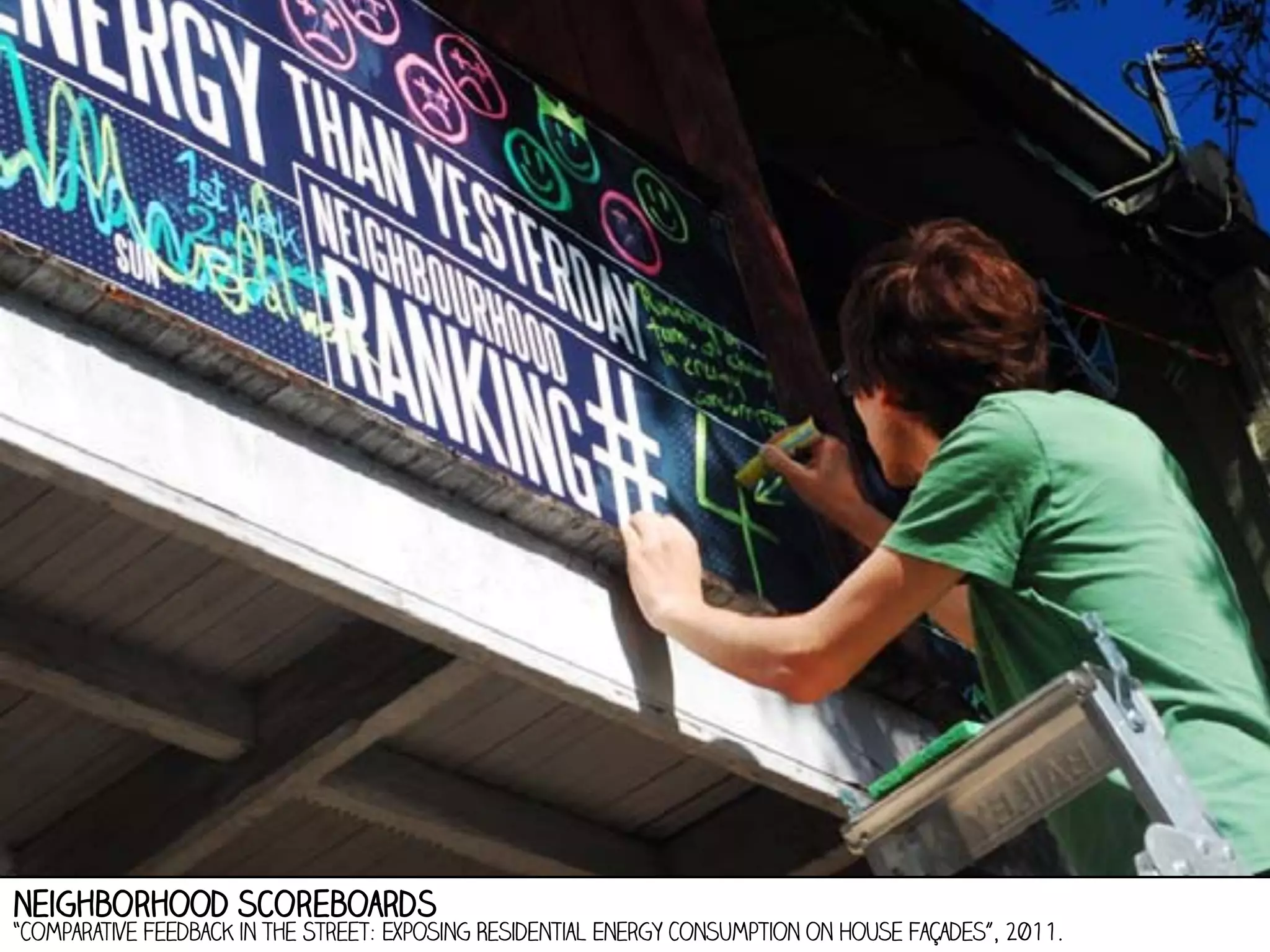
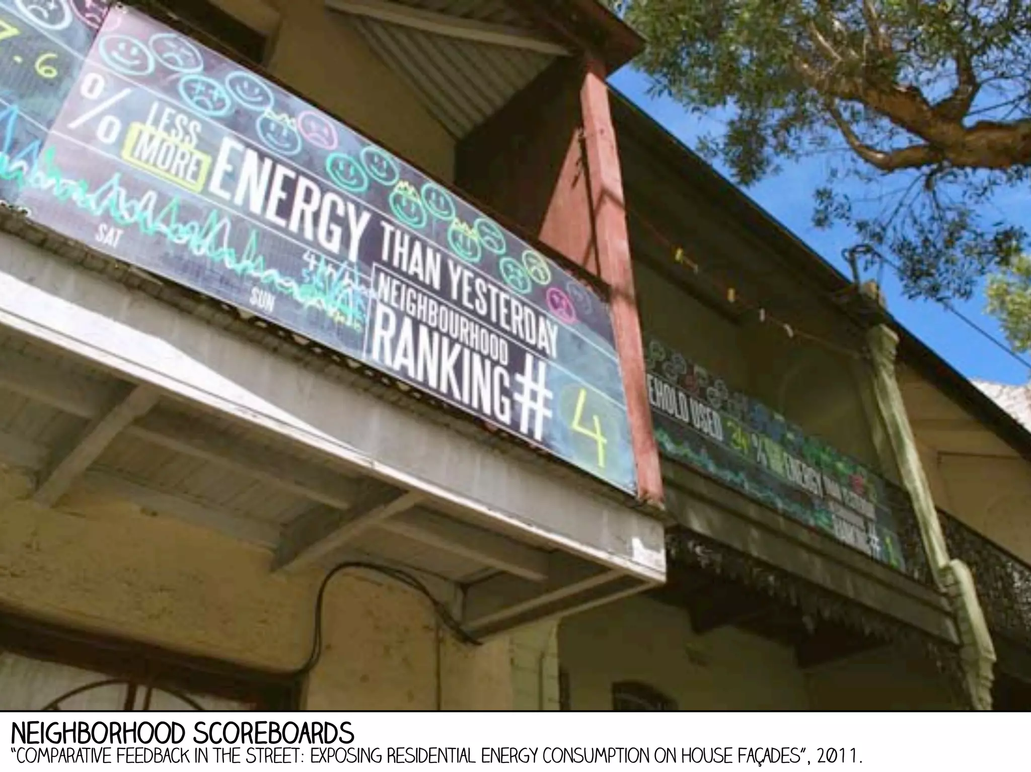
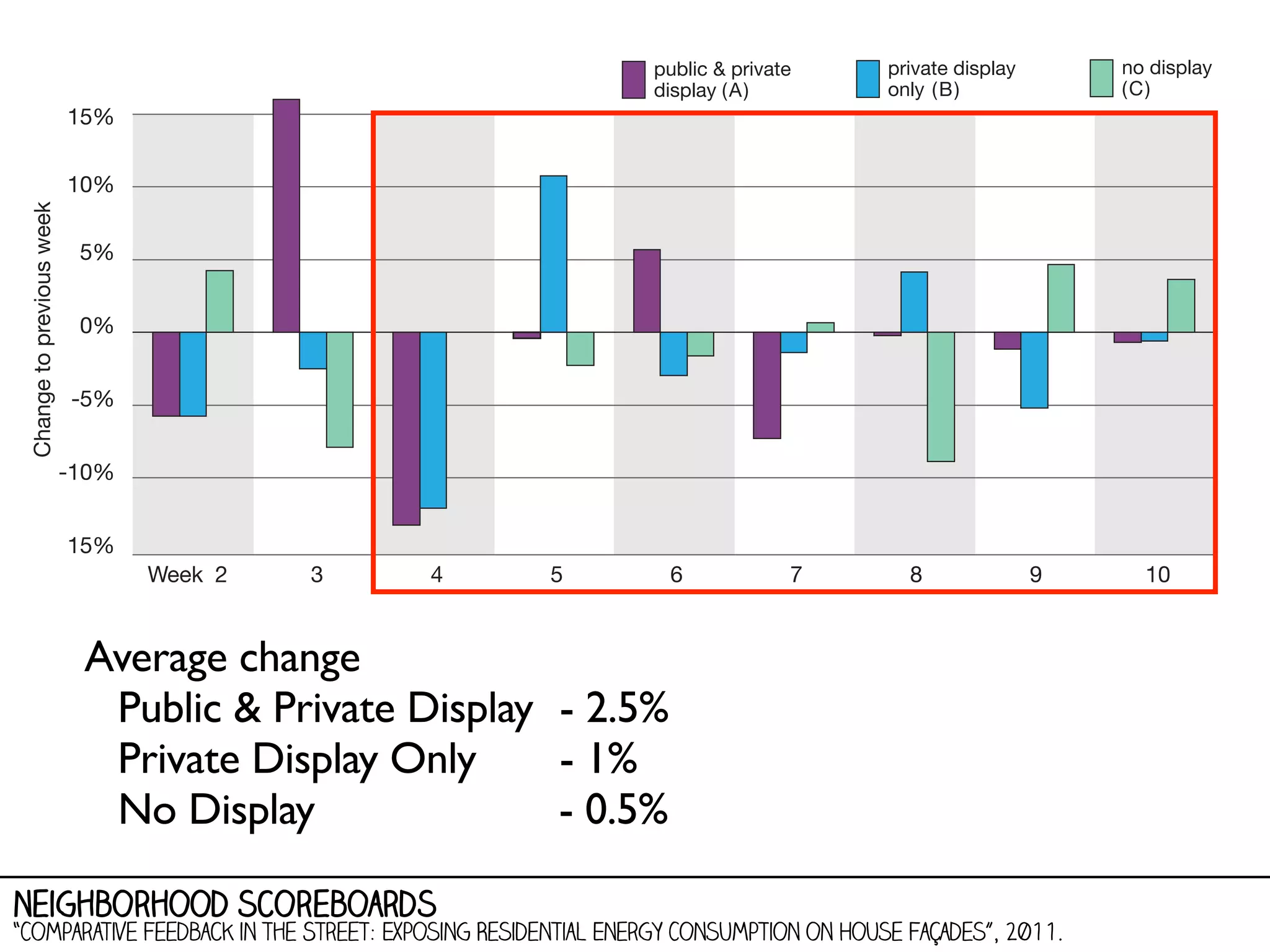
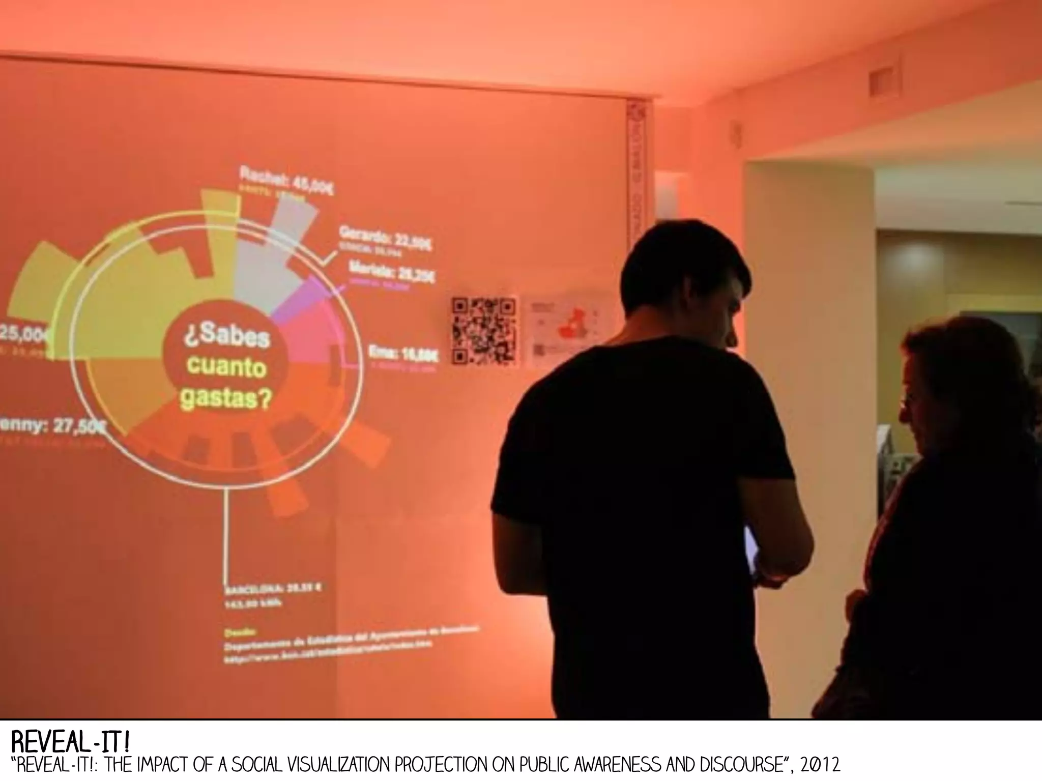
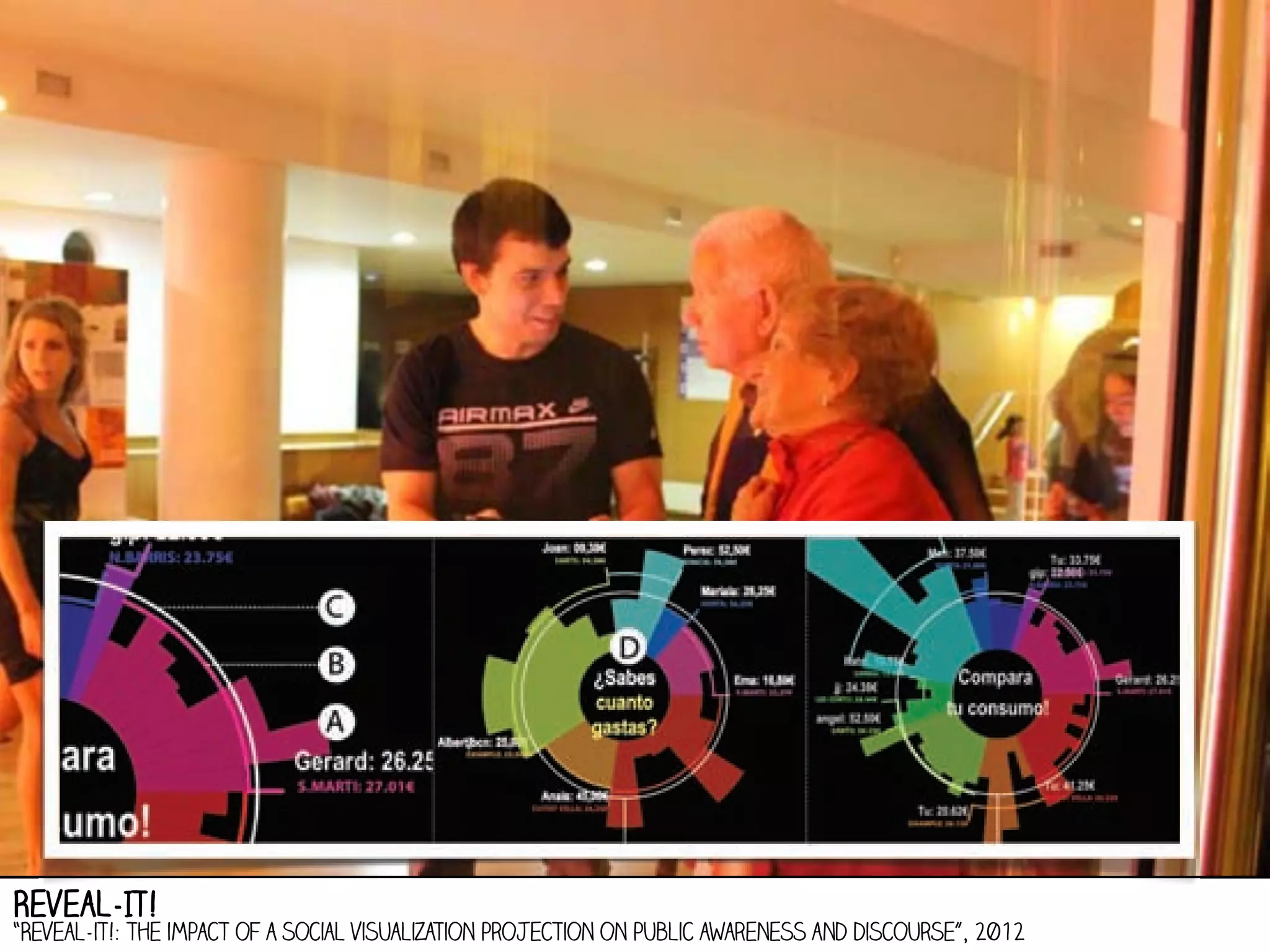
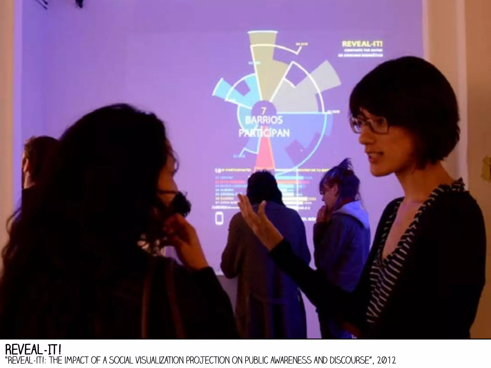
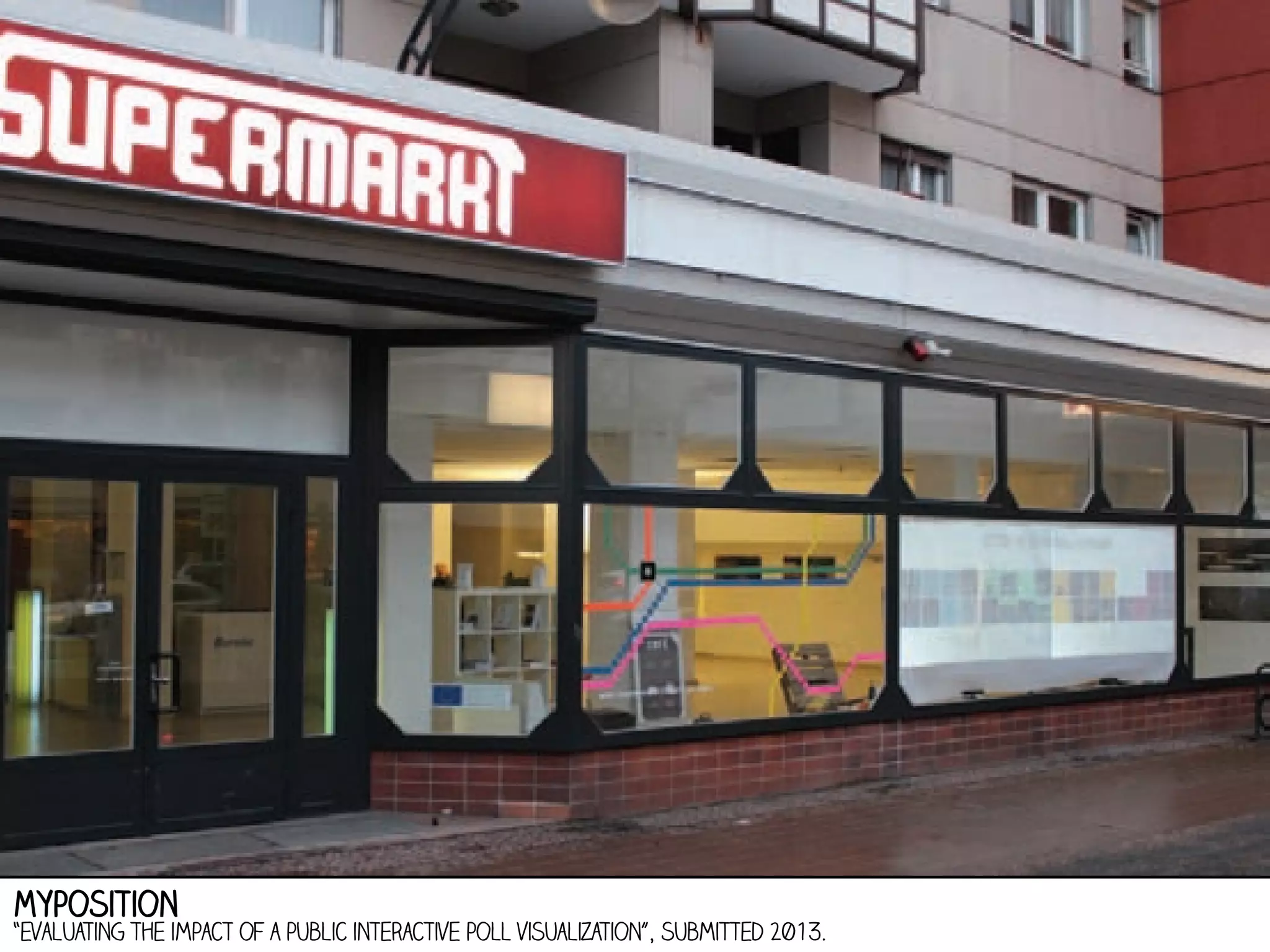
Information
Visualization:
Analyzing and
Presenting
Data.
a/prof. Andrew Vande Moere
Research[x]Design (RxD)
Department of Architecture - KU Leuven
http://rxd.asro.kuleuven.be

Data visualisation lab leuven
http://datavislab.org
Information Aesthetics
http://infosthetics.com - @infosthetics
Information Aesthetics - “Where Form Follows Data”
HTTP://infosthetics.com - founded in 2004
Johny mnemonic
tristar pictures -1995
Hackers

United Artists - 1996
Cyber swap worlds
1997
Stock Market Swarm
2004
Stock Market Swarm
2004
Stock Market Swarm
2004
University Finance
2003
University Finance
2003
emerging popularity of data visualization?
Ability to collect data is increasing faster than our ability to analyze it

http://www.popsci.com/technology/article/2011-05/every-six-hours-nsa-gathers-much-data-stored-entire-library-congress
open data

“VLAAMSE OVERHEID KIEST VOOR OPEN DATA” - 2012 - http://www.bestuurszaken.be/vlaamse-overheid-kiest-voor-open-data
open data

European union open data portal - http://open-data.europa.eu/
SOCIAL relevance

hospital costs - Kitware - http://infovis.kitware.com/hospital-costs/
new kinds of relevance

Travel Time Maps - Stamen design - http://www.mysociety.org/2007/more-travel-maps/morehousing
quantified self

Stranger Than Fiction - Columbia Pictures - 2006
quantified self

The personal analytics of my life- http://blog.stephenwolfram.com/2012/03/the-personal-analytics-of-my-life/
quantified self

Feltron Annual Year Report - 2005-2012- http://feltron.com
rich meaning of data

Tourists versus Locals - Eric Fischer - 2010 - http://www.flickr.com/photos/walkingsf/sets/72157624209158632/
rich meaning of data

Tourists versus Locals - Eric Fischer - 2010 - http://www.flickr.com/photos/walkingsf/sets/72157624209158632/
rich meaning of data

Digital Footprinting: Uncovering Tourists with User-Generated Content - 2008
rich meaning of data

New york runners visualized - cargo collective - http://cargocollective.com/coopersmith/Nike-Plus-Visualization
Data
visualisation as...
1) tool

2) medium
3) practice
4) communication
5) catalyst
Data
visualisation
as a tool.
choice of visualization technique
information display tips - Cleveland and McGill
choice of visualization technique

information display tips - http://understandinggraphics.com/visualizations/information-display-tips/
choice of visualization technique

chart suggestions - 2006 - http://extremepresentation.typepad.com/blog/2006/09/choosing_a_good.html
time-based visualization techniques

line graph - stacked graph - small multiples - horizon graph
map-based visualization techniques

flow map - chloropeth map - symbol map - cartogram (DORLING cartogram / bubble map)
hierarchy-based visualization techniques

flat & radial node-link diagram - dendogram - sunburst -treemap
network-based visualization techniques
Force-directed network - arc diagram - matrix view
1. Show comparisons, contrasts, differences
2. Show causality, mechanism, explanation, systematic
structure
3. Show multivariate data, i.e. more than 1 or 2 variables
4. Completely integrate words, numbers, images,
diagrams
5. Thoroughly describe the evidence: title, authors and
sponsors, data sources, add measurement scales,
highlight relevant issues
6. Analytical presentations ultimately stand or fall
depending on the quality, relevance and integrity of
their content
DATA VisualisatiON good practice guidelines

Principles for the Analysis and Presentation of Data - edward Tufte
Data
visualisation
as a
medium.
data graphics

Today In Dishonest Fox News Charts - http://mediamatters.org/blog/2011/12/12/today-in-dishonest-fox-news-charts/185162
infografiek

How Osama bin Laden Was Located and Killed - nytimes- 2011 - http://www.nytimes.com/interactive/2011/05/02/world/asia/abbot
data visualization

Visualizing information flow in science - moritz stefaner - 2009 - http://stefaner.eu/projects/eigenfactor/
information design

Compare countries through their shape - carlo zapponi & vasundhara parakh - http://worldshap.in/#/
information design

Visualizing deletion discussions on wikipedia - moritz stefaner - http://notabilia.net/
data Illustration

literary organism - stefanie posavec - http://www.itsbeenreal.co.uk/
data illustration

Poetry on the road - Boris Müller - http://www.esono.com/boris/projects/poetry06/
data ART

DNA Portrait - http://dna11.com
data ART

Nonsensical infographics - chad Hagen - 2009
Data
visualisation
as
design.
visualization as design

“On the Role of Design in Information Visualization” - Vande Moere and Purchase - 2012
visualization as design

“On the Role of Design in Information Visualization” - Vande Moere and Purchase - 2012
visualisatie in ontwikkeling

“On the Role of Design in Information Visualization” - Vande Moere and Purchase - 2012
ThemeRiver

“ThemeRiver: Visualizing Theme Changes over Time” - Havre et al. - 2002
StreamGraph

“Stacked Graphs – Geometry & Aesthetics” - Lee Byron et al. - 2007
The Ebb and Flow of Movies: Box Office Receipts 1986 - 2008

NYTimes - http://www.nytimes.com/interactive/2008/02/23/movies/20080223_REVENUE_GRAPHIC.html
research -> exploration -> practice
Movie Narrative Charts

Randall MUnroe - http://xkcd.com/657
Software Evolution Storylines
Ogawa and Ma - 2010
practice -> research
Data
visualisation
as
communication.
Be
au
ty
Meaning

‘aesthetic’ components of data visualization

“Towards a Model of Aesthetics in Information Visualization”, Lau and Vande Moere et al., 2007
1. beauty / style

Billion Pound-O-Gram - Information is Beautiful - 2009 - informationisbeautiful.net
1. beauty / visualization technique

http://www.mcclatchydc.com/2012/02/13/138787/obamas-budget-would-shrink-annual.html#.UkBfimSkxNw
http://www.nytimes.com/interactive/2012/02/13/us/politics/2013-budget-proposal-graphic.html
2. interaction: interface

Many Eyes - IBM - http://www-958.ibm.com/software/analytics/manyeyes/
2. interaction: fluid selection

Baby Name Wizard - http://www.babynamewizard.com/voyager
2. interaction: animation

the jobless rate for people like you - nytimes - http://www.nytimes.com/interactive/2009/11/06/business/economy/unemployme
3. Interactie: sharing responsibility

Budget Puzzle: You Fix the Budget - NYTimes - http://www.nytimes.com/interactive/2010/11/13/weekinreview/deficits-graphic.html
3. communication of meaning

UK Casualties in Afghanistan and Iraq - BBC News - 2009 - http://www.bbc.co.uk/news/uk-10634102
3. communication of meaning

faces of the death - nytimes - http://www.nytimes.com/interactive/us/faces-of-the-dead.html
3. communication of meaning

CNN Home and AWAY - http://edition.cnn.com/
3. communication of meaning
aleb Larsen - caleblarsen.com - 2006
3. communication of meaning
aleb Larsen - caleblarsen.com - 2006
Out of Sight, Out of Mind

Pitch Interactive -2013 - http://drones.pitchinteractive.com/
U.S. Gun Murders in 2010

Periscopic - 2013 - http://guns.periscopic.com/
3. communication of meaning

“Narrative Visualization: Telling Stories with Data” - Segel and Heer - 2010
Data
visualisation
as
catalyst.
evaluation studies

effectiveness - efficiency - impact of design choices
NEW Visualization interfaces
Rxd - work in progress
social media mapping in Belgium
Rxd - (work in progress)
social media mapping in Belgium
Rxd - (work in progress)
social media mapping in Belgium
(work in progress)
social media mapping in Belgium
(work in progress)
social media mapping in Belgium
(work in progress)
persuasive power of (Public) visualization
persuasive power of visualization
Public visualization

Where is the Money - http://timdevin.com/broadsides.html
real-time electricity consumption monitors
Eco Eye - http://eco-eye.com/
Externalizing Energy Consumption
Dan Hill (Arup Sydney)
Externalizing Energy Consumption
Dan Hill (Arup Sydney)
neighborhood scoreboards

“Comparative Feedback in the Street: Exposing Residential Energy Consumption on House Façades”, 2011.
neighborhood scoreboards

“Comparative Feedback in the Street: Exposing Residential Energy Consumption on House Façades”, 2011.
neighborhood scoreboards

“Comparative Feedback in the Street: Exposing Residential Energy Consumption on House Façades”, 2011.
neighborhood scoreboards

“Comparative Feedback in the Street: Exposing Residential Energy Consumption on House Façades”, 2011.
Average change
Public & Private Display - 2.5%
Private Display Only
- 1%
- 0.5%
No Display
neighborhood scoreboards

“Comparative Feedback in the Street: Exposing Residential Energy Consumption on House Façades”, 2011.
Civic Smart Meter

public competition of Building Performance
Civic Smart Meter

public competition of Street-wide Performance
Street visualization

"Street Visualization: Raising Awareness for Local Social Issues through a Situated Display”, 2013.
Street visualization

"Street Visualization: Raising Awareness for Local Social Issues through a Situated Display”, 2013.
Reveal-IT!

“Reveal-it!: the impact of a social visualization projection on public awareness and discourse”, 2012
Reveal-It!

“Reveal-it!: the impact of a social visualization projection on public awareness and discourse”, 2012
Reveal-IT!

“Reveal-it!: the impact of a social visualization projection on public awareness and discourse”, 2012
Myposition

“evaluating the impact of a public interactive poll visualization”, submitted 2013.
Myposition

“evaluating the impact of a public interactive poll visualization”, submitted 2013.
Myposition

“evaluating the impact of a public interactive poll visualization”, submitted 2013.
Myposition

“evaluating the impact of a public interactive poll visualization”, submitted 2013.
Design guidelines

“Design Study Methodology: Reflections from the Trenches and the Stacks”
Michael Sedlmair, Miriah Meyer, Tamara Munzner, IEEE Infovis 2012
. maak verschil tussen exploratie en communicatie
. betracht sociale relevantie van data
. verken praktijk, onderzoek en kunsten
. ken cognitieve en good-practice guidelines
. integreer schoonheid, interactie en betekenis
conclusion

Symbiosis of design and visualization
contacT

http://infoscape.org- http://rxd.asro.kuleuven.be - http://datavislab.org - http://infosthetics.com

Information Visualization: Analyzing and Presenting Data