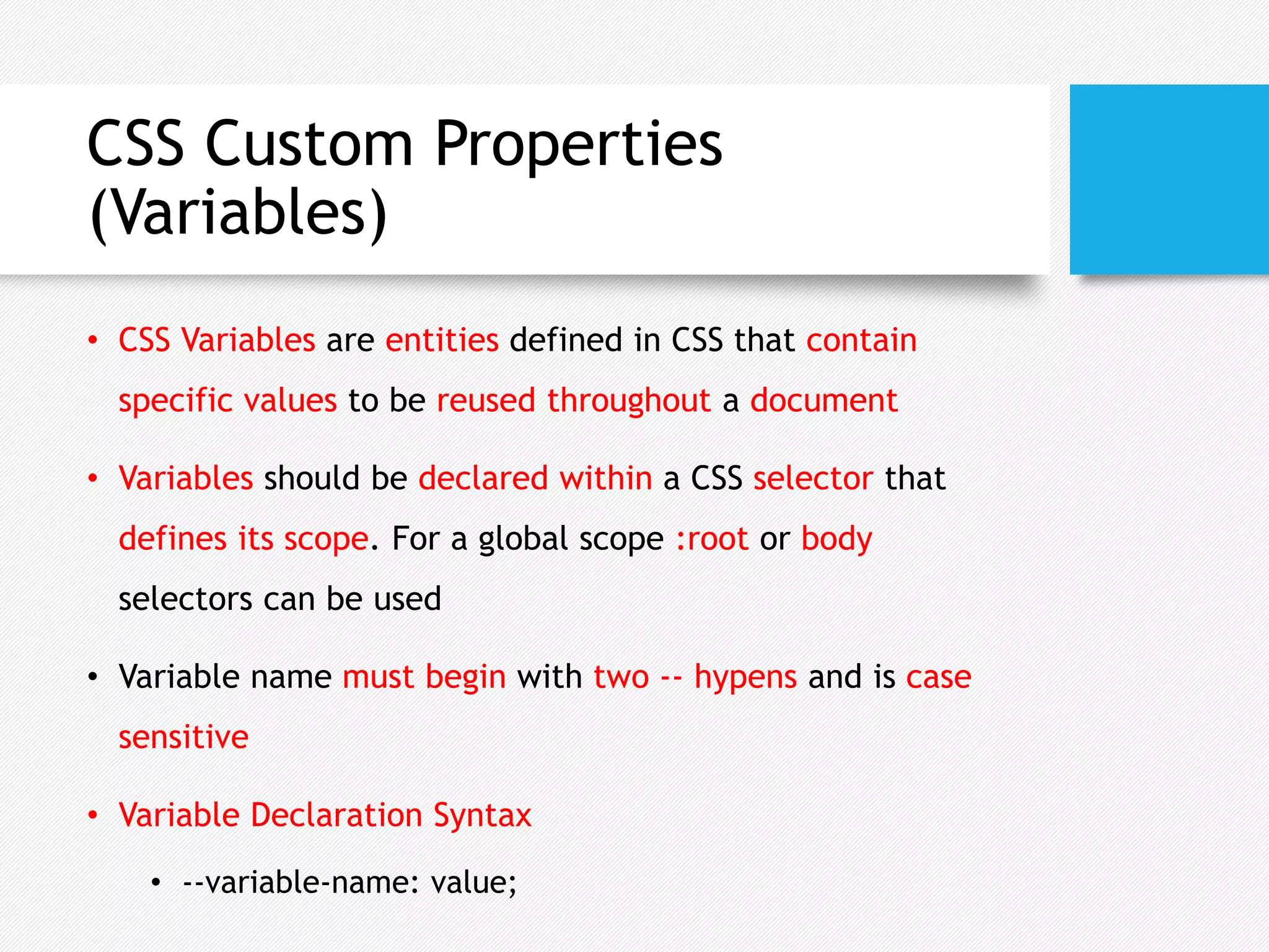
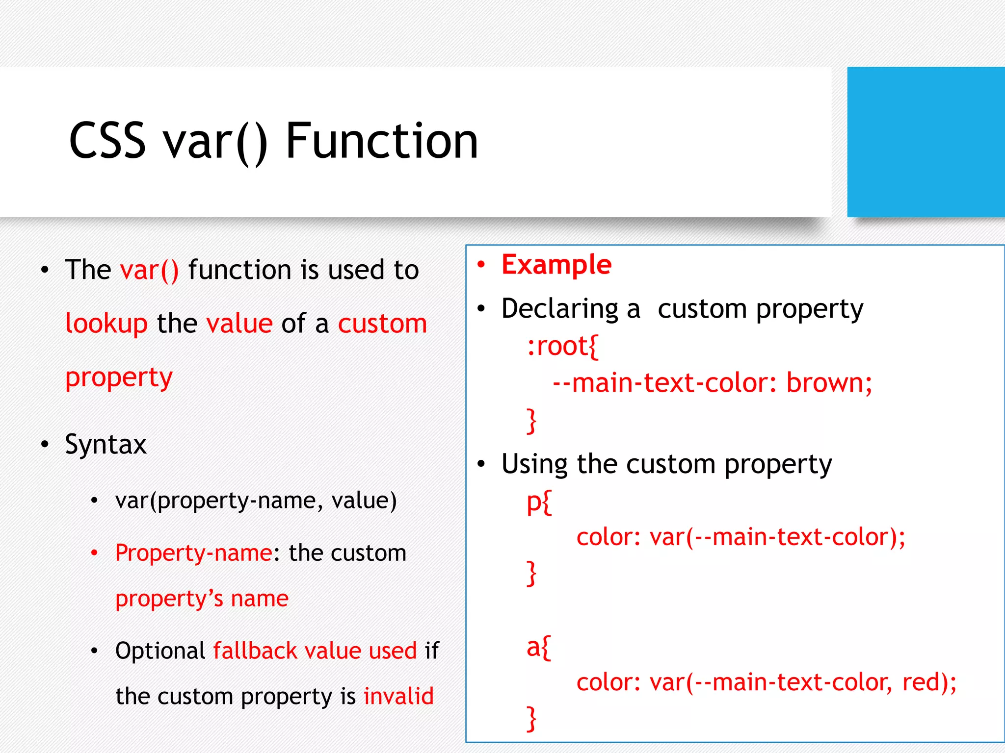
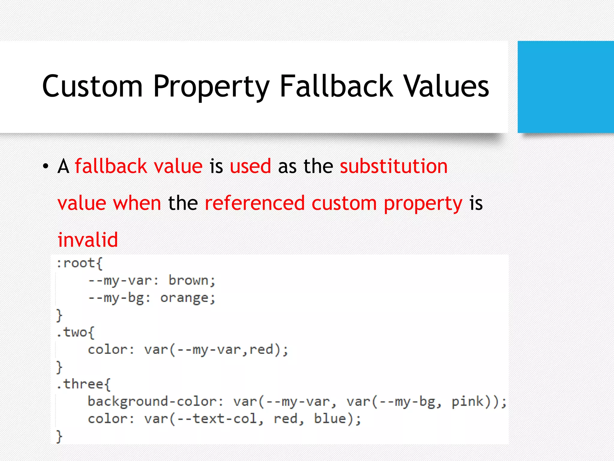
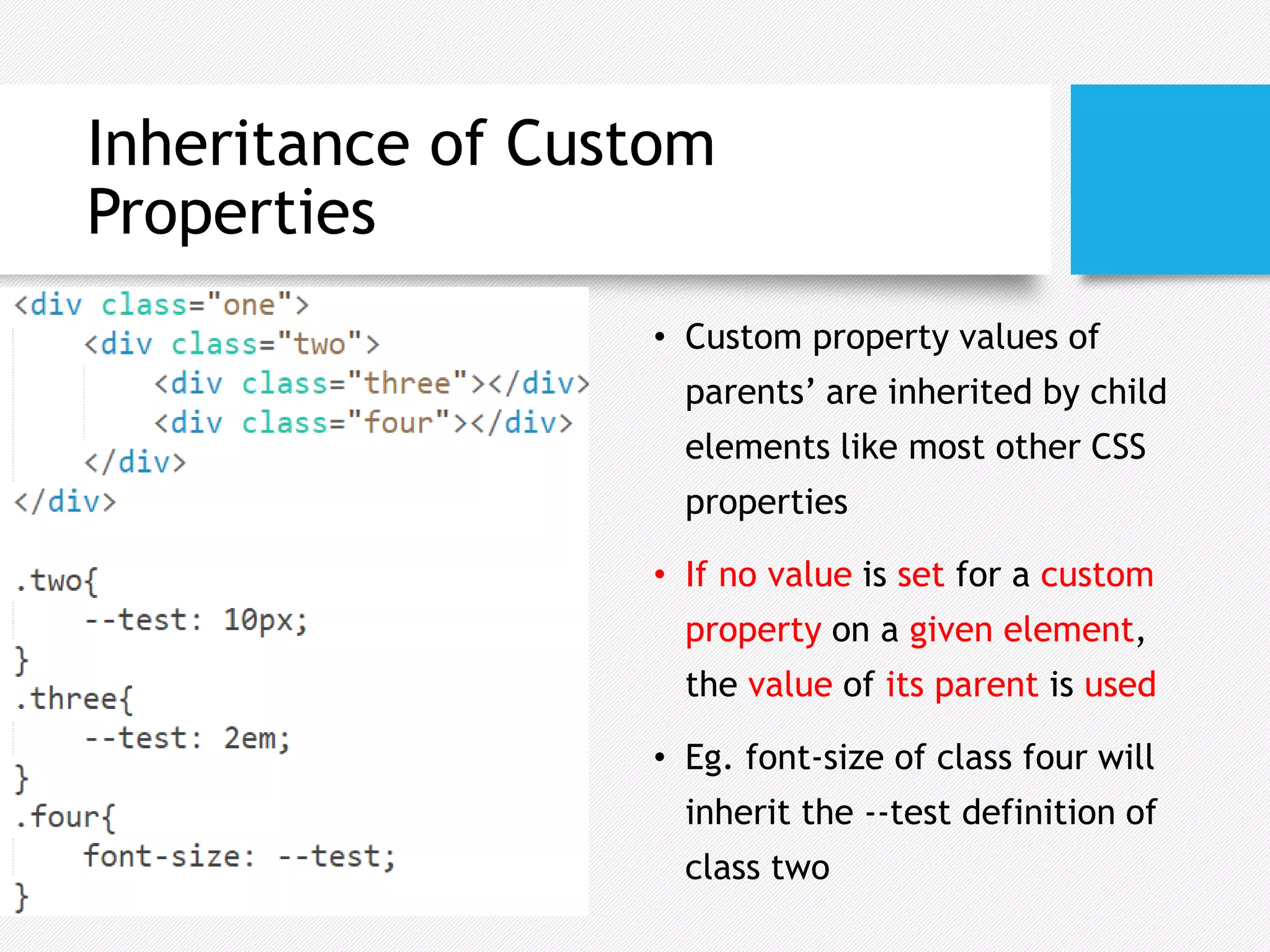
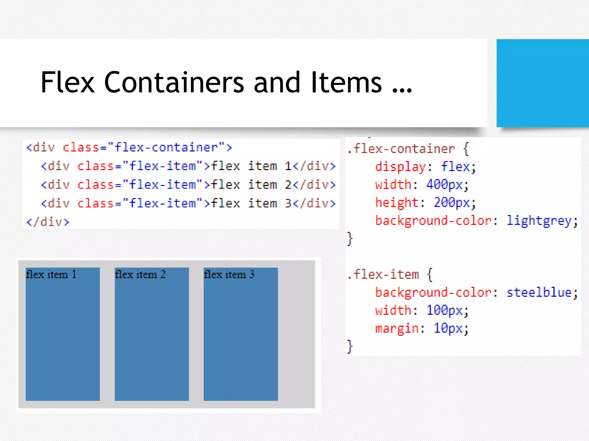
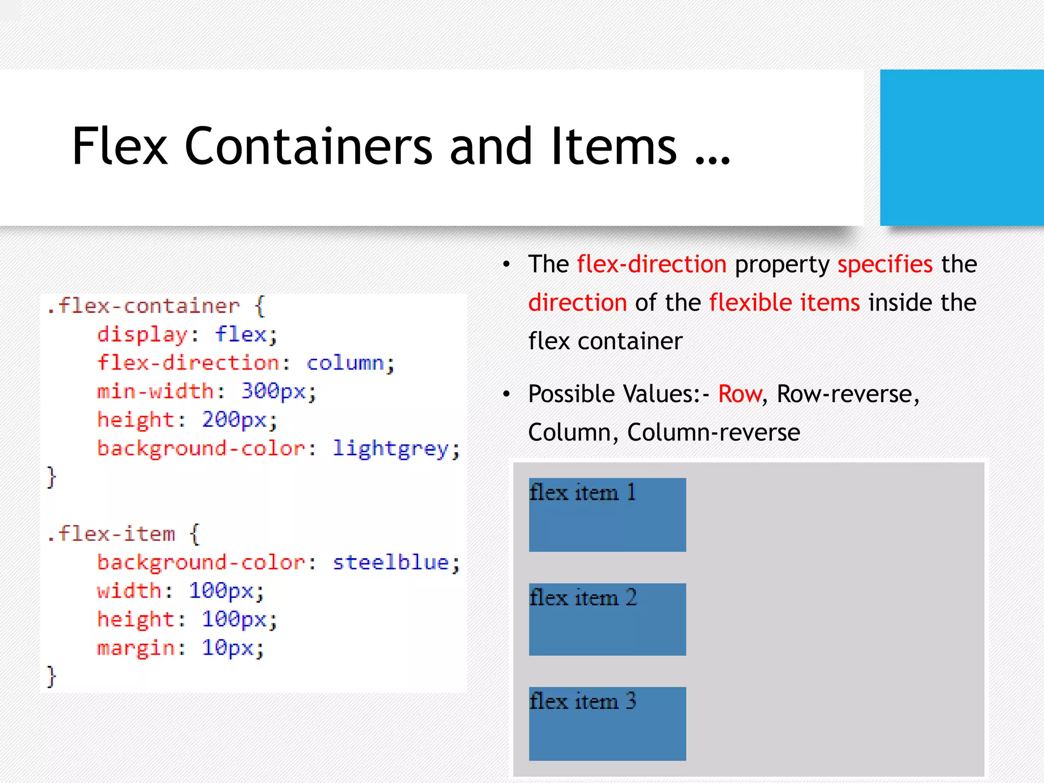
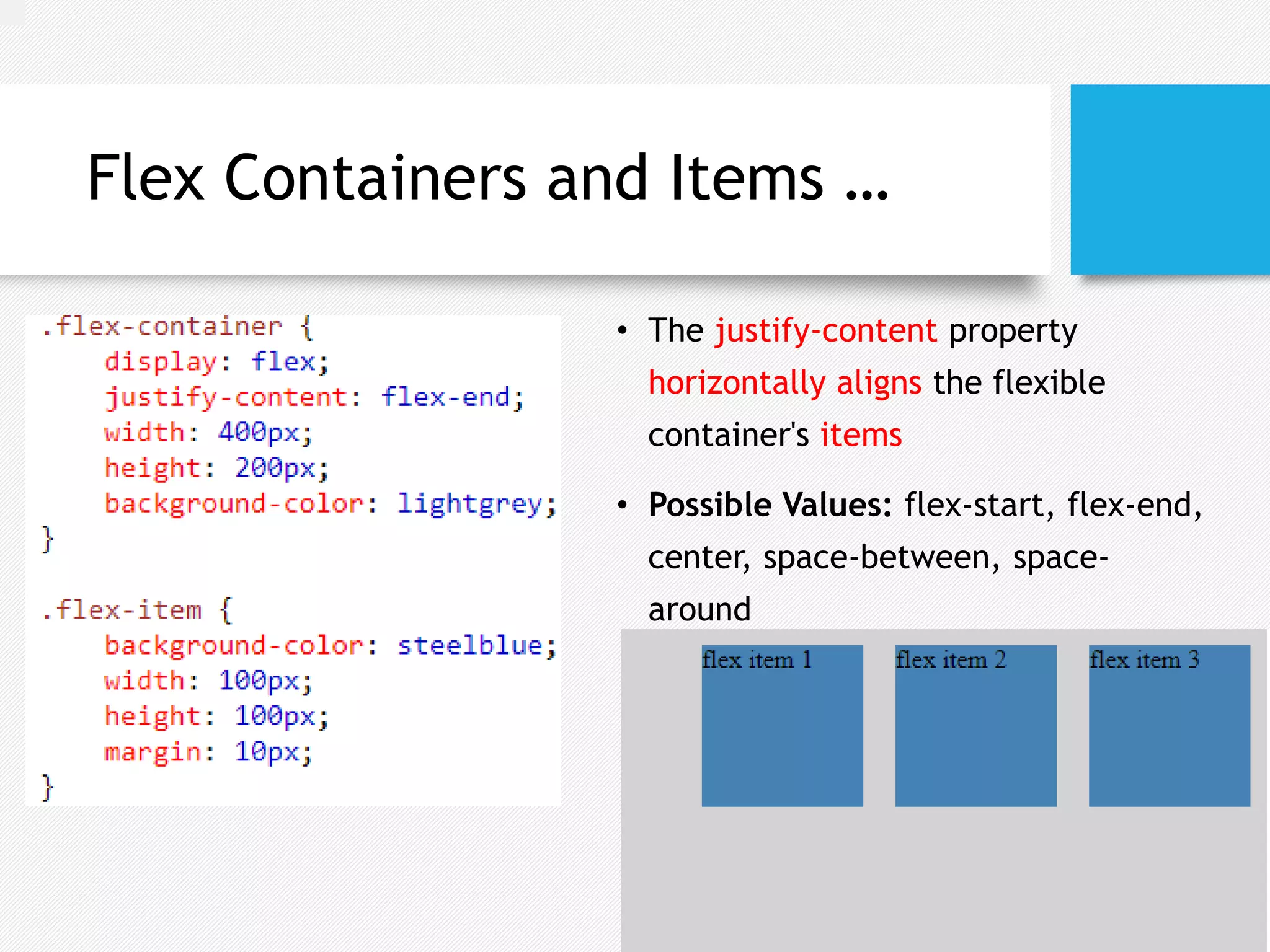
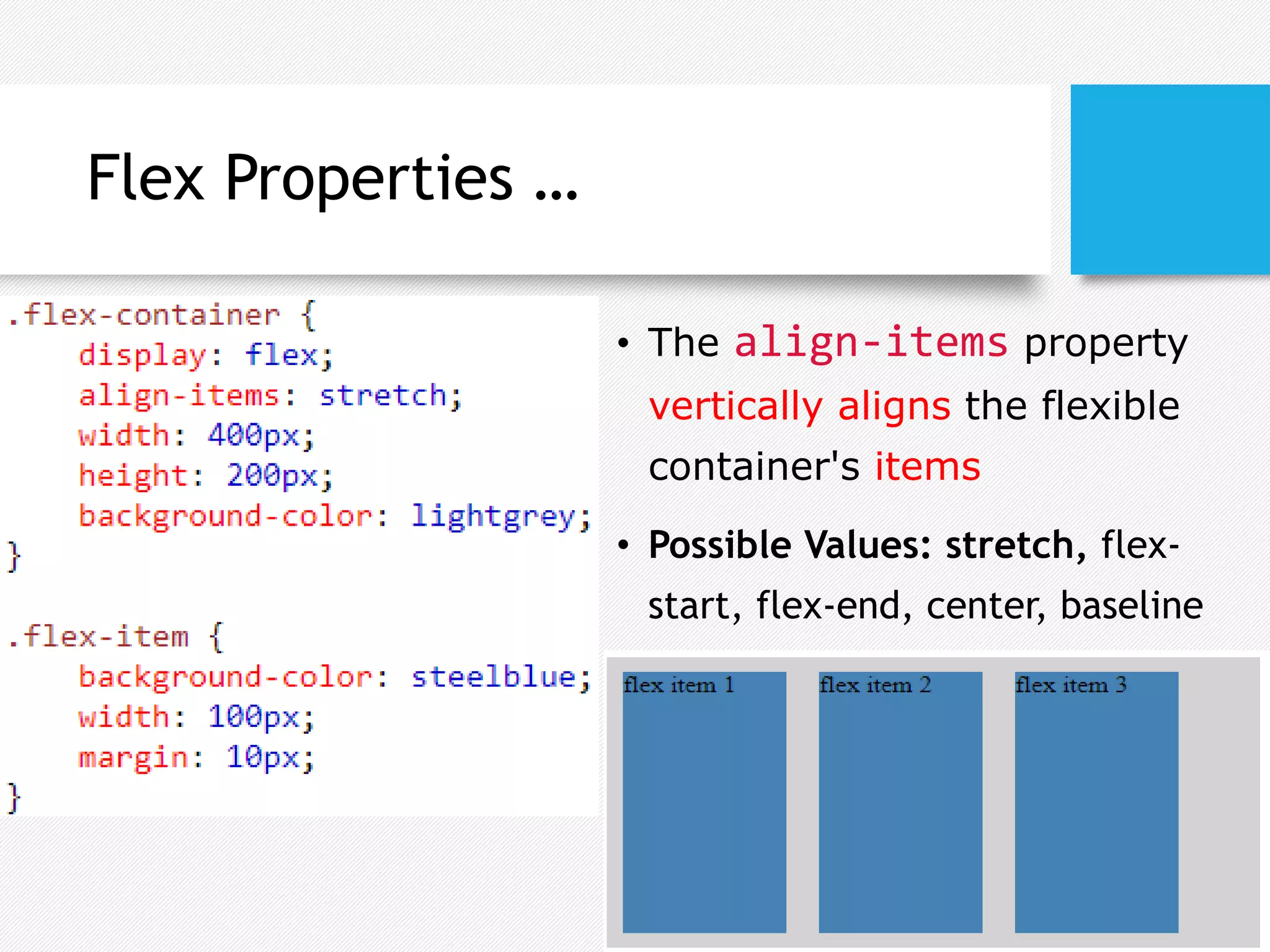
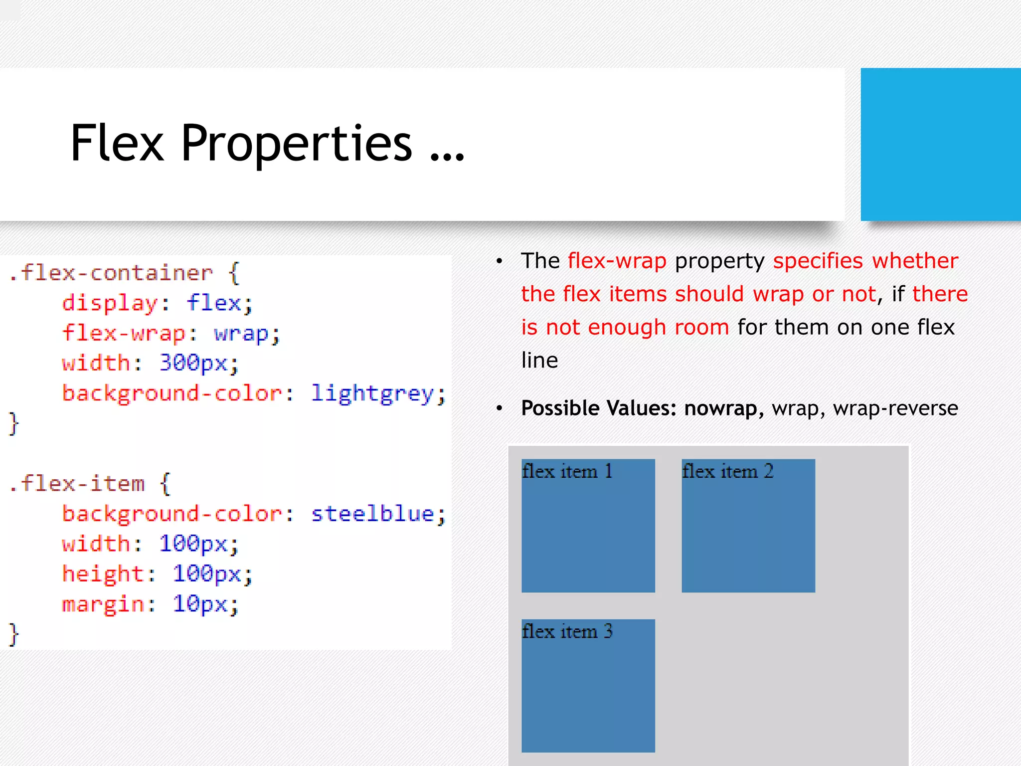
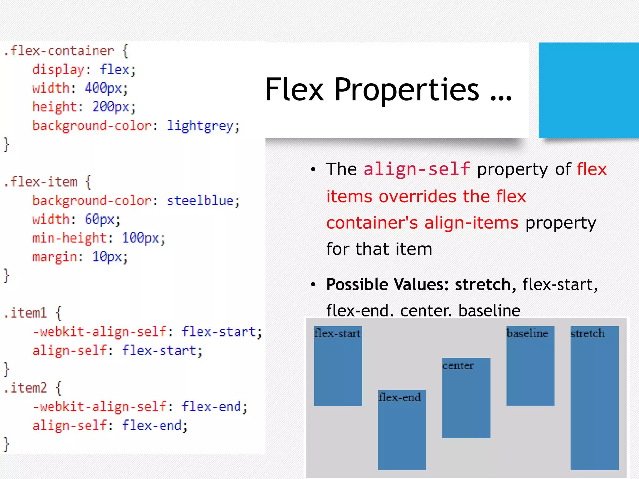
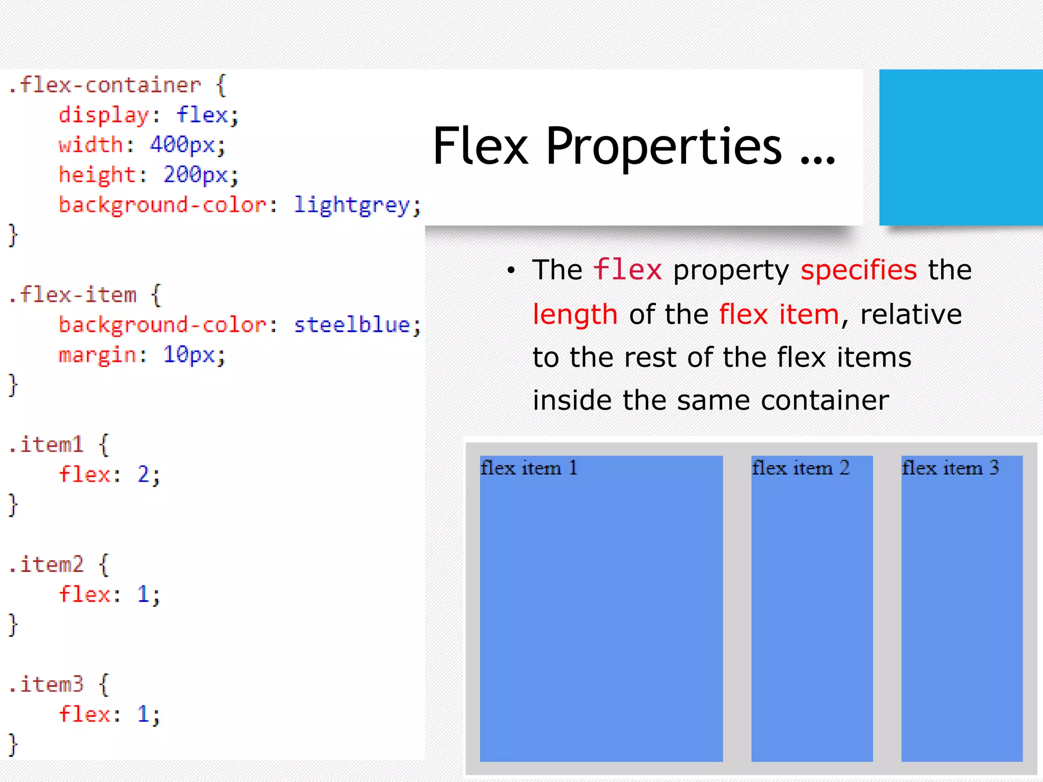
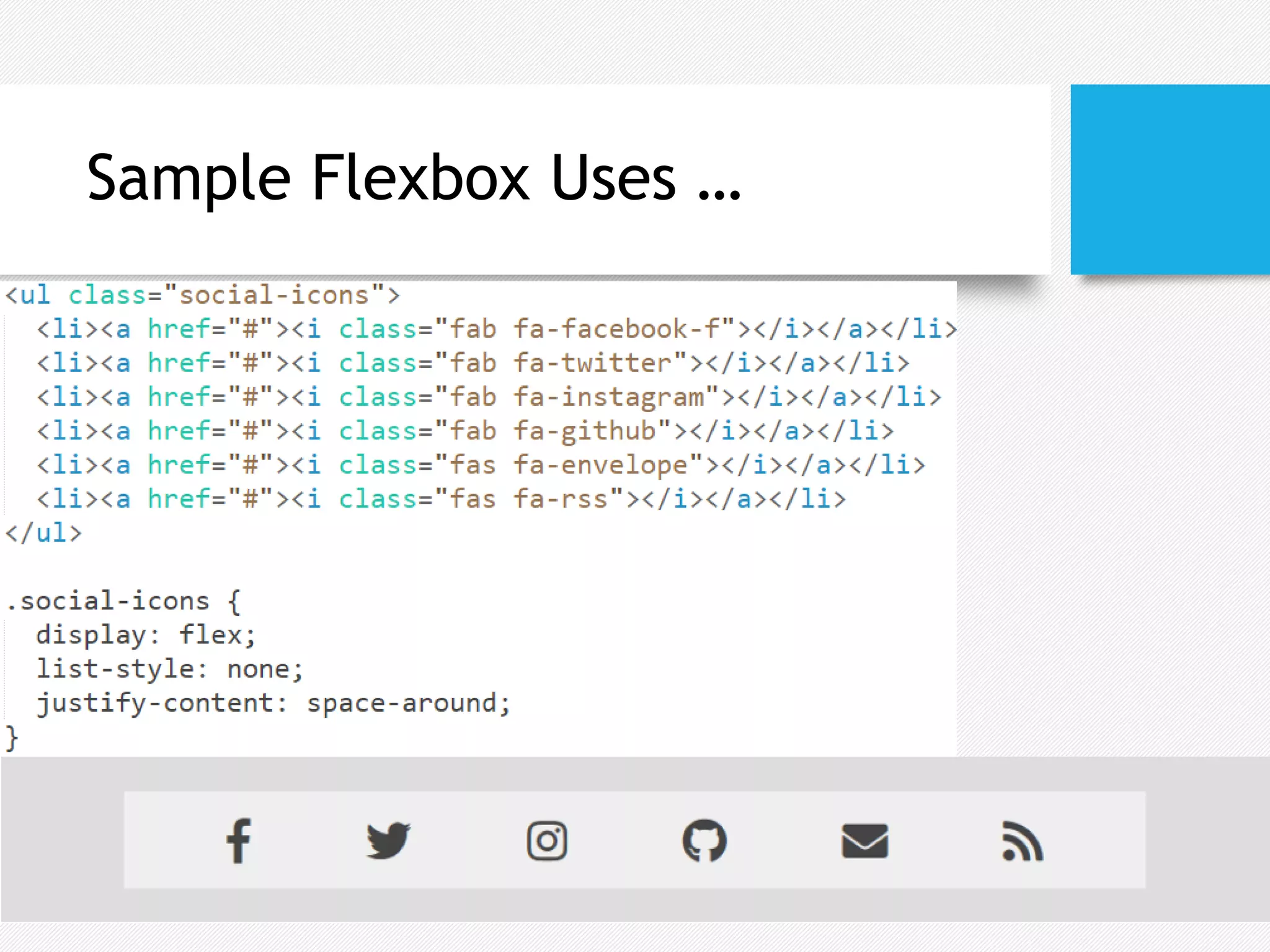
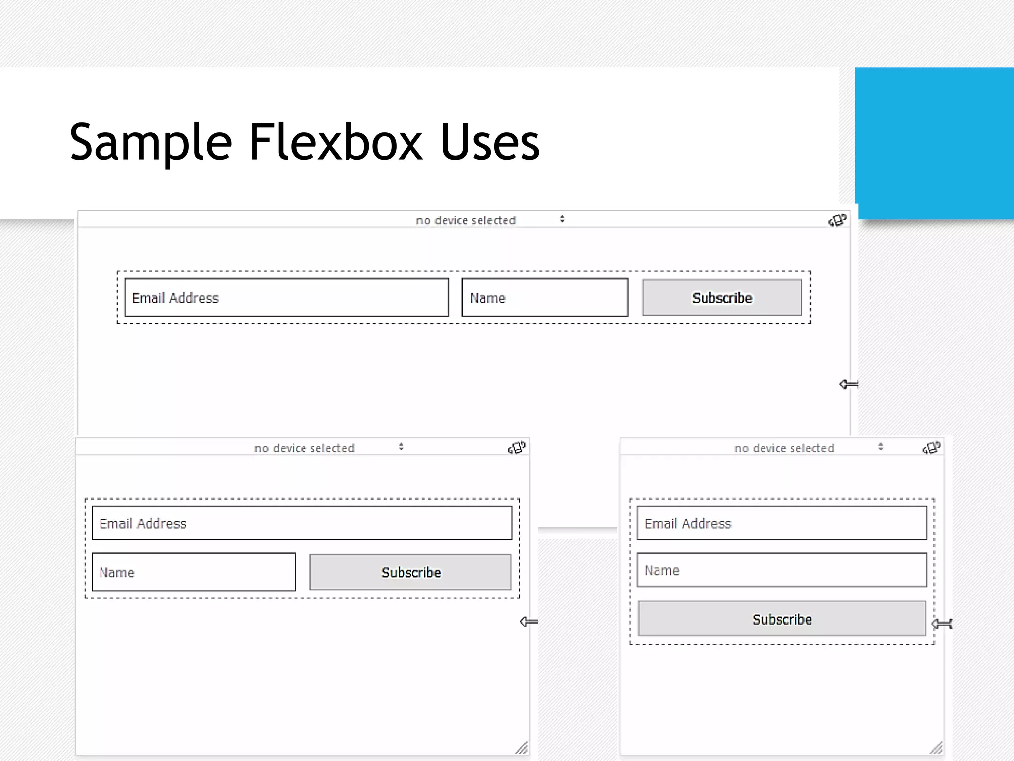
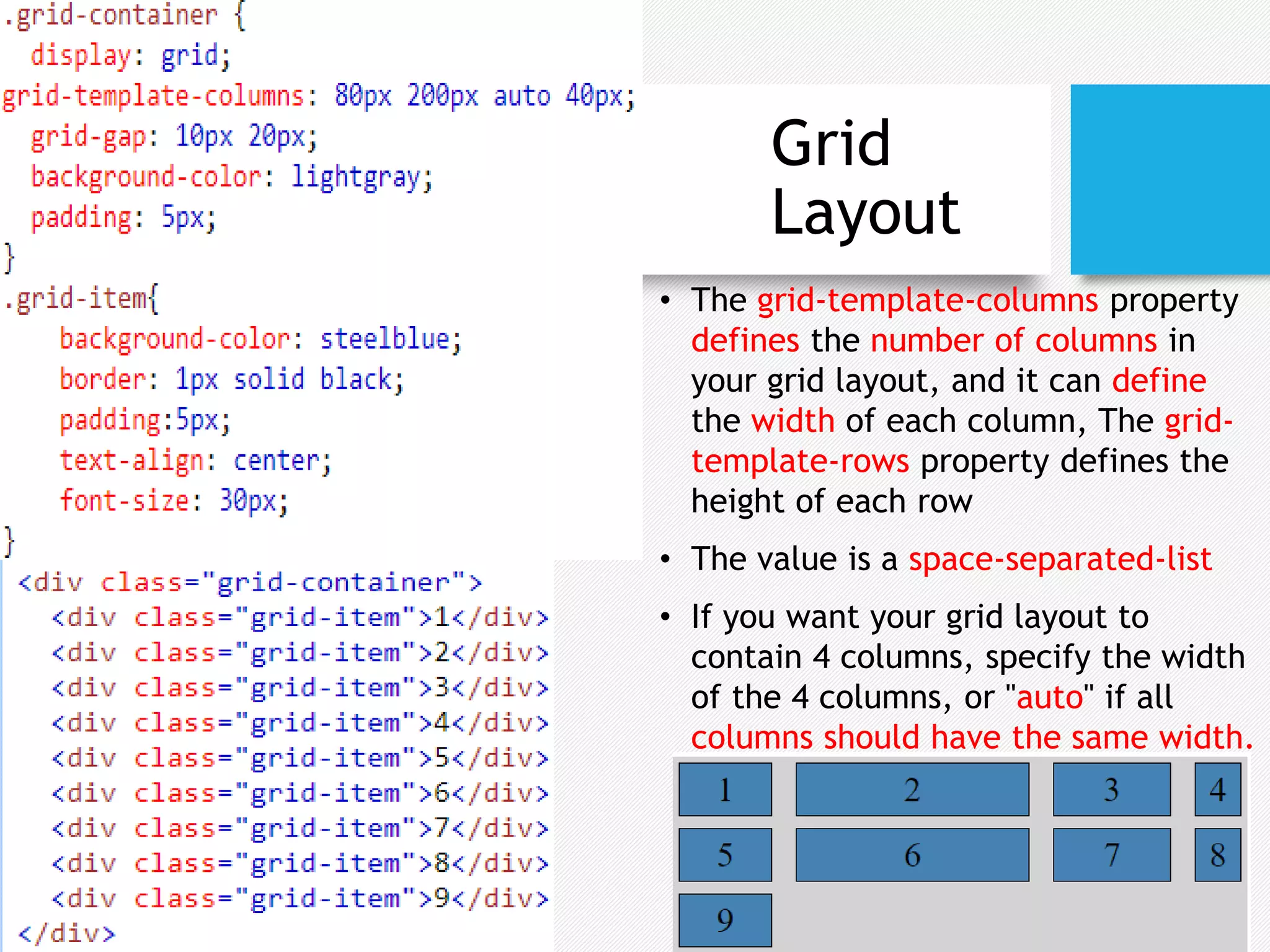
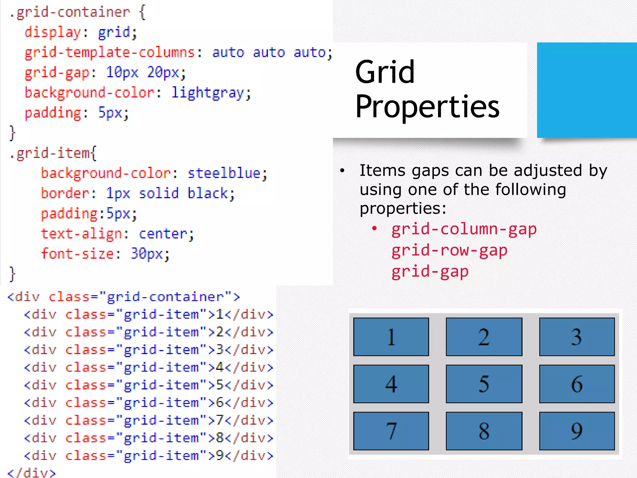
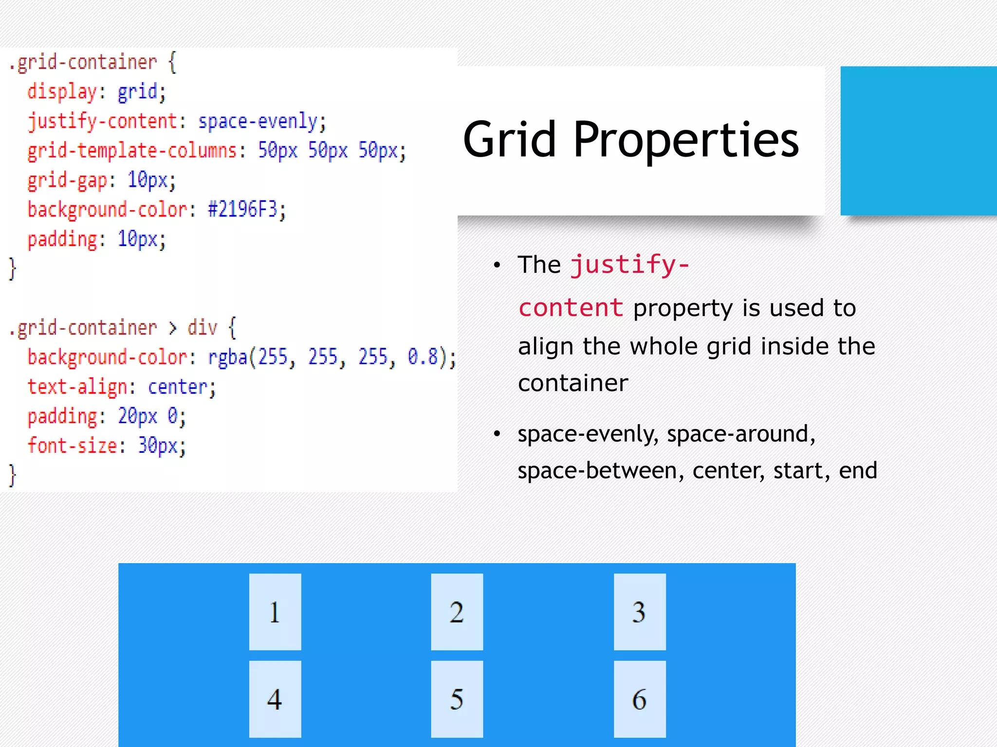
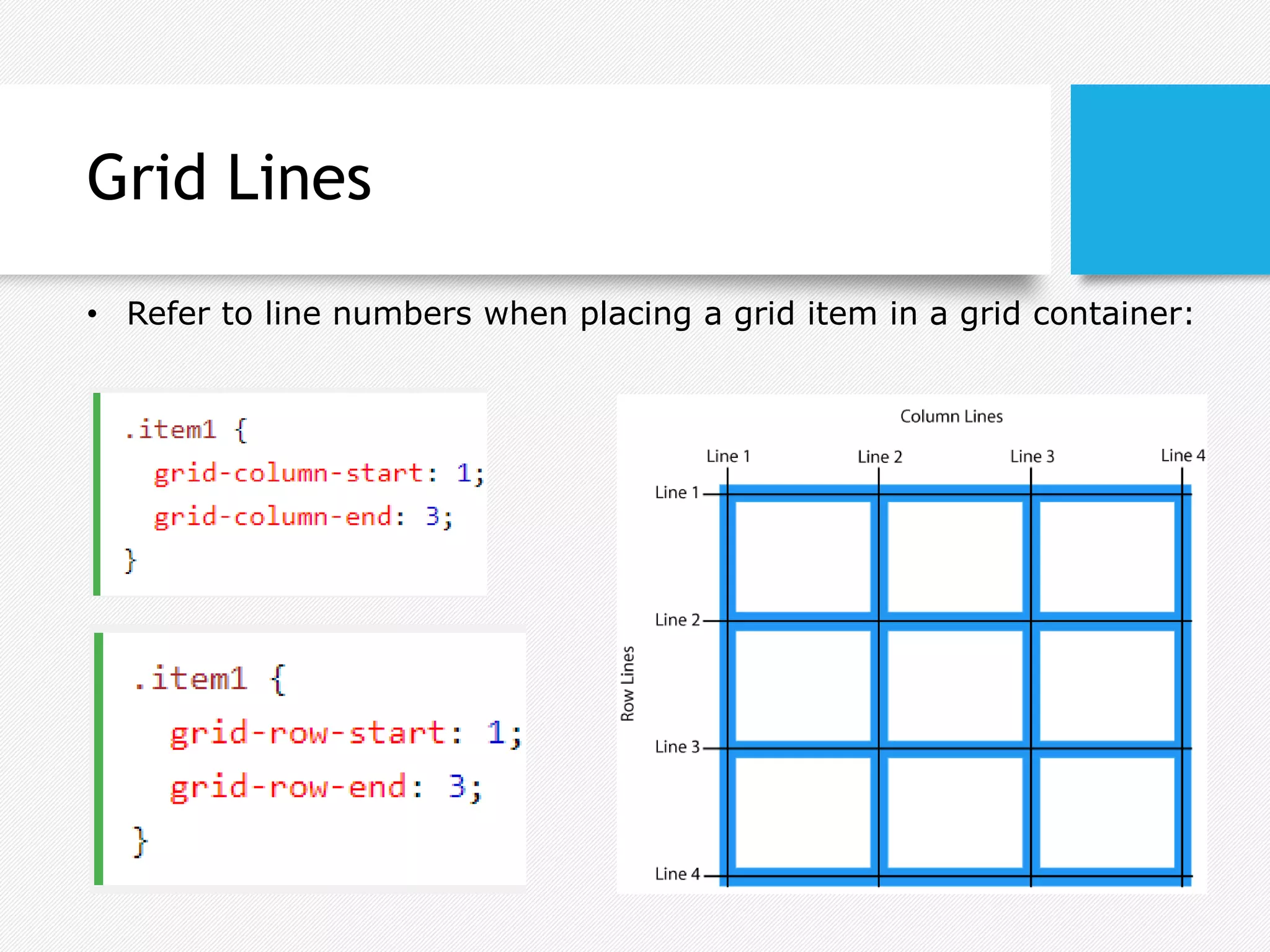
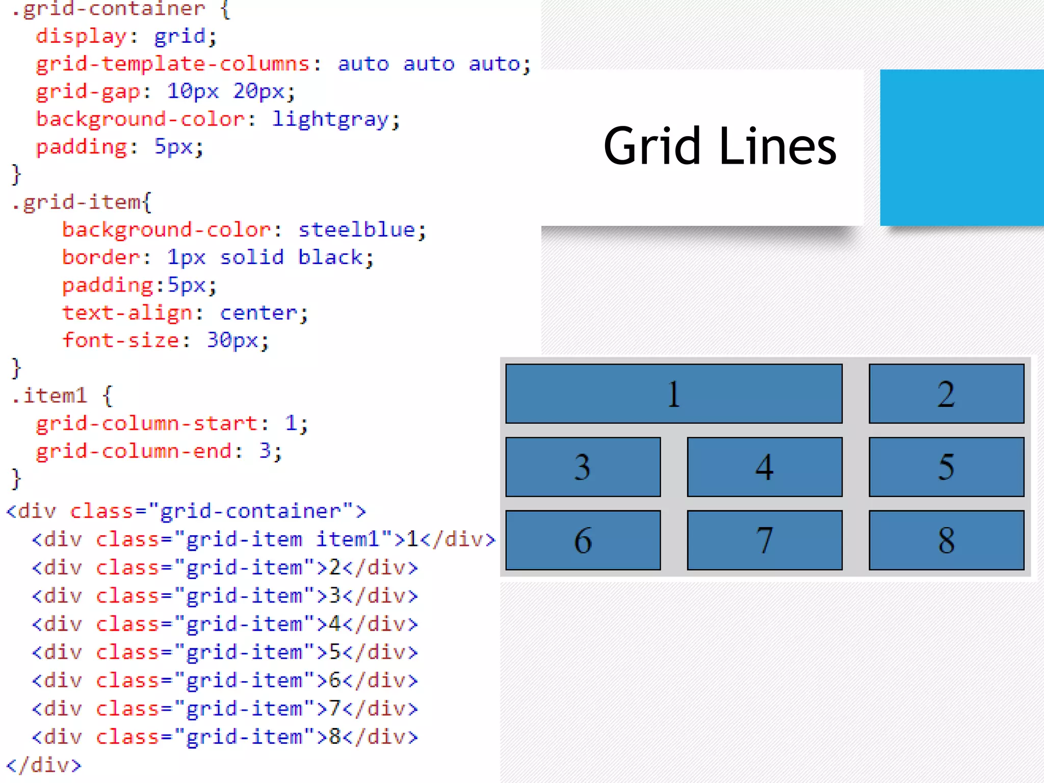
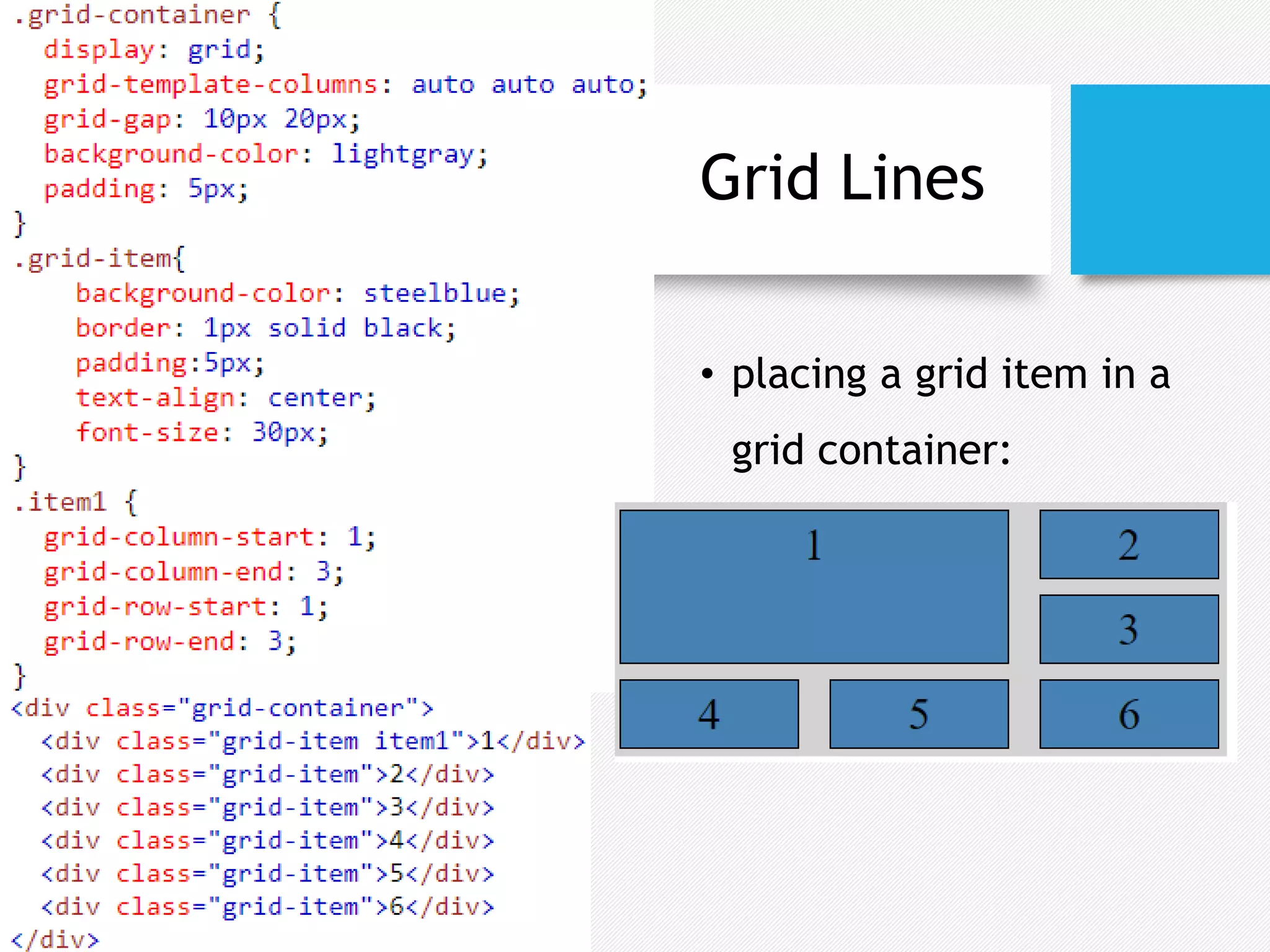
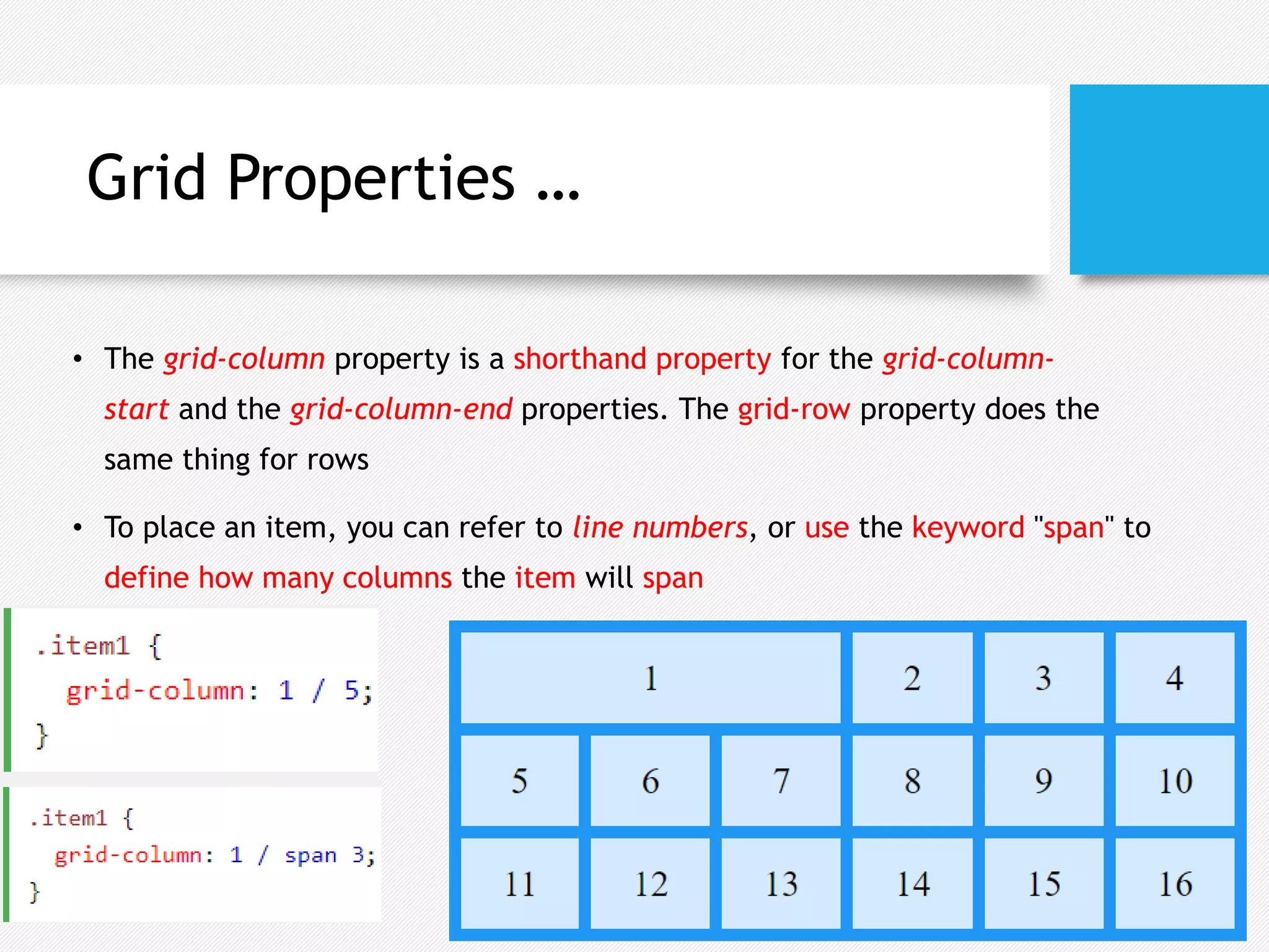
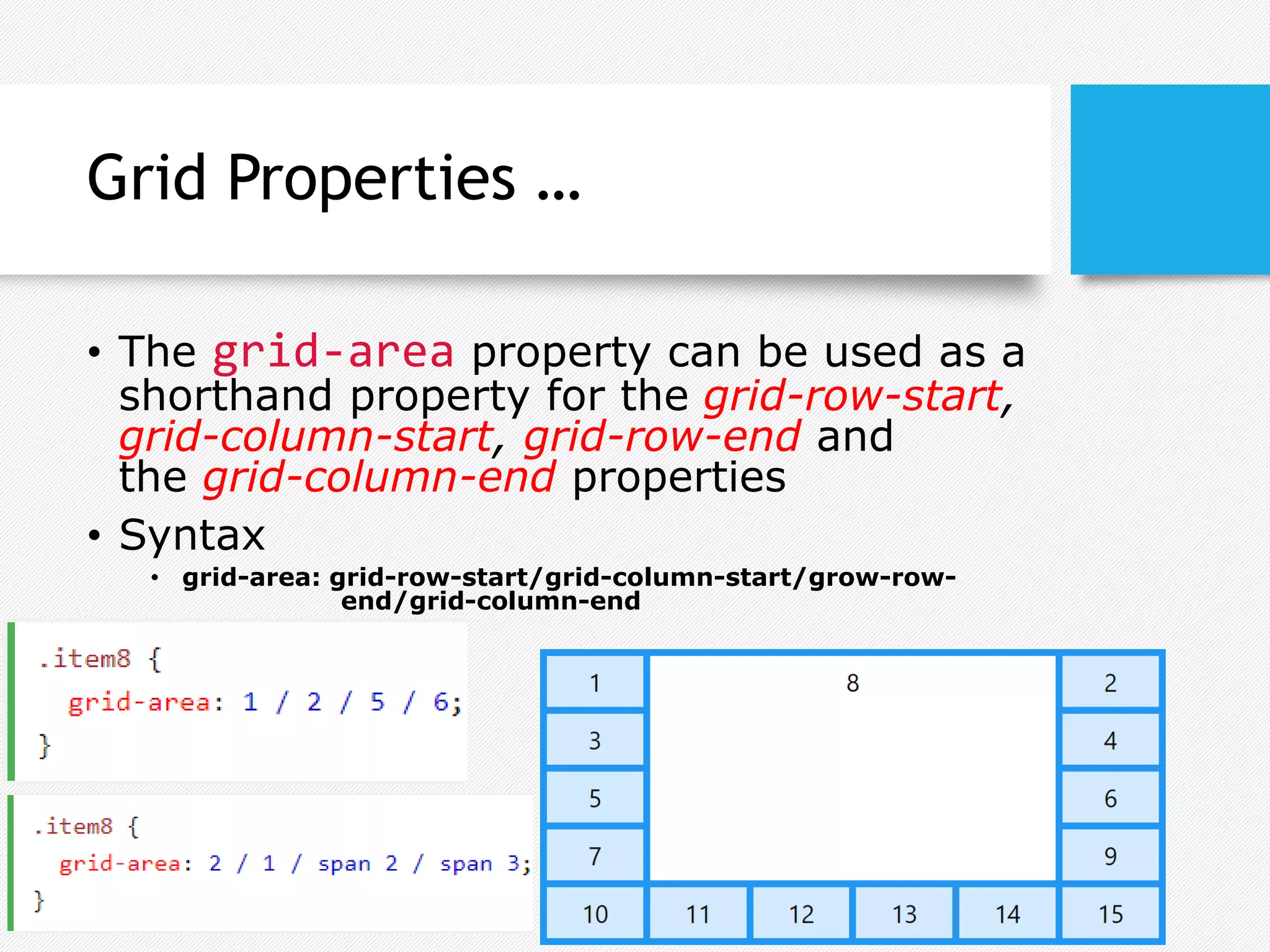
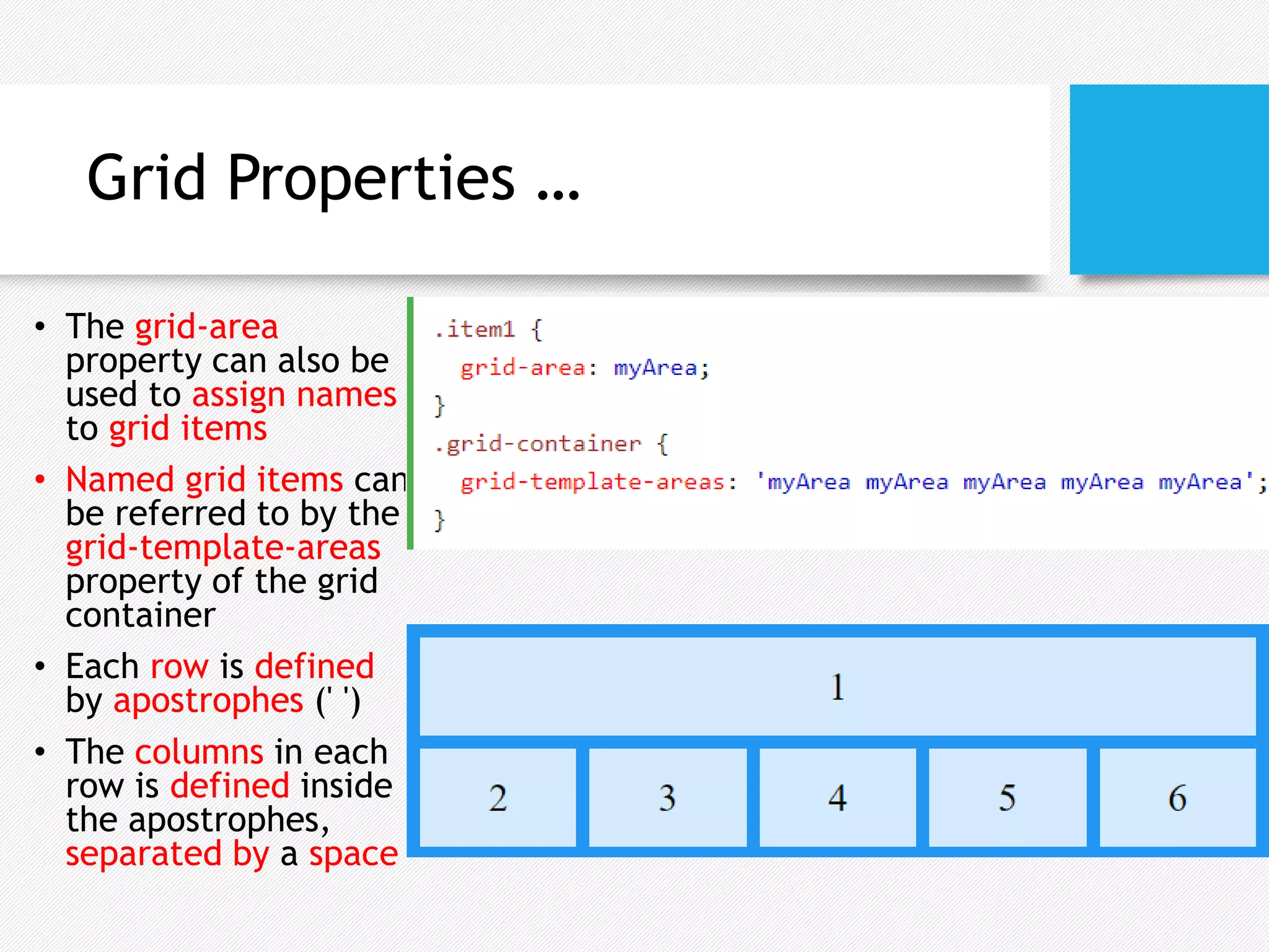
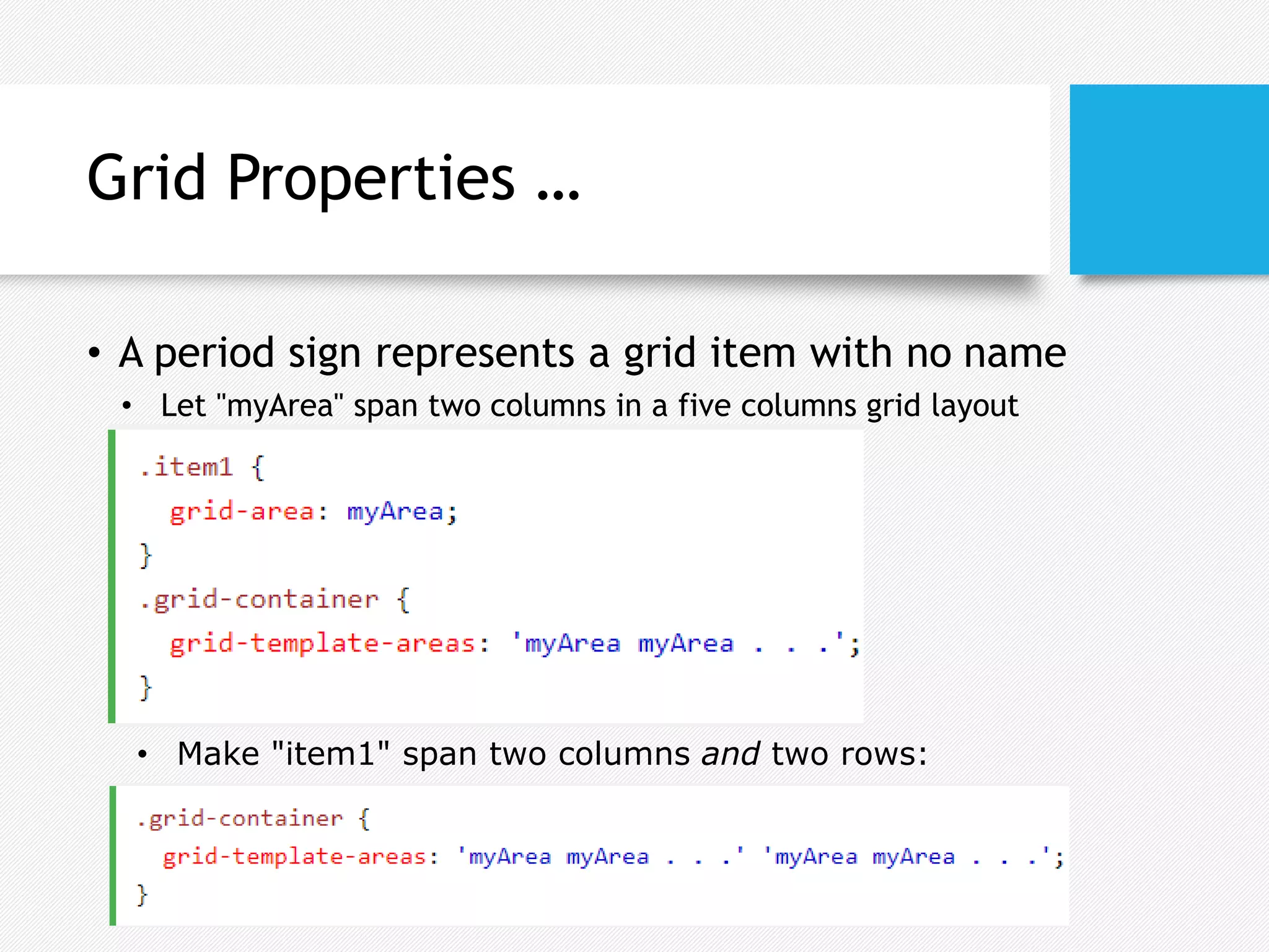
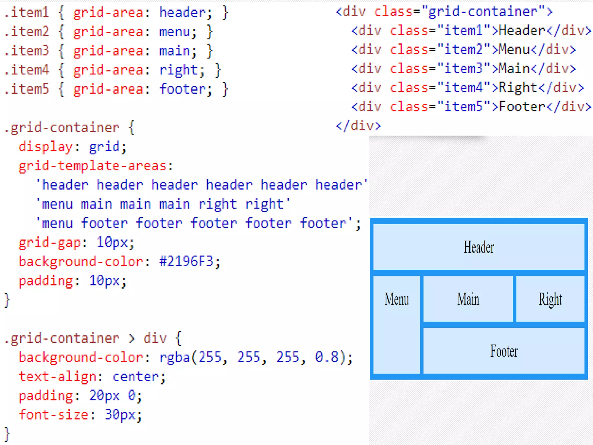
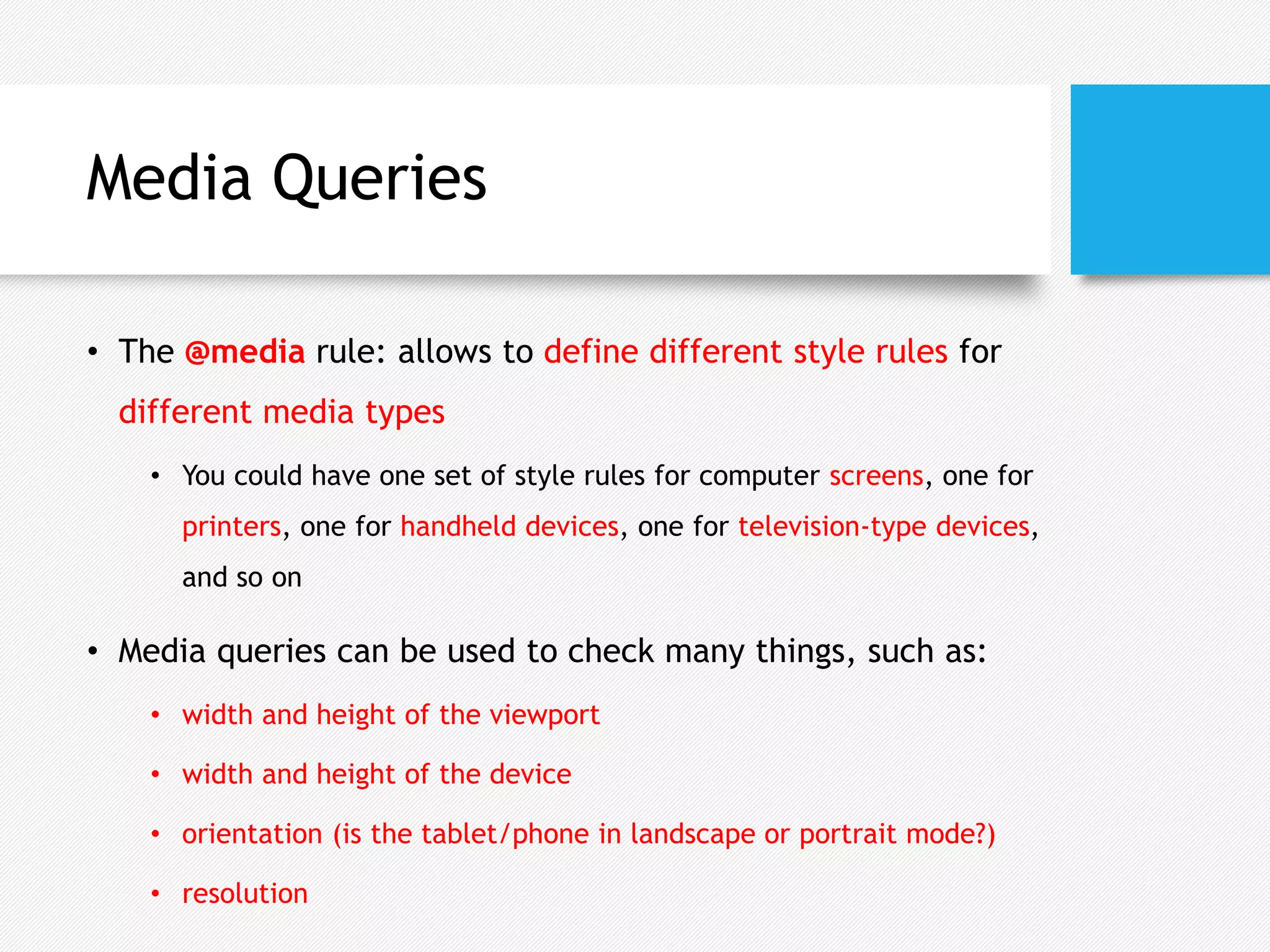
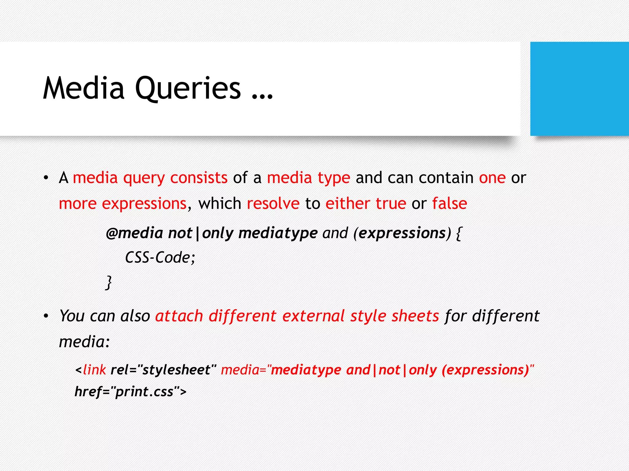
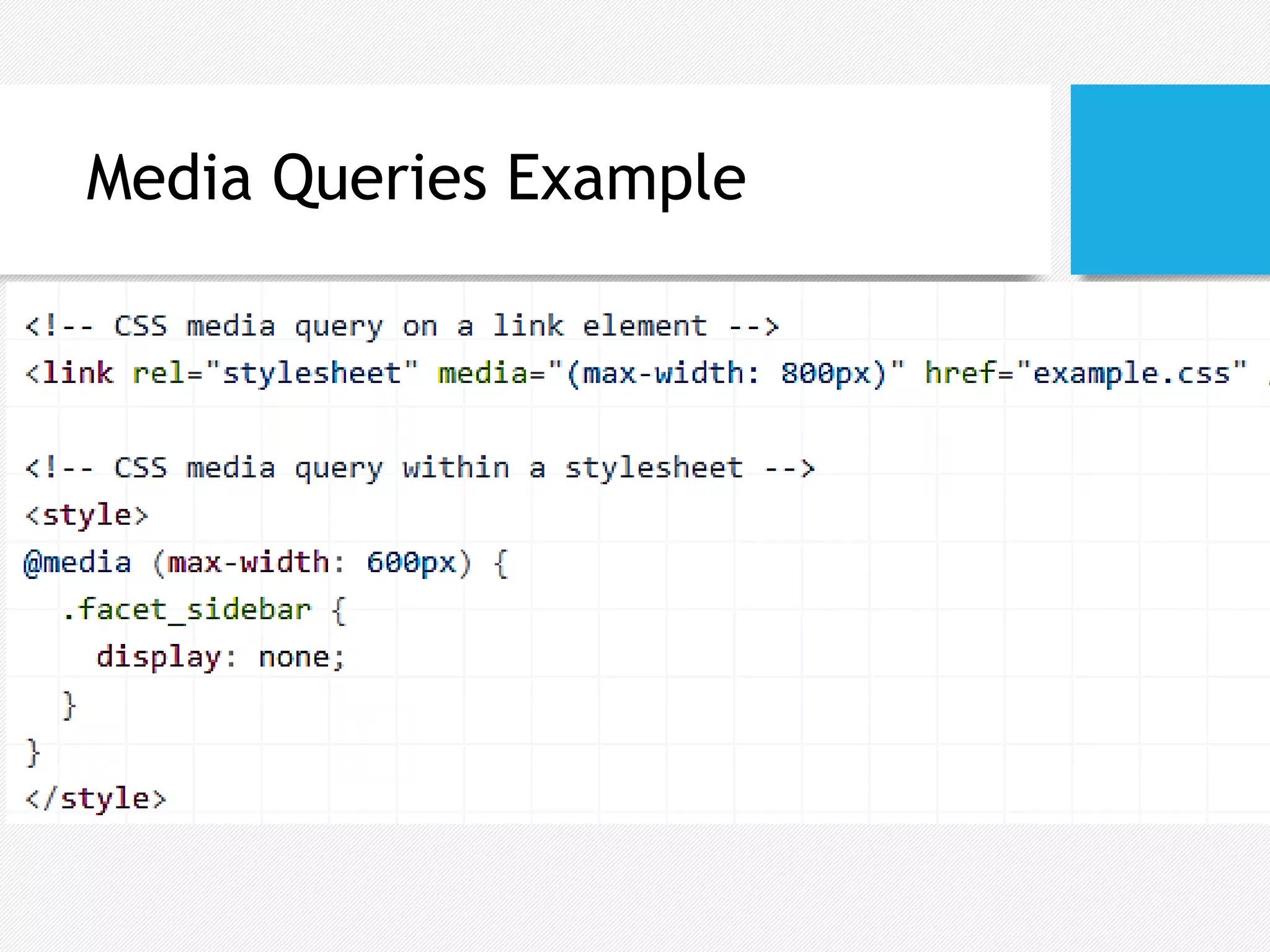
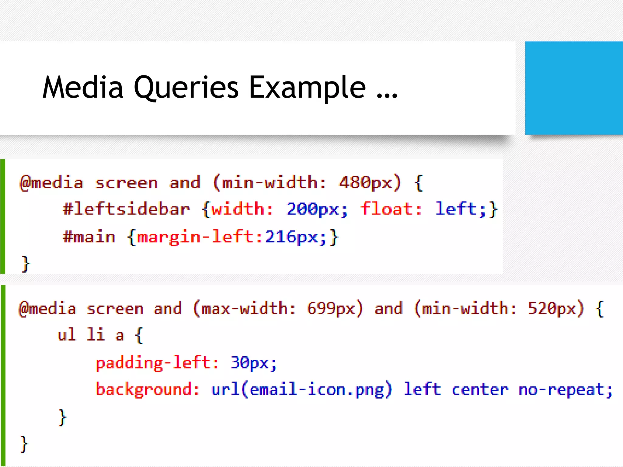
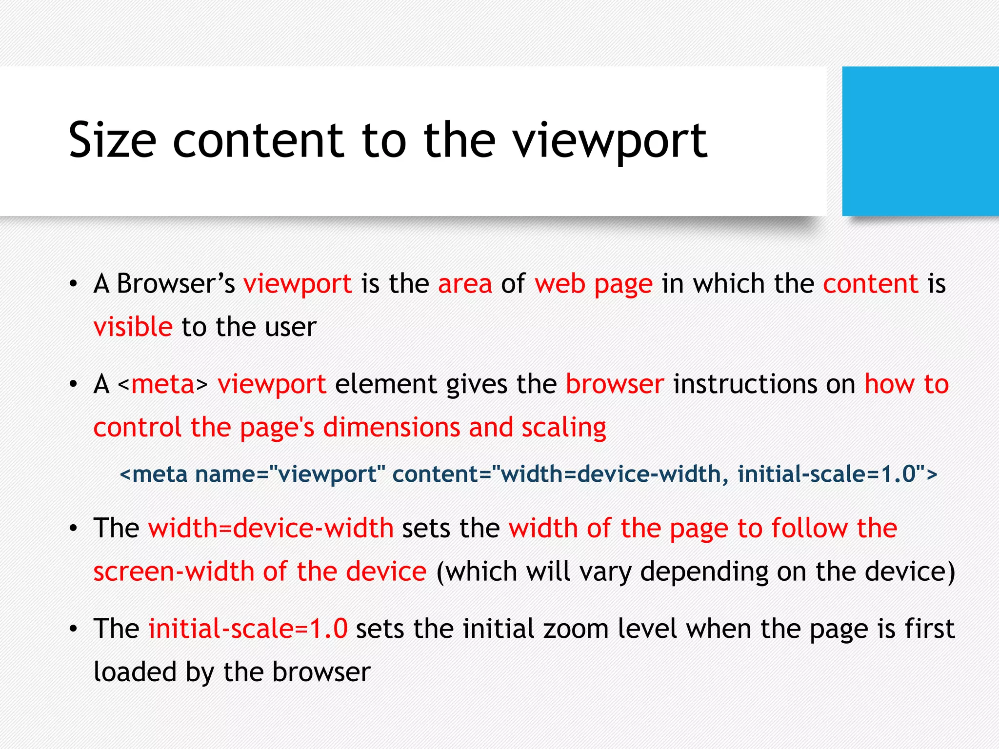
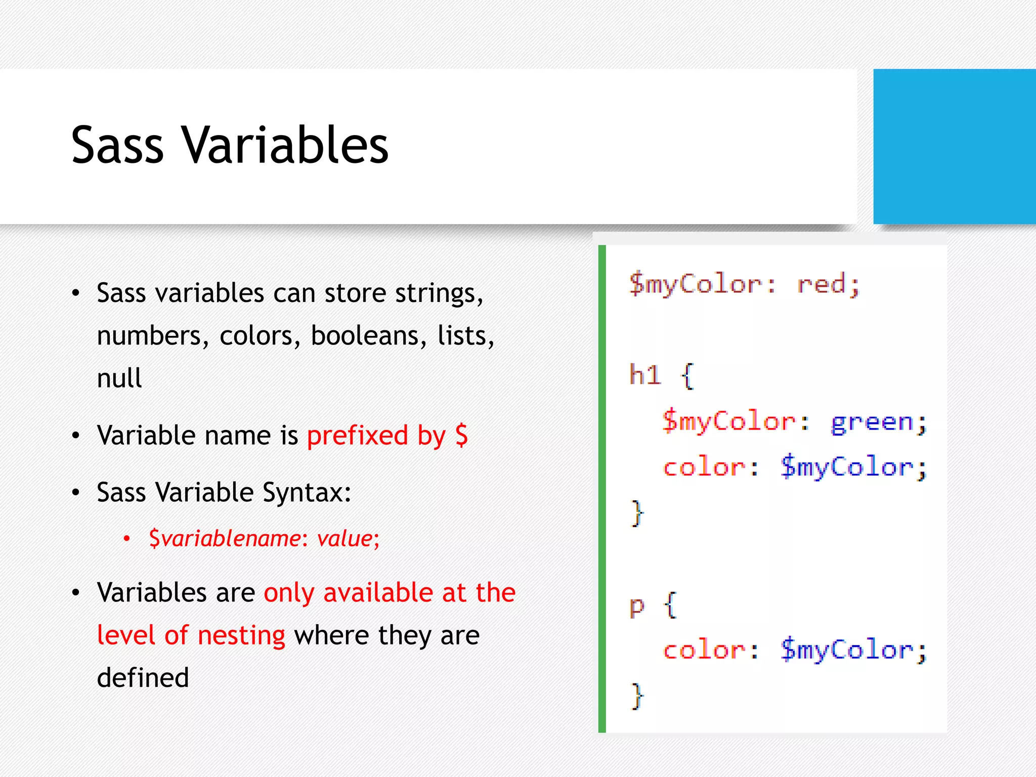
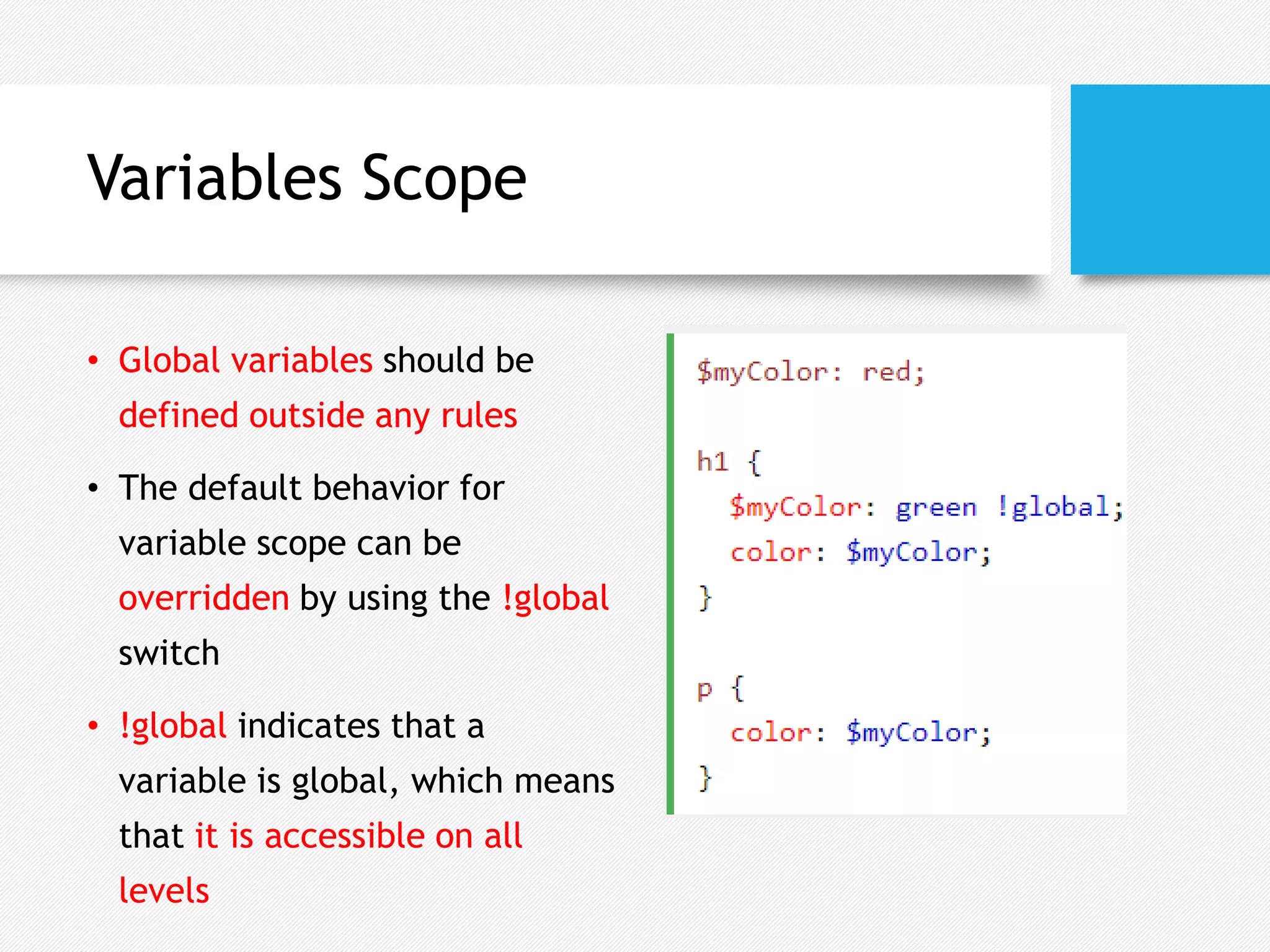
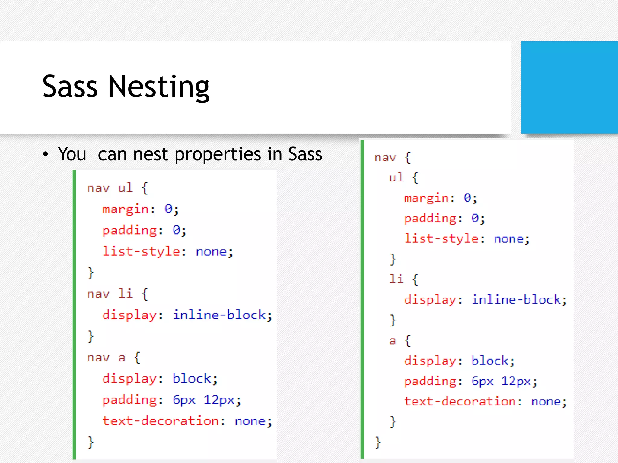
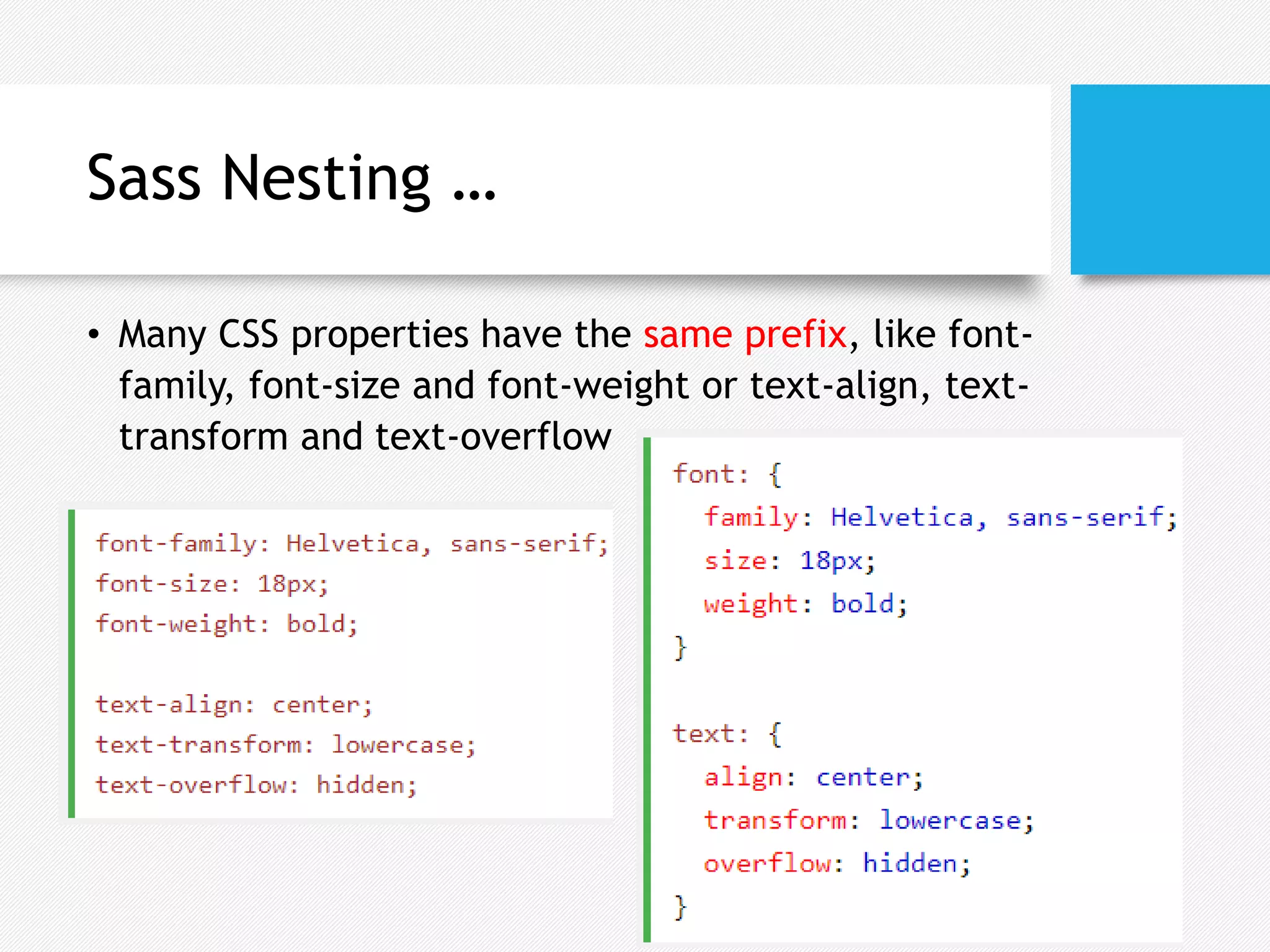
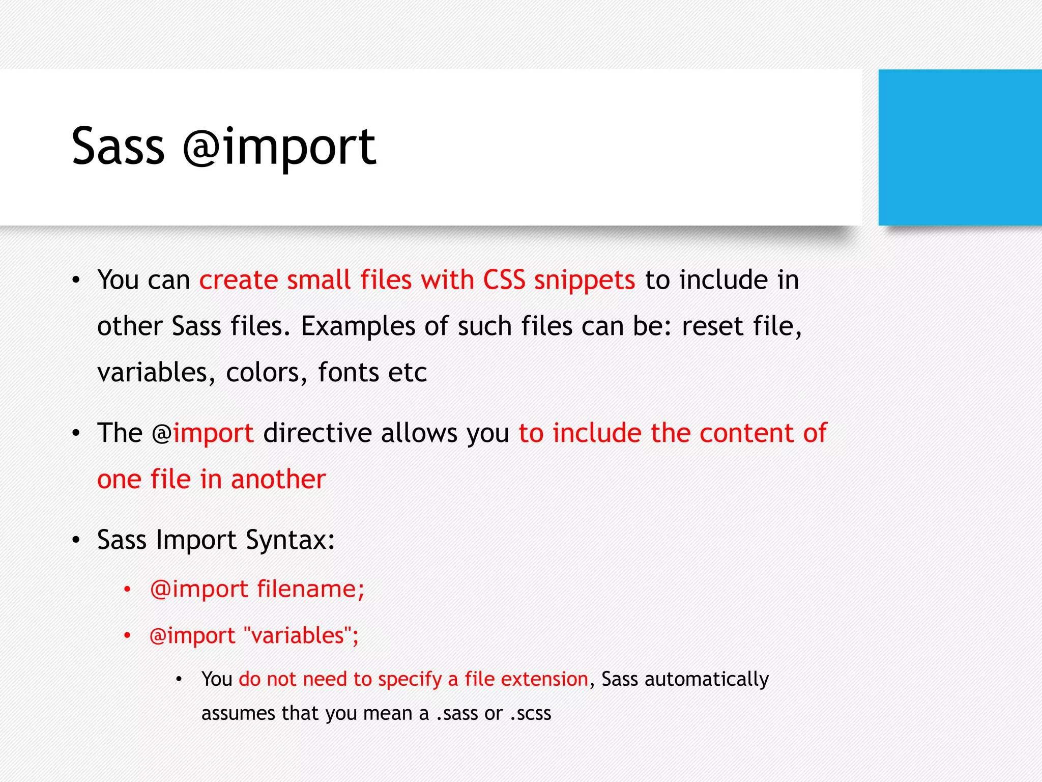
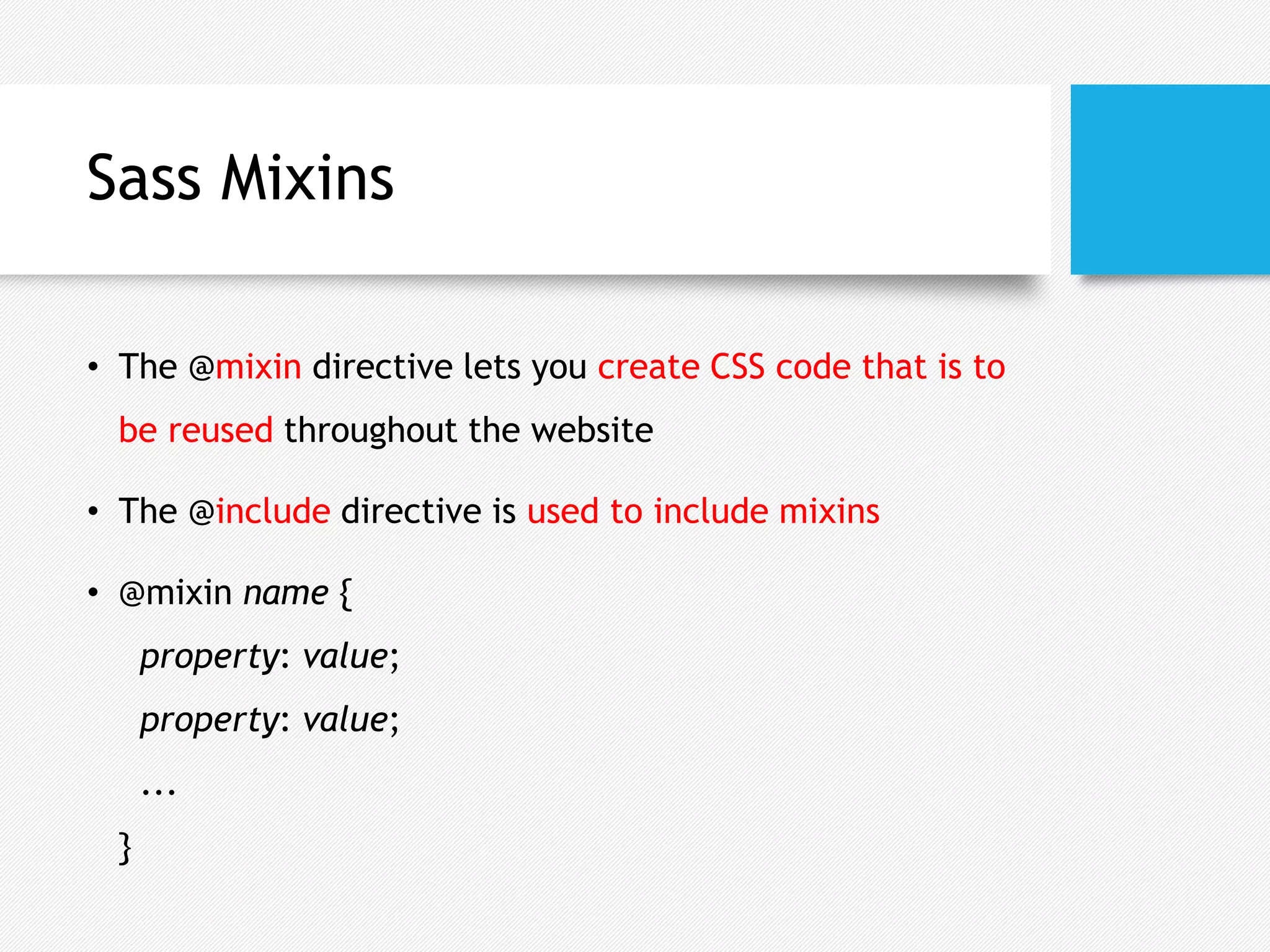
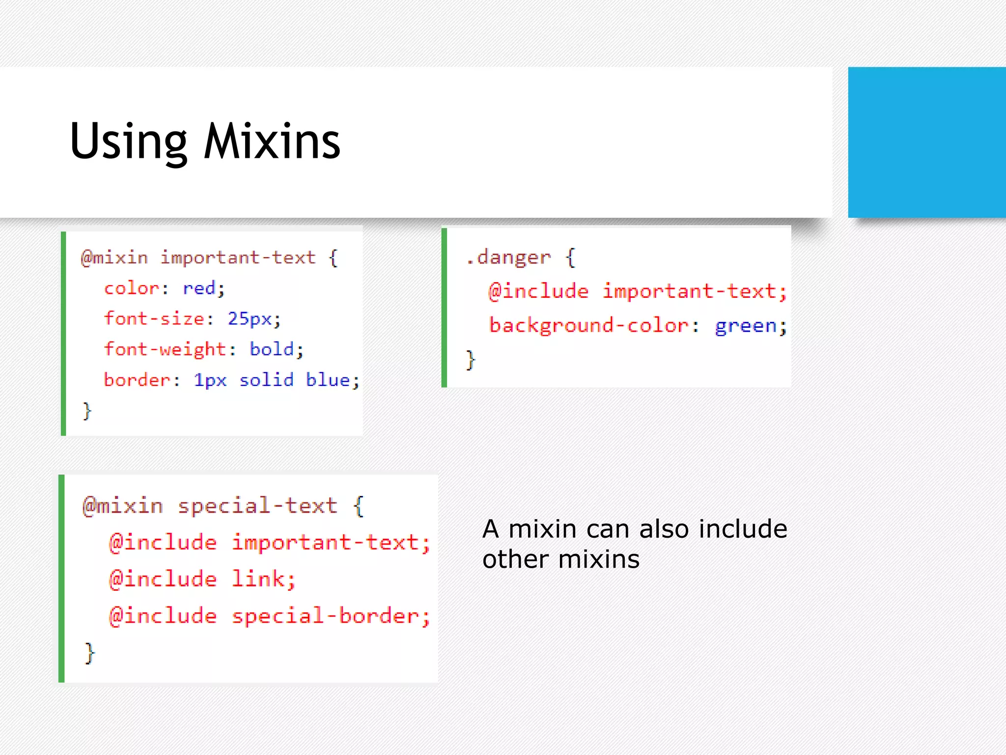
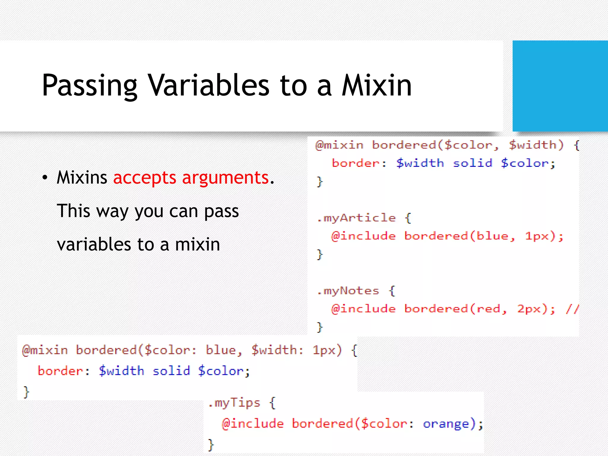
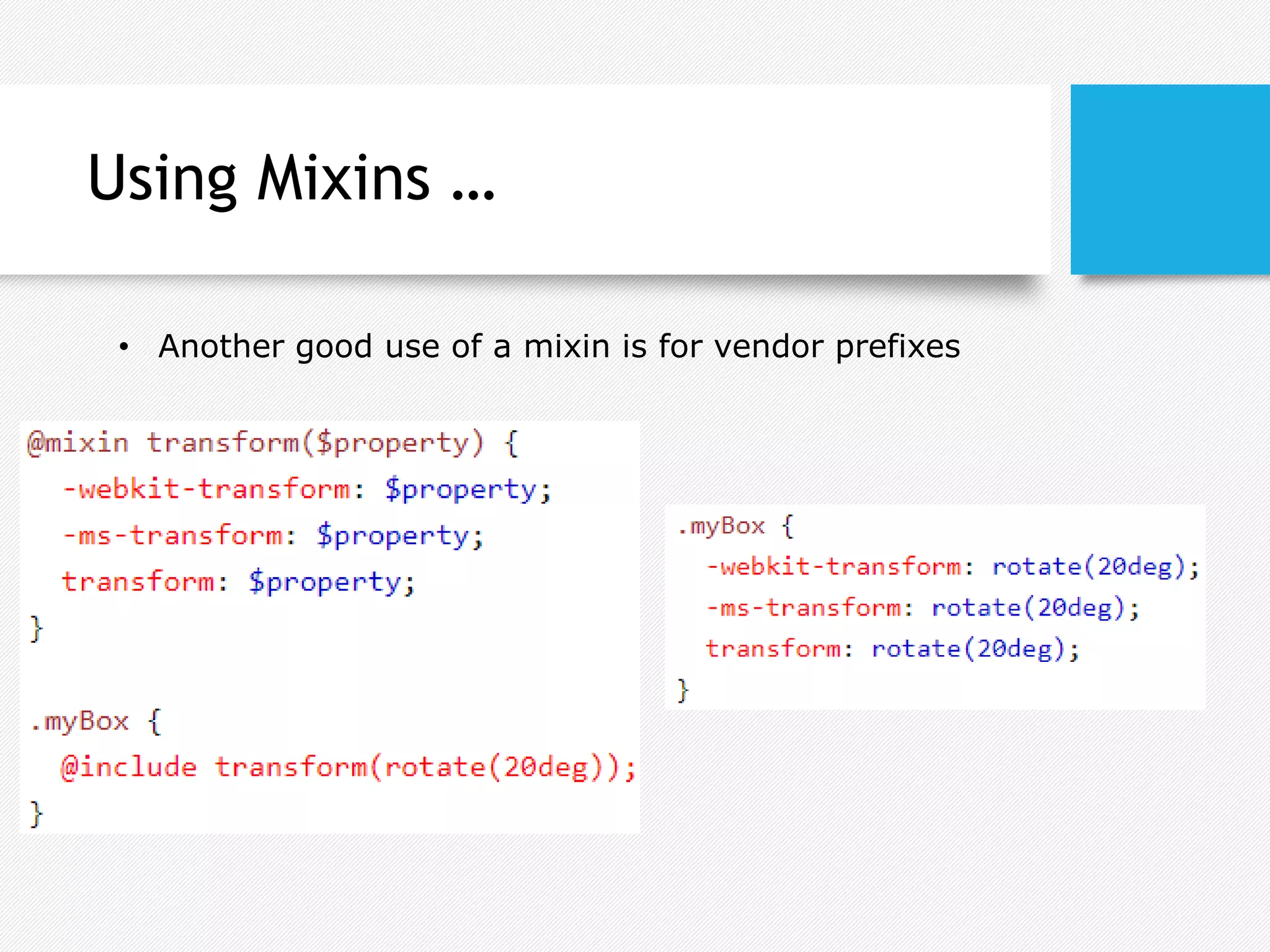
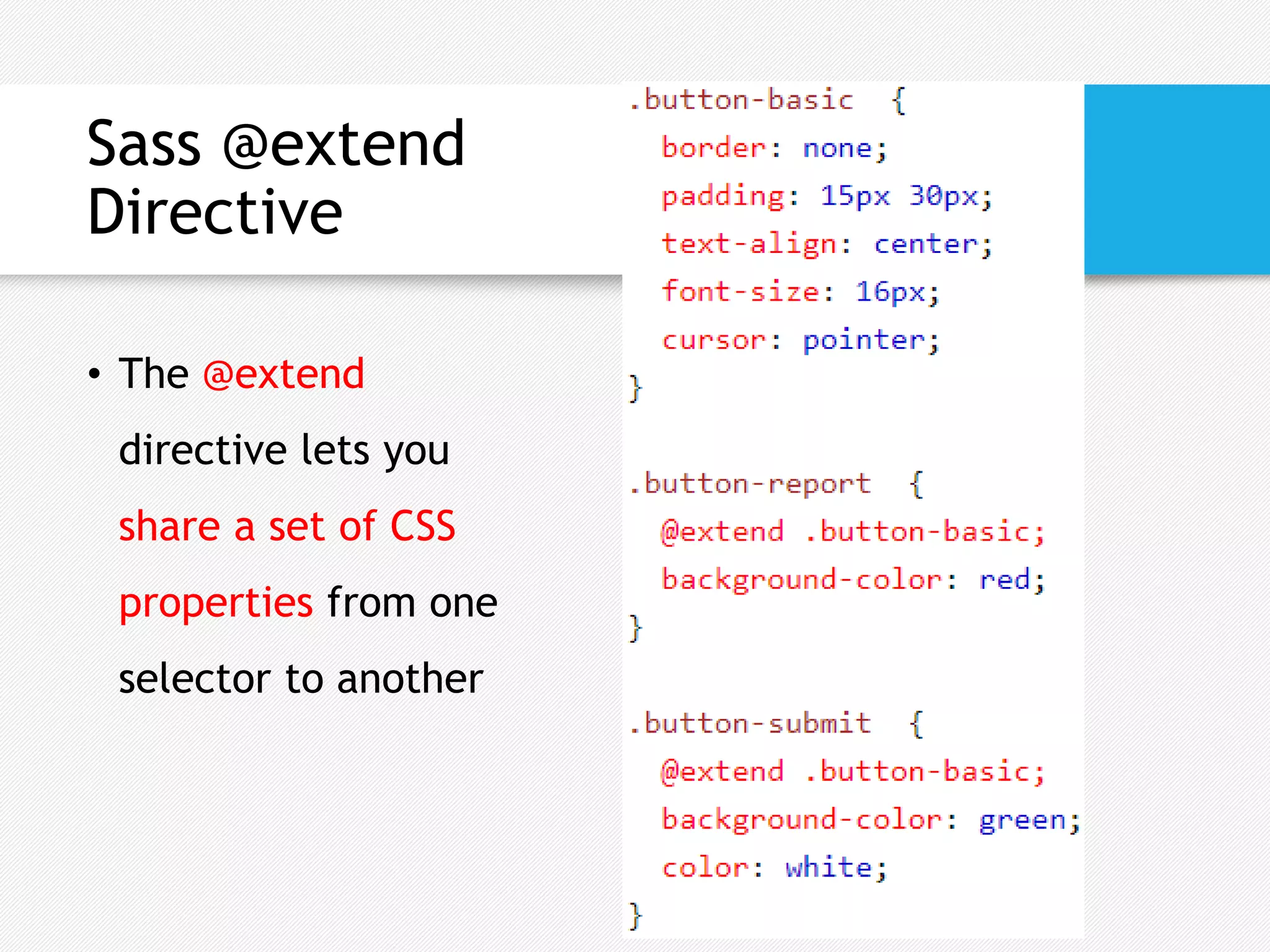
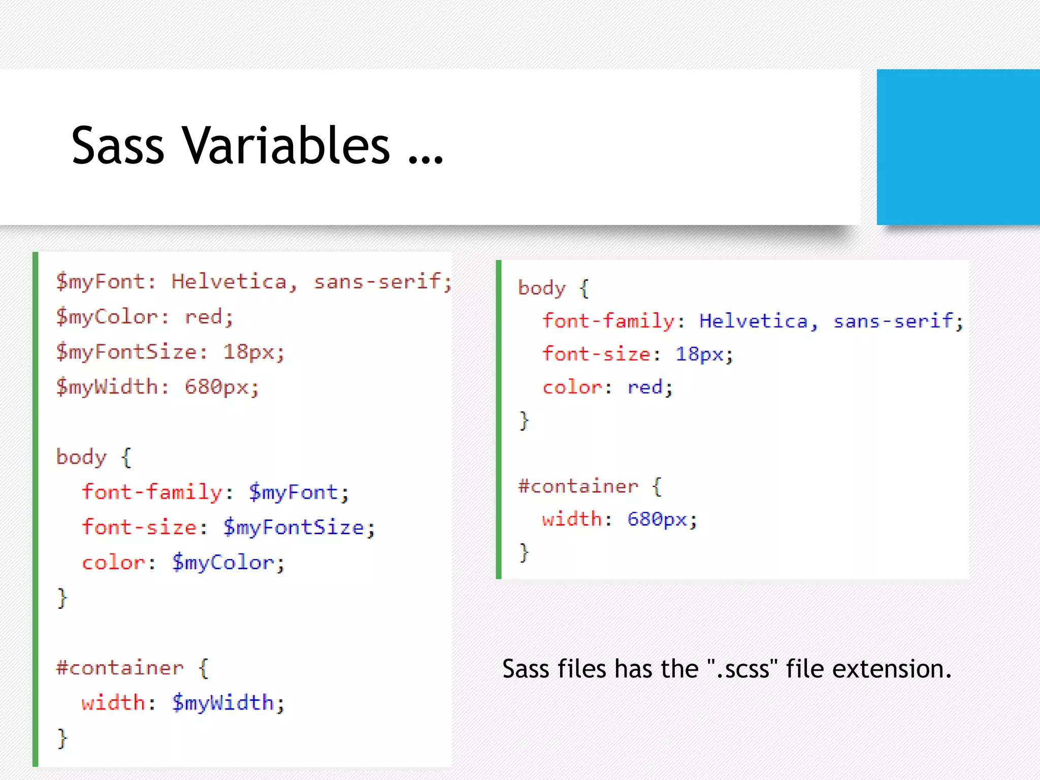
Advanced
CSS3
Compiled by: Seble Nigussie
Topics
• Custom CSS properties
• Responsive Page Layout
• CSS Flexboxes
• CSS Grid
• Media Queries
• CSS Pre-compilers
CSS Custom Properties
(Variables)
• CSS Variables are entities defined in CSS that contain
specific values to be reused throughout a document
• Variables should be declared within a CSS selector that
defines its scope. For a global scope :root or body
selectors can be used
• Variable name must begin with two -- hypens and is case
sensitive
• Variable Declaration Syntax
• --variable-name: value;
CSS var() Function
• The var() function is used to
lookup the value of a custom
property
• Syntax
• var(property-name, value)
• Property-name: the custom
property’s name
• Optional fallback value used if
the custom property is invalid
• Example
• Declaring a custom property
:root{
--main-text-color: brown;
}
• Using the custom property
p{
color: var(--main-text-color);
}
a{
color: var(--main-text-color, red);
}
Custom Property Fallback Values
• A fallback value is used as the substitution
value when the referenced custom property is
invalid
Inheritance of Custom
Properties
• Custom property values of
parents’ are inherited by child
elements like most other CSS
properties
• If no value is set for a custom
property on a given element,
the value of its parent is used
• Eg. font-size of class four will
inherit the --test definition of
class two
Responsive Page
• A responsive page is a web-page that adapts to
different screen sizes and different display devices
like mobiles, tablets, desktops …
• Techniques to develop responsive web page
components and/or layouts
• CSS Flexboxes
• CSS Grid
• Media Queries
CSS Flexbox
• Flexible boxes, or flexbox, is a new layout mode in CSS3
• It is a one-dimensional layout model that offers space
allocation between items in a container and robust
alignment capabilities
• Use of flexbox ensures that elements behave
predictably when the page layout must accommodate
different screen sizes and different display devices
Flex Containers and Items
• Flexbox consists of flex containers and flex items
• Flexbox defines how flex items are laid out inside a flex
container
• A flex container expands its items to fill available free
space or shrinks them to prevent overflow
• A flex container is declared by setting the display property
of an element to either flex (rendered as a block) or inline-
flex (rendered as inline element)
Flex Containers and Items …
• The flex-direction property specifies the
direction of the flexible items inside the
flex container
• Possible Values:- Row, Row-reverse,
Column, Column-reverse
Flex Containers and Items …
• The justify-content property
horizontally aligns the flexible
container's items
• Possible Values: flex-start, flex-end,
center, space-between, space-
around
Flex Properties …
• The align-items property
vertically aligns the flexible
container's items
• Possible Values: stretch, flex-
start, flex-end, center, baseline
Flex Properties …
• The flex-wrap property specifies whether
the flex items should wrap or not, if there
is not enough room for them on one flex
line
• Possible Values: nowrap, wrap, wrap-reverse
Flex Properties …
• The align-self property of flex
items overrides the flex
container's align-items property
for that item
• Possible Values: stretch, flex-start,
flex-end, center, baseline
Flex Properties …
• The flex property specifies the
length of the flex item, relative
to the rest of the flex items
inside the same container
Sample Flexbox Uses …
Sample Flexbox Uses
CSS Grid Layout
• The CSS Grid Layout Module offers a grid-based
layout system, with rows and columns, making it
easier to design web pages without having to use
floats and positioning
• A grid layout consists of a parent element, with
one or more child elements
• An HTML element becomes a grid container when
its display property is set to grid or inline-grid
Grid
Layout
• The grid-template-columns property
defines the number of columns in
your grid layout, and it can define
the width of each column, The grid-
template-rows property defines the
height of each row
• The value is a space-separated-list
• If you want your grid layout to
contain 4 columns, specify the width
of the 4 columns, or "auto" if all
columns should have the same width.
Grid
Properties
• Items gaps can be adjusted by
using one of the following
properties:
• grid-column-gap
grid-row-gap
grid-gap
Grid Properties
• The justify-
content property is used to
align the whole grid inside the
container
• space-evenly, space-around,
space-between, center, start, end
Grid Lines
• Refer to line numbers when placing a grid item in a grid container:
Grid Lines
Grid Lines
• placing a grid item in a
grid container:
Grid Properties …
• The grid-column property is a shorthand property for the grid-column-
start and the grid-column-end properties. The grid-row property does the
same thing for rows
• To place an item, you can refer to line numbers, or use the keyword "span" to
define how many columns the item will span
Grid Properties …
• The grid-area property can be used as a
shorthand property for the grid-row-start,
grid-column-start, grid-row-end and
the grid-column-end properties
• Syntax
• grid-area: grid-row-start/grid-column-start/grow-row-
end/grid-column-end
Grid Properties …
• The grid-area
property can also be
used to assign names
to grid items
• Named grid items can
be referred to by the
grid-template-areas
property of the grid
container
• Each row is defined
by apostrophes (' ')
• The columns in each
row is defined inside
the apostrophes,
separated by a space
Grid Properties …
• A period sign represents a grid item with no name
• Make "item1" span two columns and two rows:
• Let "myArea" span two columns in a five columns grid layout
Media Queries
• The @media rule: allows to define different style rules for
different media types
• You could have one set of style rules for computer screens, one for
printers, one for handheld devices, one for television-type devices,
and so on
• Media queries can be used to check many things, such as:
• width and height of the viewport
• width and height of the device
• orientation (is the tablet/phone in landscape or portrait mode?)
• resolution
Media Queries …
• A media query consists of a media type and can contain one or
more expressions, which resolve to either true or false
@media not|only mediatype and (expressions) {
CSS-Code;
}
• You can also attach different external style sheets for different
media:
<link rel="stylesheet" media="mediatype and|not|only (expressions)"
href="print.css">
CSS3 Media Types
• all
• Used for all media type devices
• print
• Used for printers
• screen
• Used for computer screens, tablets, smart-phones etc.
• speech
• Used for screen readers that "reads" the page out loud
Media Queries Example
Media Queries Example …
Media Queries Example…
Size content to the viewport
• A Browser’s viewport is the area of web page in which the content is
visible to the user
• A <meta> viewport element gives the browser instructions on how to
control the page's dimensions and scaling
<meta name="viewport" content="width=device-width, initial-scale=1.0">
• The width=device-width sets the width of the page to follow the
screen-width of the device (which will vary depending on the device)
• The initial-scale=1.0 sets the initial zoom level when the page is first
loaded by the browser
Exercises
• Calculator with flexbox or grid
Sass
• Sass (Syntactically Awesome Stylesheet) is a CSS pre-processor that
reduces repetition of CSS and therefore saves time
• Everything about Sass is to provide tools to prevent repeating
yourself in your code: it’s the DRY principle, which stands
for Don’t repeat yourself
• variables prevents repeating values
• nesting prevents repeating selectors
• mixins and extensions prevent repeating properties
• A browser does not understand Sass code. Therefore, you will need
a Sass pre-processor to convert Sass code into standard CSS
Sass Variables
• Sass variables can store strings,
numbers, colors, booleans, lists,
null
• Variable name is prefixed by $
• Sass Variable Syntax:
• $variablename: value;
• Variables are only available at the
level of nesting where they are
defined
Variables Scope
• Global variables should be
defined outside any rules
• The default behavior for
variable scope can be
overridden by using the !global
switch
• !global indicates that a
variable is global, which means
that it is accessible on all
levels
Sass Nesting
• You can nest properties in Sass
Sass Nesting …
• Many CSS properties have the same prefix, like font-
family, font-size and font-weight or text-align, text-
transform and text-overflow
Sass @import
• You can create small files with CSS snippets to include in
other Sass files. Examples of such files can be: reset file,
variables, colors, fonts etc
• The @import directive allows you to include the content of
one file in another
• Sass Import Syntax:
• @import filename;
• @import "variables";
• You do not need to specify a file extension, Sass automatically
assumes that you mean a .sass or .scss
Sass Mixins
• The @mixin directive lets you create CSS code that is to
be reused throughout the website
• The @include directive is used to include mixins
• @mixin name {
property: value;
property: value;
...
}
Using Mixins
A mixin can also include
other mixins
Passing Variables to a Mixin
• Mixins accepts arguments.
This way you can pass
variables to a mixin
Using Mixins …
• Another good use of a mixin is for vendor prefixes
Sass @extend
Directive
• The @extend
directive lets you
share a set of CSS
properties from one
selector to another
Sass Variables …
Sass files has the ".scss" file extension.

Flexbox, Grid and Sass

  • 1.
  • 2.
    Topics • Custom CSSproperties • Responsive Page Layout • CSS Flexboxes • CSS Grid • Media Queries • CSS Pre-compilers
  • 3.
    CSS Custom Properties (Variables) •CSS Variables are entities defined in CSS that contain specific values to be reused throughout a document • Variables should be declared within a CSS selector that defines its scope. For a global scope :root or body selectors can be used • Variable name must begin with two -- hypens and is case sensitive • Variable Declaration Syntax • --variable-name: value;
  • 4.
    CSS var() Function •The var() function is used to lookup the value of a custom property • Syntax • var(property-name, value) • Property-name: the custom property’s name • Optional fallback value used if the custom property is invalid • Example • Declaring a custom property :root{ --main-text-color: brown; } • Using the custom property p{ color: var(--main-text-color); } a{ color: var(--main-text-color, red); }
  • 5.
    Custom Property FallbackValues • A fallback value is used as the substitution value when the referenced custom property is invalid
  • 6.
    Inheritance of Custom Properties •Custom property values of parents’ are inherited by child elements like most other CSS properties • If no value is set for a custom property on a given element, the value of its parent is used • Eg. font-size of class four will inherit the --test definition of class two
  • 7.
    Responsive Page • Aresponsive page is a web-page that adapts to different screen sizes and different display devices like mobiles, tablets, desktops … • Techniques to develop responsive web page components and/or layouts • CSS Flexboxes • CSS Grid • Media Queries
  • 8.
    CSS Flexbox • Flexibleboxes, or flexbox, is a new layout mode in CSS3 • It is a one-dimensional layout model that offers space allocation between items in a container and robust alignment capabilities • Use of flexbox ensures that elements behave predictably when the page layout must accommodate different screen sizes and different display devices
  • 9.
    Flex Containers andItems • Flexbox consists of flex containers and flex items • Flexbox defines how flex items are laid out inside a flex container • A flex container expands its items to fill available free space or shrinks them to prevent overflow • A flex container is declared by setting the display property of an element to either flex (rendered as a block) or inline- flex (rendered as inline element)
  • 10.
  • 11.
    Flex Containers andItems … • The flex-direction property specifies the direction of the flexible items inside the flex container • Possible Values:- Row, Row-reverse, Column, Column-reverse
  • 12.
    Flex Containers andItems … • The justify-content property horizontally aligns the flexible container's items • Possible Values: flex-start, flex-end, center, space-between, space- around
  • 13.
    Flex Properties … •The align-items property vertically aligns the flexible container's items • Possible Values: stretch, flex- start, flex-end, center, baseline
  • 14.
    Flex Properties … •The flex-wrap property specifies whether the flex items should wrap or not, if there is not enough room for them on one flex line • Possible Values: nowrap, wrap, wrap-reverse
  • 15.
    Flex Properties … •The align-self property of flex items overrides the flex container's align-items property for that item • Possible Values: stretch, flex-start, flex-end, center, baseline
  • 16.
    Flex Properties … •The flex property specifies the length of the flex item, relative to the rest of the flex items inside the same container
  • 17.
  • 18.
  • 19.
    CSS Grid Layout •The CSS Grid Layout Module offers a grid-based layout system, with rows and columns, making it easier to design web pages without having to use floats and positioning • A grid layout consists of a parent element, with one or more child elements • An HTML element becomes a grid container when its display property is set to grid or inline-grid
  • 20.
    Grid Layout • The grid-template-columnsproperty defines the number of columns in your grid layout, and it can define the width of each column, The grid- template-rows property defines the height of each row • The value is a space-separated-list • If you want your grid layout to contain 4 columns, specify the width of the 4 columns, or "auto" if all columns should have the same width.
  • 21.
    Grid Properties • Items gapscan be adjusted by using one of the following properties: • grid-column-gap grid-row-gap grid-gap
  • 22.
    Grid Properties • Thejustify- content property is used to align the whole grid inside the container • space-evenly, space-around, space-between, center, start, end
  • 23.
    Grid Lines • Referto line numbers when placing a grid item in a grid container:
  • 24.
  • 25.
    Grid Lines • placinga grid item in a grid container:
  • 26.
    Grid Properties … •The grid-column property is a shorthand property for the grid-column- start and the grid-column-end properties. The grid-row property does the same thing for rows • To place an item, you can refer to line numbers, or use the keyword "span" to define how many columns the item will span
  • 27.
    Grid Properties … •The grid-area property can be used as a shorthand property for the grid-row-start, grid-column-start, grid-row-end and the grid-column-end properties • Syntax • grid-area: grid-row-start/grid-column-start/grow-row- end/grid-column-end
  • 28.
    Grid Properties … •The grid-area property can also be used to assign names to grid items • Named grid items can be referred to by the grid-template-areas property of the grid container • Each row is defined by apostrophes (' ') • The columns in each row is defined inside the apostrophes, separated by a space
  • 29.
    Grid Properties … •A period sign represents a grid item with no name • Make "item1" span two columns and two rows: • Let "myArea" span two columns in a five columns grid layout
  • 31.
    Media Queries • The@media rule: allows to define different style rules for different media types • You could have one set of style rules for computer screens, one for printers, one for handheld devices, one for television-type devices, and so on • Media queries can be used to check many things, such as: • width and height of the viewport • width and height of the device • orientation (is the tablet/phone in landscape or portrait mode?) • resolution
  • 32.
    Media Queries … •A media query consists of a media type and can contain one or more expressions, which resolve to either true or false @media not|only mediatype and (expressions) { CSS-Code; } • You can also attach different external style sheets for different media: <link rel="stylesheet" media="mediatype and|not|only (expressions)" href="print.css">
  • 33.
    CSS3 Media Types •all • Used for all media type devices • print • Used for printers • screen • Used for computer screens, tablets, smart-phones etc. • speech • Used for screen readers that "reads" the page out loud
  • 34.
  • 35.
  • 36.
  • 37.
    Size content tothe viewport • A Browser’s viewport is the area of web page in which the content is visible to the user • A <meta> viewport element gives the browser instructions on how to control the page's dimensions and scaling <meta name="viewport" content="width=device-width, initial-scale=1.0"> • The width=device-width sets the width of the page to follow the screen-width of the device (which will vary depending on the device) • The initial-scale=1.0 sets the initial zoom level when the page is first loaded by the browser
  • 38.
  • 39.
    Sass • Sass (SyntacticallyAwesome Stylesheet) is a CSS pre-processor that reduces repetition of CSS and therefore saves time • Everything about Sass is to provide tools to prevent repeating yourself in your code: it’s the DRY principle, which stands for Don’t repeat yourself • variables prevents repeating values • nesting prevents repeating selectors • mixins and extensions prevent repeating properties • A browser does not understand Sass code. Therefore, you will need a Sass pre-processor to convert Sass code into standard CSS
  • 40.
    Sass Variables • Sassvariables can store strings, numbers, colors, booleans, lists, null • Variable name is prefixed by $ • Sass Variable Syntax: • $variablename: value; • Variables are only available at the level of nesting where they are defined
  • 41.
    Variables Scope • Globalvariables should be defined outside any rules • The default behavior for variable scope can be overridden by using the !global switch • !global indicates that a variable is global, which means that it is accessible on all levels
  • 42.
    Sass Nesting • Youcan nest properties in Sass
  • 43.
    Sass Nesting … •Many CSS properties have the same prefix, like font- family, font-size and font-weight or text-align, text- transform and text-overflow
  • 44.
    Sass @import • Youcan create small files with CSS snippets to include in other Sass files. Examples of such files can be: reset file, variables, colors, fonts etc • The @import directive allows you to include the content of one file in another • Sass Import Syntax: • @import filename; • @import "variables"; • You do not need to specify a file extension, Sass automatically assumes that you mean a .sass or .scss
  • 45.
    Sass Mixins • The@mixin directive lets you create CSS code that is to be reused throughout the website • The @include directive is used to include mixins • @mixin name { property: value; property: value; ... }
  • 46.
    Using Mixins A mixincan also include other mixins
  • 47.
    Passing Variables toa Mixin • Mixins accepts arguments. This way you can pass variables to a mixin
  • 48.
    Using Mixins … •Another good use of a mixin is for vendor prefixes
  • 49.
    Sass @extend Directive • The@extend directive lets you share a set of CSS properties from one selector to another
  • 50.
    Sass Variables … Sassfiles has the ".scss" file extension.