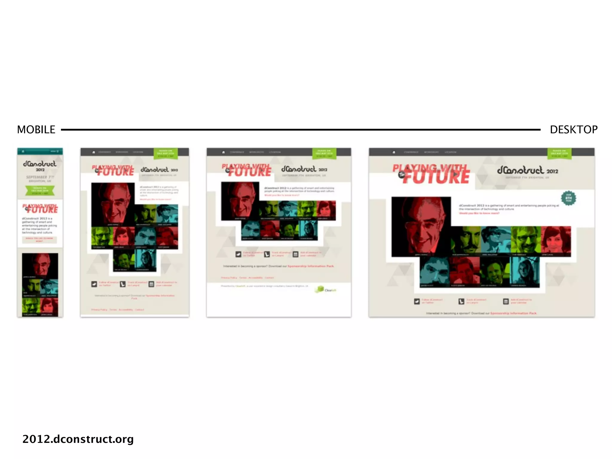
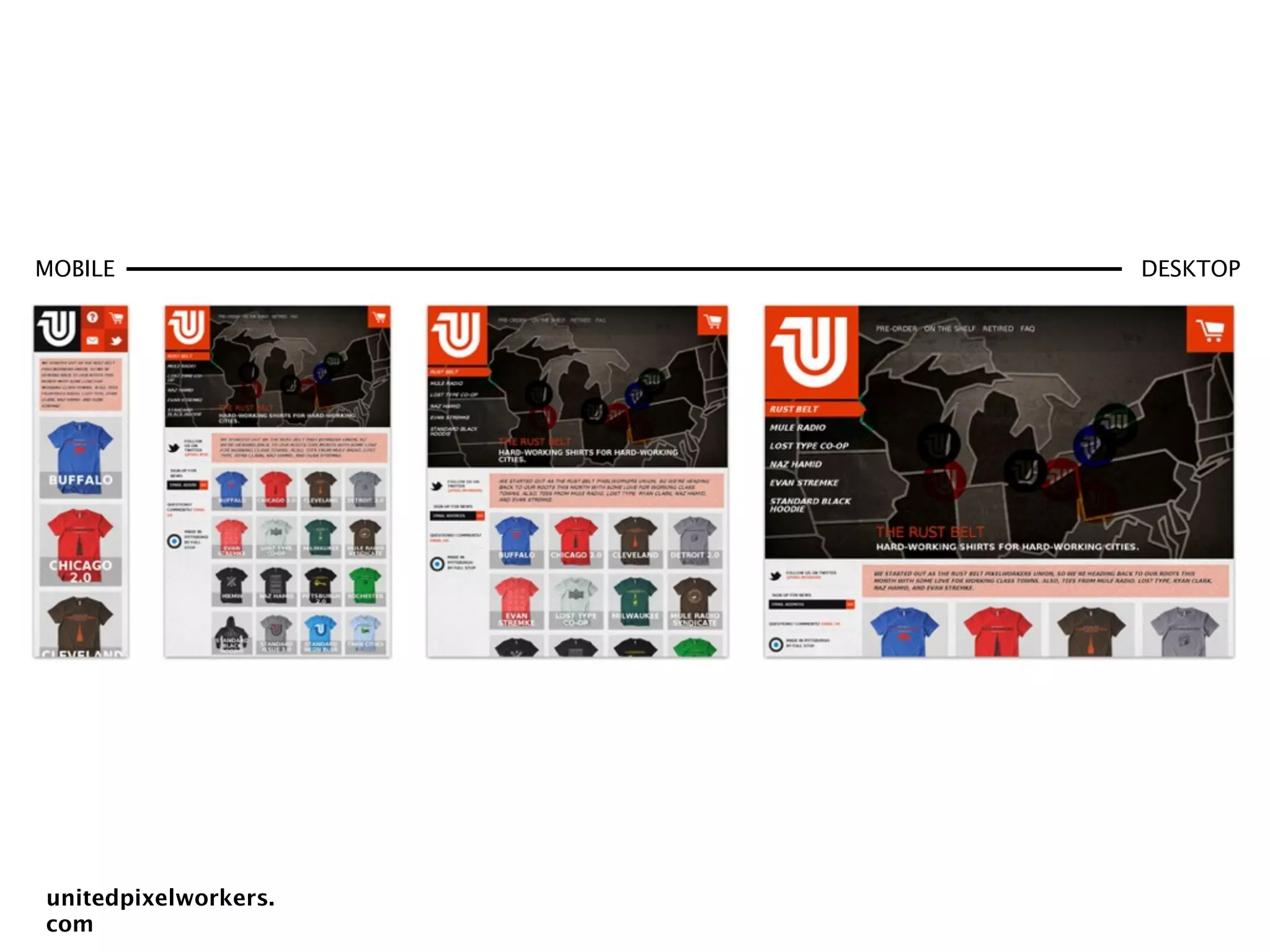
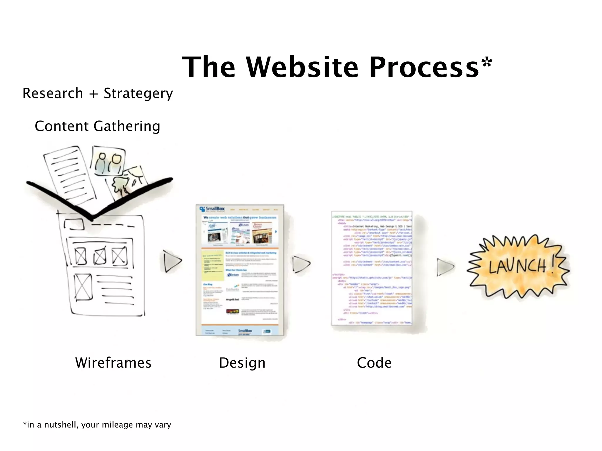
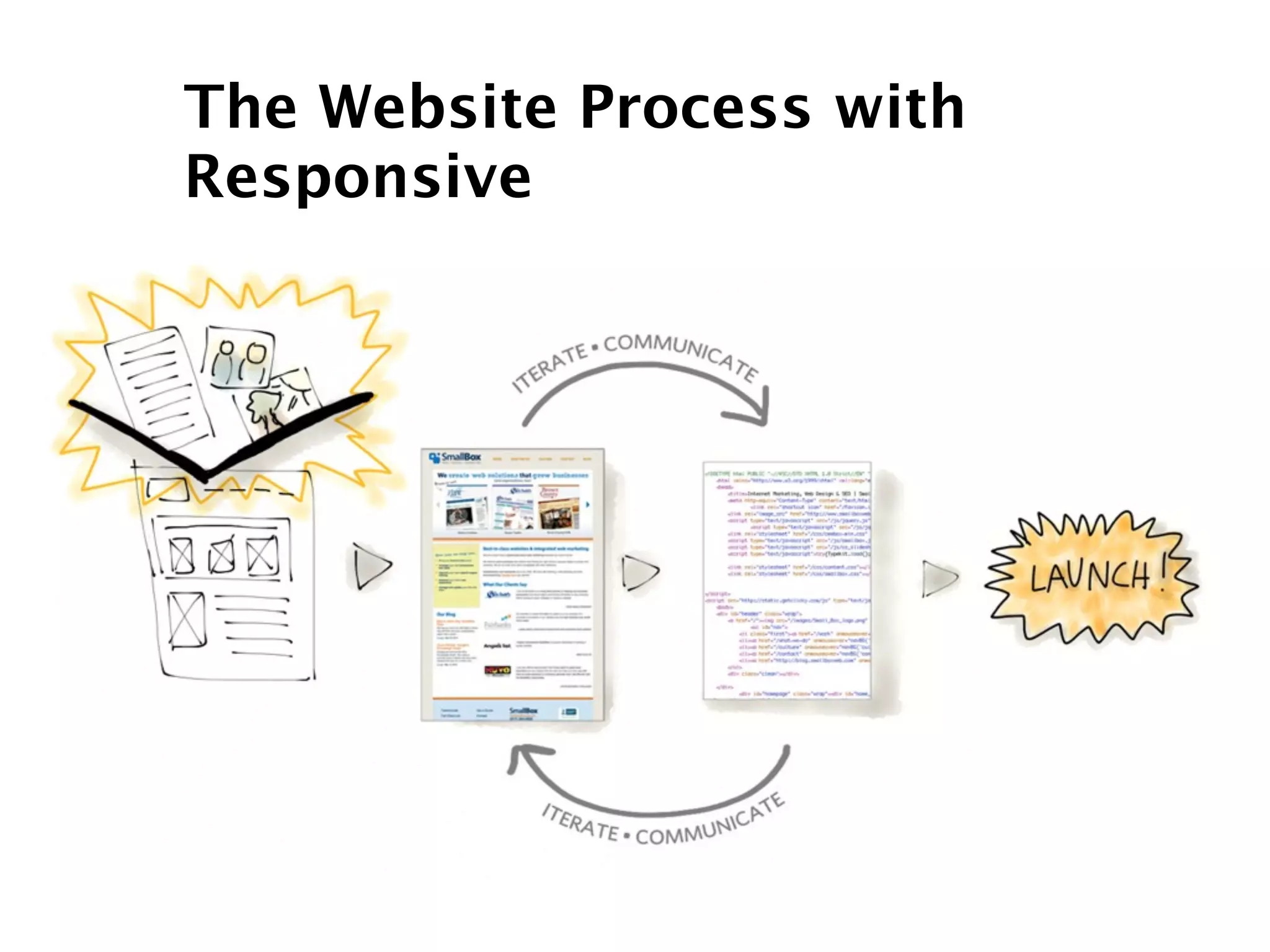
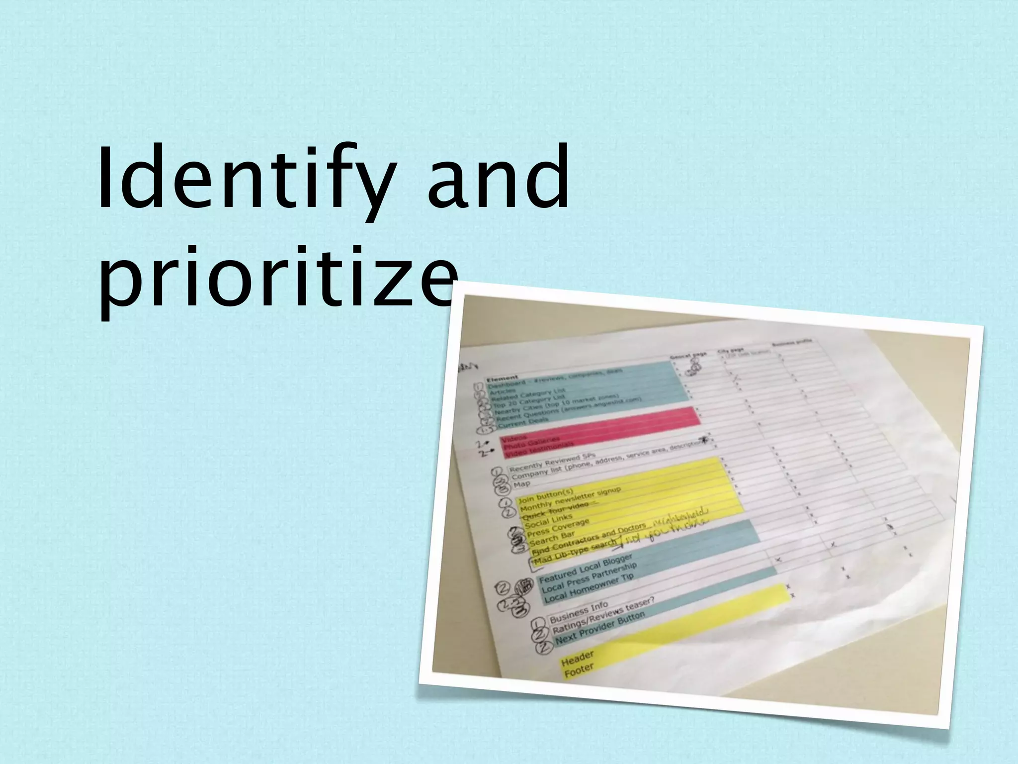
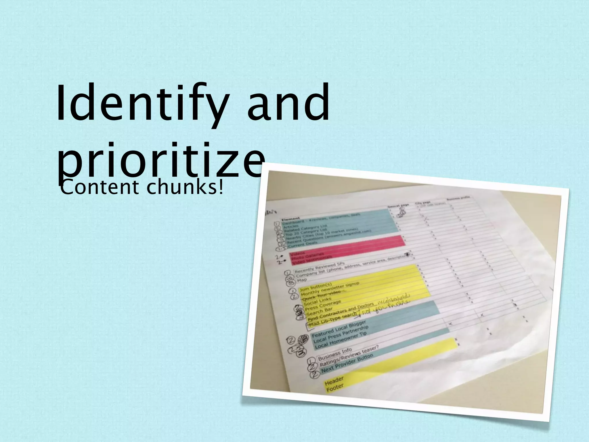
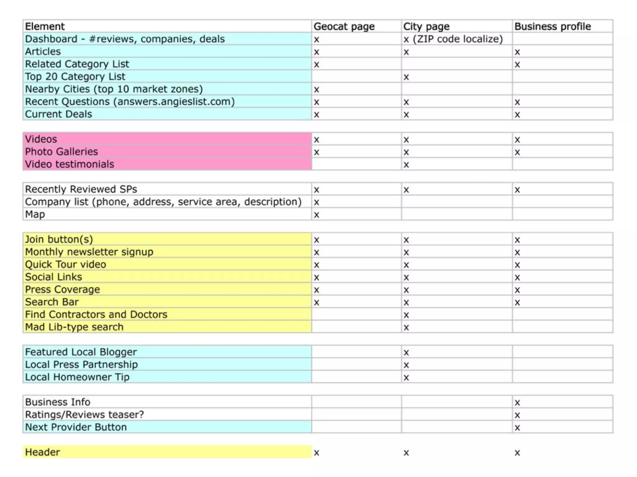
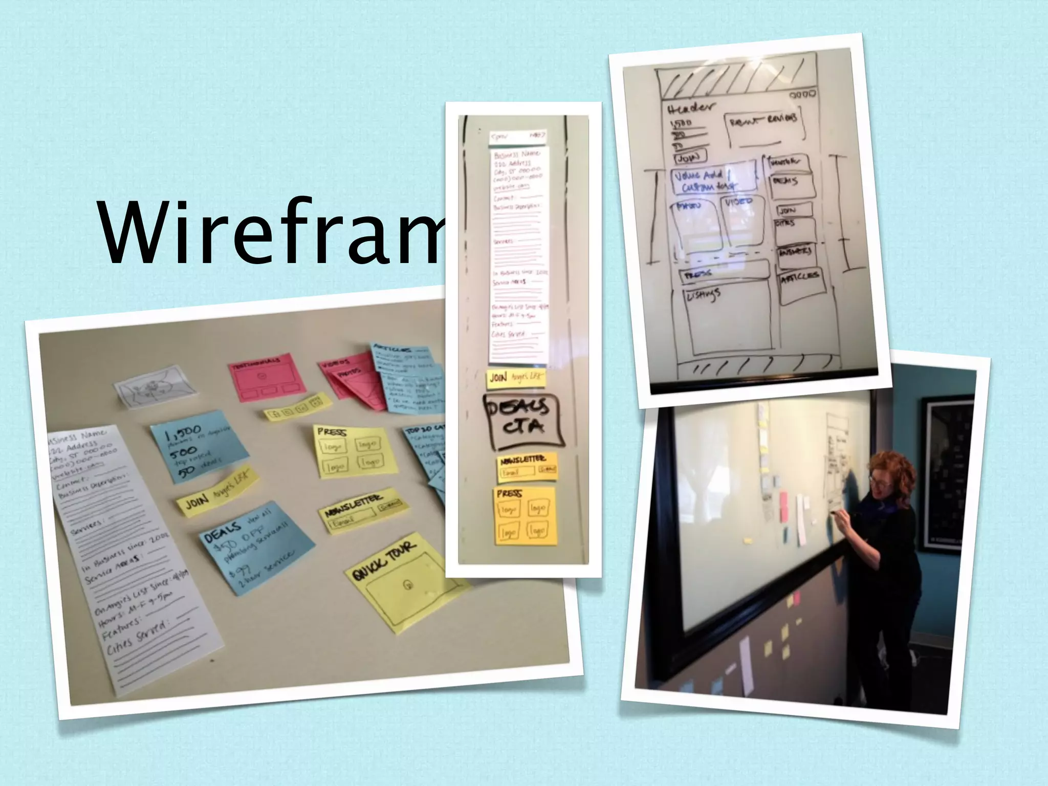
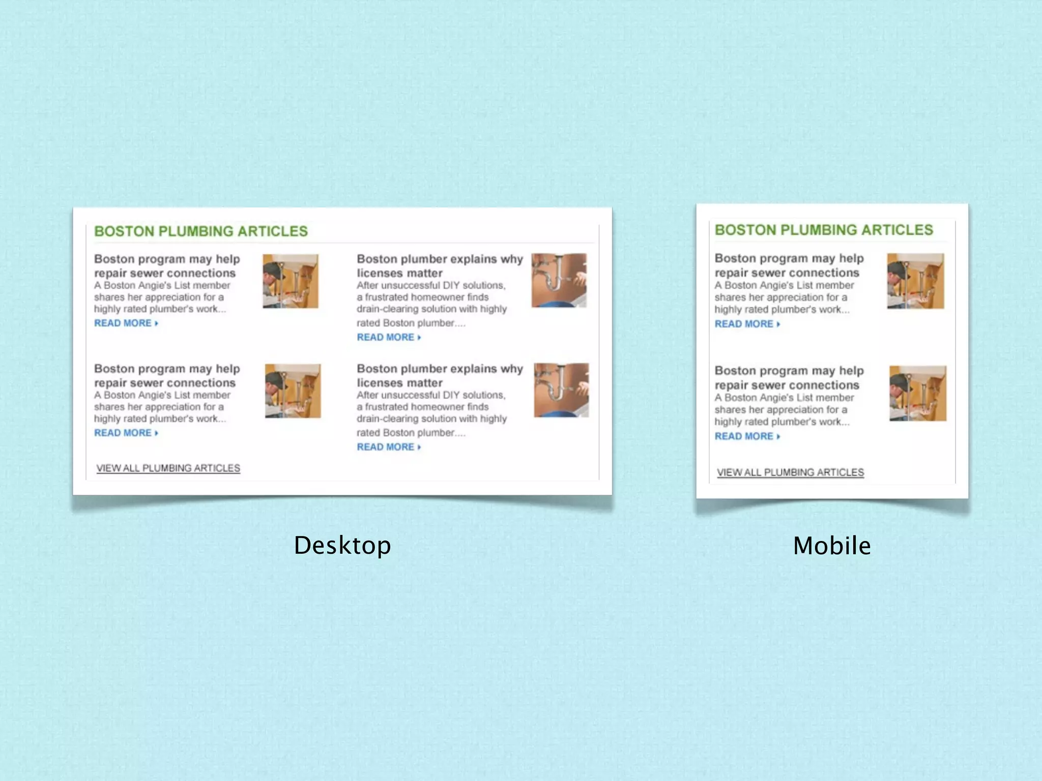
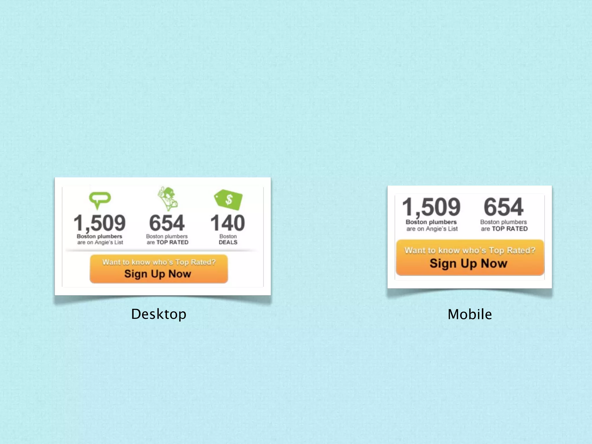
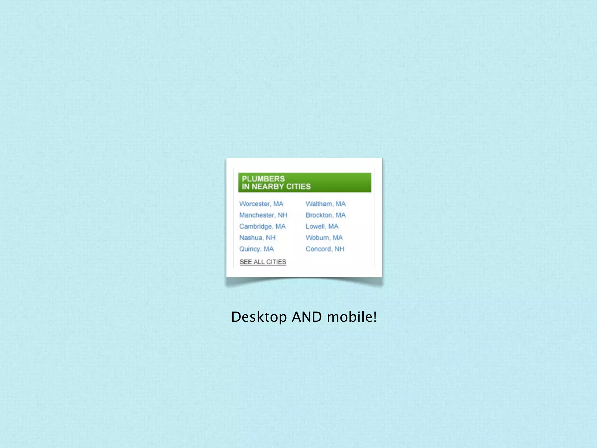
Building a Responsive
Web Design Process

                Hello!


                    Lydia ›
                 @lydiology
This isn’t about writing code.
               But this is ›
What is responsive design?
MOBILE                DESKTOP


2012.dconstruct.org
MOBILE                   DESKTOP


unitedpixelworkers.com
When to go responsive?
Time
Budget
Strategy
How does responsive
change the design process?
The Website Process*
   Research + Strategery

      Content Gathering


               Wireframes                  Design     Code


*in a nutshell, your mileage may vary
The Website Process with Responsive
Love on the content!
Identify and prioritize.
Content chunks!
Decide on breakpoints.
                    ‹ Analytics = helpful
Work out a grid template(s).
Wireframe.
Content styles/patterns
are your friend.
Desktop   Mobile
Desktop   Mobile
Desktop AND mobile!
Iterate.
When the developer is not the
designer (and vice versa).
Doing Better Next Time.
Thanks!
GET THIS SHOW!
Slides at: slideshare.net/lydiawhitehead

A VERY SHORT LIST OF HELPFUL RESPONSIVE DESIGN TOOLS & RESOURCES
www.responsive.is
www.thismanslife.co.uk/projects/lab/responsivewireframes/
www.alistapart.com/articles/responsive-web-design/
www.lukew.com/ff/entry.asp?1514
www.adactio.com/journal/5351/
Responsive Web Design by Ethan Marcotte

PERSONAL PLUG
@lydiology
about.me/lydiology
smallboxweb.com

Building a Responsive Web Design Process

Editor's Notes

  • #2 \n
  • #3 \n
  • #4 \n
  • #5 \n
  • #6 \n
  • #7 it depends with an emphasis on pretty much always\nUNLESS: budget, time, skill? — STRATEGY?\n
  • #8 it depends with an emphasis on pretty much always\nUNLESS: budget, time, skill? — STRATEGY?\n
  • #9 it depends with an emphasis on pretty much always\nUNLESS: budget, time, skill? — STRATEGY?\n
  • #10 \n
  • #11 \n
  • #12 \n
  • #13 identify content components or content types or sections, blocks, parts\n
  • #14 (a great place to get the client involved)\nremind them of this prioritization \n(and its importance) often.\n
  • #15 (a great place to get the client involved)\nremind them of this prioritization \n(and its importance) often.\n
  • #16 \n
  • #17 \n
  • #18 Keep in mind you may have a few, depending on the nature of your site.\n
  • #19 We “bookended” the design desktop - mobile\n(a great place to get the client involved)\n
  • #20 \n
  • #21 \n
  • #22 \n
  • #23 \n
  • #24 \n
  • #25 I’m designer who knows and can code, our developer can design.\n\n(communicating the design. instead of creating PSDs for each\nscreen, we created mobile styles for that “breakpoint” and communicated and \nannotated the desktop version)\n
  • #26 \n
  • #27 -we probably could have gotten to the code sooner\n-responsive.is\n-Twitter bootstrap?\n
  • #28 \n