Downloaded 490 times

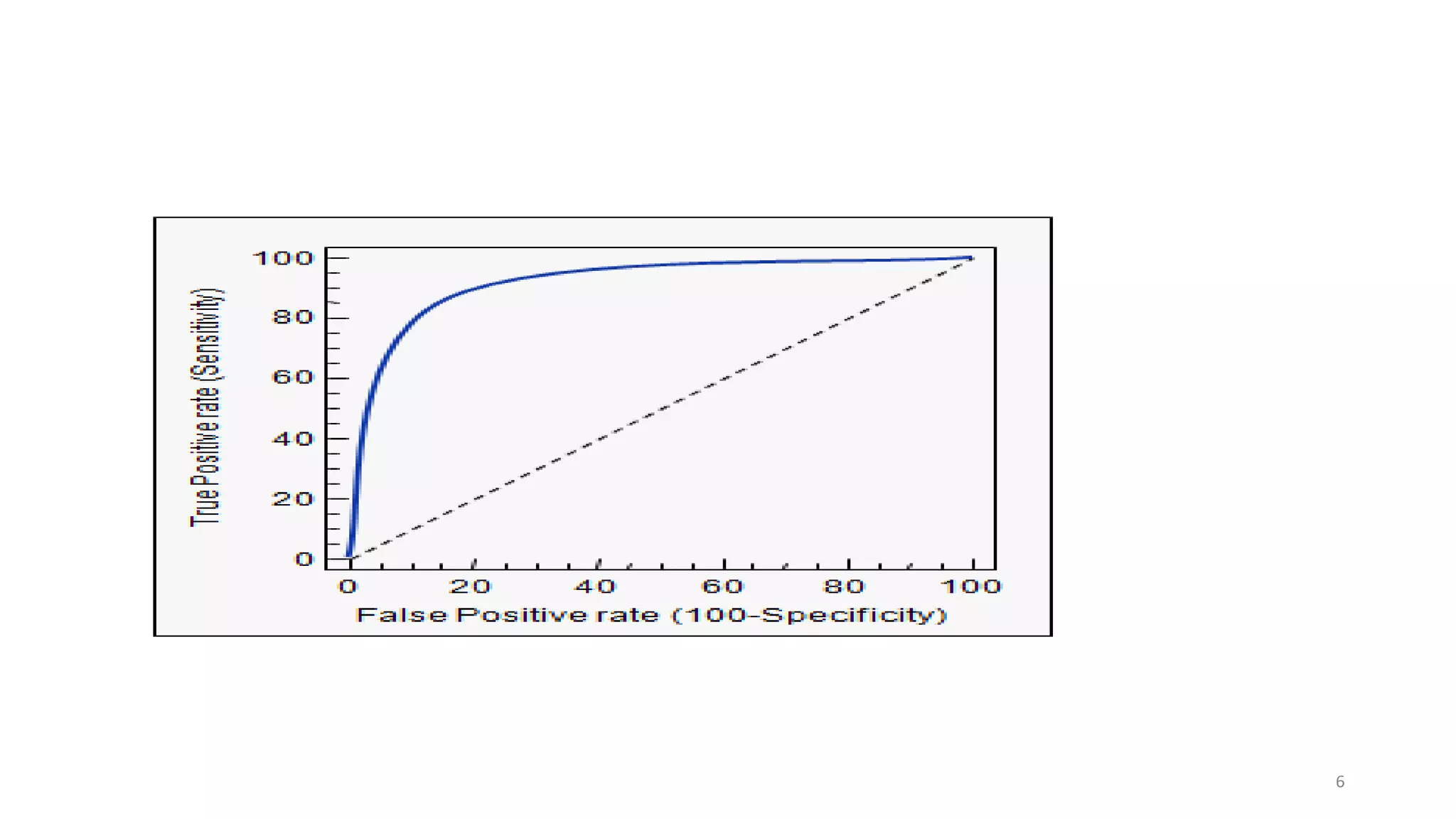


This document provides an overview of receiver operating characteristic (ROC) curves. It defines an ROC curve as a graphical plot that illustrates the performance of a binary classifier system by varying its discrimination threshold. An ROC curve plots the true positive rate against the false positive rate. The area under the ROC curve (AUC) provides a single measure of classifier performance, where an AUC of 1 represents a perfect classifier and 0.5 represents a random classifier. The document discusses how ROC curves can be used to compare multiple classifiers and select optimal threshold values to balance sensitivity and specificity.
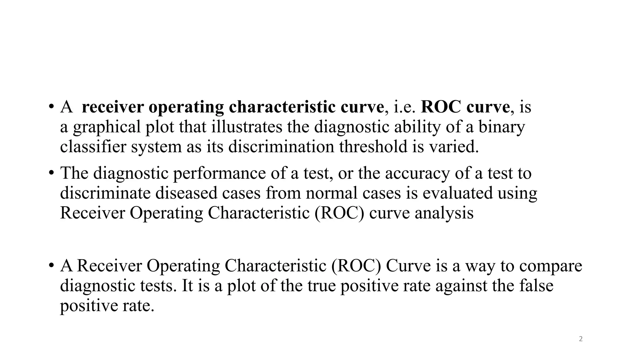
Introduction to Receiver Operating Characteristic (ROC) curves and their role in evaluating binary classifiers.
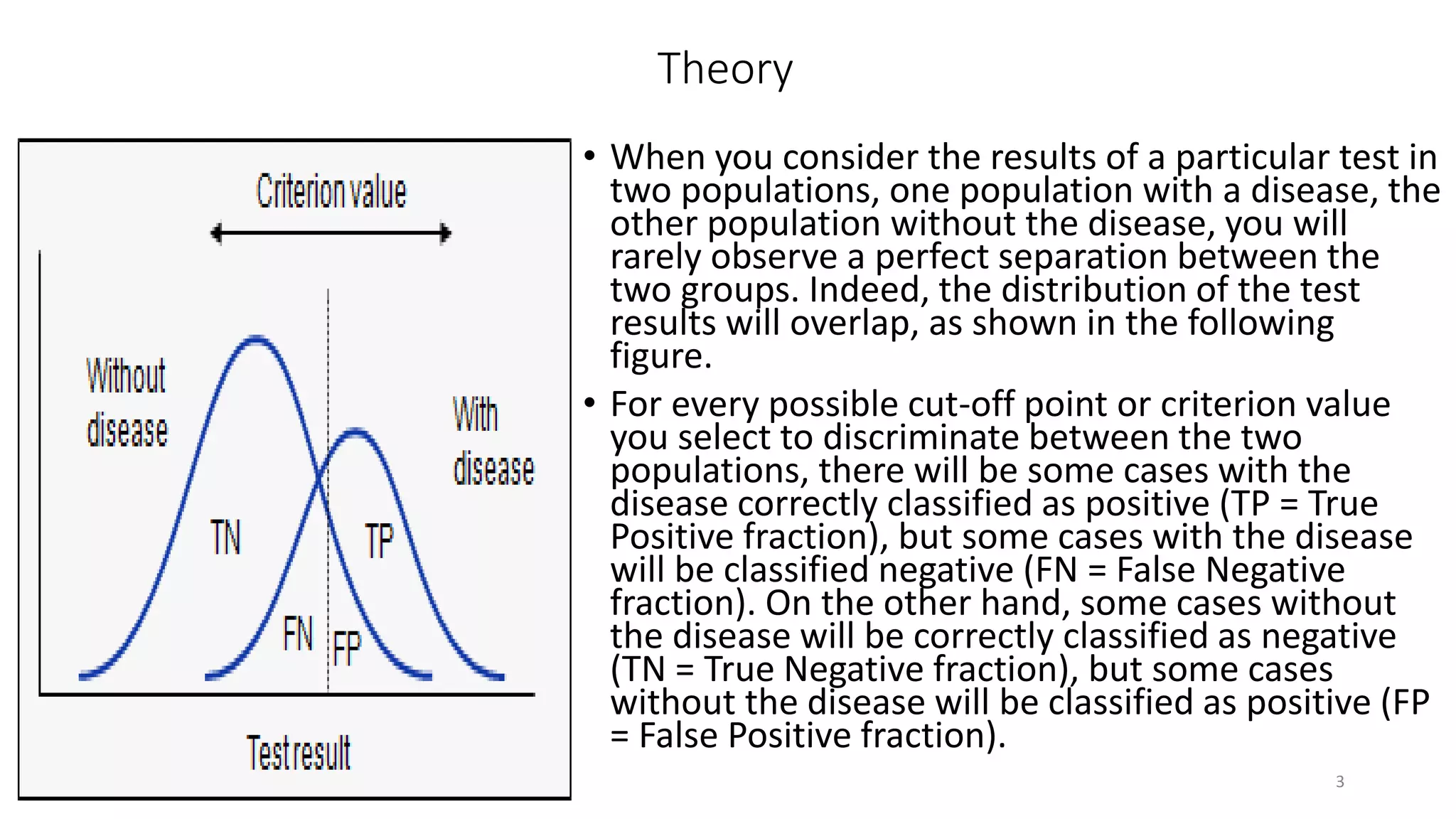
Theory behind ROC curves, dealing with true/false positive/negative rates, and historical context.
ROC plots depict relationships between sensitivity and specificity, illustrating test accuracy and trade-offs.
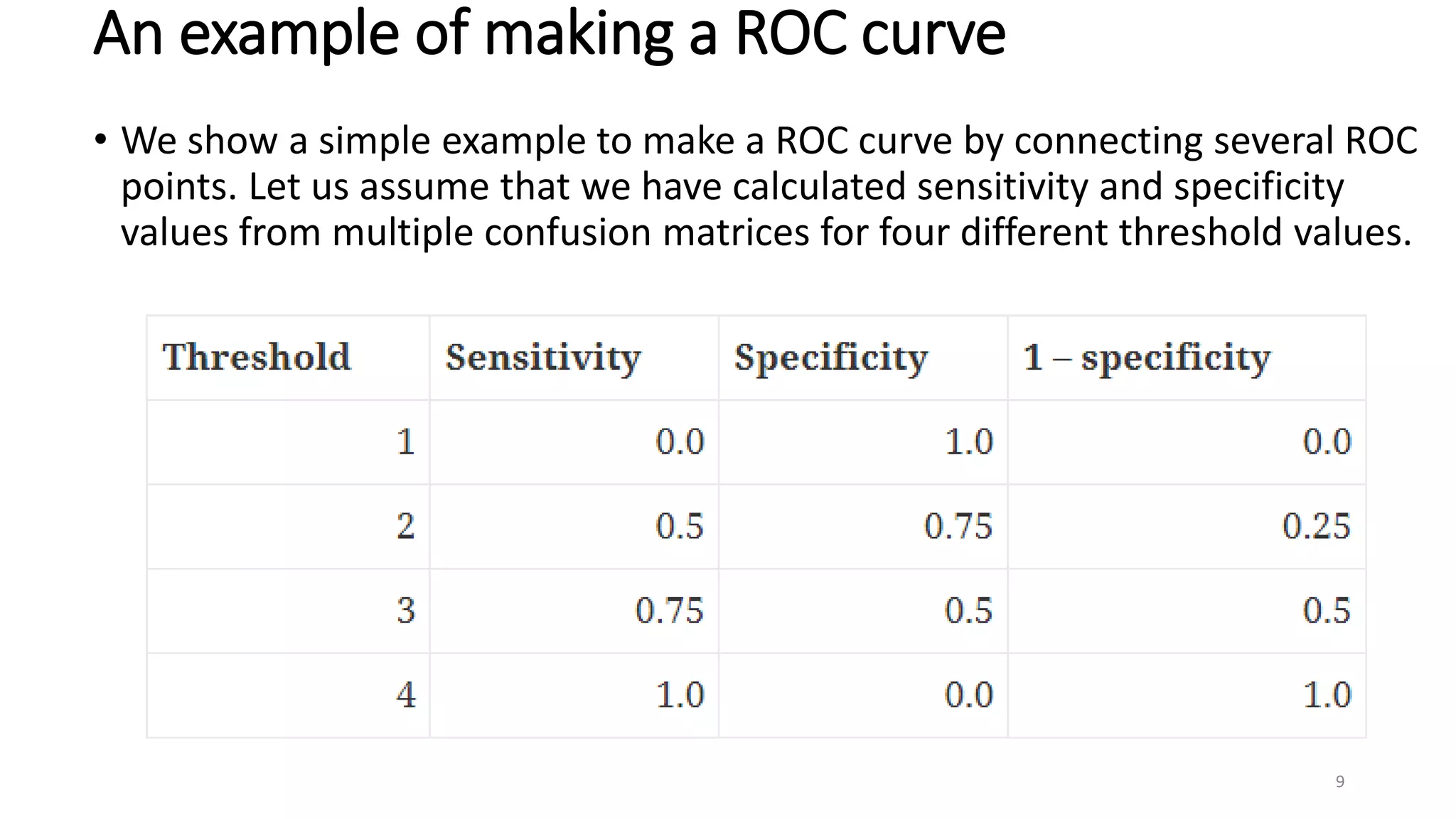
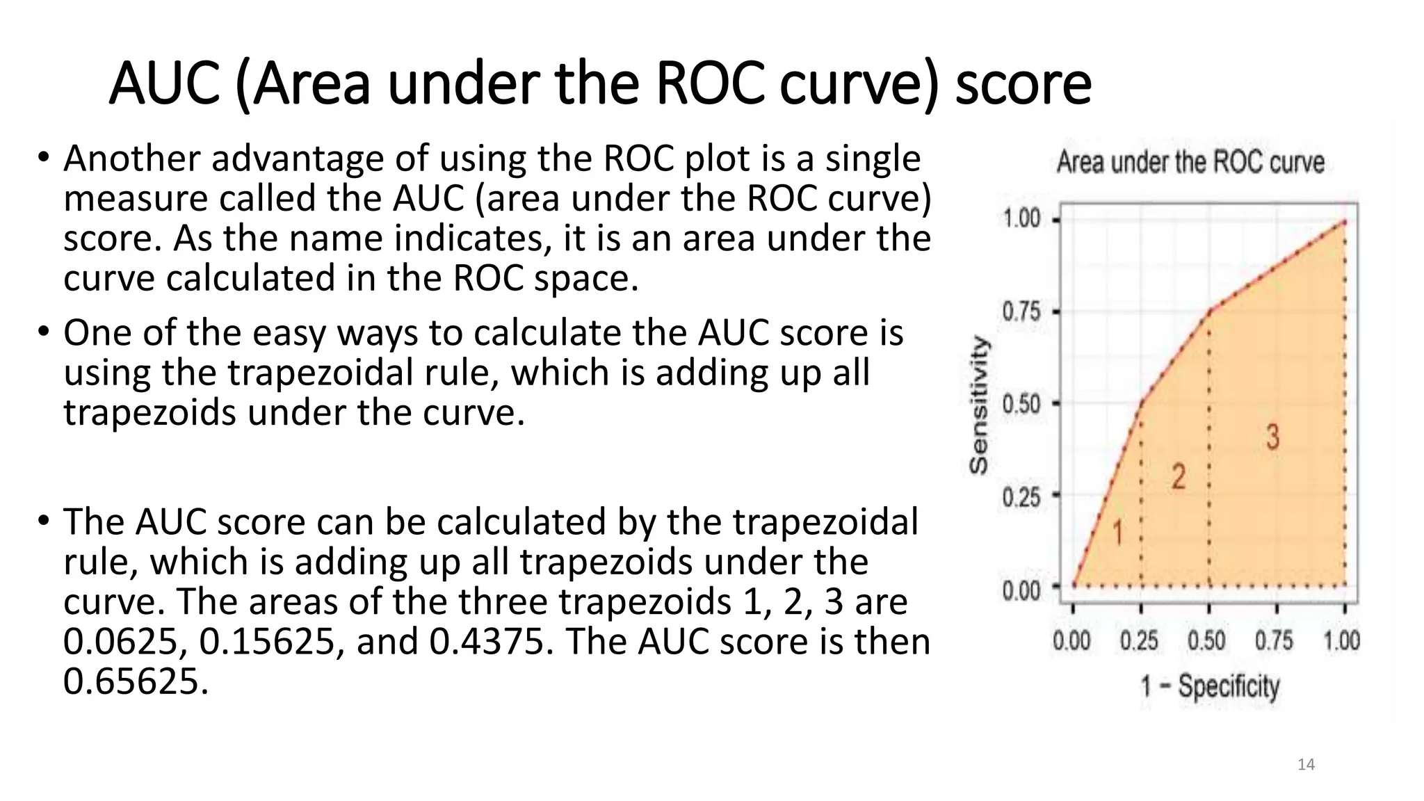
Steps to construct ROC curves by connecting defined ROC points based on sensitivity and specificity.
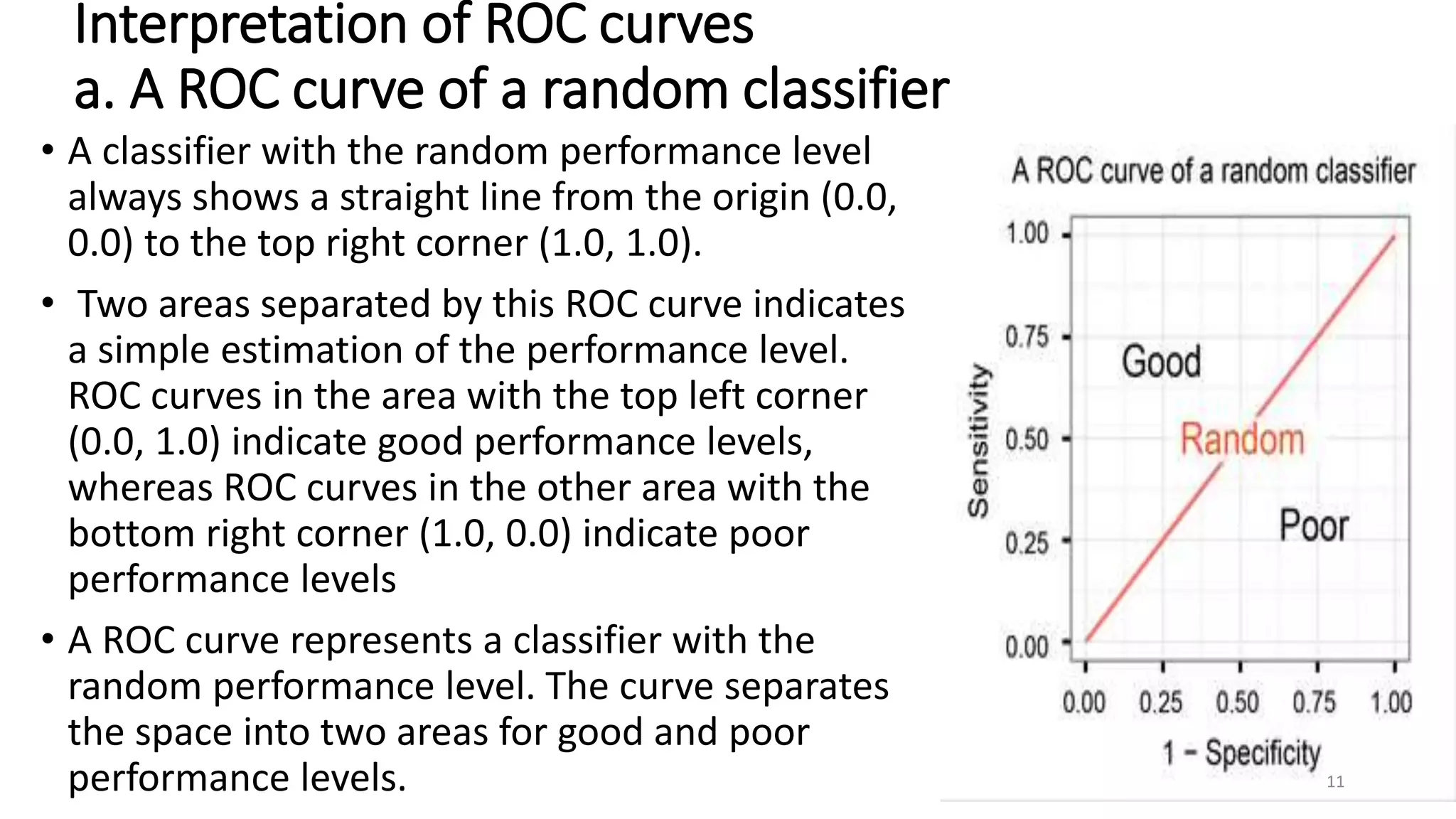
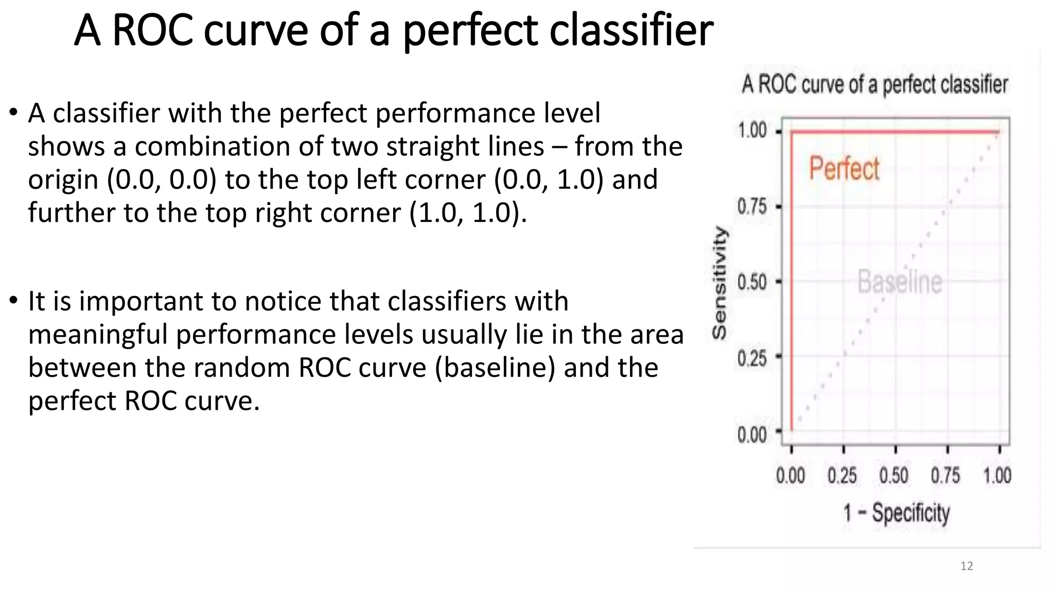
Interpretations of ROC curves: distinguishing good vs. poor classifiers and identifying perfect classifier characteristics.
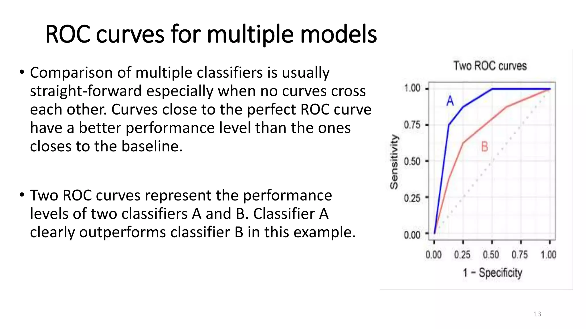
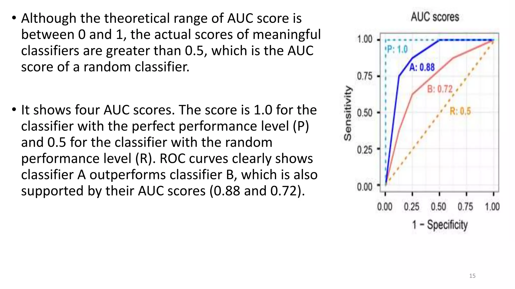
Comparing multiple classifiers using ROC curves and AUC scores to evaluate performance levels.
Links to studies and further readings on Receiver Operating Characteristic curves.


