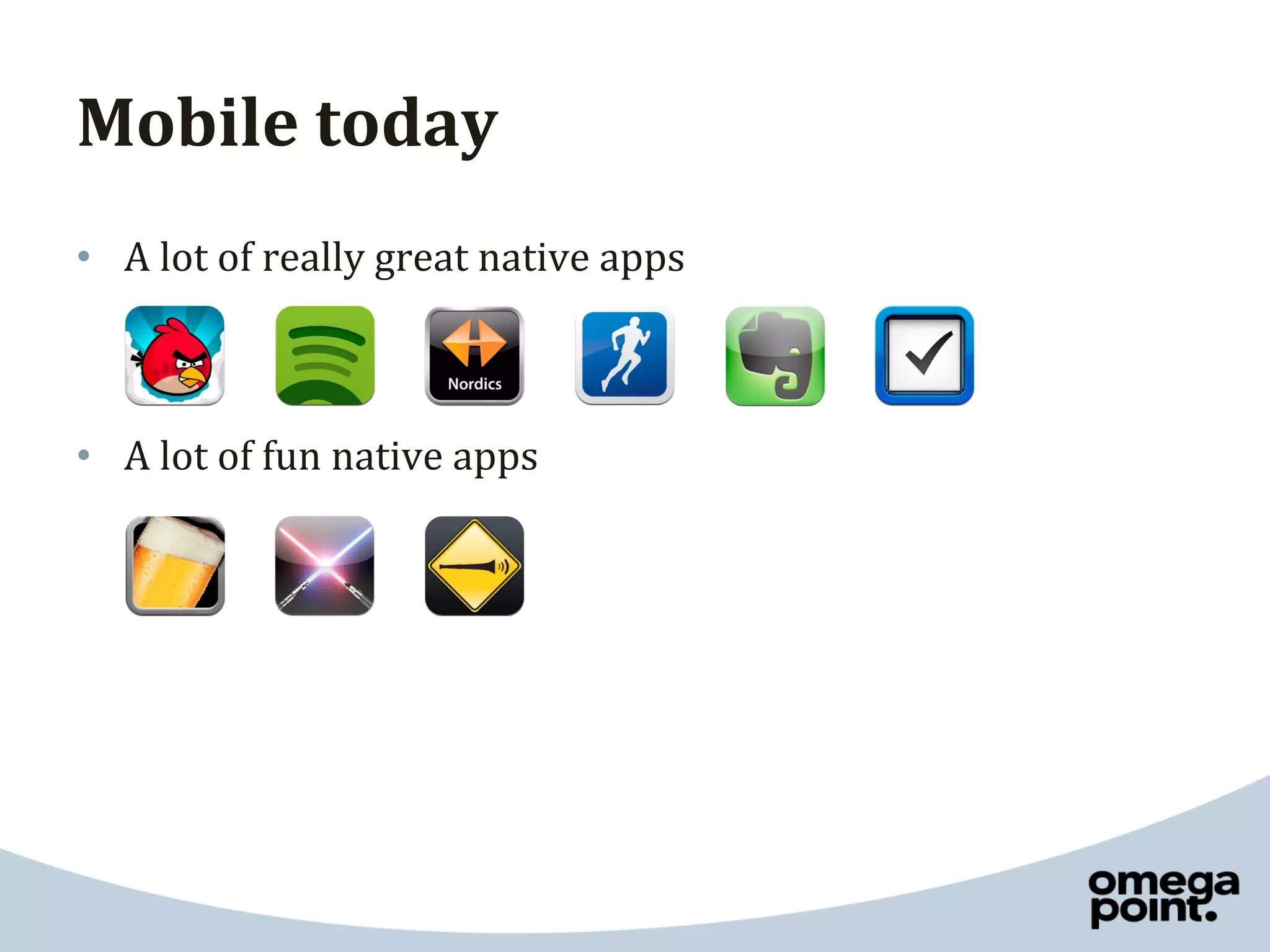
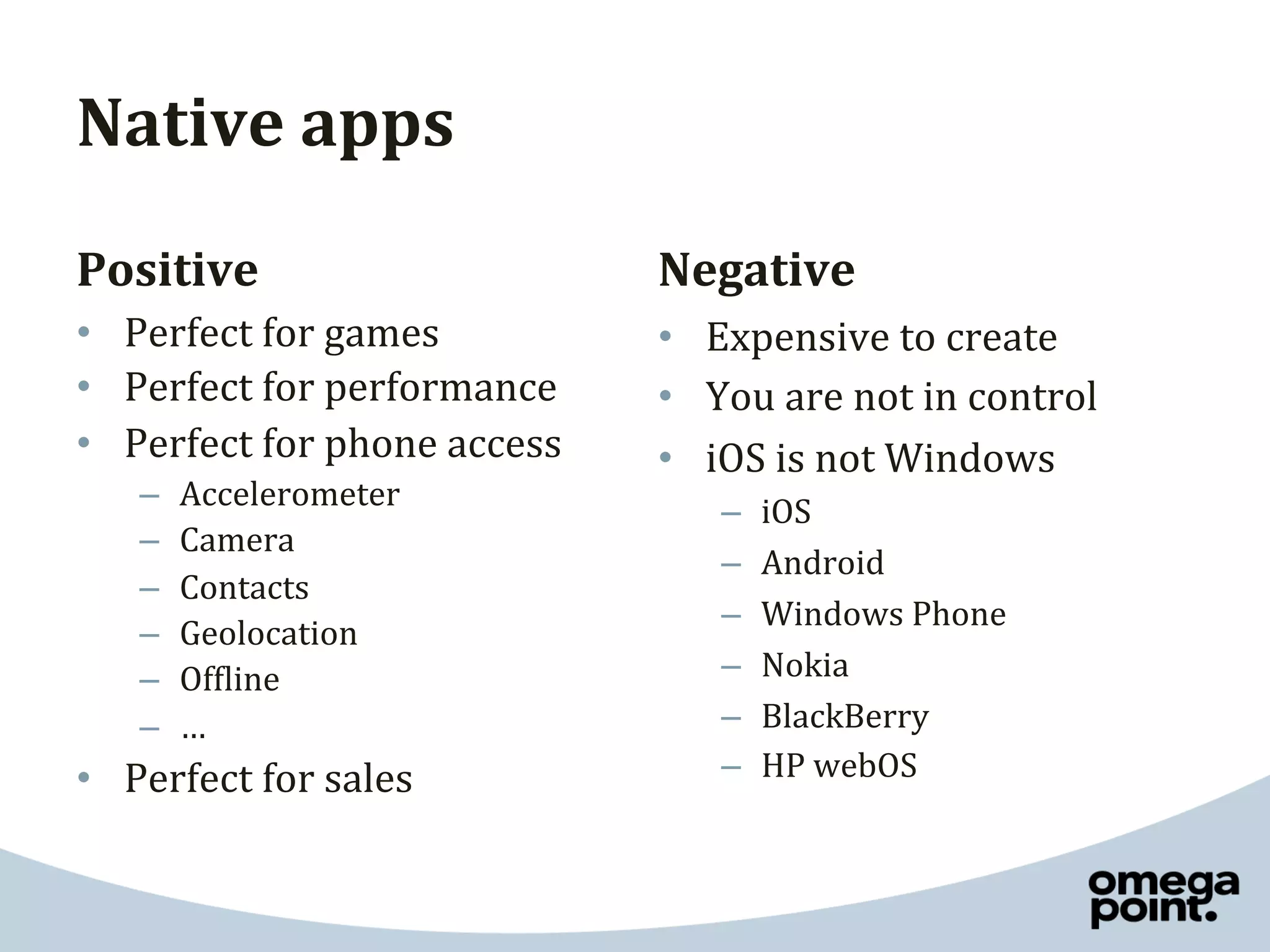
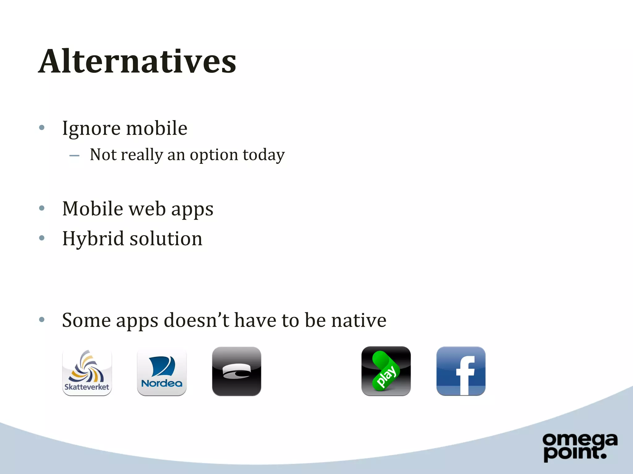
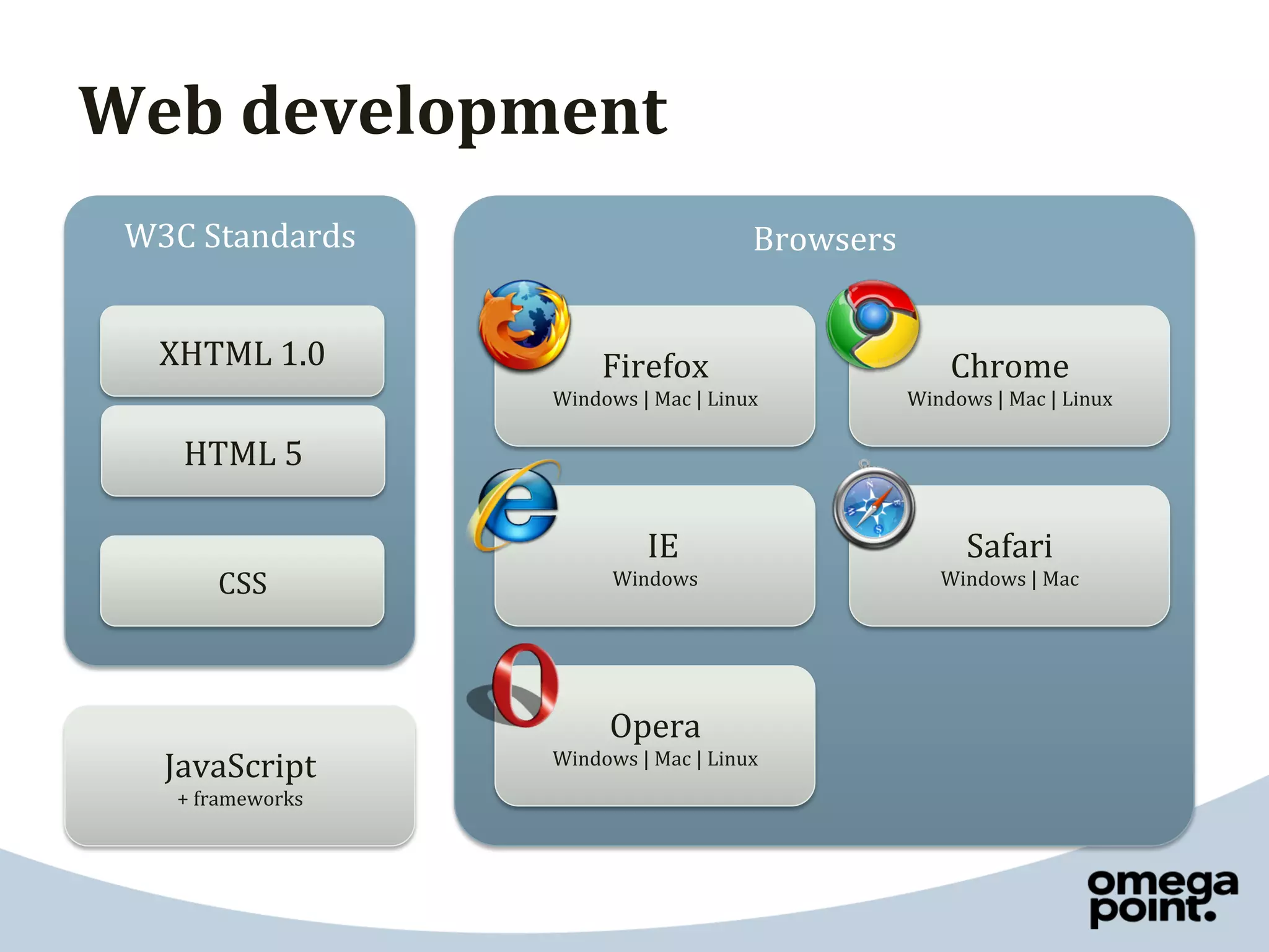
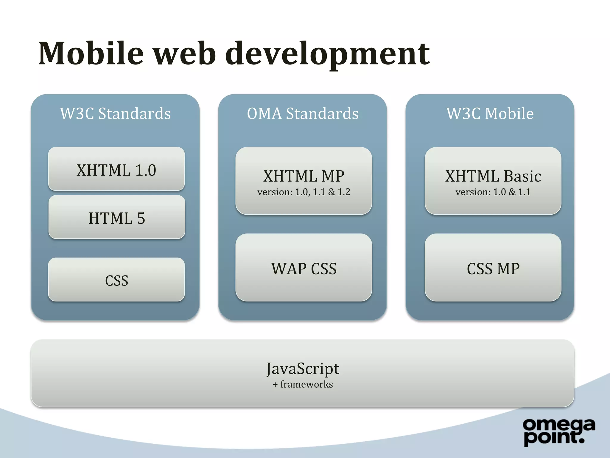
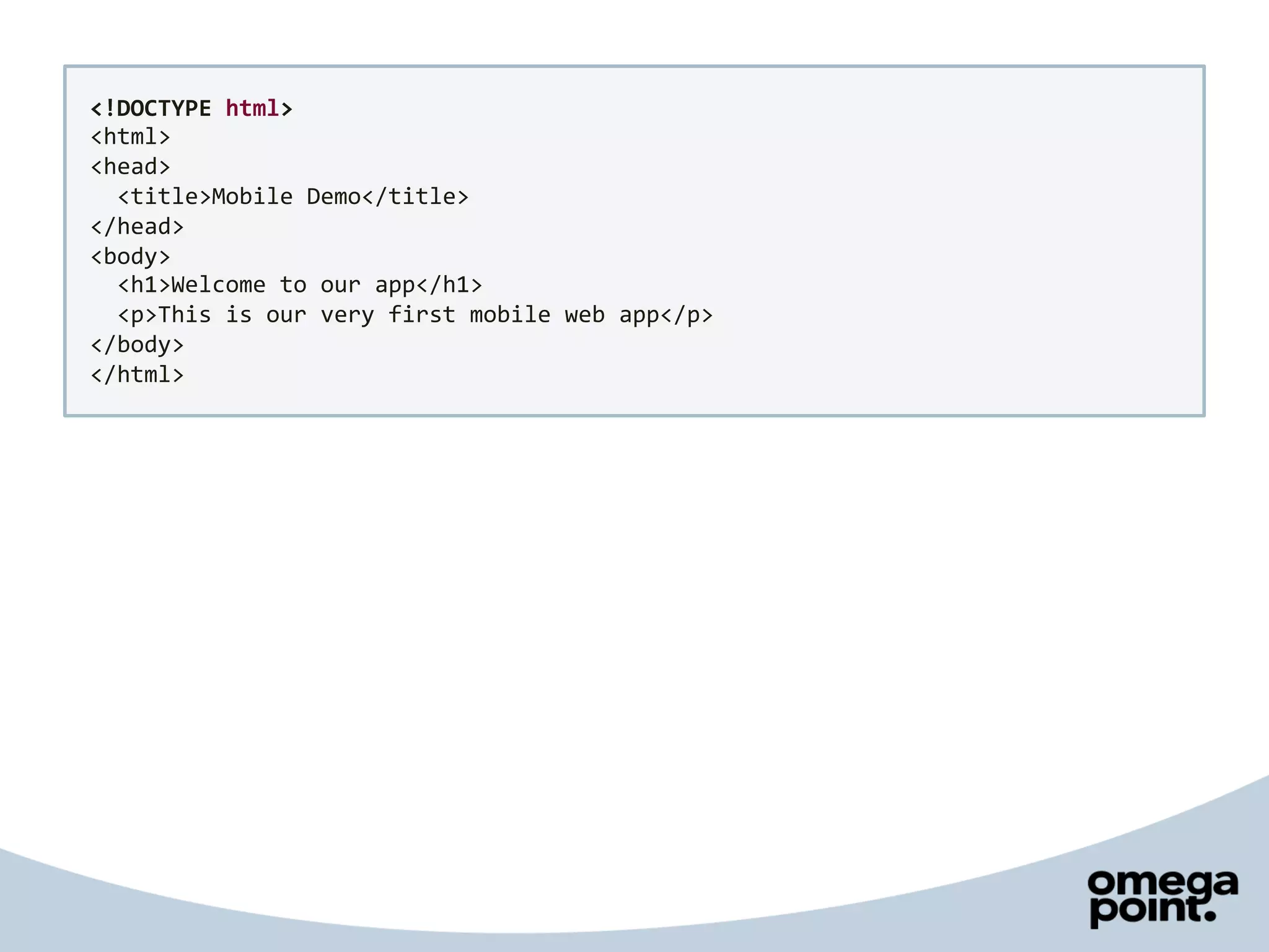
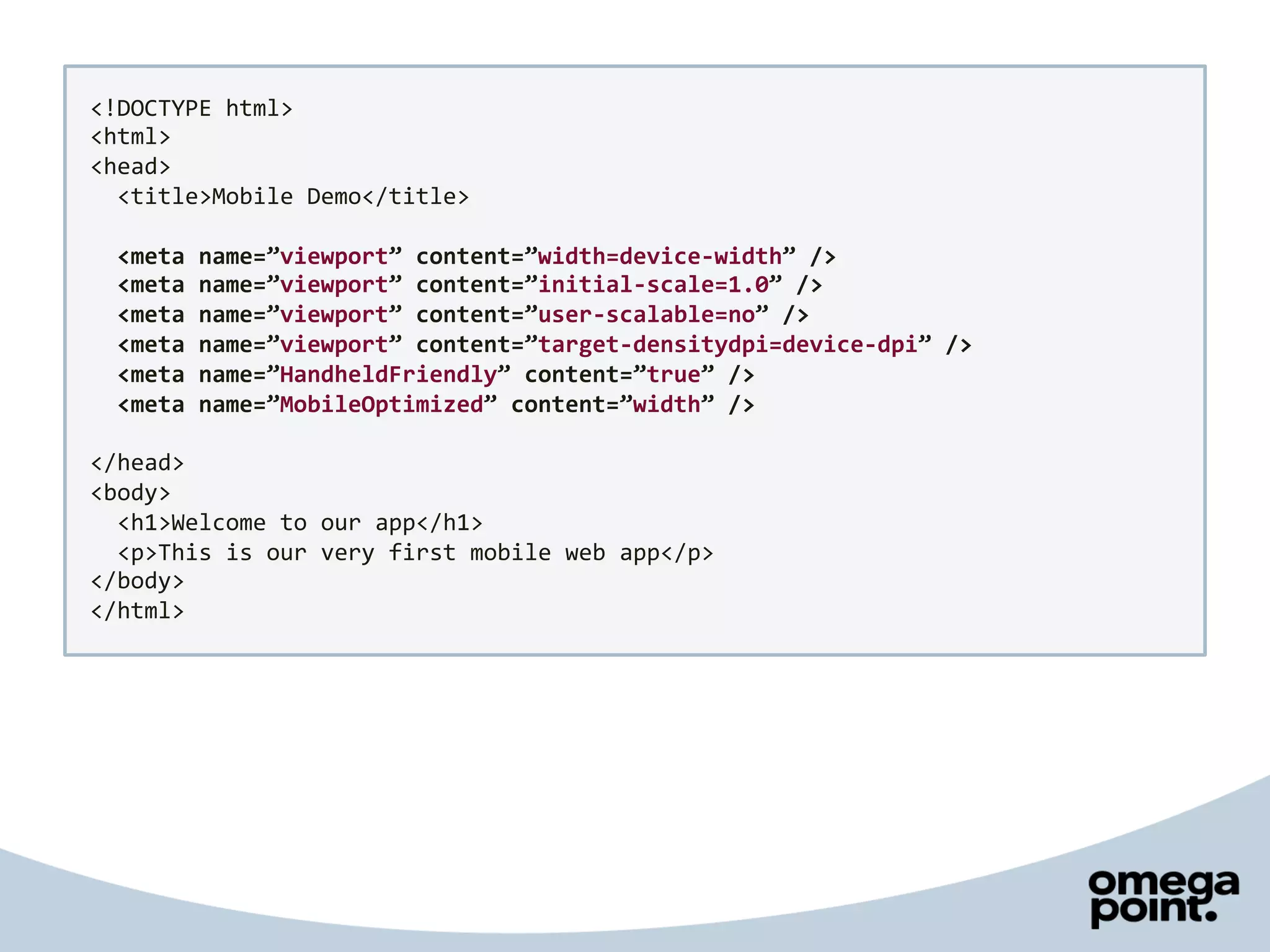
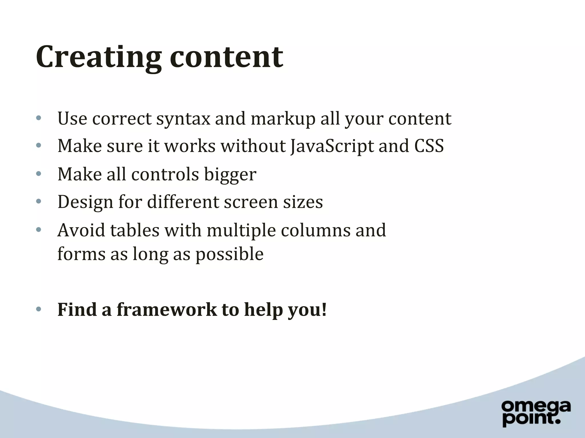
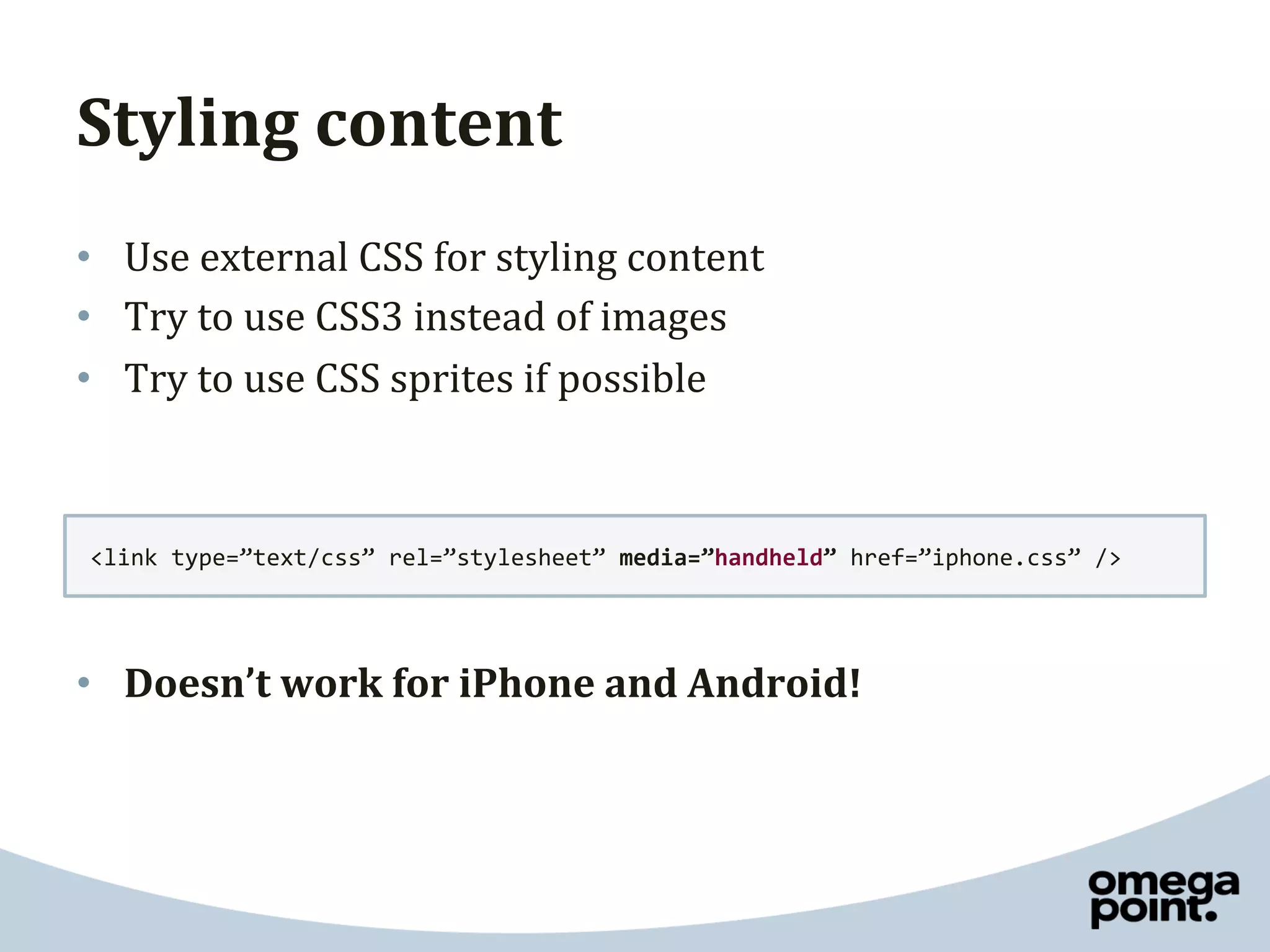
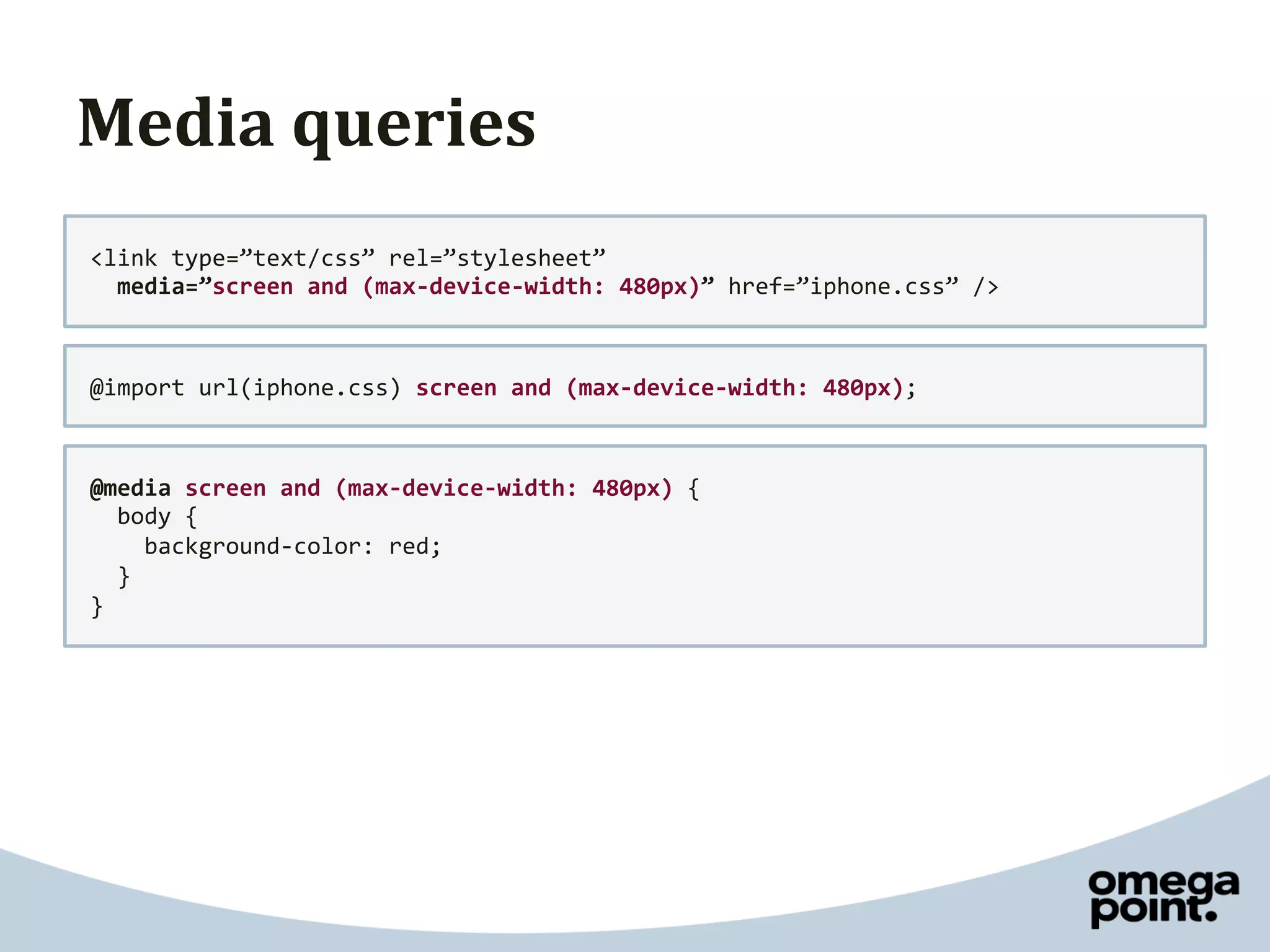
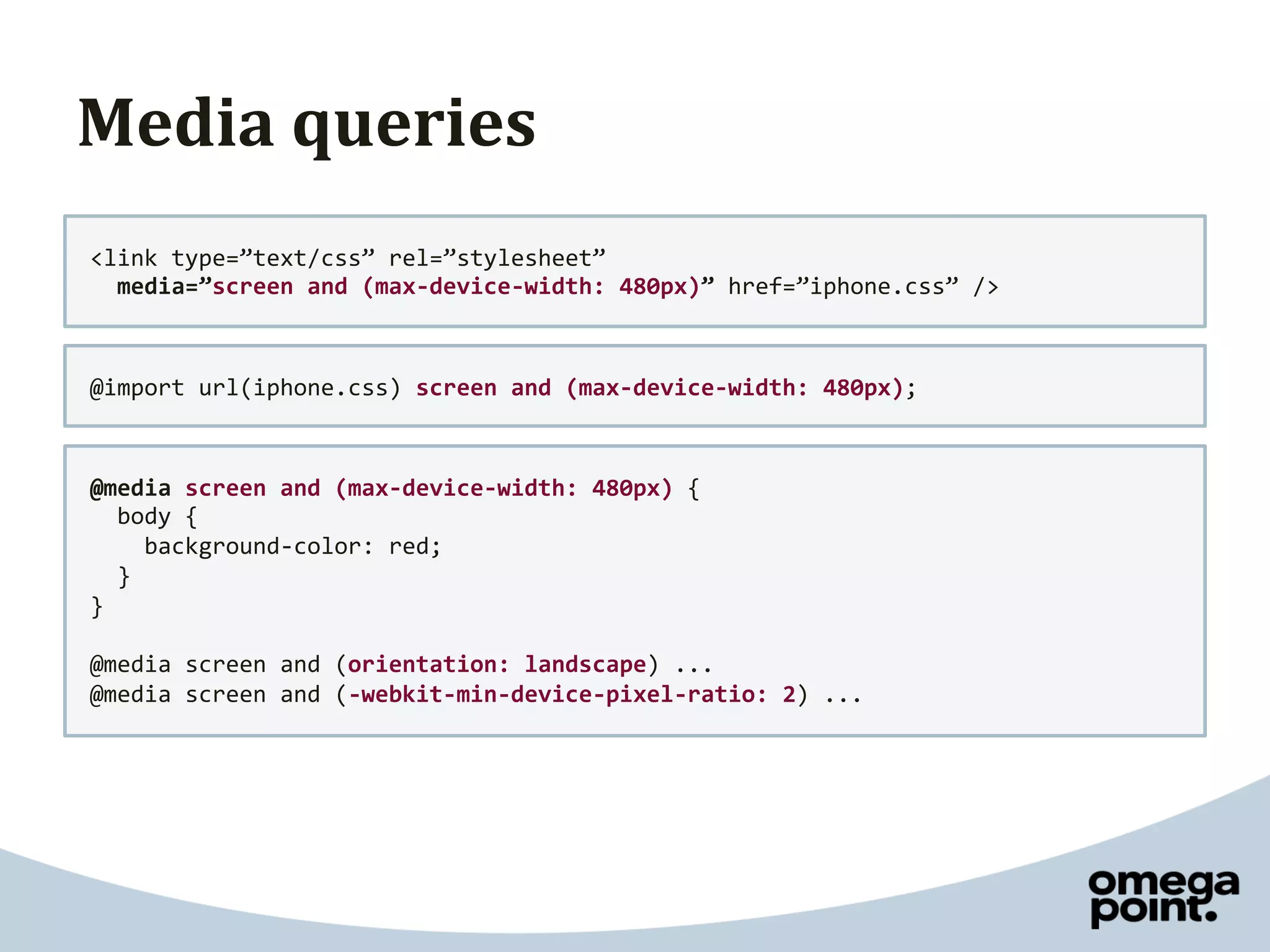
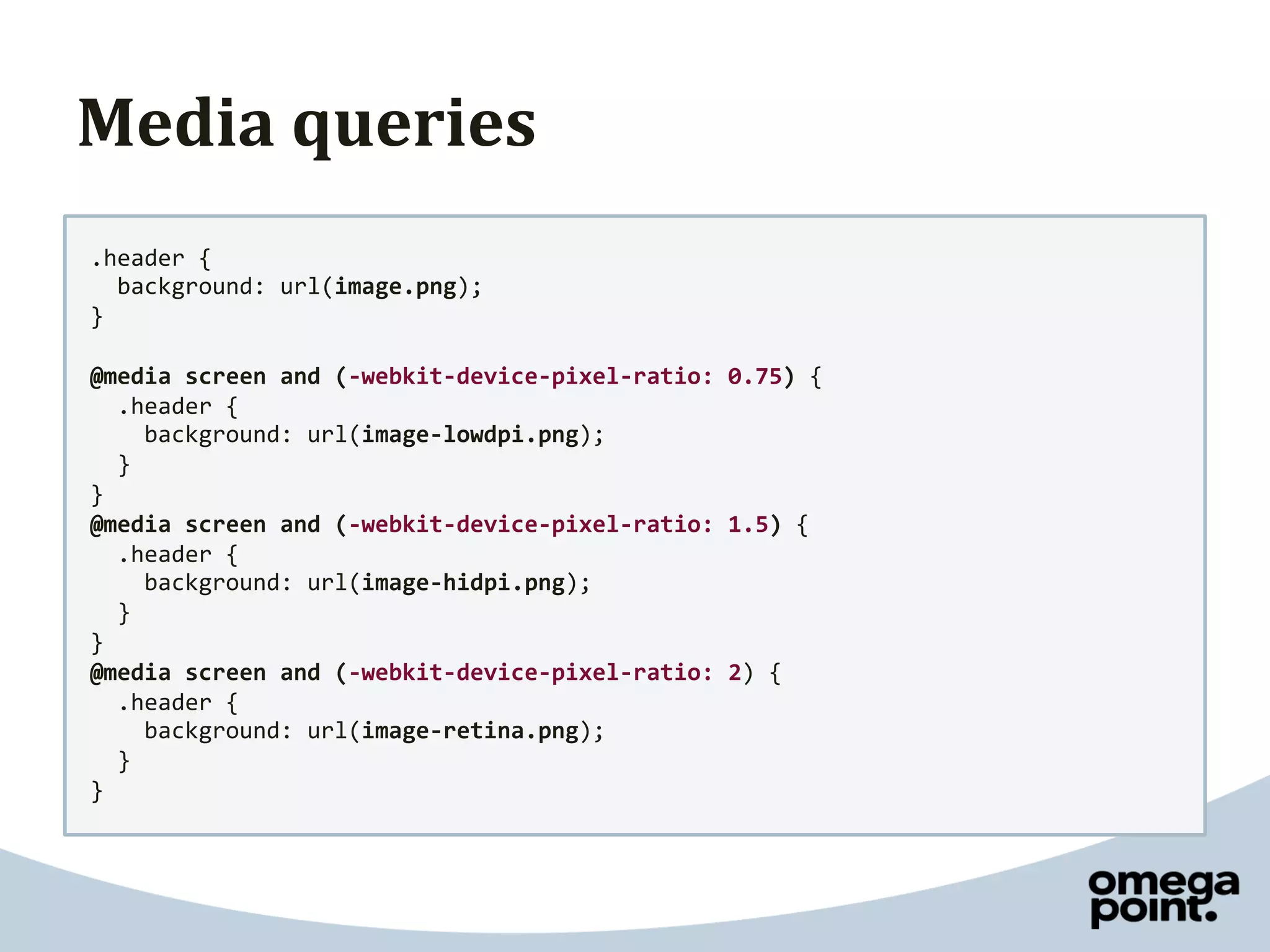
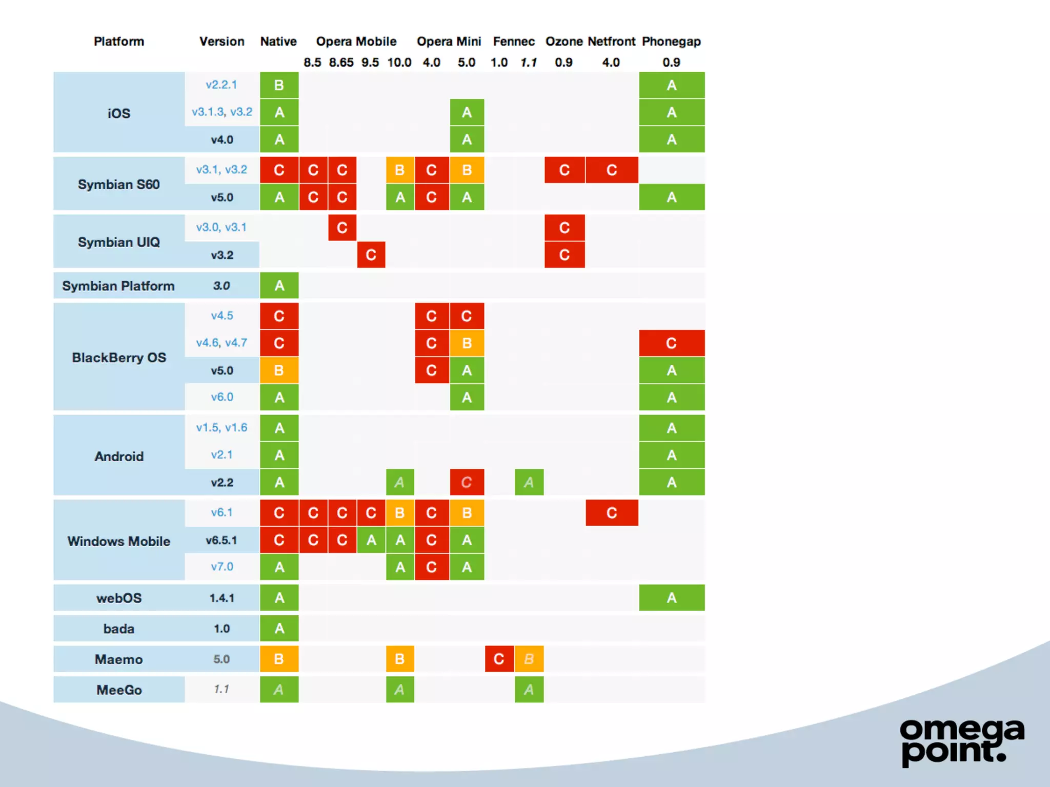
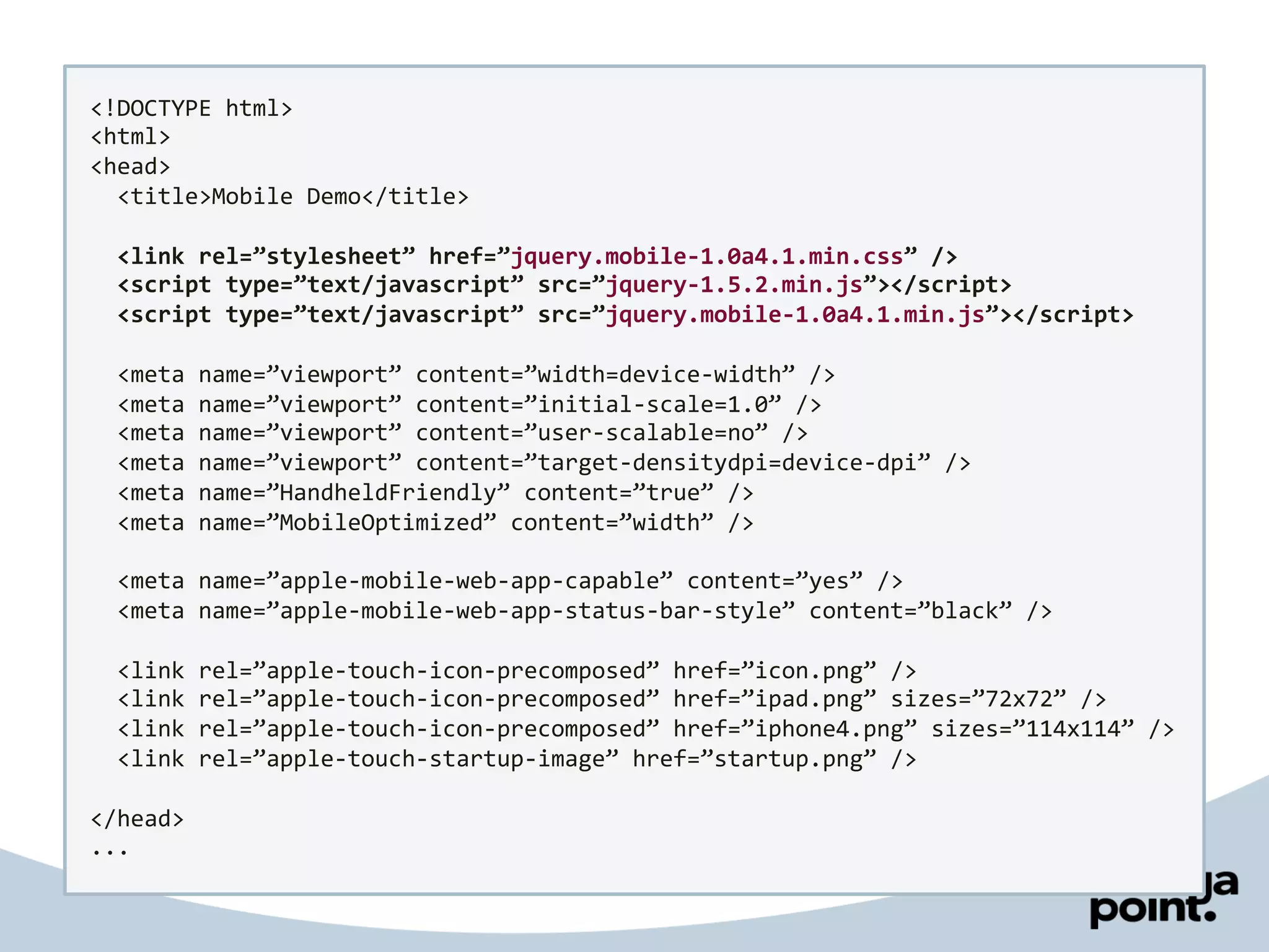
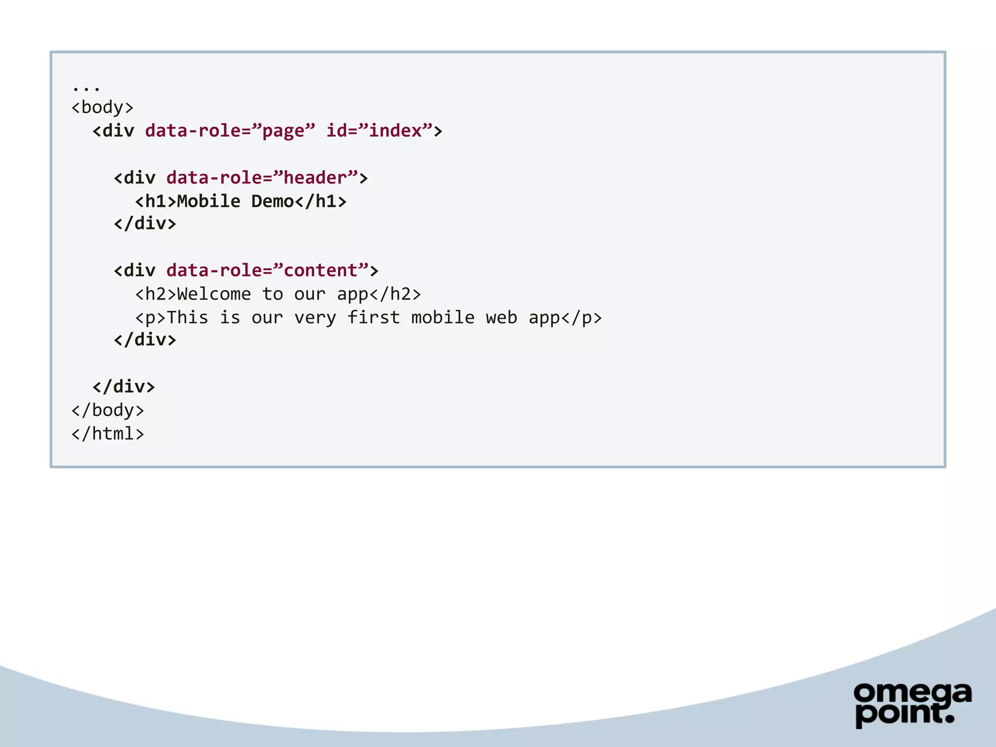
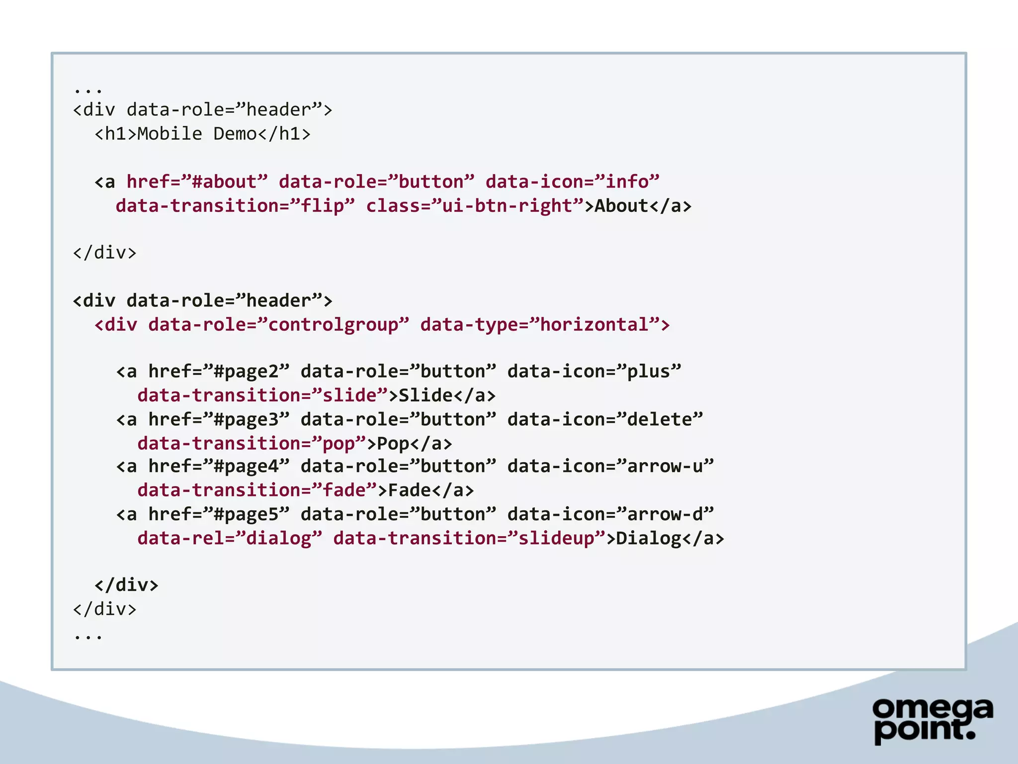
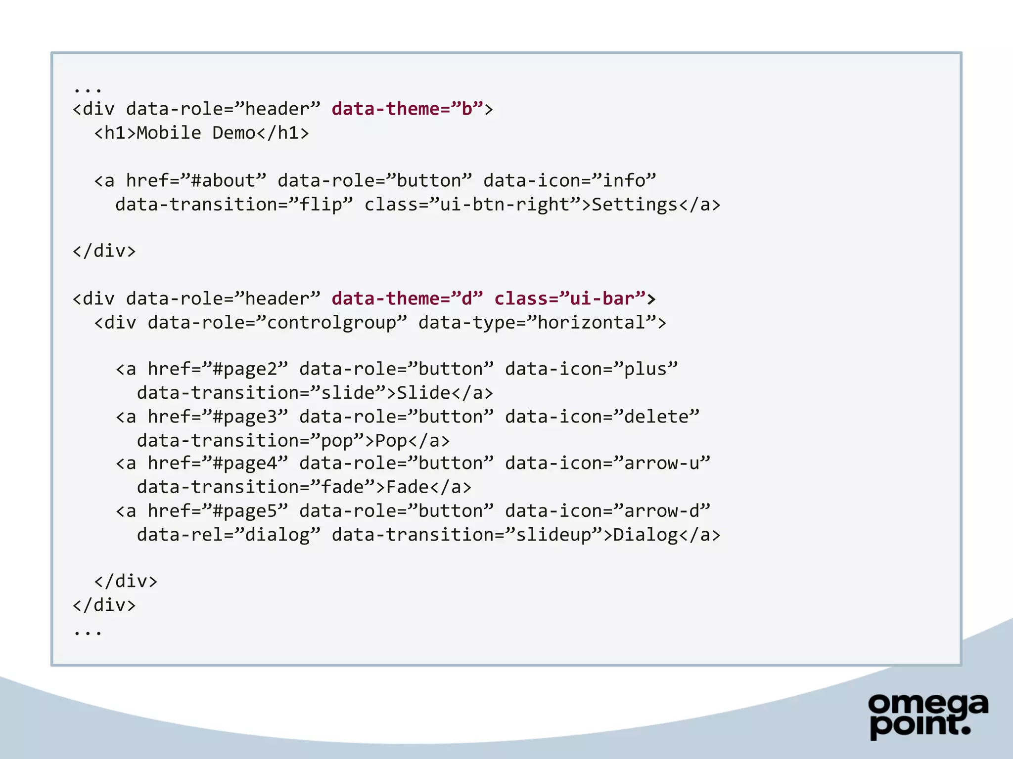
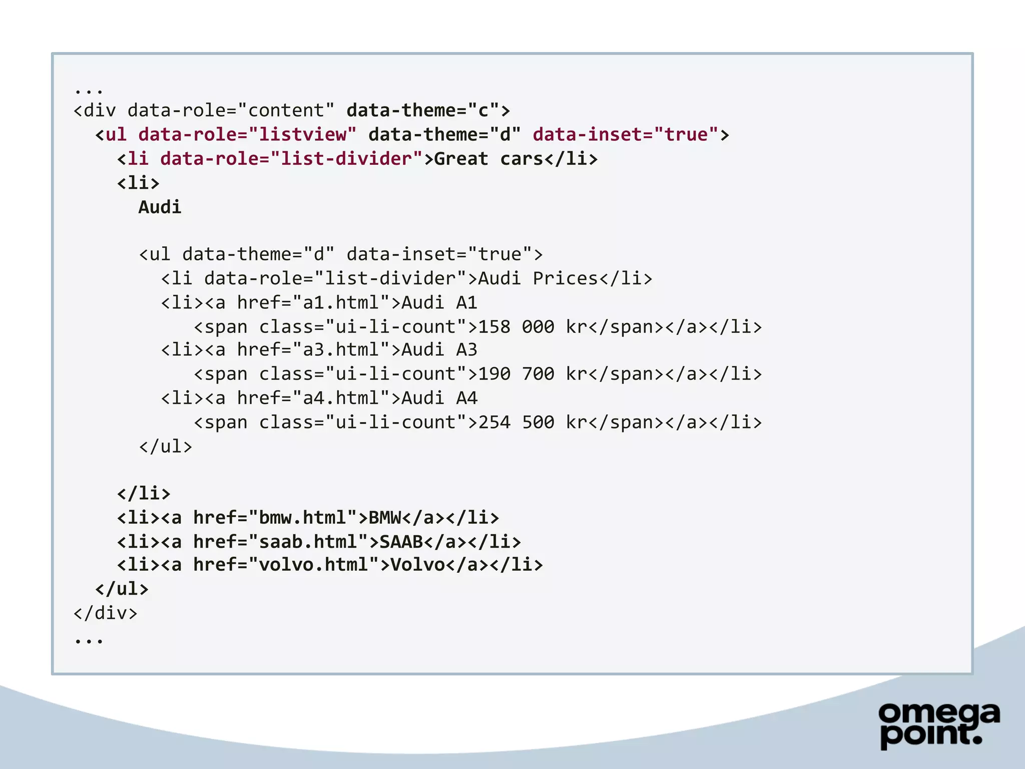
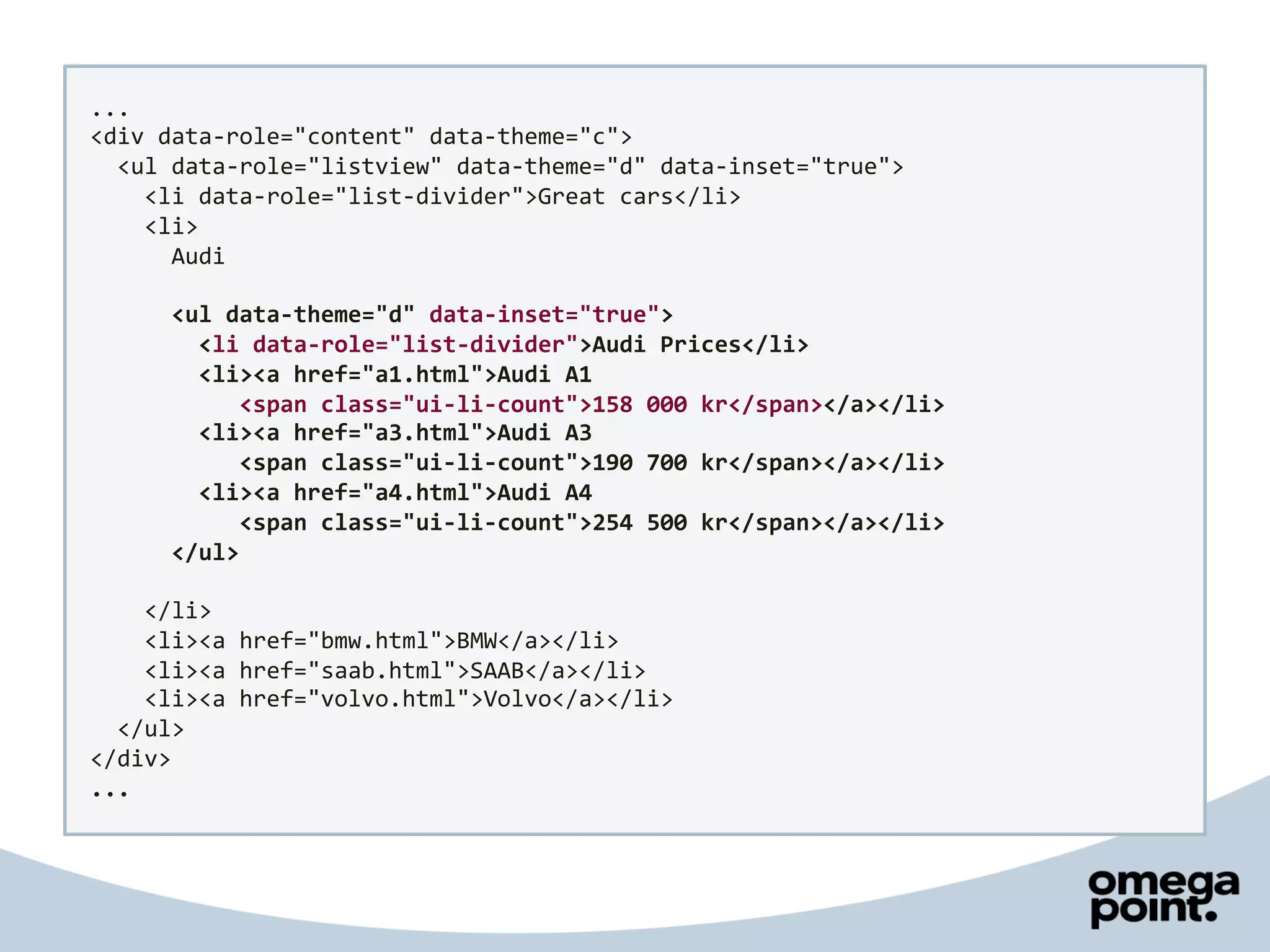
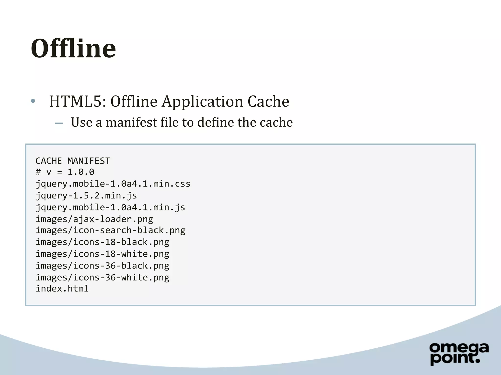
Creating	
  mobile	
  apps	
  
 without	
  native	
  code	
  
       Joakim	
  Kemeny	
  
Mobile	
  today	
  
•  A	
  lot	
  of	
  really	
  great	
  native	
  apps	


•  A	
  lot	
  of	
  fun	
  native	
  apps	


Native	
  apps	
  
Positive	
                                 Negative	
  
•  Perfect	
  for	
  games	
               •  Expensive	
  to	
  create	
  
•  Perfect	
  for	
  performance	
         •  You	
  are	
  not	
  in	
  control	
  
•  Perfect	
  for	
  phone	
  access	
     •  iOS	
  is	
  not	
  Windows	
  
     –    Accelerometer	
                       –    iOS	
  
     –    Camera	
  
                                                –    Android	
  
     –    Contacts	
  
                                                –    Windows	
  Phone	
  
     –    Geolocation	
  
     –    Of<line	
                             –    Nokia	
  
     –    …	
                                   –    BlackBerry	
  
•  Perfect	
  for	
  sales	
                    –    HP	
  webOS	
  
Alternatives	
  
•  Ignore	
  mobile	
  
     –  Not	
  really	
  an	
  option	
  today	


•  Mobile	
  web	
  apps	
  
•  Hybrid	
  solution	


•  Some	
  apps	
  doesn’t	
  have	
  to	
  be	
  native	
  
Web	
  development	
  
 W3C	
  Standards	
                                           Browsers	


   XHTML	
  1.0	
                  Firefox	
                                        Chrome	
  
                           Windows	
  |	
  Mac	
  |	
  Linux	
               Windows	
  |	
  Mac	
  |	
  Linux	
  

     HTML	
  5	


  IE	
                                   Safari	
  
          CSS	
                      Windows	
                                    Windows	
  |	
  Mac	


                                     Opera	
  
    JavaScript	
           Windows	
  |	
  Mac	
  |	
  Linux	
  
     +	
  frameworks	
  
Mobile	
  web	
  development	
  
 W3C	
  Standards	
     OMA	
  Standards	
                         W3C	
  Mobile	


   XHTML	
  1.0	
          XHTML	
  MP	
                           XHTML	
  Basic	
  
                         version:	
  1.0,	
  1.1	
  &	
  1.2	
      version:	
  1.0	
  &	
  1.1	
  

     HTML	
  5	
  

                              WAP	
  CSS	
                              CSS	
  MP	
  
        CSS	


                            JavaScript	
  
                               +	
  frameworks	
  
Let’s	
  build	
  a	
  mobile	
  web	
  app	
  
<!DOCTYPE	
  html>	
  
<html>	
  
<head>	


  <title>Mobile	
  Demo</title>	
  
</head>	
  
<body>	


  <h1>Welcome	
  to	
  our	
  app</h1>	


  <p>This	
  is	
  our	
  very	
  first	
  mobile	
  web	
  app</p>	
  
</body>	
  
</html>	
  
<!DOCTYPE	
  html>	
  
<html>	
  
<head>	


  <title>Mobile	
  Demo</title>	


  <meta	
  name=”viewport”	
  content=”width=device-­‐width”	
  />	


  <meta	
  name=”viewport”	
  content=”initial-­‐scale=1.0”	
  />	


  <meta	
  name=”viewport”	
  content=”user-­‐scalable=no”	
  />	


  <meta	
  name=”viewport”	
  content=”target-­‐densitydpi=device-­‐dpi”	
  />	


  <meta	
  name=”HandheldFriendly”	
  content=”true”	
  />	


  <meta	
  name=”MobileOptimized”	
  content=”width”	
  />	


  <meta	
  name=”apple-­‐mobile-­‐web-­‐app-­‐capable”	
  content=”yes”	
  />	


  <meta	
  name=”apple-­‐mobile-­‐web-­‐app-­‐status-­‐bar-­‐style”	
  content=”black”	
  />	


  <link	
  rel=”apple-­‐touch-­‐icon”	
  href=”icon.png”	
  />	


  <link	
  rel=”apple-­‐touch-­‐icon”	
  href=”ipad.png”	
  sizes=”72x72”	
  />	


  <link	
  rel=”apple-­‐touch-­‐icon”	
  href=”iphone4.png”	
  sizes=”114x114”	
  />	


  <link	
  rel=”apple-­‐touch-­‐startup-­‐image”	
  href=”startup.png”	
  />	


</head>	
  
<body>	


  <h1>Welcome	
  to	
  our	
  app</h1>	


  <p>This	
  is	
  our	
  very	
  first	
  mobile	
  web	
  app</p>	
  
</body>	
  
</html>	
  
<!DOCTYPE	
  html>	
  
<html>	
  
<head>	


  <title>Mobile	
  Demo</title>	


  <meta	
  name=”viewport”	
  content=”width=device-­‐width”	
  />	


  <meta	
  name=”viewport”	
  content=”initial-­‐scale=1.0”	
  />	


  <meta	
  name=”viewport”	
  content=”user-­‐scalable=no”	
  />	


  <meta	
  name=”viewport”	
  content=”target-­‐densitydpi=device-­‐dpi”	
  />	


  <meta	
  name=”HandheldFriendly”	
  content=”true”	
  />	


  <meta	
  name=”MobileOptimized”	
  content=”width”	
  />	


  <meta	
  name=”apple-­‐mobile-­‐web-­‐app-­‐capable”	
  content=”yes”	
  />	


  <meta	
  name=”apple-­‐mobile-­‐web-­‐app-­‐status-­‐bar-­‐style”	
  content=”black”	
  />	


  <link	
  rel=”apple-­‐touch-­‐icon-­‐precomposed”	
  href=”icon.png”	
  />	


  <link	
  rel=”apple-­‐touch-­‐icon-­‐precomposed”	
  href=”ipad.png”	
  sizes=”72x72”	
  />	


  <link	
  rel=”apple-­‐touch-­‐icon-­‐precomposed”	
  href=”iphone4.png”	
  sizes=”114x114”	
  />	


  <link	
  rel=”apple-­‐touch-­‐startup-­‐image”	
  href=”startup.png”	
  />	


</head>	
  
<body>	


  <h1>Welcome	
  to	
  our	
  app</h1>	


  <p>This	
  is	
  our	
  very	
  first	
  mobile	
  web	
  app</p>	
  
</body>	
  
</html>	
  
Creating	
  content	
  
•    Use	
  correct	
  syntax	
  and	
  markup	
  all	
  your	
  content	
  
•    Make	
  sure	
  it	
  works	
  without	
  JavaScript	
  and	
  CSS	
  
•    Make	
  all	
  controls	
  bigger	
  
•    Design	
  for	
  different	
  screen	
  sizes	
  
•    Avoid	
  tables	
  with	
  multiple	
  columns	
  and	
  	
  
     forms	
  as	
  long	
  as	
  possible	
  

•  Find	
  a	
  framework	
  to	
  help	
  you!	
  
Styling	
  content	
  
•  Use	
  external	
  CSS	
  for	
  styling	
  content	
  
•  Try	
  to	
  use	
  CSS3	
  instead	
  of	
  images	
  
•  Try	
  to	
  use	
  CSS	
  sprites	
  if	
  possible	


 <link	
  type=”text/css”	
  rel=”stylesheet”	
  media=”handheld”	
  href=”iphone.css”	
  />	


•  Doesn’t	
  work	
  for	
  iPhone	
  and	
  Android!	
  
Media	
  queries	
  
<link	
  type=”text/css”	
  rel=”stylesheet”	


  media=”screen	
  and	
  (max-­‐device-­‐width:	
  480px)”	
  href=”iphone.css”	
  />	


@import	
  url(iphone.css)	
  screen	
  and	
  (max-­‐device-­‐width:	
  480px);	


@media	
  screen	
  and	
  (max-­‐device-­‐width:	
  480px)	
  {	


  body	
  {	


  background-­‐color:	
  red;	


  }	
  
}	


@media	
  screen	
  and	
  (orientation:	
  landscape)	
  ...	
  
@media	
  screen	
  and	
  (-­‐webkit-­‐min-­‐device-­‐pixel-­‐ratio:	
  2)	
  ...	
  
Media	
  queries	
  
.header	
  {	


  background:	
  url(image.png);	
  
}	


@media	
  screen	
  and	
  (-­‐webkit-­‐device-­‐pixel-­‐ratio:	
  0.75)	
  {	


  .header	
  {	


  background:	
  url(image-­‐lowdpi.png);	


  }	
  
}	
  
@media	
  screen	
  and	
  (-­‐webkit-­‐device-­‐pixel-­‐ratio:	
  1.5)	
  {	


  .header	
  {	


  background:	
  url(image-­‐hidpi.png);	


  }	
  
}	
  
@media	
  screen	
  and	
  (-­‐webkit-­‐device-­‐pixel-­‐ratio:	
  2)	
  {	


  .header	
  {	


  background:	
  url(image-­‐retina.png);	


  }	
  
}	
  
jQuery	
  Mobile	
  
•  Version	
  1.0	
  alpha	
  4.1	
  

•    Easy	
  to	
  learn	
  
•    Uses	
  progressive	
  enhancement	
  
•    Great	
  device	
  support	
  
•    Builds	
  on	
  popular	
  jQuery	
  
•    Uses	
  CSS3	
  for	
  effects	
  
•    Small	
  
<!DOCTYPE	
  html>	
  
<html>	
  
<head>	


  <title>Mobile	
  Demo</title>	


  <link	
  rel=”stylesheet”	
  href=”jquery.mobile-­‐1.0a4.1.min.css”	
  />	


  <script	
  type=”text/javascript”	
  src=”jquery-­‐1.5.2.min.js”></script>	


  <script	
  type=”text/javascript”	
  src=”jquery.mobile-­‐1.0a4.1.min.js”></script>	


  <meta	
  name=”viewport”	
  content=”width=device-­‐width”	
  />	


  <meta	
  name=”viewport”	
  content=”initial-­‐scale=1.0”	
  />	


  <meta	
  name=”viewport”	
  content=”user-­‐scalable=no”	
  />	


  <meta	
  name=”viewport”	
  content=”target-­‐densitydpi=device-­‐dpi”	
  />	


  <meta	
  name=”HandheldFriendly”	
  content=”true”	
  />	


  <meta	
  name=”MobileOptimized”	
  content=”width”	
  />	


  <meta	
  name=”apple-­‐mobile-­‐web-­‐app-­‐capable”	
  content=”yes”	
  />	


  <meta	
  name=”apple-­‐mobile-­‐web-­‐app-­‐status-­‐bar-­‐style”	
  content=”black”	
  />	


  <link	
  rel=”apple-­‐touch-­‐icon-­‐precomposed”	
  href=”icon.png”	
  />	


  <link	
  rel=”apple-­‐touch-­‐icon-­‐precomposed”	
  href=”ipad.png”	
  sizes=”72x72”	
  />	


  <link	
  rel=”apple-­‐touch-­‐icon-­‐precomposed”	
  href=”iphone4.png”	
  sizes=”114x114”	
  />	


  <link	
  rel=”apple-­‐touch-­‐startup-­‐image”	
  href=”startup.png”	
  />	


</head>	
  
...	
  
...	
  
<body>	


  <div	
  data-­‐role=”page”	
  id=”index”>	


  <div	
  data-­‐role=”header”>	


  <h1>Mobile	
  Demo</h1>	


  </div>	


  <div	
  data-­‐role=”content”>	


  <h2>Welcome	
  to	
  our	
  app</h2>	


  <p>This	
  is	
  our	
  very	
  first	
  mobile	
  web	
  app</p>	


  </div>	


  </div>	
  
</body>	
  
</html>	
  
...	
  
<div	
  data-­‐role=”header”>	


  <h1>Mobile	
  Demo</h1>	


  <a	
  href=”#about”	
  data-­‐role=”button”	
  data-­‐icon=”info”	


  data-­‐transition=”flip”	
  class=”ui-­‐btn-­‐right”>About</a>	


</div>	


<div	
  data-­‐role=”header”>	


  <div	
  data-­‐role=”controlgroup”	
  data-­‐type=”horizontal”>	


  <a	
  href=”#page2”	
  data-­‐role=”button”	
  data-­‐icon=”plus”	


  data-­‐transition=”slide”>Slide</a>	


  <a	
  href=”#page3”	
  data-­‐role=”button”	
  data-­‐icon=”delete”	


  data-­‐transition=”pop”>Pop</a>	


  <a	
  href=”#page4”	
  data-­‐role=”button”	
  data-­‐icon=”arrow-­‐u”	


  data-­‐transition=”fade”>Fade</a>	


  <a	
  href=”#page5”	
  data-­‐role=”button”	
  data-­‐icon=”arrow-­‐d”	


  data-­‐rel=”dialog”	
  data-­‐transition=”slideup”>Dialog</a>	


  </div>	
  
</div>	
  
...	
  
...	
  
<div	
  data-­‐role=”header”	
  data-­‐theme=”b”>	


  <h1>Mobile	
  Demo</h1>	


  <a	
  href=”#about”	
  data-­‐role=”button”	
  data-­‐icon=”info”	


  data-­‐transition=”flip”	
  class=”ui-­‐btn-­‐right”>Settings</a>	


</div>	


<div	
  data-­‐role=”header”	
  data-­‐theme=”d”	
  class=”ui-­‐bar”>	


  <div	
  data-­‐role=”controlgroup”	
  data-­‐type=”horizontal”>	


  <a	
  href=”#page2”	
  data-­‐role=”button”	
  data-­‐icon=”plus”	


  data-­‐transition=”slide”>Slide</a>	


  <a	
  href=”#page3”	
  data-­‐role=”button”	
  data-­‐icon=”delete”	


  data-­‐transition=”pop”>Pop</a>	


  <a	
  href=”#page4”	
  data-­‐role=”button”	
  data-­‐icon=”arrow-­‐u”	


  data-­‐transition=”fade”>Fade</a>	


  <a	
  href=”#page5”	
  data-­‐role=”button”	
  data-­‐icon=”arrow-­‐d”	


  data-­‐rel=”dialog”	
  data-­‐transition=”slideup”>Dialog</a>	


  </div>	
  
</div>	
  
...	
  
...	
  
<div	
  data-­‐role="content"	
  data-­‐theme="c">	


  <ul	
  data-­‐role="listview"	
  data-­‐theme="d"	
  data-­‐inset="true">	


  <li	
  data-­‐role="list-­‐divider">Great	
  cars</li>	


  <li>	


  Audi	


  <ul	
  data-­‐theme="d"	
  data-­‐inset="true">	


  <li	
  data-­‐role="list-­‐divider">Audi	
  Prices</li>	


  <li><a	
  href="a1.html">Audi	
  A1	


  <span	
  class="ui-­‐li-­‐count">158	
  000	
  kr</span></a></li>	


  <li><a	
  href="a3.html">Audi	
  A3	


  <span	
  class="ui-­‐li-­‐count">190	
  700	
  kr</span></a></li>	


  <li><a	
  href="a4.html">Audi	
  A4	


  <span	
  class="ui-­‐li-­‐count">254	
  500	
  kr</span></a></li>	


  </ul>	


  </li>	


  <li><a	
  href="bmw.html">BMW</a></li>	


  <li><a	
  href="saab.html">SAAB</a></li>	


  <li><a	
  href="volvo.html">Volvo</a></li>	


  </ul>	
  
</div>	
  
...	
  
OfHline	
  
•  HTML5:	
  Of<line	
  Application	
  Cache	
  	
  
     –  Use	
  a	
  manifest	
  <ile	
  to	
  de<ine	
  the	
  cache	
  

 CACHE	
  MANIFEST	
  
 #	
  v	
  =	
  1.0.0	
  
 jquery.mobile-­‐1.0a4.1.min.css	
  
 jquery-­‐1.5.2.min.js	
  
 jquery.mobile-­‐1.0a4.1.min.js	
  
 images/ajax-­‐loader.png	
  
 images/icon-­‐search-­‐black.png	
  
 images/icons-­‐18-­‐black.png	
  
 images/icons-­‐18-­‐white.png	
  
 images/icons-­‐36-­‐black.png	
  
 images/icons-­‐36-­‐white.png	
  
 index.html	
  
OfHline	
  
•  HTML5:	
  Of<line	
  Application	
  Cache	
  
    –  Use	
  a	
  manifest	
  <ile	
  to	
  de<ine	
  the	
  cache	
  

<!DOCTYPE	
  html>	
  
<html	
  manifest=”my_cached_files.manifest">	
  
<head>	


  <title>Mobile	
  Demo</title>	


  <link	
  rel=”stylesheet”	
  href=”jquery.mobile-­‐1.0a4.1.min.css”	
  />	


  <script	
  type=”text/javascript”	
  src=”jquery-­‐1.5.2.min.js”></script>	


  <script	
  type=”text/javascript”	
  src=”jquery.mobile-­‐1.0a4.1.min.js”></script>	


  ...	
  
PhoneGap	
  
•  Use	
  HTML5	
  and	
  CSS3	
  to	
  create	
  your	
  application	
  
•  Use	
  JavaScript	
  to	
  implement	
  business	
  logic	
  
•  Use	
  PhoneGap	
  JavaScript	
  lib	
  to	
  access	
  native	
  features	
  

•  Deploy	
  to	
  multiple	
  platforms	
  
     –  iOS,	
  Android,	
  BlackBerry,	
  webOS,	
  Symbian	
  (supported)	
  
     –  Windows	
  Phone,	
  MeeGo,	
  Bada	
  (planned)	
  
•  Use	
  build	
  server	
  to	
  automate	
  process	
  
Final	
  thoughts	
  
•  HTML5	
  has	
  huge	
  potential	
  
•  It’s	
  still	
  dif<icult	
  
     –  Browsers	
  are	
  still	
  not	
  your	
  friend	
  
     –  Testing	
  is	
  much	
  more	
  dif<icult	
  
     –  Usability	
  is	
  essential	


•  jQuery	
  Mobile	
  is	
  still	
  in	
  alpha	
  mode	
  
Thank	
  you	
  for	
  listening	
  

    http://demo.kemeny.se/	
  
        javaforum2011/	


Links	
  
•  jQuery	
  Mobile	
                                              •  Mobile	
  Compatibility	
  
    http://www.jquerymobile.com	
                                      http://www.quirksmode.org/m/table.html	


•  PhoneGap	
                                                      •  iUI	
  
    http://www.phonegap.com	
                                          http://code.google.com/p/iui/	
  

•  PhoneGap	
  Xcode	
  4	
  Fix	
                                 •  jqTouch	
  
    http://iamcam.wordpress.com/2011/03/17/phonegap-­‐xcode4	
         http://jqtouch.com	
  

                                                                   •  Sencha	
  Touch	
  
                                                                       http://www.sencha.com/products/touch	
  
•  WURFL	
  
    http://wur<l.com	
                                             •  iWebKit	
  
                                                                       http://snippetspace.com/iwebkit	
  
•  DeviceAtlas	
  
    http://deviceatlas.com	
                                       •  WebApp.net	
  
                                                                       http://webapp-­‐net.com	
  
•  Emulators	
  
    http://www.mobilexweb.com/emulators	
                          •  Spring	
  Mobile	
  
                                                                       http://www.springsource.org/spring-­‐mobile  	
  
•  DeviceAnywhere	
  
    http://www.deviceanywhere.com	
                                •  iUI	
  
                                                                       http://code.google.com/p/iui/	
  
Links	
  (continued)	
  
•  W3C	
  HTML5	
                                                  •  Programming	
  the	
  mobile	
  web	


    http://www.w3.org/TR/html5                                         http://oreilly.com/catalog/9780596807795	
  

•  W3C	
  Media	
  Queries	
                                       •  Designing	
  with	
  progressive	
  
    http://www.w3.org/TR/css3-­‐mediaqueries	
  
                                                                      enhancement	
  
                                                                       http://www.<ilamentgroup.com/dwpe/	


•  W3C	
  XHTML	
  Basic	
  
    http://www.w3.org/TR/2010/REC-­‐xhtml-­‐basic-­‐20101123	
  
                                                                   •  Mobile	
  Web	
  Best	
  Practices	
  
•  W3C	
  CSS	
  Mobile	
  Pro<ile	
                                   http://http://www.w3.org/TR/mobile-­‐bp	
  
    http://www.w3.org/TR/2008/CR-­‐css-­‐mobile-­‐20081210	
  
                                                                   •  Mobile	
  Web	
  Application	
  	
  
                                                                      Best	
  Practices	
  
•  Open	
  Mobile	
  Alliance	
                                        http://http://www.w3.org/TR/mwabp	
  

    http://www.openmobilealliance.org	
  

Creating mobile apps without native code

  • 1.
    Creating  mobile  apps   without  native  code   Joakim  Kemeny  
  • 2.
    Mobile  today   • A  lot  of  really  great  native  apps       •  A  lot  of  fun  native  apps    
  • 3.
    Native  apps   Positive   Negative   •  Perfect  for  games   •  Expensive  to  create   •  Perfect  for  performance   •  You  are  not  in  control   •  Perfect  for  phone  access   •  iOS  is  not  Windows   –  Accelerometer   –  iOS   –  Camera   –  Android   –  Contacts   –  Windows  Phone   –  Geolocation   –  Of<line   –  Nokia   –  …   –  BlackBerry   •  Perfect  for  sales   –  HP  webOS  
  • 4.
    Alternatives   •  Ignore  mobile   –  Not  really  an  option  today   •  Mobile  web  apps   •  Hybrid  solution   •  Some  apps  doesn’t  have  to  be  native  
  • 5.
    Web  development   W3C  Standards   Browsers   XHTML  1.0   Firefox   Chrome   Windows  |  Mac  |  Linux   Windows  |  Mac  |  Linux   HTML  5      IE   Safari   CSS   Windows   Windows  |  Mac   Opera   JavaScript   Windows  |  Mac  |  Linux   +  frameworks  
  • 6.
    Mobile  web  development   W3C  Standards   OMA  Standards   W3C  Mobile   XHTML  1.0   XHTML  MP   XHTML  Basic   version:  1.0,  1.1  &  1.2   version:  1.0  &  1.1   HTML  5   WAP  CSS   CSS  MP   CSS   JavaScript   +  frameworks  
  • 7.
    Let’s  build  a  mobile  web  app   <!DOCTYPE  html>   <html>   <head>      <title>Mobile  Demo</title>   </head>   <body>      <h1>Welcome  to  our  app</h1>      <p>This  is  our  very  first  mobile  web  app</p>   </body>   </html>  
  • 8.
    <!DOCTYPE  html>   <html>   <head>      <title>Mobile  Demo</title>        <meta  name=”viewport”  content=”width=device-­‐width”  />      <meta  name=”viewport”  content=”initial-­‐scale=1.0”  />      <meta  name=”viewport”  content=”user-­‐scalable=no”  />      <meta  name=”viewport”  content=”target-­‐densitydpi=device-­‐dpi”  />      <meta  name=”HandheldFriendly”  content=”true”  />      <meta  name=”MobileOptimized”  content=”width”  />     </head>   <body>      <h1>Welcome  to  our  app</h1>      <p>This  is  our  very  first  mobile  web  app</p>   </body>   </html>  
  • 9.
    <!DOCTYPE  html>   <html>   <head>      <title>Mobile  Demo</title>        <meta  name=”viewport”  content=”width=device-­‐width”  />      <meta  name=”viewport”  content=”initial-­‐scale=1.0”  />      <meta  name=”viewport”  content=”user-­‐scalable=no”  />      <meta  name=”viewport”  content=”target-­‐densitydpi=device-­‐dpi”  />      <meta  name=”HandheldFriendly”  content=”true”  />      <meta  name=”MobileOptimized”  content=”width”  />        <meta  name=”apple-­‐mobile-­‐web-­‐app-­‐capable”  content=”yes”  />      <meta  name=”apple-­‐mobile-­‐web-­‐app-­‐status-­‐bar-­‐style”  content=”black”  />        <link  rel=”apple-­‐touch-­‐icon”  href=”icon.png”  />      <link  rel=”apple-­‐touch-­‐icon”  href=”ipad.png”  sizes=”72x72”  />      <link  rel=”apple-­‐touch-­‐icon”  href=”iphone4.png”  sizes=”114x114”  />      <link  rel=”apple-­‐touch-­‐startup-­‐image”  href=”startup.png”  />     </head>   <body>      <h1>Welcome  to  our  app</h1>      <p>This  is  our  very  first  mobile  web  app</p>   </body>   </html>  
  • 10.
    <!DOCTYPE  html>   <html>   <head>      <title>Mobile  Demo</title>        <meta  name=”viewport”  content=”width=device-­‐width”  />      <meta  name=”viewport”  content=”initial-­‐scale=1.0”  />      <meta  name=”viewport”  content=”user-­‐scalable=no”  />      <meta  name=”viewport”  content=”target-­‐densitydpi=device-­‐dpi”  />      <meta  name=”HandheldFriendly”  content=”true”  />      <meta  name=”MobileOptimized”  content=”width”  />        <meta  name=”apple-­‐mobile-­‐web-­‐app-­‐capable”  content=”yes”  />      <meta  name=”apple-­‐mobile-­‐web-­‐app-­‐status-­‐bar-­‐style”  content=”black”  />        <link  rel=”apple-­‐touch-­‐icon-­‐precomposed”  href=”icon.png”  />      <link  rel=”apple-­‐touch-­‐icon-­‐precomposed”  href=”ipad.png”  sizes=”72x72”  />      <link  rel=”apple-­‐touch-­‐icon-­‐precomposed”  href=”iphone4.png”  sizes=”114x114”  />      <link  rel=”apple-­‐touch-­‐startup-­‐image”  href=”startup.png”  />     </head>   <body>      <h1>Welcome  to  our  app</h1>      <p>This  is  our  very  first  mobile  web  app</p>   </body>   </html>  
  • 11.
    Creating  content   •  Use  correct  syntax  and  markup  all  your  content   •  Make  sure  it  works  without  JavaScript  and  CSS   •  Make  all  controls  bigger   •  Design  for  different  screen  sizes   •  Avoid  tables  with  multiple  columns  and     forms  as  long  as  possible   •  Find  a  framework  to  help  you!  
  • 12.
    Styling  content   • Use  external  CSS  for  styling  content   •  Try  to  use  CSS3  instead  of  images   •  Try  to  use  CSS  sprites  if  possible   <link  type=”text/css”  rel=”stylesheet”  media=”handheld”  href=”iphone.css”  />   •  Doesn’t  work  for  iPhone  and  Android!  
  • 13.
    Media  queries   <link  type=”text/css”  rel=”stylesheet”        media=”screen  and  (max-­‐device-­‐width:  480px)”  href=”iphone.css”  />   @import  url(iphone.css)  screen  and  (max-­‐device-­‐width:  480px);   @media  screen  and  (max-­‐device-­‐width:  480px)  {      body  {          background-­‐color:  red;      }   }  
  • 14.
    Media  queries   <link  type=”text/css”  rel=”stylesheet”        media=”screen  and  (max-­‐device-­‐width:  480px)”  href=”iphone.css”  />   @import  url(iphone.css)  screen  and  (max-­‐device-­‐width:  480px);   @media  screen  and  (max-­‐device-­‐width:  480px)  {      body  {          background-­‐color:  red;      }   }     @media  screen  and  (orientation:  landscape)  ...   @media  screen  and  (-­‐webkit-­‐min-­‐device-­‐pixel-­‐ratio:  2)  ...  
  • 15.
    Media  queries   .header  {      background:  url(image.png);   }     @media  screen  and  (-­‐webkit-­‐device-­‐pixel-­‐ratio:  0.75)  {      .header  {          background:  url(image-­‐lowdpi.png);      }   }   @media  screen  and  (-­‐webkit-­‐device-­‐pixel-­‐ratio:  1.5)  {      .header  {          background:  url(image-­‐hidpi.png);      }   }   @media  screen  and  (-­‐webkit-­‐device-­‐pixel-­‐ratio:  2)  {      .header  {          background:  url(image-­‐retina.png);      }   }  
  • 16.
    jQuery  Mobile   • Version  1.0  alpha  4.1   •  Easy  to  learn   •  Uses  progressive  enhancement   •  Great  device  support   •  Builds  on  popular  jQuery   •  Uses  CSS3  for  effects   •  Small  
  • 18.
    <!DOCTYPE  html>   <html>   <head>      <title>Mobile  Demo</title>        <link  rel=”stylesheet”  href=”jquery.mobile-­‐1.0a4.1.min.css”  />      <script  type=”text/javascript”  src=”jquery-­‐1.5.2.min.js”></script>      <script  type=”text/javascript”  src=”jquery.mobile-­‐1.0a4.1.min.js”></script>        <meta  name=”viewport”  content=”width=device-­‐width”  />      <meta  name=”viewport”  content=”initial-­‐scale=1.0”  />      <meta  name=”viewport”  content=”user-­‐scalable=no”  />      <meta  name=”viewport”  content=”target-­‐densitydpi=device-­‐dpi”  />      <meta  name=”HandheldFriendly”  content=”true”  />      <meta  name=”MobileOptimized”  content=”width”  />        <meta  name=”apple-­‐mobile-­‐web-­‐app-­‐capable”  content=”yes”  />      <meta  name=”apple-­‐mobile-­‐web-­‐app-­‐status-­‐bar-­‐style”  content=”black”  />        <link  rel=”apple-­‐touch-­‐icon-­‐precomposed”  href=”icon.png”  />      <link  rel=”apple-­‐touch-­‐icon-­‐precomposed”  href=”ipad.png”  sizes=”72x72”  />      <link  rel=”apple-­‐touch-­‐icon-­‐precomposed”  href=”iphone4.png”  sizes=”114x114”  />      <link  rel=”apple-­‐touch-­‐startup-­‐image”  href=”startup.png”  />         </head>   ...  
  • 19.
    ...   <body>      <div  data-­‐role=”page”  id=”index”>            <div  data-­‐role=”header”>              <h1>Mobile  Demo</h1>          </div>            <div  data-­‐role=”content”>              <h2>Welcome  to  our  app</h2>              <p>This  is  our  very  first  mobile  web  app</p>          </div>        </div>   </body>   </html>  
  • 20.
    ...   <div  data-­‐role=”header”>      <h1>Mobile  Demo</h1>        <a  href=”#about”  data-­‐role=”button”  data-­‐icon=”info”          data-­‐transition=”flip”  class=”ui-­‐btn-­‐right”>About</a>     </div>     <div  data-­‐role=”header”>      <div  data-­‐role=”controlgroup”  data-­‐type=”horizontal”>            <a  href=”#page2”  data-­‐role=”button”  data-­‐icon=”plus”              data-­‐transition=”slide”>Slide</a>          <a  href=”#page3”  data-­‐role=”button”  data-­‐icon=”delete”              data-­‐transition=”pop”>Pop</a>          <a  href=”#page4”  data-­‐role=”button”  data-­‐icon=”arrow-­‐u”              data-­‐transition=”fade”>Fade</a>          <a  href=”#page5”  data-­‐role=”button”  data-­‐icon=”arrow-­‐d”              data-­‐rel=”dialog”  data-­‐transition=”slideup”>Dialog</a>        </div>   </div>   ...  
  • 21.
    ...   <div  data-­‐role=”header”  data-­‐theme=”b”>      <h1>Mobile  Demo</h1>        <a  href=”#about”  data-­‐role=”button”  data-­‐icon=”info”          data-­‐transition=”flip”  class=”ui-­‐btn-­‐right”>Settings</a>     </div>     <div  data-­‐role=”header”  data-­‐theme=”d”  class=”ui-­‐bar”>      <div  data-­‐role=”controlgroup”  data-­‐type=”horizontal”>            <a  href=”#page2”  data-­‐role=”button”  data-­‐icon=”plus”              data-­‐transition=”slide”>Slide</a>          <a  href=”#page3”  data-­‐role=”button”  data-­‐icon=”delete”              data-­‐transition=”pop”>Pop</a>          <a  href=”#page4”  data-­‐role=”button”  data-­‐icon=”arrow-­‐u”              data-­‐transition=”fade”>Fade</a>          <a  href=”#page5”  data-­‐role=”button”  data-­‐icon=”arrow-­‐d”              data-­‐rel=”dialog”  data-­‐transition=”slideup”>Dialog</a>        </div>   </div>   ...  
  • 22.
    ...   <div  data-­‐role="content"  data-­‐theme="c">      <ul  data-­‐role="listview"  data-­‐theme="d"  data-­‐inset="true">          <li  data-­‐role="list-­‐divider">Great  cars</li>          <li>              Audi                <ul  data-­‐theme="d"  data-­‐inset="true">                  <li  data-­‐role="list-­‐divider">Audi  Prices</li>                  <li><a  href="a1.html">Audi  A1                        <span  class="ui-­‐li-­‐count">158  000  kr</span></a></li>                  <li><a  href="a3.html">Audi  A3                        <span  class="ui-­‐li-­‐count">190  700  kr</span></a></li>                  <li><a  href="a4.html">Audi  A4                        <span  class="ui-­‐li-­‐count">254  500  kr</span></a></li>              </ul>            </li>          <li><a  href="bmw.html">BMW</a></li>          <li><a  href="saab.html">SAAB</a></li>          <li><a  href="volvo.html">Volvo</a></li>      </ul>   </div>   ...  
  • 23.
    ...   <div  data-­‐role="content"  data-­‐theme="c">      <ul  data-­‐role="listview"  data-­‐theme="d"  data-­‐inset="true">          <li  data-­‐role="list-­‐divider">Great  cars</li>          <li>              Audi                <ul  data-­‐theme="d"  data-­‐inset="true">                  <li  data-­‐role="list-­‐divider">Audi  Prices</li>                  <li><a  href="a1.html">Audi  A1                        <span  class="ui-­‐li-­‐count">158  000  kr</span></a></li>                  <li><a  href="a3.html">Audi  A3                        <span  class="ui-­‐li-­‐count">190  700  kr</span></a></li>                  <li><a  href="a4.html">Audi  A4                        <span  class="ui-­‐li-­‐count">254  500  kr</span></a></li>              </ul>            </li>          <li><a  href="bmw.html">BMW</a></li>          <li><a  href="saab.html">SAAB</a></li>          <li><a  href="volvo.html">Volvo</a></li>      </ul>   </div>   ...  
  • 24.
    OfHline   •  HTML5:  Of<line  Application  Cache     –  Use  a  manifest  <ile  to  de<ine  the  cache   CACHE  MANIFEST   #  v  =  1.0.0   jquery.mobile-­‐1.0a4.1.min.css   jquery-­‐1.5.2.min.js   jquery.mobile-­‐1.0a4.1.min.js   images/ajax-­‐loader.png   images/icon-­‐search-­‐black.png   images/icons-­‐18-­‐black.png   images/icons-­‐18-­‐white.png   images/icons-­‐36-­‐black.png   images/icons-­‐36-­‐white.png   index.html  
  • 25.
    OfHline   •  HTML5:  Of<line  Application  Cache   –  Use  a  manifest  <ile  to  de<ine  the  cache   <!DOCTYPE  html>   <html  manifest=”my_cached_files.manifest">   <head>      <title>Mobile  Demo</title>        <link  rel=”stylesheet”  href=”jquery.mobile-­‐1.0a4.1.min.css”  />      <script  type=”text/javascript”  src=”jquery-­‐1.5.2.min.js”></script>      <script  type=”text/javascript”  src=”jquery.mobile-­‐1.0a4.1.min.js”></script>      ...  
  • 26.
    PhoneGap   •  Use  HTML5  and  CSS3  to  create  your  application   •  Use  JavaScript  to  implement  business  logic   •  Use  PhoneGap  JavaScript  lib  to  access  native  features   •  Deploy  to  multiple  platforms   –  iOS,  Android,  BlackBerry,  webOS,  Symbian  (supported)   –  Windows  Phone,  MeeGo,  Bada  (planned)   •  Use  build  server  to  automate  process  
  • 27.
    Final  thoughts   • HTML5  has  huge  potential   •  It’s  still  dif<icult   –  Browsers  are  still  not  your  friend   –  Testing  is  much  more  dif<icult   –  Usability  is  essential   •  jQuery  Mobile  is  still  in  alpha  mode  
  • 28.
    Thank  you  for  listening   http://demo.kemeny.se/   javaforum2011/    
  • 29.
    Links   •  jQuery  Mobile   •  Mobile  Compatibility   http://www.jquerymobile.com   http://www.quirksmode.org/m/table.html   •  PhoneGap   •  iUI   http://www.phonegap.com   http://code.google.com/p/iui/   •  PhoneGap  Xcode  4  Fix   •  jqTouch   http://iamcam.wordpress.com/2011/03/17/phonegap-­‐xcode4   http://jqtouch.com   •  Sencha  Touch   http://www.sencha.com/products/touch   •  WURFL   http://wur<l.com   •  iWebKit   http://snippetspace.com/iwebkit   •  DeviceAtlas   http://deviceatlas.com   •  WebApp.net   http://webapp-­‐net.com   •  Emulators   http://www.mobilexweb.com/emulators   •  Spring  Mobile   http://www.springsource.org/spring-­‐mobile   •  DeviceAnywhere   http://www.deviceanywhere.com   •  iUI   http://code.google.com/p/iui/  
  • 30.
    Links  (continued)   • W3C  HTML5   •  Programming  the  mobile  web     http://www.w3.org/TR/html5 http://oreilly.com/catalog/9780596807795   •  W3C  Media  Queries   •  Designing  with  progressive   http://www.w3.org/TR/css3-­‐mediaqueries   enhancement   http://www.<ilamentgroup.com/dwpe/   •  W3C  XHTML  Basic   http://www.w3.org/TR/2010/REC-­‐xhtml-­‐basic-­‐20101123   •  Mobile  Web  Best  Practices   •  W3C  CSS  Mobile  Pro<ile   http://http://www.w3.org/TR/mobile-­‐bp   http://www.w3.org/TR/2008/CR-­‐css-­‐mobile-­‐20081210   •  Mobile  Web  Application     Best  Practices   •  Open  Mobile  Alliance   http://http://www.w3.org/TR/mwabp   http://www.openmobilealliance.org